USAvionix runs a whole site on one scroll-driven camera
basement studio holds one camera shot for the whole USAvionix page, and puts a section ruler in the header so you always know where you are.
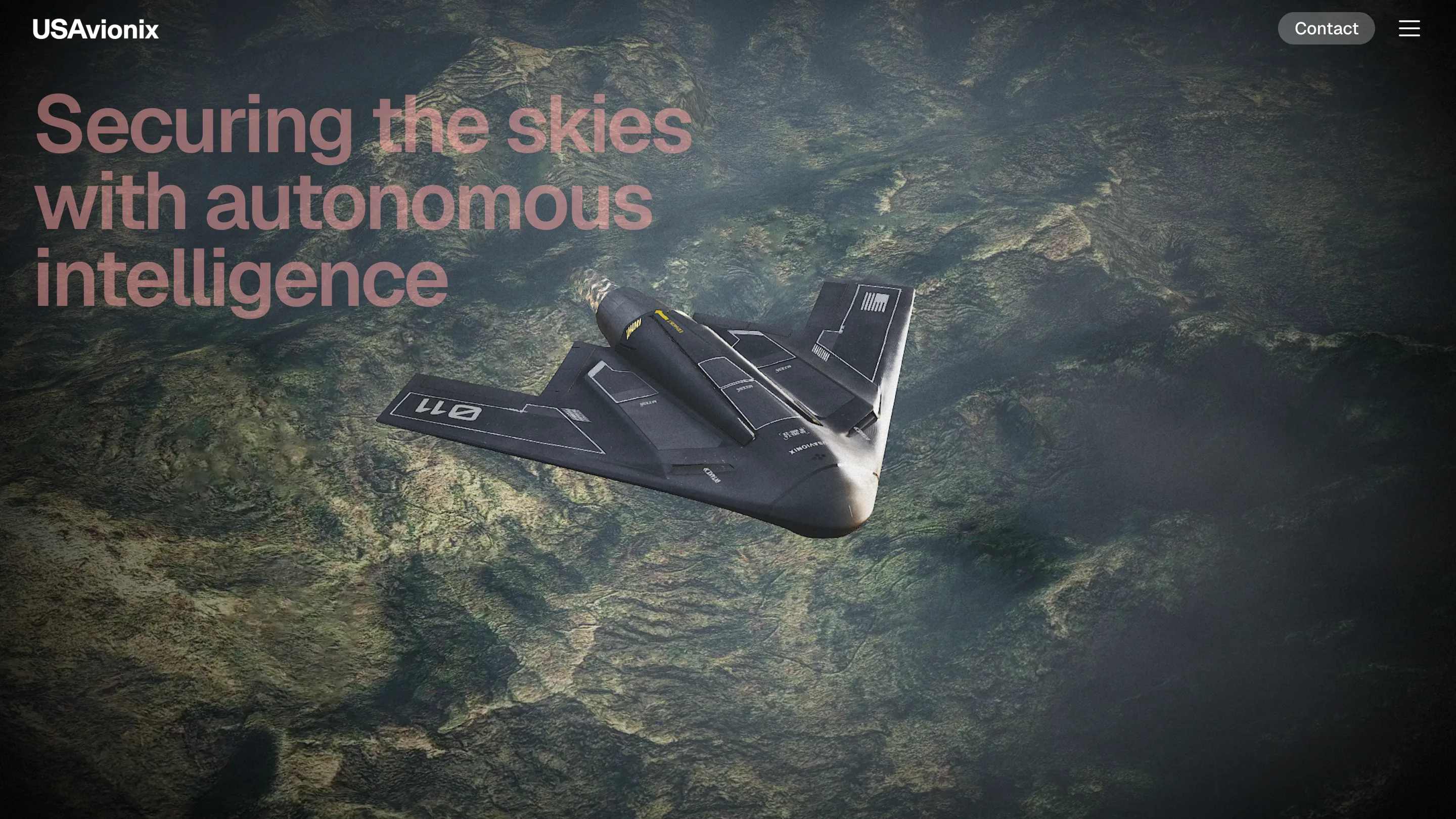
The USAvionix site never cuts. One scroll-driven camera flies the whole page: down onto a black wing lit like a studio product shot, up over a green mountain range at 1,240 metres, out to a wireframe map where three counties float on a dot grid. basement studio built it, and it took awwwards Site of the Day on 9 September 2026 with a 7.41. Creativity took 8.00, the highest of the four sub-scores, and that reads right.
A scroll-driven camera is easy to do badly. Tie a Three.js scene to scrollY, drop in some keyframes, and you get a page that fights the mouse wheel and forgets where it is. The work here went into the second problem.
One scroll-driven camera, ten chapters
The page runs about ten sections and the camera visits all of them without a hard cut. Hangar to sky. Sky to terrain. Terrain to a top-down thermal pass over a village of maybe two hundred roofs. The village dissolves into an abstract dot grid, and the last shot pulls back to the drone parked in front of the wordmark, which is drawn as an outline behind it.
Every transition happens on the subject, so you're never left watching a loader. The one dark frame in the whole thing is the intro: a grey wing turning slowly over the word READY. It ends before you've decided to be annoyed by it.
The header is a ruler
This is the move worth stealing. The nav holds three things: the USAvionix wordmark, a Contact pill, a hamburger. Between them sits a row of about a dozen thin tick marks and one small monospaced label.
Scroll, and the label slides along the ticks. SWARM. SYNC. DETECTION. PHALANX AI. COORDINATION. RESPONSE. Where it sits on the ruler is where you are in the page.
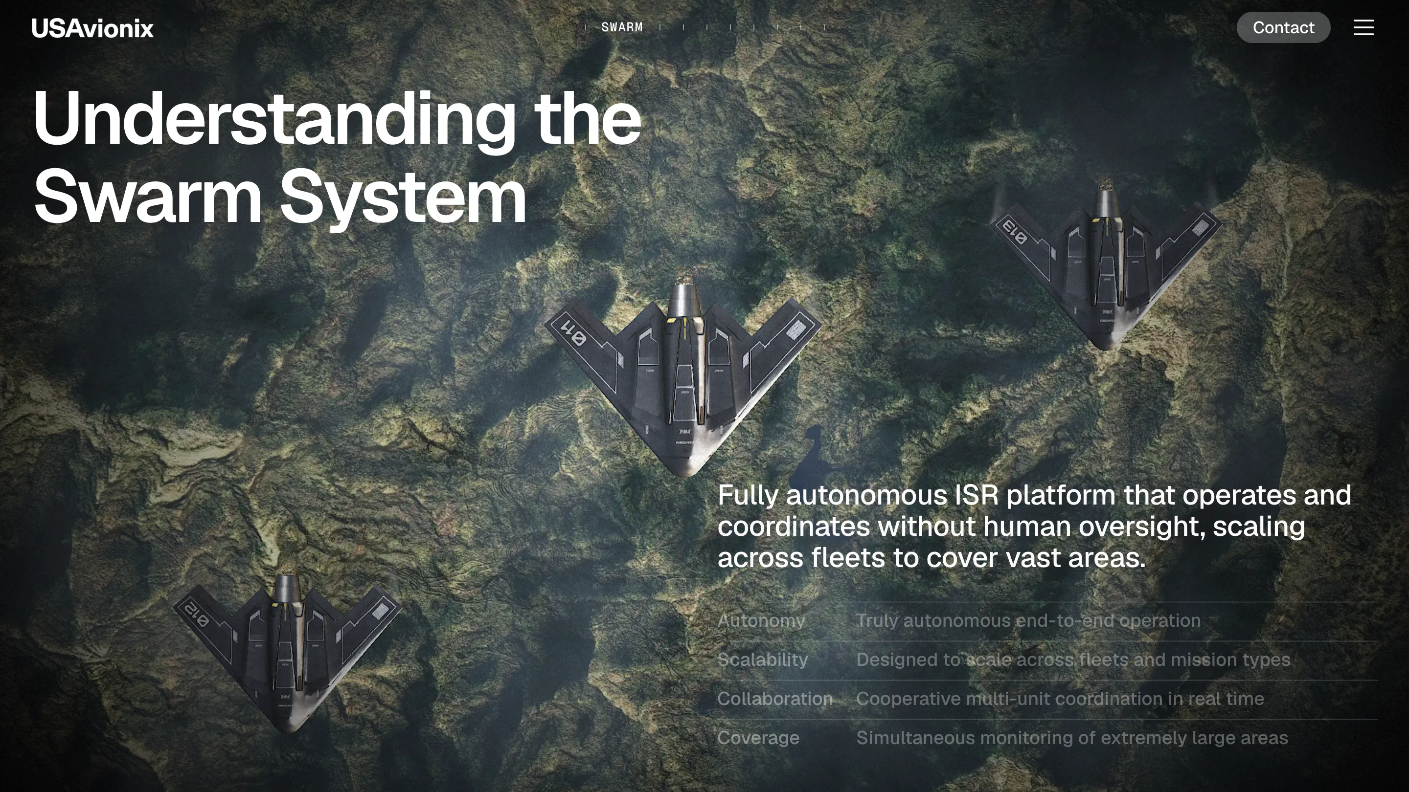
A long WebGL scroll usually costs you your bearings. There's no scrollbar, the sections have no edges, and the depth is invented. The ruler hands that back for about forty pixels of type, and it names each chapter while it's at it. The page ends up with a table of contents that's always on screen and never in the way.
Telemetry where the body copy would be
The type sets from the corners. Headline top left in a heavy grotesk, two lines, white over terrain. Supporting paragraph bottom right, three lines, and under it a spec table of four rows: Autonomy, Scalability, Collaboration, Coverage. Two sizes, two positions, held for the whole page.
Then the bottom right corner does something better. It runs a live-looking readout in mono that rewrites itself per section. SCAN MODE: ACTIVE. COORD: [37.4419°N / 119.8772°W]. ALT 1,240M | SPEED 74 KM/H. 32 CAR / 4 TRUCK / 1 PERSON / 2 UAV.
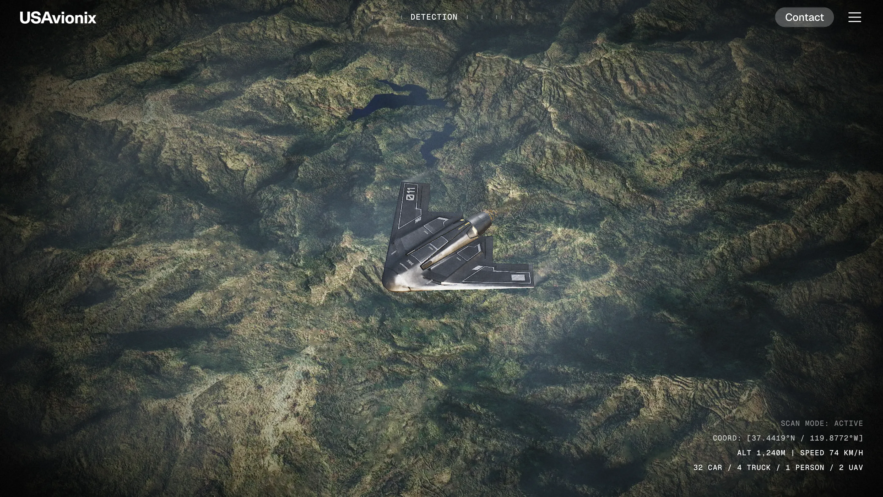
That's product copy dressed as an instrument. Four right-aligned mono lines carry more about what the machine does than a feature grid would, and they cost the layout nothing.
Colour held back for status
The palette is two greys and whatever the terrain happens to be. Then cyan arrives, and it only ever means a unit or a secured area. Amber only means a sensitive one. Red only means the fire. By the final map you can read the state of the scene before you read the labels, because the colour has been taught.
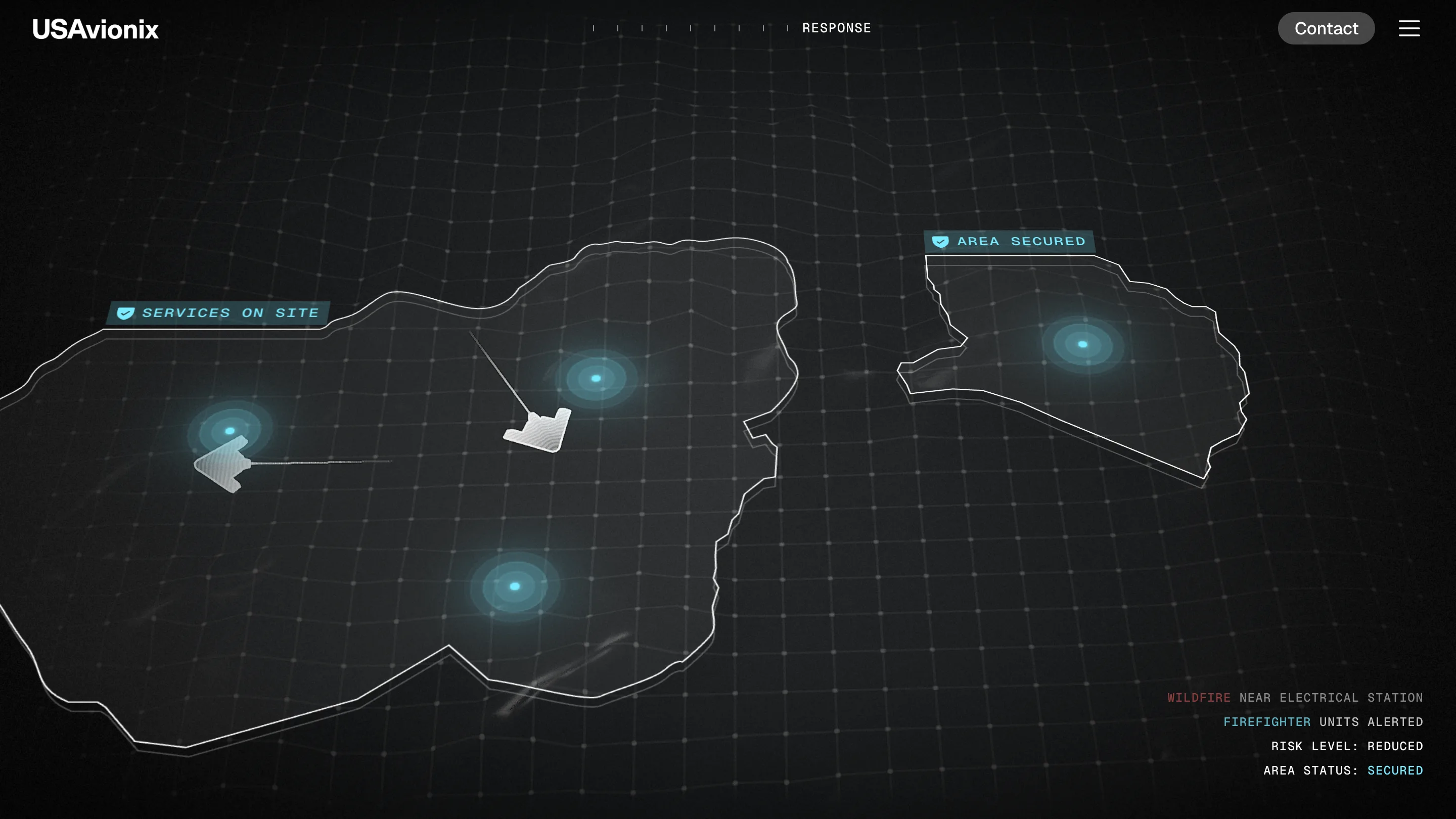
That discipline is what separates this from the usual dark-mode defence-tech look. Anyone can render a black jet on a black page. Reserving three accents for three meanings and holding it across a scroll this long is the part that takes an art director.
Where it pays for the idea
Usability scored 7.03, the lowest of the four, and that's fair. The section names in the header don't link anywhere, so the ruler tells you where you are without letting you move. The whole story is one page with no way to skip ahead. For a company whose call to action is a demo request, that costs something real.
The site knows what it is, though. It's a film for buyers who want to feel the hardware before they book the call, and it's cut like one.