Zero makes you draw a zero before the site opens
Zero's site holds its story behind a gesture: trace a circle with the cursor and it opens. The entry gate carries the argument on its own.
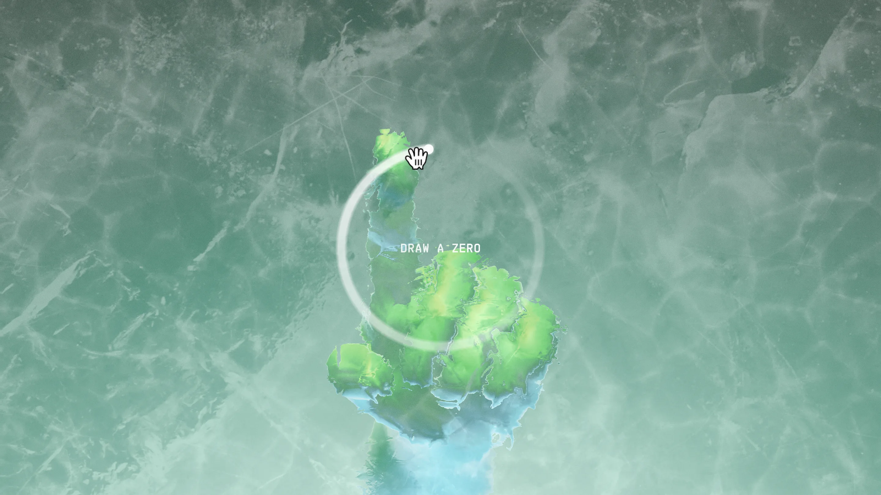
Zero's site shows you nothing until you draw a zero. You land on a green field of simulated fluid, a white ring picks up under the cursor, and a line of mono type reads DRAW A ZERO. Trace the circle and the page opens. Sit still and you're looking at water.
That entry gesture is the reason Zero took awwwards Site of the Day on 7 September 2026, scoring 7.73 overall and 8.16 on creativity, its highest mark. The site is Zero University's pitch for an AI-native alternative to a degree. Sindhur Dutta is credited as designer, and it runs on Three.js, GSAP and Blender.
The gate teaches you the name
Drawing a circle means drawing the logo. The brand is a zero, and the first thing the site asks is that you make one with your own hand. Four seconds of tracing and you've written the name before you've read a word of copy.
The reward lands right after: a 100 XP chip pins itself to the top right and stays there for the rest of the scroll. Small move, big effect on tone. You've been scored, so you read the rest as a player rather than a visitor.
One sentence, four screens
Past the gate the palette flips. Green murk becomes a pale mint gradient, close to white, and a display serif takes the screen. "You Believed" comes first, its B carrying a swash that loops back under the whole word and roughly doubles its width. Keep scrolling and the sentence continues: "College would", then "land You", then "a JOB".
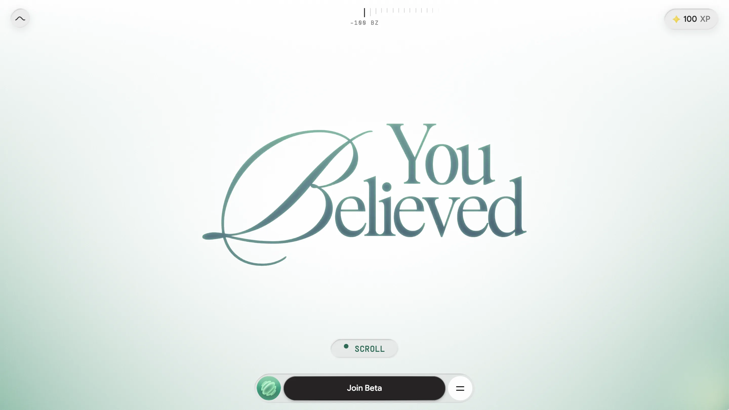
Setting one sentence across a scroll is an old trick. What holds it up here is the restraint around it. No body copy, no cards, no section headers. The only other type on screen is a mono UI layer: a ruler ticking across the top in units labelled BZ, a SCROLL prompt, and a Join Beta pill docked at the bottom. Two typefaces, two jobs, no overlap between them.
The argument is in one image
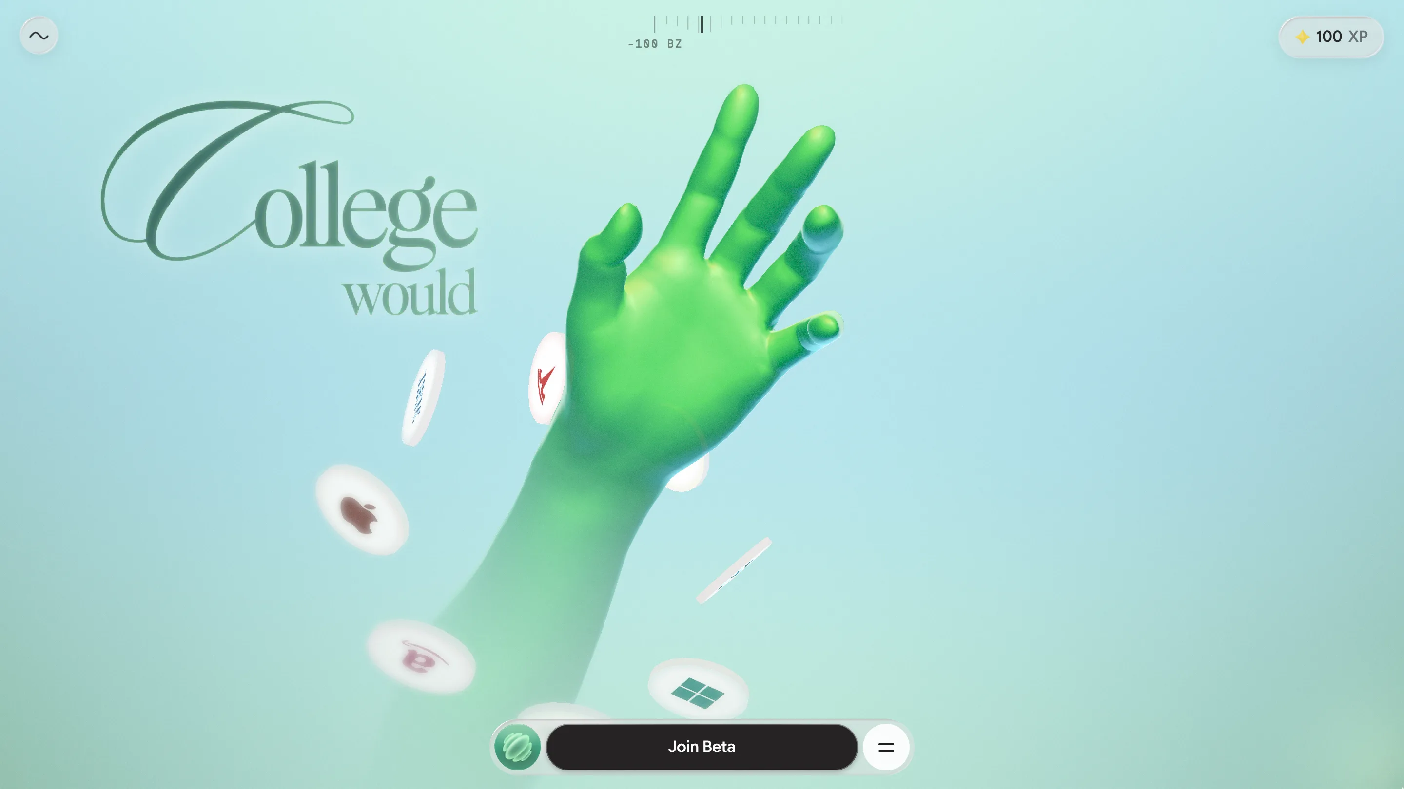
On the second screen a green CG hand rises through the mint, fingers open, while discs stamped with the logos of Apple, Windows, X and Y Combinator drift past it like coins nobody caught. That's the setup for the joke the sentence is building toward.
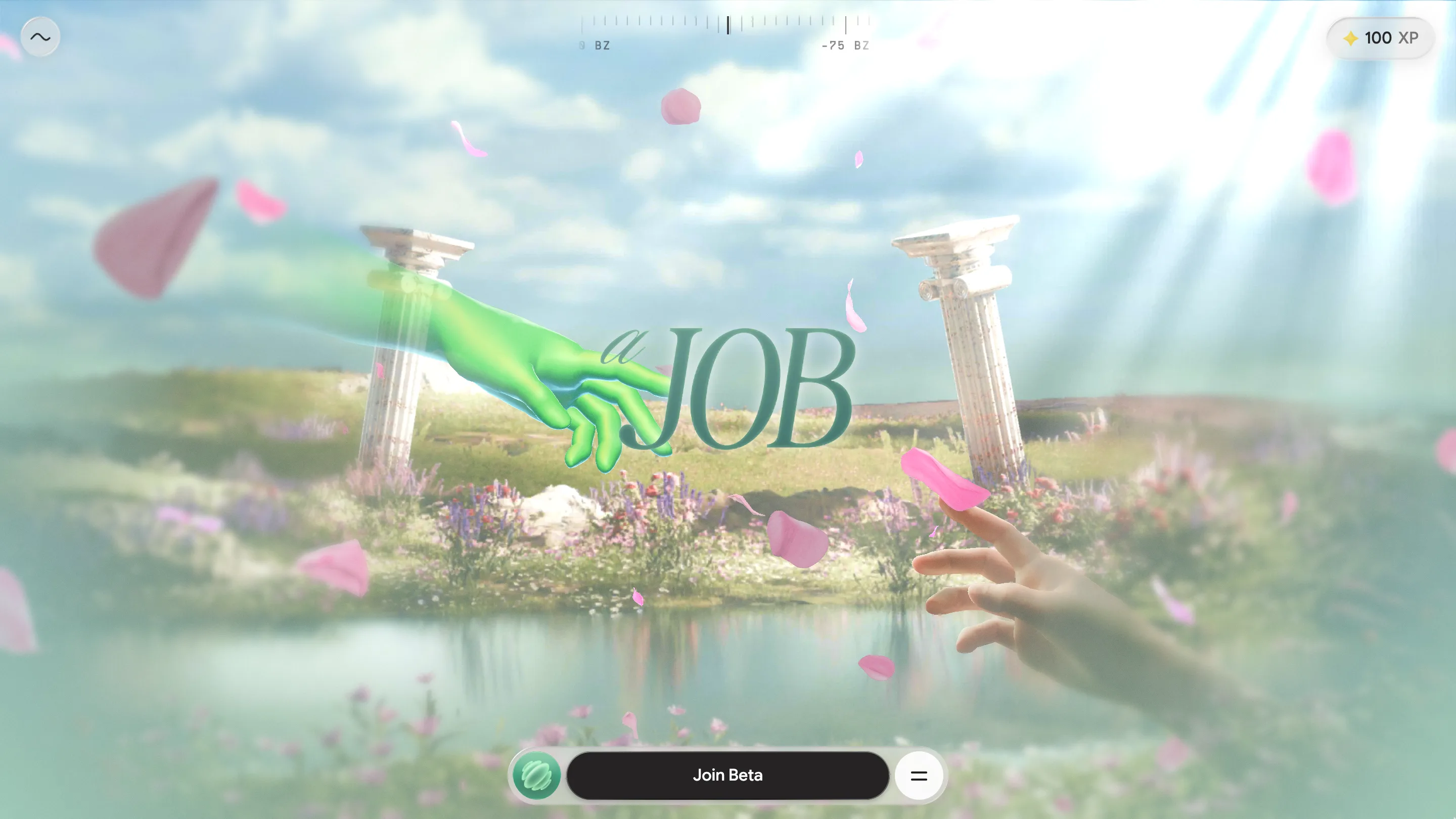
The payoff is Michelangelo. Two Doric columns, a meadow, a lake, pink petals falling through god-rays, and two hands reaching for each other with the word JOB set between the fingertips. The green hand takes the position Michelangelo gave God. The human hand does the reaching.
Then it stops you again
Right where the fingertips almost meet, the scroll locks and a ring appears between them reading TAP HOLD. The site won't finish the painting for you. Press and hold, and the hands close the gap.
Twice in ninety seconds, the site makes its point with your hand instead of a paragraph. A school selling real work over lectures asks you to do a small piece of work before it will talk. The medium and the message agree.
What it costs
Usability came in at 7.46, the lowest of the four scores and well under creativity's 8.16. That's a fair read. Anyone on a phone, on an unfamiliar trackpad, or on a screen reader has to pass a drawing test before reaching the pitch, and the tap-and-hold gate stops the scroll outright until you complete it. Plenty of visitors will bounce at the water.
Zero decided the filter was worth paying for, and for a school whose only CTA is a Join Beta button, that math probably works. What's worth taking is the reasoning behind the ring: the gesture and the product say the same thing, so four seconds of tracing carry meaning that would otherwise need three paragraphs. A gate that asks for effort and gives nothing back is friction. This one hands you an argument you can feel in your wrist.