Butter's block icons are made of the effect they name
Every tile in Butter's effect library is a demo of itself. Inflate is puffed up, Glow glows, Focus goes out of focus. ToyFight built the site.
Awards · The Editors · 3 min read ·
Featured: ToyFight
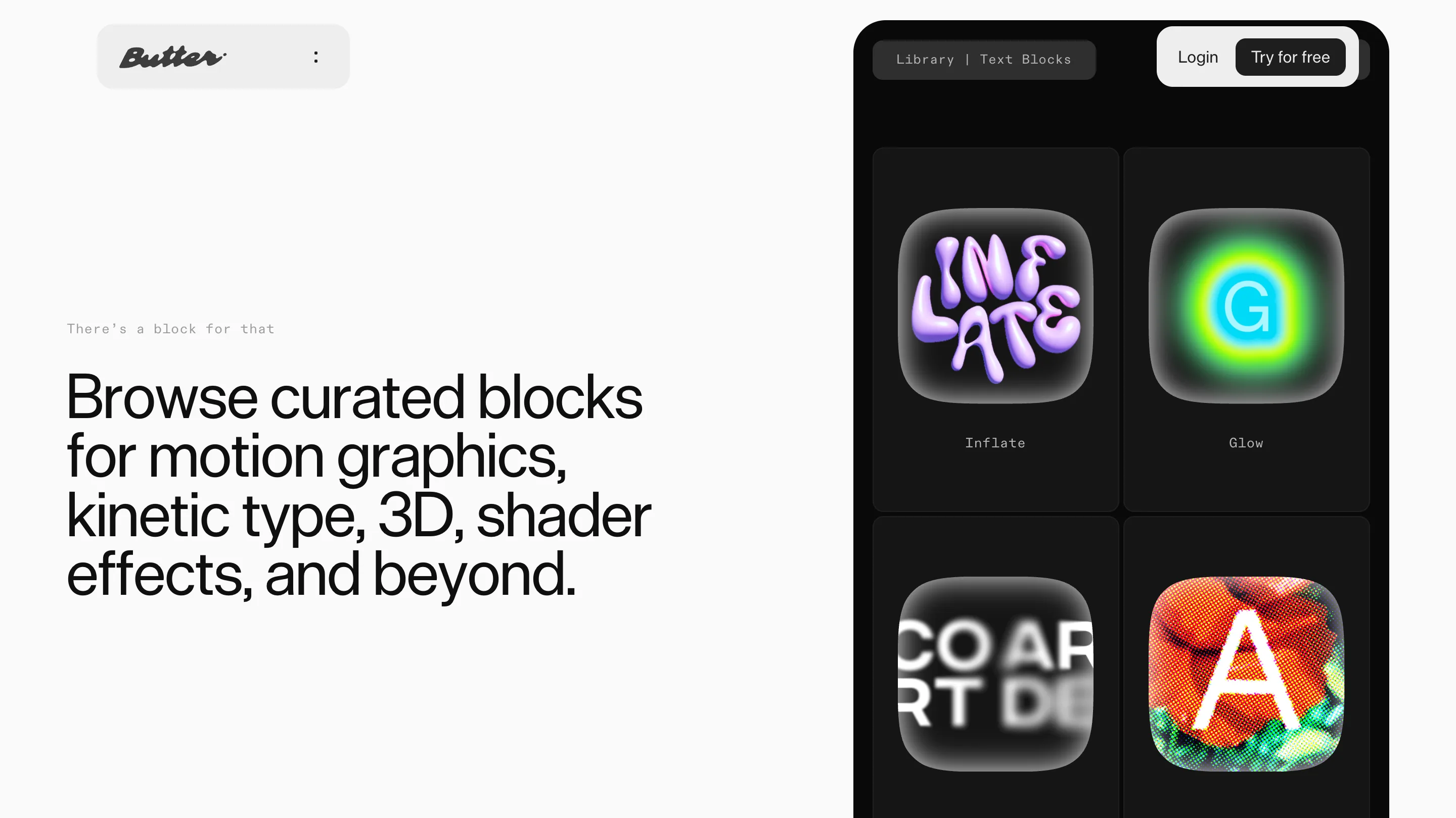
Open Butter's block library and the icons stop behaving like icons. The tile labelled Inflate shows the word INFLATE puffed into lilac balloon letters. Glow is a cyan G sitting inside a green halo. Focus is four letters going soft. Halftone is a photograph of tomatoes broken into printer's dots. Every thumbnail is the effect run on its own name. ToyFight made the site, and awwwards gave it Site of the Day on 28 September 2026 with a score of 7.5.
The icon is the demo
Butter is a video editor that runs in the browser. Its pitch, printed under the hero, is that you can build and remix your own tools on the timeline. Software like that is hard to photograph. A screenshot of a timeline looks like every other timeline, and a grid of abstract glyphs would have said nothing about what the effects do.
So the library performs instead. Two columns of rounded squares on near-black, each labelled underneath in a tracked-out mono. You read Inflate, you see inflation. No caption, no hover state, no tooltip. It's the oldest move in type specimen design, pointed at a shader library, and it works because everything this product makes is visual by definition.
The panel is cropped by the right edge of the viewport. You get four tiles and the beginning of four more. That crop does the arguing: there are more of these than fit on a screen.
One silver page, one line of type
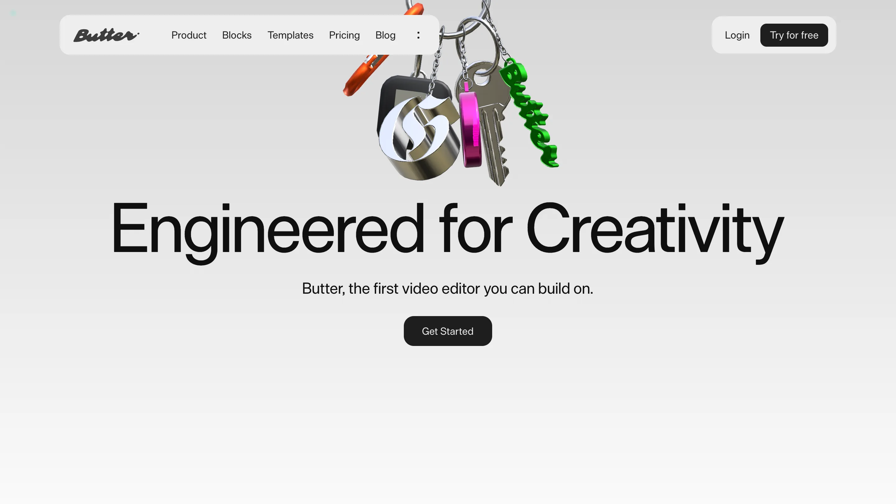
Everything else is the same page over again. A silver-to-white gradient, a headline centred in the middle third, one sentence under it, one black pill button. The home page sets "Engineered for Creativity" at 108 pixels in Die Grotesk with the leading pulled just under the type size, so the line lands as a single object rather than a sentence.
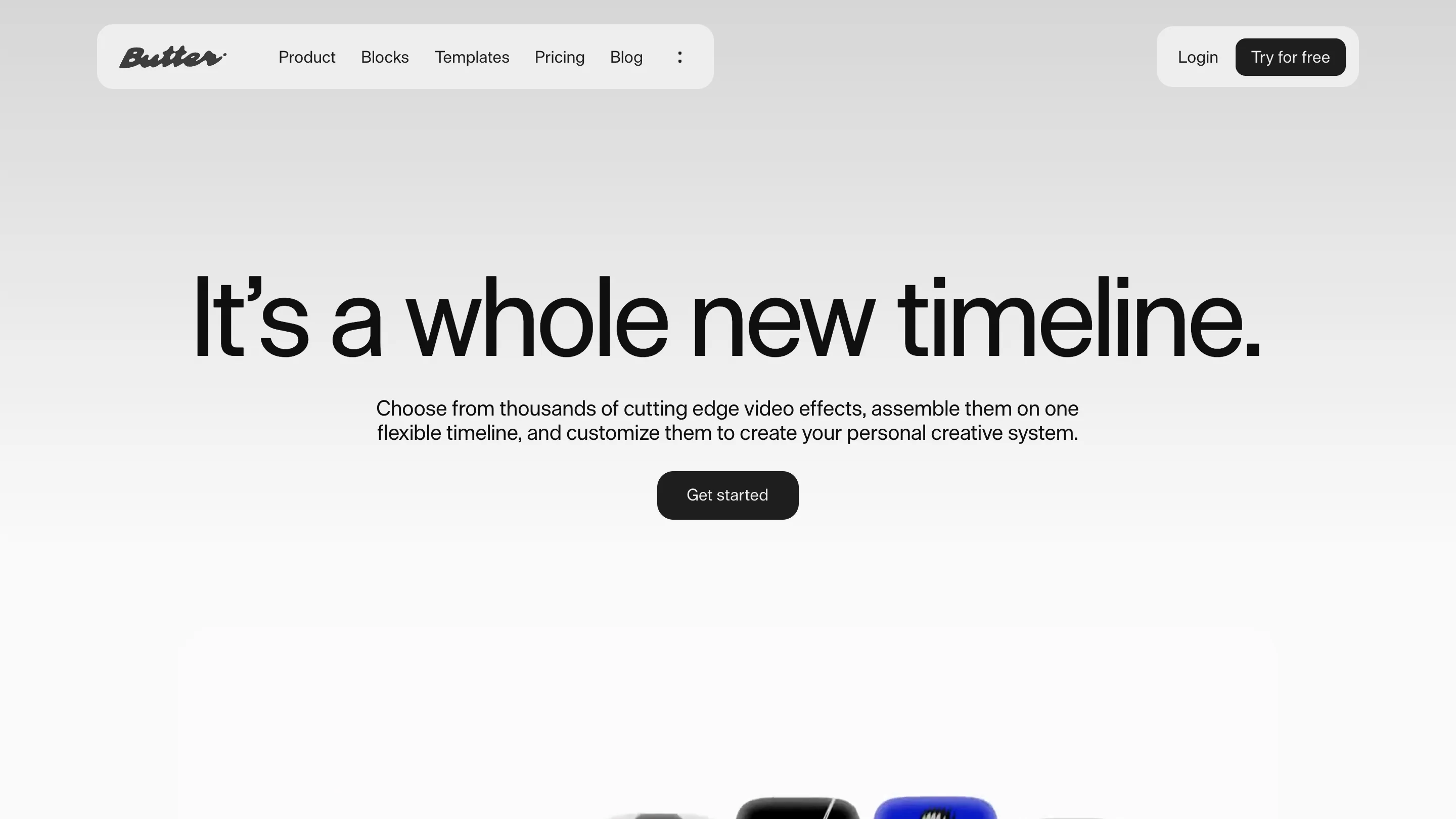
The product page opens with "It's a whole new timeline." in exactly the same arrangement. Pricing repeats it. When the layout never moves, the only thing changing between pages is the sentence, which is the right thing to be looking at on a page whose job is a claim.
Section headlines fill in as you scroll. The words sit light grey and darken to black one at a time, left to right, so a line caught halfway through the scroll reads like a frame pulled off a timeline. Above each one there's a 13-pixel label in mono, spaced out and grey: "There's a block for that", "Explore features", "Create more, faster". A kicker, doing what a kicker does in a magazine.
The hero is a keyring
The restraint breaks once, at the top of the home page, and it breaks well. In place of a product shot there's a 3D render of a keyring hanging into frame: an orange carabiner, a black tag with a chrome swash letter on it, a magenta anodised ring, a cut house key, and the Butter script moulded in glossy green plastic. Conference merch, rendered at a quality nobody gives conference merch.
It's a good opening for a tool aimed at motion designers. The first thing on screen is a lit, shaded object of the kind you would go and make in the editor.
The wordmark goes through the same machine
At the bottom of the page the Butter script runs nearly the full width of the site, black, its baseline melted into a slow wave, a green-into-blue fringe bleeding out underneath it. It's the bloom from the Glow tile, scaled up to footer size and put on the brand.
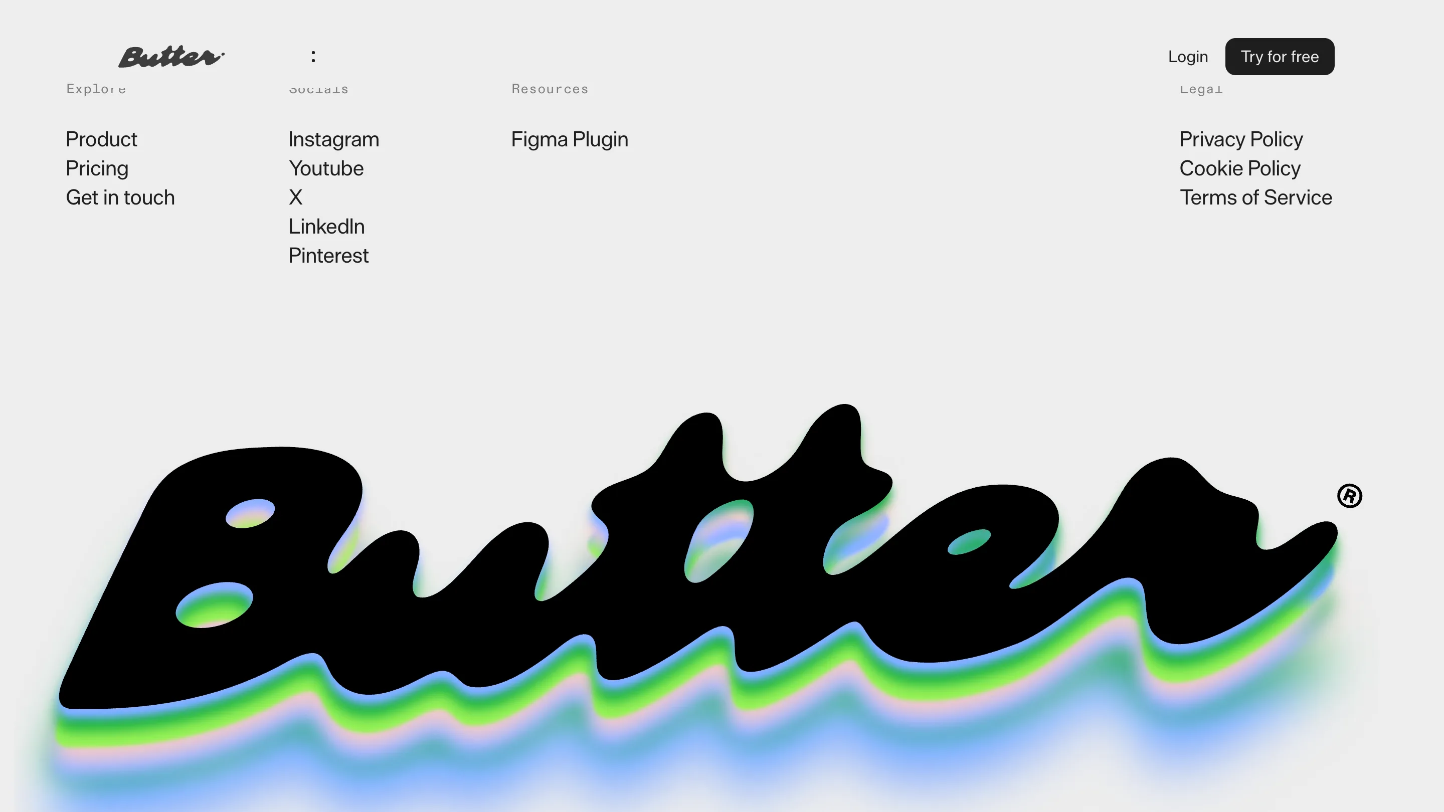
That is the argument of the whole site in one mark. The identity went through the product to get made, the same way the icons did.