No Art hangs its rave photos on a white gallery wall
An art-music label's site sets grainy festival photography in paper-white space, pairs a felt-tip logo with monospace type, and frames it in crop marks.
No Art throws raves, and its website behaves like a gallery. The Dutch label books unconventional music at odd venues and keeps every lineup secret, then hangs all of it in paper-white space with the calm of a museum wall. It took awwwards Site of the Day on August 6, 2026, scoring 7.28, and the studio behind it is BORING. The reason a judge rated it is restraint: a site about loud rooms that stays quiet.
The white wall does the framing
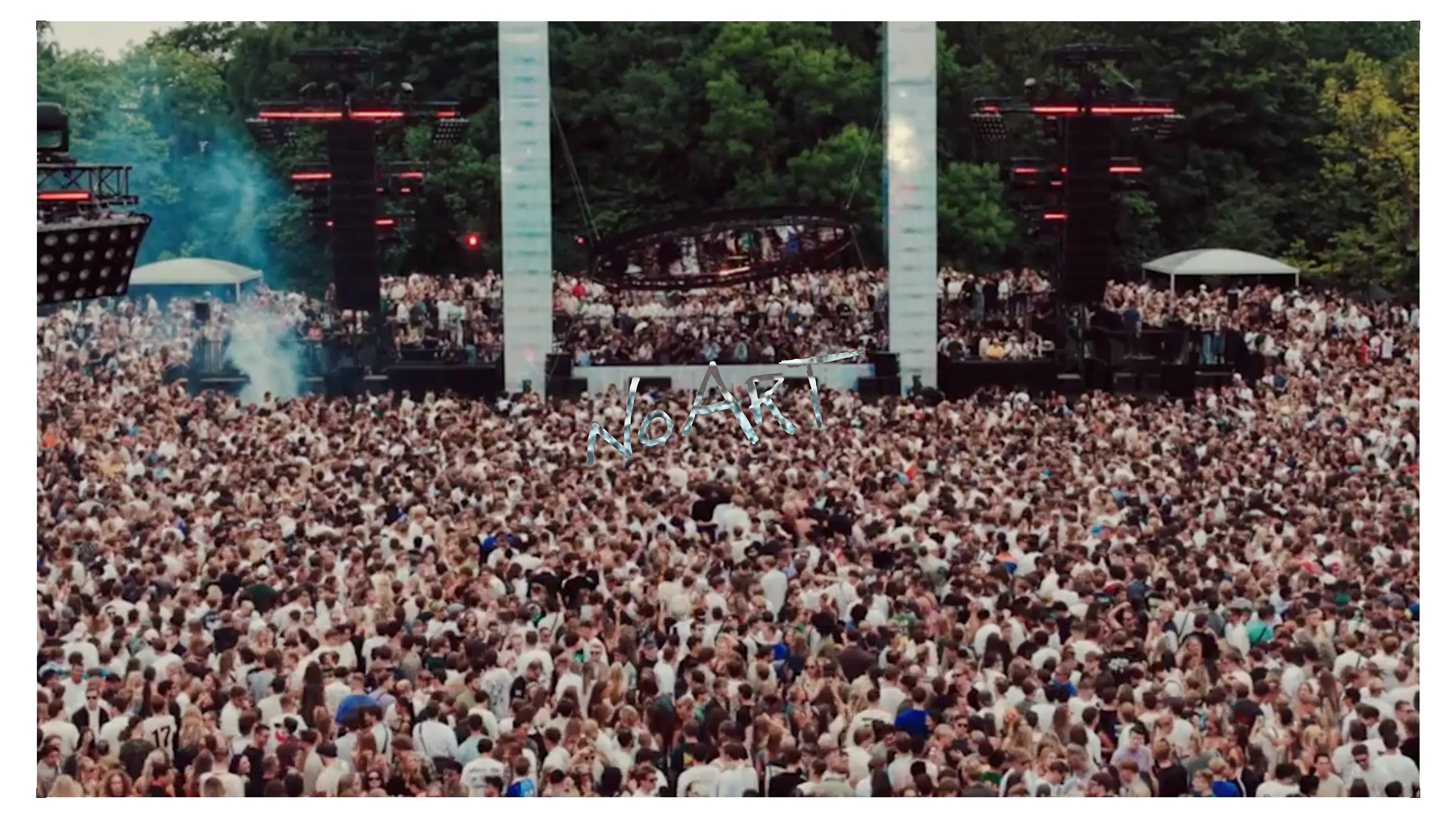
The homepage opens on a full-bleed video of a festival crowd, desaturated almost to grey, thousands of people under a treeline stage. Every other page drops that noise. Photos sit on white with wide margins, floating at staggered heights instead of locking into a grid. On the gallery page the images scatter down the field like prints laid out on a light table, and the eye moves between them at its own pace.
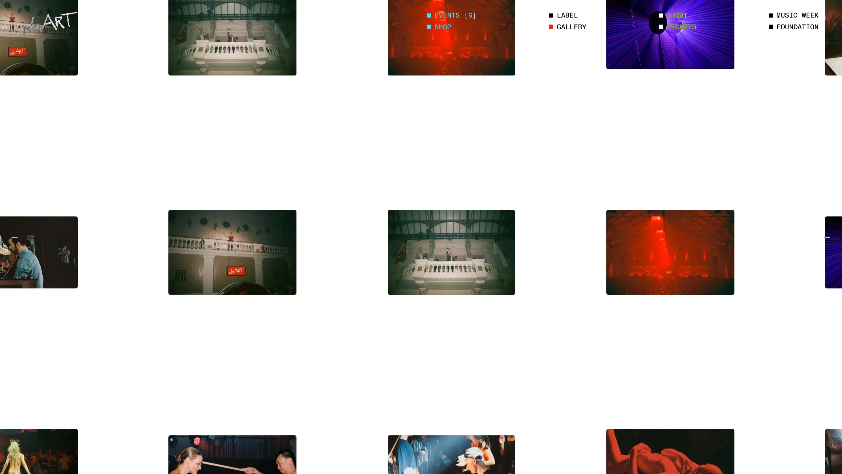
Colour lives only inside the photography. Laser reds, blue smoke, the purple wash of a strobe. The interface itself never picks up a hue beyond a single red square that marks the active nav item. The work is loud so the chrome does not have to be.
A felt-tip logo against machine type
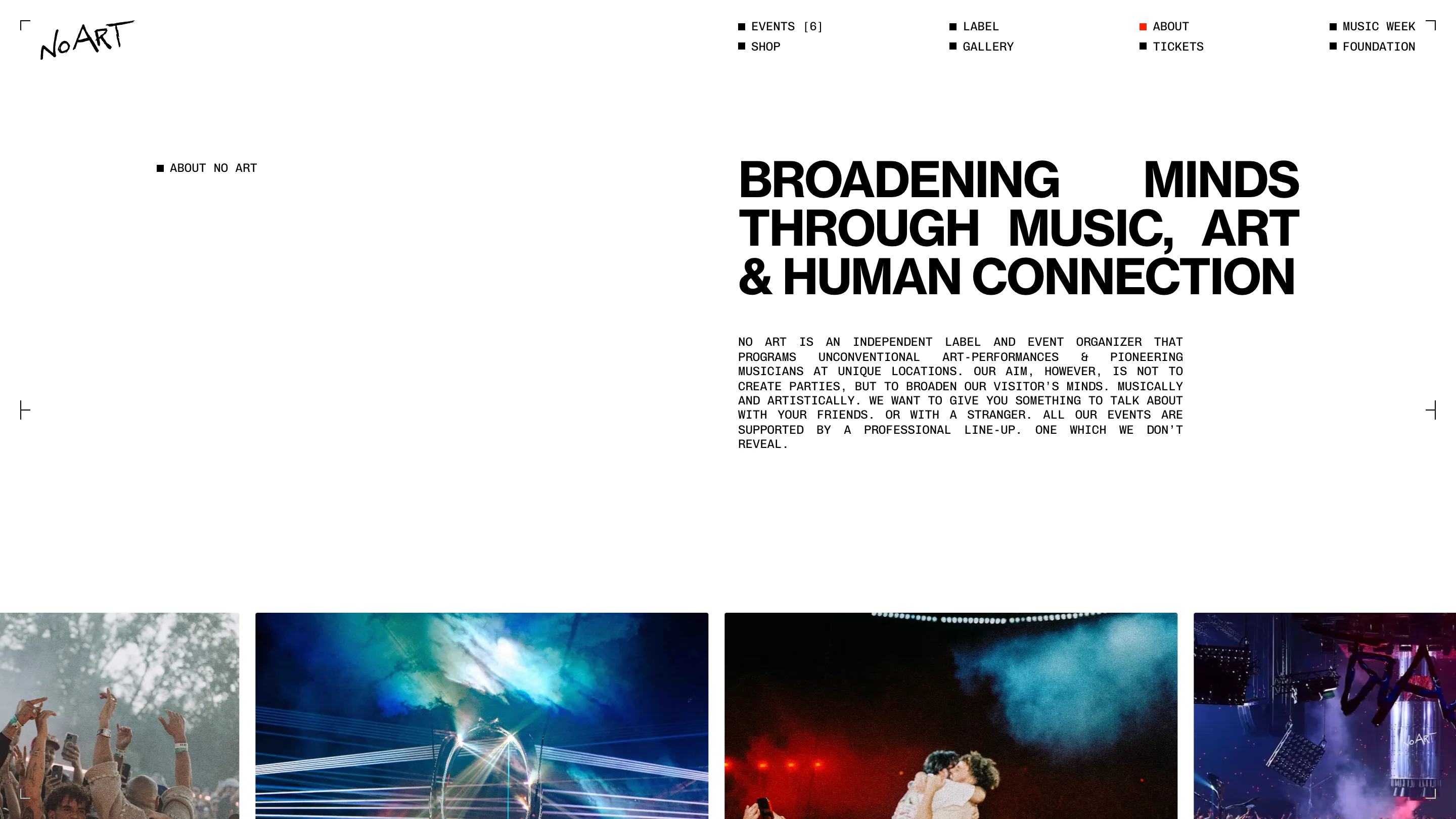
The wordmark is a marker scrawl. "NoART" written by hand, shaky and quick, the kind of tag you would find on a flyer or a bathroom wall. Then it sits inside an interface built from rigid monospace, all caps, each menu item flagged with a small filled square. Two hands are at work on the same page, one human and off-kilter, one mechanical and gridded, and the friction between them is the whole identity.
The about page adds a third register. A heavy grotesque display headline, "Broadening minds through music, art and human connection," runs big and black against a monospace paragraph set below it. Three type voices, each doing a different job, none of them fighting.
Crop marks turn the page into a proof
Look at the corners. Every screen is framed by registration marks, brackets at the four corners and small ticks halfway down each edge, the same marks a printer leaves on a proof sheet. They give the site the feel of an unfinished print run, something still on the press. It is a small move and it carries a lot of the art direction.
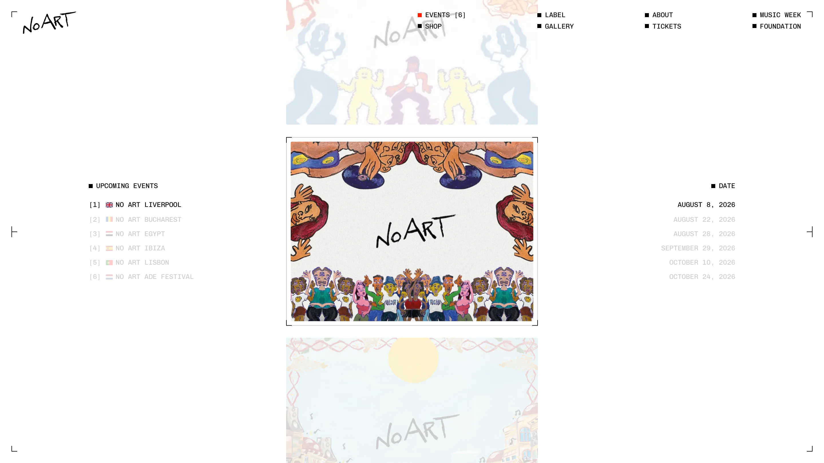
On the events page those marks bracket a mirrored, hand-painted illustration of DJs and dancers, naive and bright, folded into kaleidoscope symmetry. A numbered index runs down the left, [1] through [6], from No Art Liverpool to the ADE festival. The matching dates run down the right. Only the active event is inked black; the rest sit greyed, waiting their turn. The layout reads like a contents page for a night you have not been told about yet.
What the award is really pointing at
Strip away the animation and the craft is in the decisions. A rave brand that resists neon. A secret lineup that the copy states plainly and never apologises for. A logo that looks scribbled sitting next to type that looks machined. The site sells a feeling rather than a poster, and it trusts the reader to sit with white space instead of filling every pixel. That is the kind of hold that a working designer notices, and it is why BORING walked away with the day.