Signal-A spaces its words out to a six-column grid
Signal-A justifies every headline to the six columns of its menu, and gives a serif, a grotesk and a mono one job each.
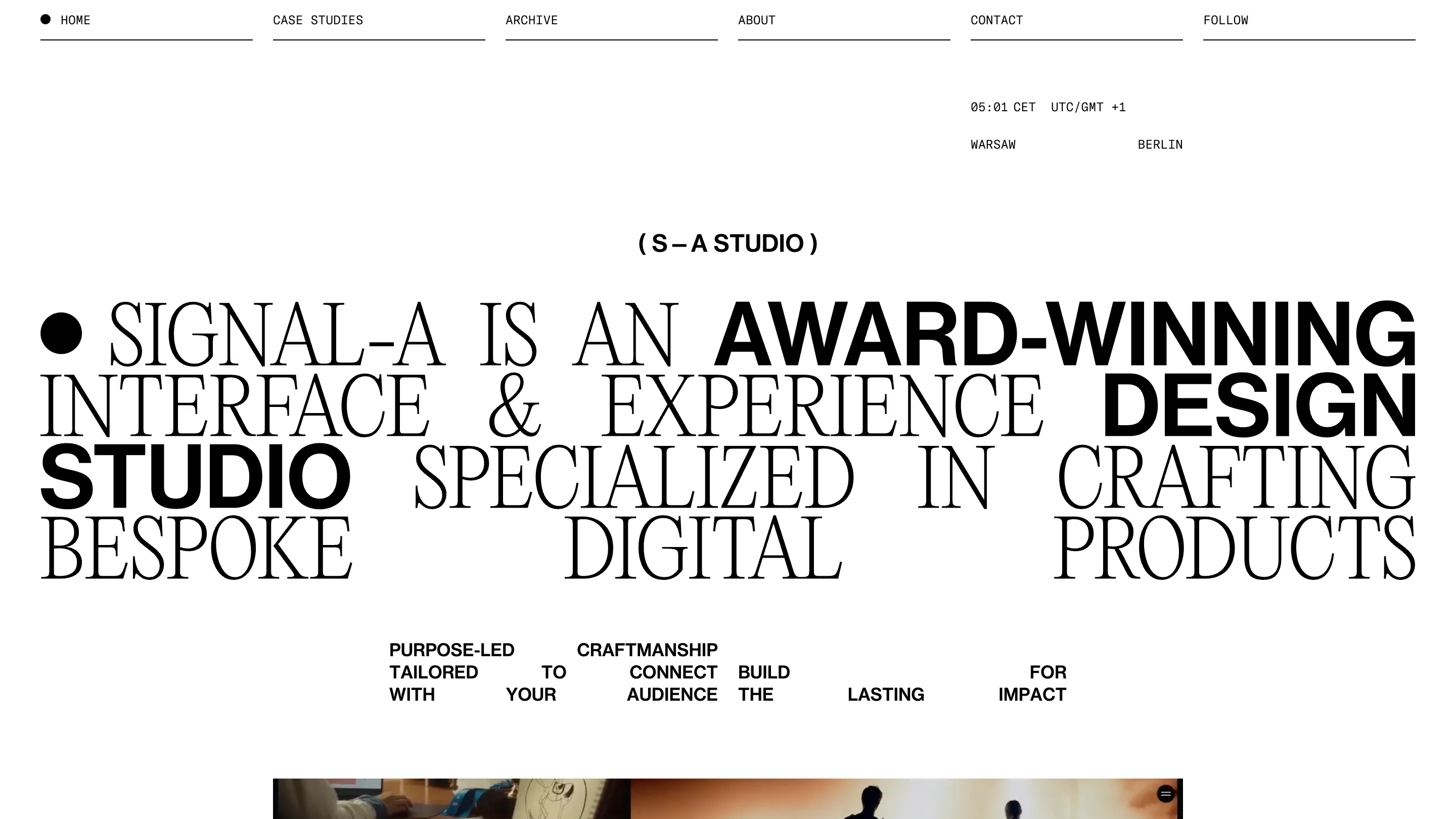
Signal-A's studio site runs every word through one six-column grid. The menu splits the screen into six equal underlined cells, and the headlines below stretch their words out until they land on those same edges. It took awwwards Site of the Day on 18 October 2026, scoring 7.22, with a Developer Award on top. The site is the Berlin and Warsaw studio's own, designed by Maciej Żuk, and you can see it at Signal-A.
Six cells across the top
Start with the nav. HOME, CASE STUDIES, ARCHIVE, ABOUT, CONTACT and FOLLOW each get a sixth of the width, set in a small monospace, each sitting on its own hairline. The current page carries a black dot in front of its label. That's the whole menu, and it's also the ruler for everything under it.
Right under it, in the fifth column, a live clock reads the hour in CET with WARSAW and BERLIN pinned to the column's two edges. It's a tiny detail. It also tells you where the studio is without a single sentence of copy.
A headline justified to the grid
The home opens on one long sentence: "Signal-A is an award-winning interface & experience design studio specialized in crafting bespoke digital products." It fills four lines edge to edge. Most of it is a tall, condensed serif in capitals. Three words, AWARD-WINNING, DESIGN and STUDIO, switch to a heavy grotesk, so the sentence has a second, shorter sentence hidden inside it.
The last line is where the grid shows. BESPOKE, DIGITAL and PRODUCTS are pushed apart until the first word hits the left margin, the last one hits the right, and DIGITAL sits in the middle. The gaps are huge and nobody minds, because the words are big enough to hold the line.
The smaller block under the headline does the same thing at reading size. "Purpose-led craftsmanship tailored to connect with your audience" is broken into single words and dropped into grid cells, so TO floats alone and YOUR sits two columns from WITH. You read it slower. That's the point of it.
The same rule on every page
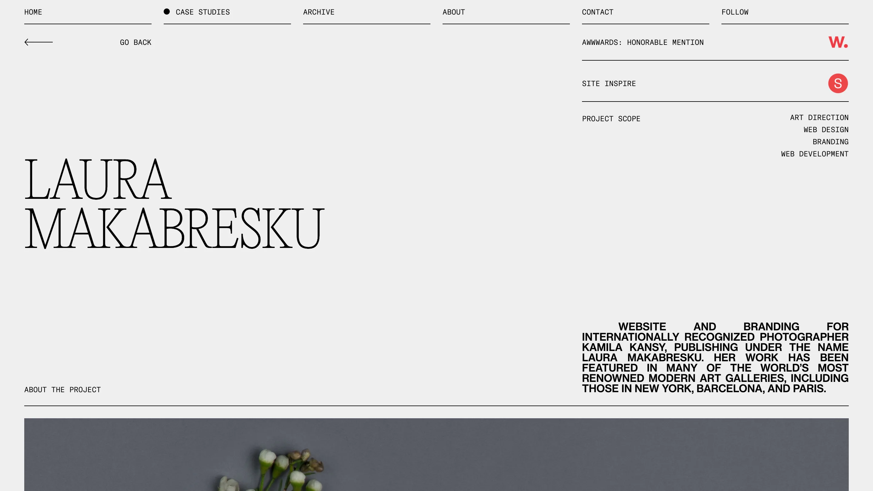
A case study keeps the frame. On the Laura Makabresku page, the photographer's name sits huge in the serif at the left, while the right column stacks the awards as ruled rows (an awwwards Honorable Mention, a Site Inspire feature) and lists the scope: art direction, web design, branding, web development. The project summary below it is set in the grotesk and fully justified, a dense block of capitals squared off on both sides.
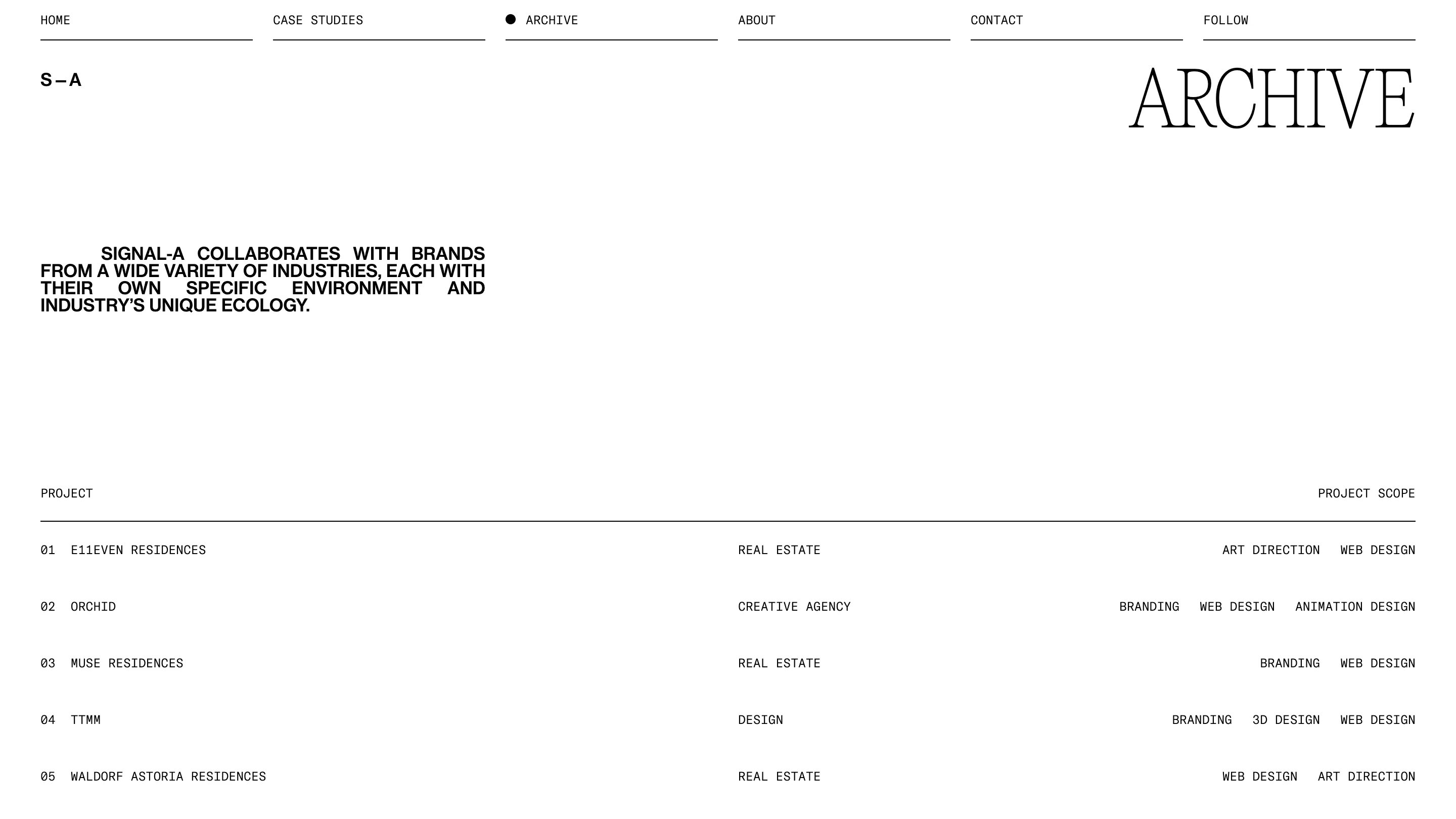
The archive turns the grid into a table. ARCHIVE sits top right in the serif, a justified intro block sits top left, and 14 projects run down the page as monospace rows: number and name in the first column, the industry in the fourth, the scope pushed to the right edge. E11EVEN Residences, Orchid, TTMM, Waldorf Astoria Residences. Click a row and an overlay slider opens with the images.
Three typefaces, three jobs
What makes it hold together is the split of roles. The condensed serif speaks: names, titles, the big claims. The grotesk does emphasis and the dense paragraphs. The monospace handles everything you'd call data, the menu, the clock, the scope, the project numbers. None of them wanders into another's job.
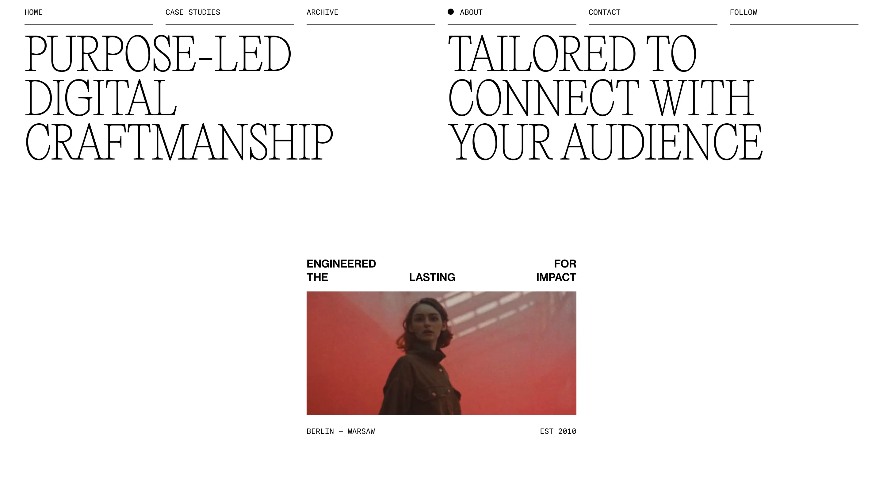
The about page shows it best. "Purpose-led digital craftmanship" and "Tailored to connect with your audience" sit side by side in the serif, each starting on a column edge. Under them, "Engineered for the lasting impact" scatters across the grid in the grotesk, over a red-toned film still, with BERLIN, WARSAW and EST 2010 in mono at its corners.
There's almost no colour, almost no decoration, and no illustration. The site is black type on white with photographs from the work. When the type is placed this carefully, that's enough, and it's why a judge scoring design gave it the highest of its four marks.