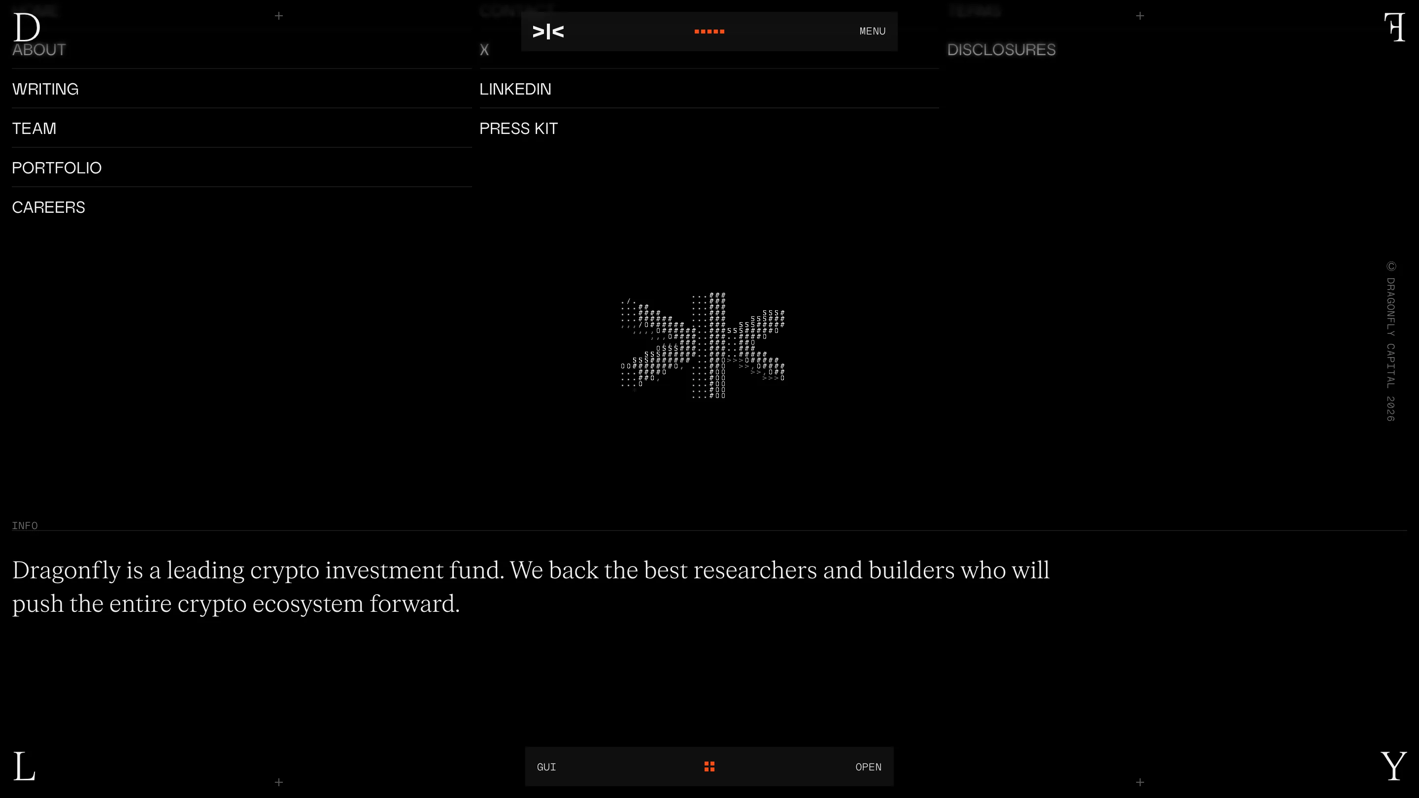
Dragonfly's hero image is drawn entirely in ASCII
Studio Freight rendered Dragonfly's crypto fund site in ASCII on black, framed by four serif letters. It took awwwards Site of the Day at 7.39.
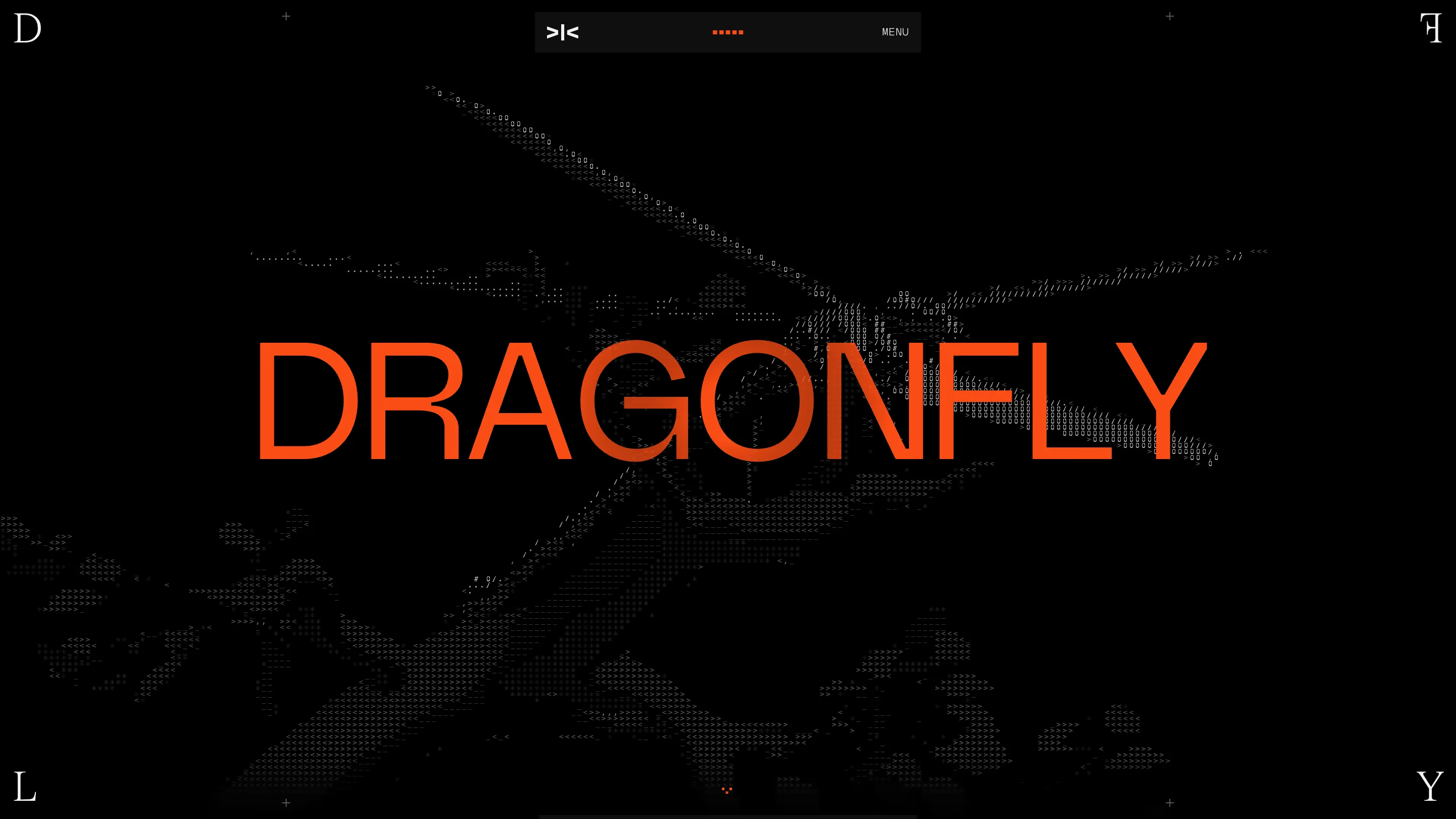
The dragonfly on Dragonfly's homepage is made of slashes, hashes, zeros and less-than signs. Look close and you can read the characters. Look at the whole thing and it's an insect with two pairs of wings, hanging in the dark behind the wordmark.
Studio Freight built the site for the crypto fund Dragonfly, and it took awwwards Site of the Day on 22 July 2026 with a 7.39. Design scored 7.55, the highest of the four sub-scores. The ASCII is why.
ASCII as a rendering technique
Most ASCII art on the web is nostalgia. A terminal joke, a loading state, something in a footer. Here it carries the largest element on the page and it's live: the wings shift as you move, and the same character treatment runs the logo mark at the bottom of the site and the hover states on the portfolio rows.
The smart part is the brightness. The insect sits at maybe fifteen percent white against pure black, so the orange wordmark stays first in the reading order and the ASCII reads as texture. Push the characters brighter and the hero becomes a fight between two things. Studio Freight kept one loud and one quiet.
The palette helps: #FA4C14 orange and #000000 black, and nothing else. Every accent on the page is that one orange, spent on maybe five percent of the pixels.
Two typefaces, two jobs
The type split is the clearest decision on the site. A plain grotesk handles anything functional: the DRAGONFLY wordmark, section titles like TEAM and INDEX, the nav, partner names, company names. A high-contrast Didone serif handles the frame and the voice: the corner letters, the alphabetical dividers in the index, the roles under the portraits, the closing statement in the footer.
Sans means interface. Serif means editorial. Once you see it you can predict which face any new label will use, which is what a type system is supposed to do.
The frame that never leaves
Four serif letters sit pinned to the corners of the viewport: D top left, F top right, L bottom left, Y bottom right. Scroll anywhere and DFLY is still spelled around whatever you're reading. Add the crosshair registration marks at the middle of the top and bottom edges and the tiny SEC-03 labels, and the whole page reads like a printer's proof sheet.
It does the work a fixed logo usually does, without spending a corner on a logo. The actual nav is a small floating pill in the top centre: a >|< mark, five orange dots for scroll progress, and MENU. Nine pixels of chrome, and you always know where you are in the page.
The index is a phone book, on purpose
A fund portfolio page is normally a grid of client logos at low opacity. This one lists 122 companies as text, in four alphabetical columns, with serif letter dividers and seven filter chips across the top.
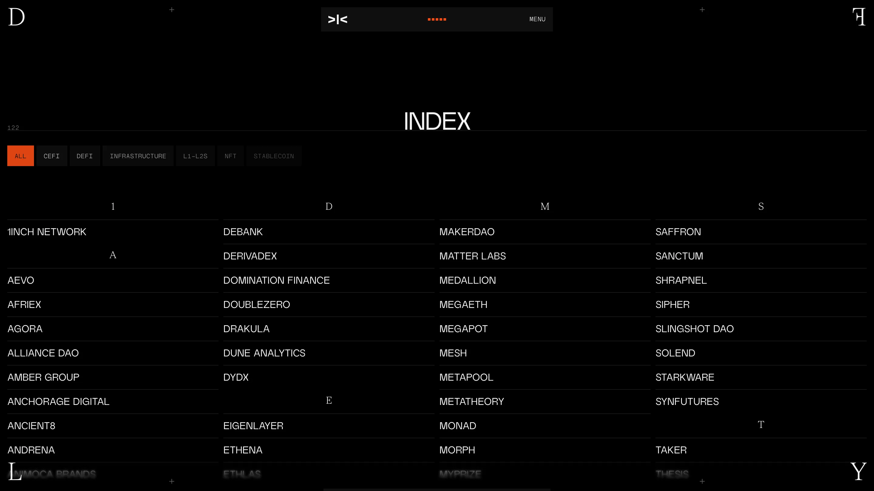
Logos turn a portfolio into wallpaper. You scan the shapes, recognise two, move on. Names make you read. 1inch, dYdX, MakerDAO, EigenLayer, StarkWare, Monad sit in the same weight and size as everything else, so the list is the flex rather than any single badge in it.
Where the score drops
Content came in at 6.84, accessibility at 6.60, markup and metadata at 6.60. The team section shows why.
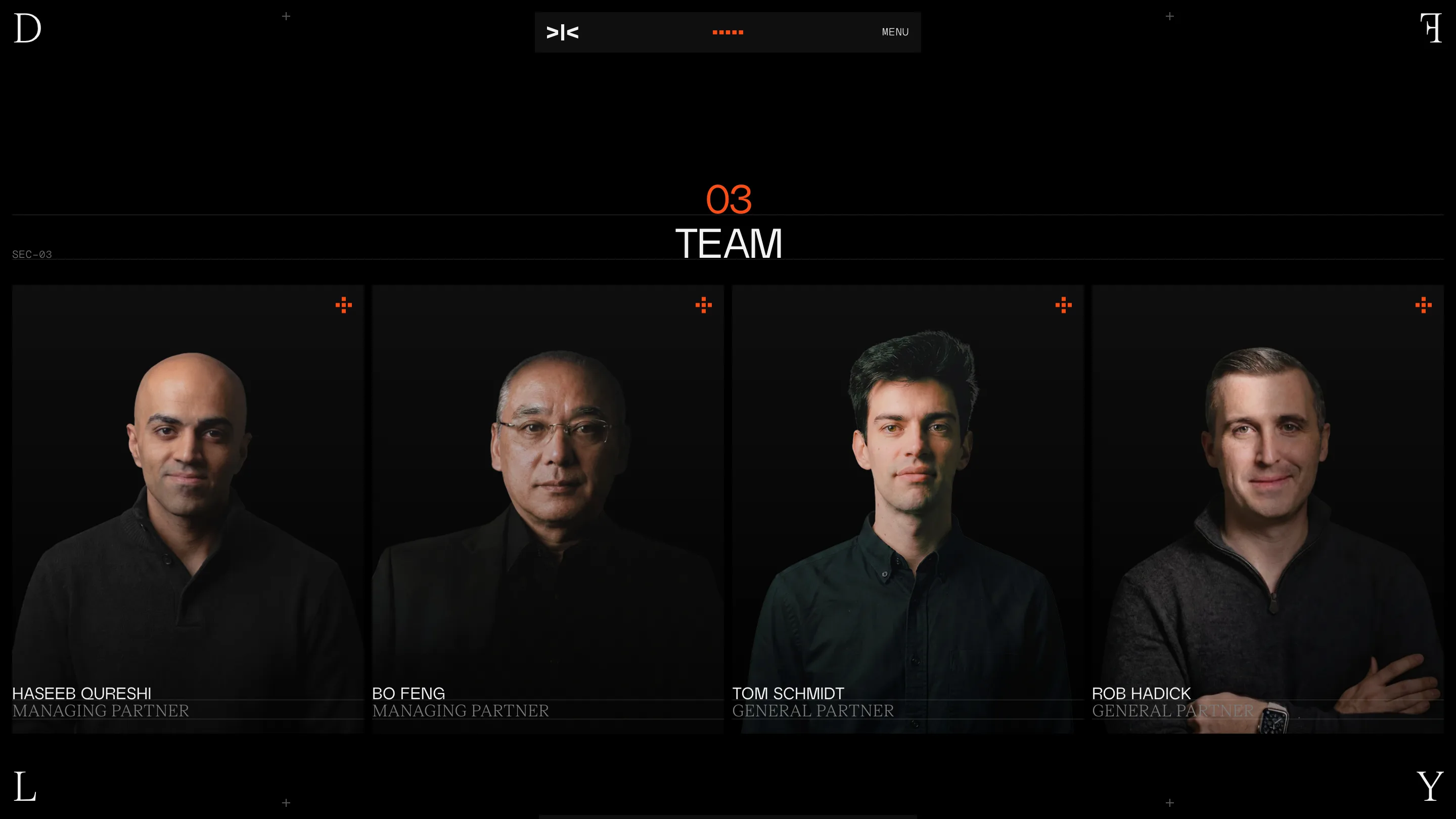
The portraits are lit so low that the shoulders disappear into the background, and the roles under the names are set in grey serif at small sizes. It's a mood, and it looks expensive, and it costs real contrast. A judge marking accessibility has to note that. The design still won the day.
What carries over to work that isn't a crypto fund: pick one texture and one accent, let a serif do the framing while a grotesk does the labels, and trust names over logos when you have 122 of them.