Illoca sets its product site on architect's graph paper
Unseen Studio set Illoca's site on architect's graph paper, ran one camera through a single drawn room, and flipped to blueprint for the footer.
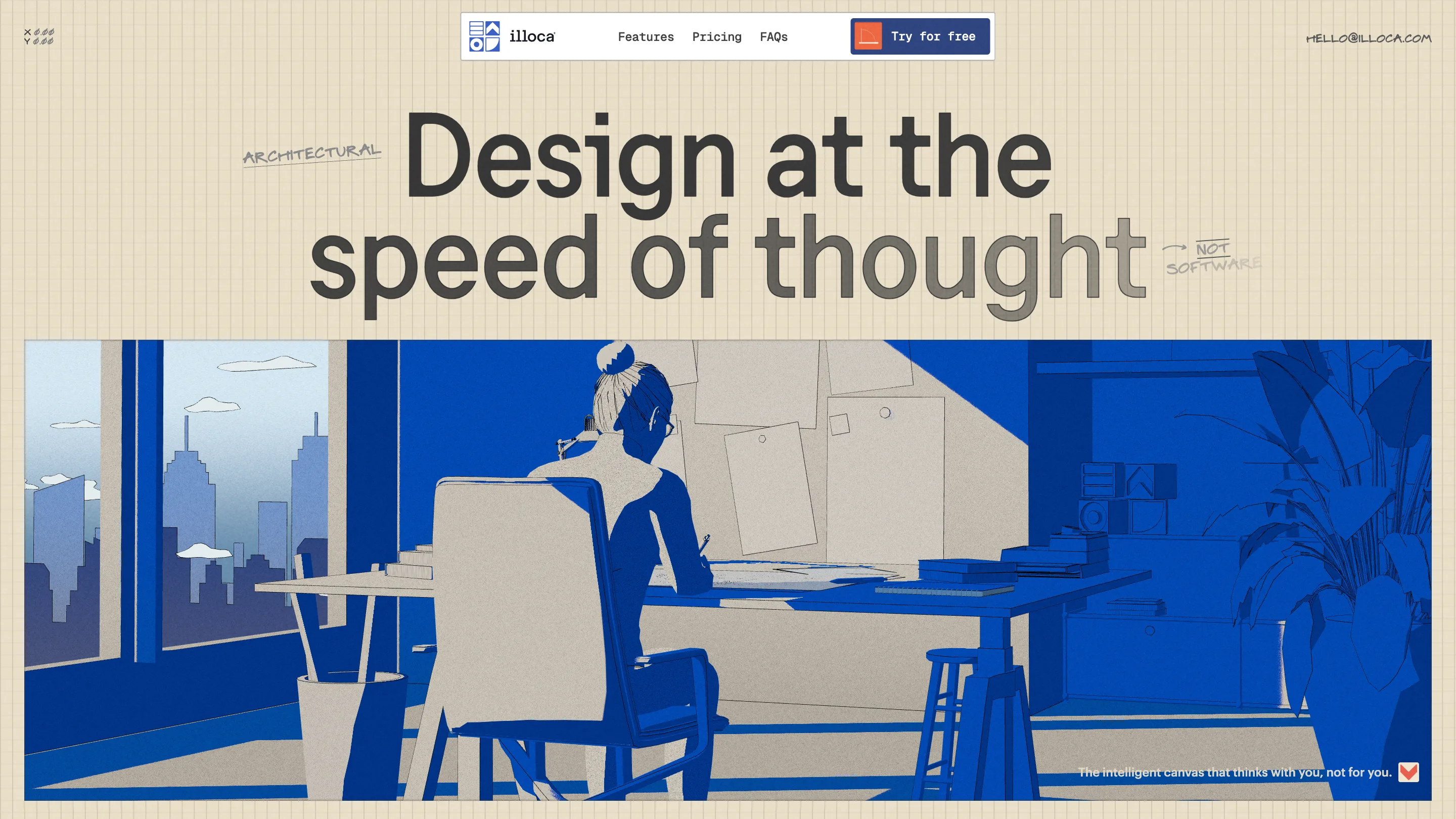
The ground under Illoca is a sheet of engineering graph paper. Cream, finely ruled, edge to edge, holding for the entire page. Unseen Studio built the site for an AI drafting tool aimed at architects and set it on the surface architects already work on. It took awwwards Site of the Day on 4 September 2026 with a 7.44, and the Developer Award with it.
The graph paper carries the layout
Through the whole feature run there is no card, no border, no rule between sections. Each illustration lands as a rectangle on the sheet and leaves a strip of bare grid down one side. That strip is the layout. Copy sits left with the drawing taking two thirds of the width, then it flips, then it flips back. The paper holds the alignment, which is why the page can drop every other framing device and still read as ordered.
The masthead floats over it as a white pill: wordmark, three links, one orange button. It is the only hard-edged white object on screen, and it reads like a tool laid on the drawing rather than a bar bolted to the page.
One room, one camera
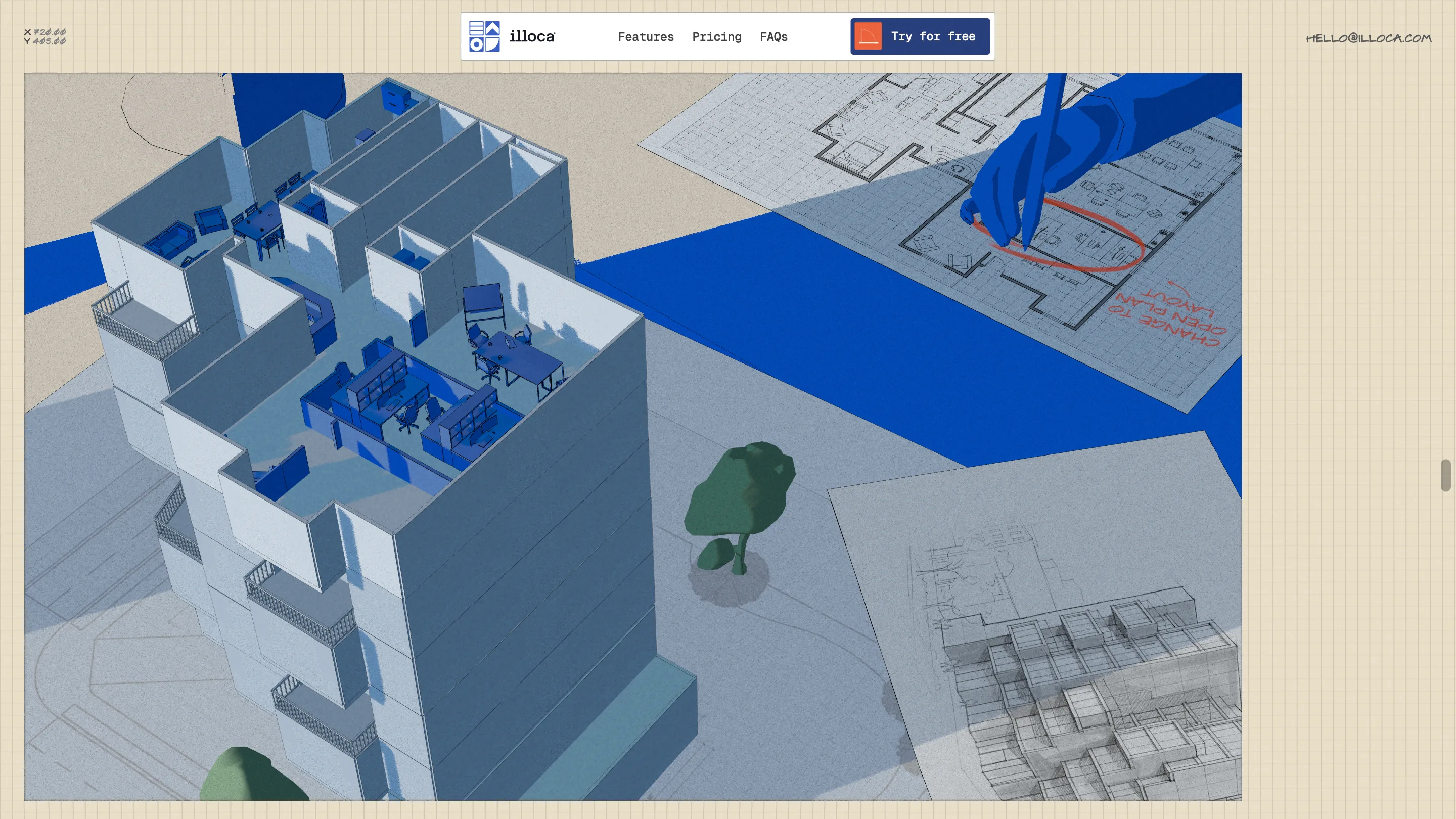
The five feature modules share a single illustrated set. Augmented Sketch opens over an architect's shoulder at a drafting table. Scroll, and the camera pushes down onto the plan under her hand. Adaptive Massing lifts to a stepped model sitting on that same desk, beside that same lamp, then flies into it until the balconies fill the frame. Prompted Plans takes the roof off and shows the furniture. There are no cuts. It is one move through one room, and it is the expensive decision on this site.
Five separate hero images would have cost nothing and said nothing. Here the transitions carry the product claim: same drawing, more resolution.
Two colours, then a tree
The palette is #3B60C5 and #FDF2DE. Blue and cream, held for minutes of scrolling, with white and a few greys doing the modelling. Then the massing scene drops four small trees at the base of the building in green, and they land like a sound. Nothing has competed for colour in a while, so a tree becomes an event.
The handwriting does the labelling
Every eyebrow on this site is hand-lettered and hand-underlined. "ARCHITECTURAL" pencilled beside the headline. "NOT SOFTWARE" scrawled at the end of it with a small arrow. Features numbered inside circles: "INTENTS, TRANSLATED!", "OPTIONS, MULTIPLIED!".
Then the same hand turns up inside the product. In the Agentic Refinement scene a blue hand circles a room on a floor plan in red pen and writes CHANGE TO OPEN PLAN LAYOUT in the margin. The site's labelling and the product's input are the same gesture. Mark up a drawing, get the edit. The art direction makes the pitch before the copy gets there.
Worth stealing: the top-left corner runs a live X and Y readout of the cursor position, set in the same wobbly mono, placed like a coordinate stamp on a drawing sheet.
The desk keeps going
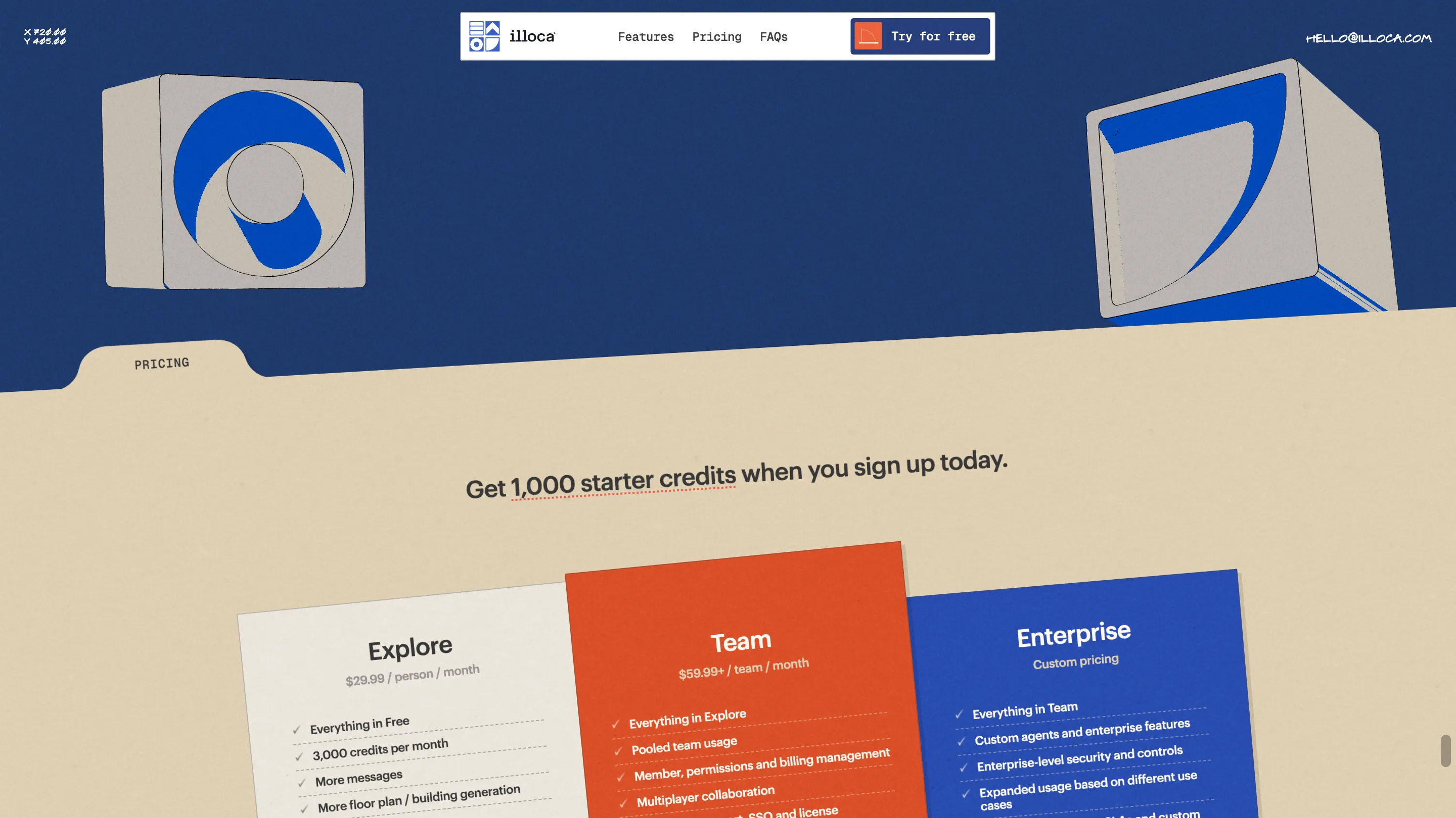
Pricing arrives as a manila folder. It slides up out of a navy field with PRICING typed on the tab, and the three plans sit on it as tilted paper cards, cream, orange, blue, dealt onto the desk. The metaphor holds because it stays physical. Nothing on that screen pretends to be a web component.
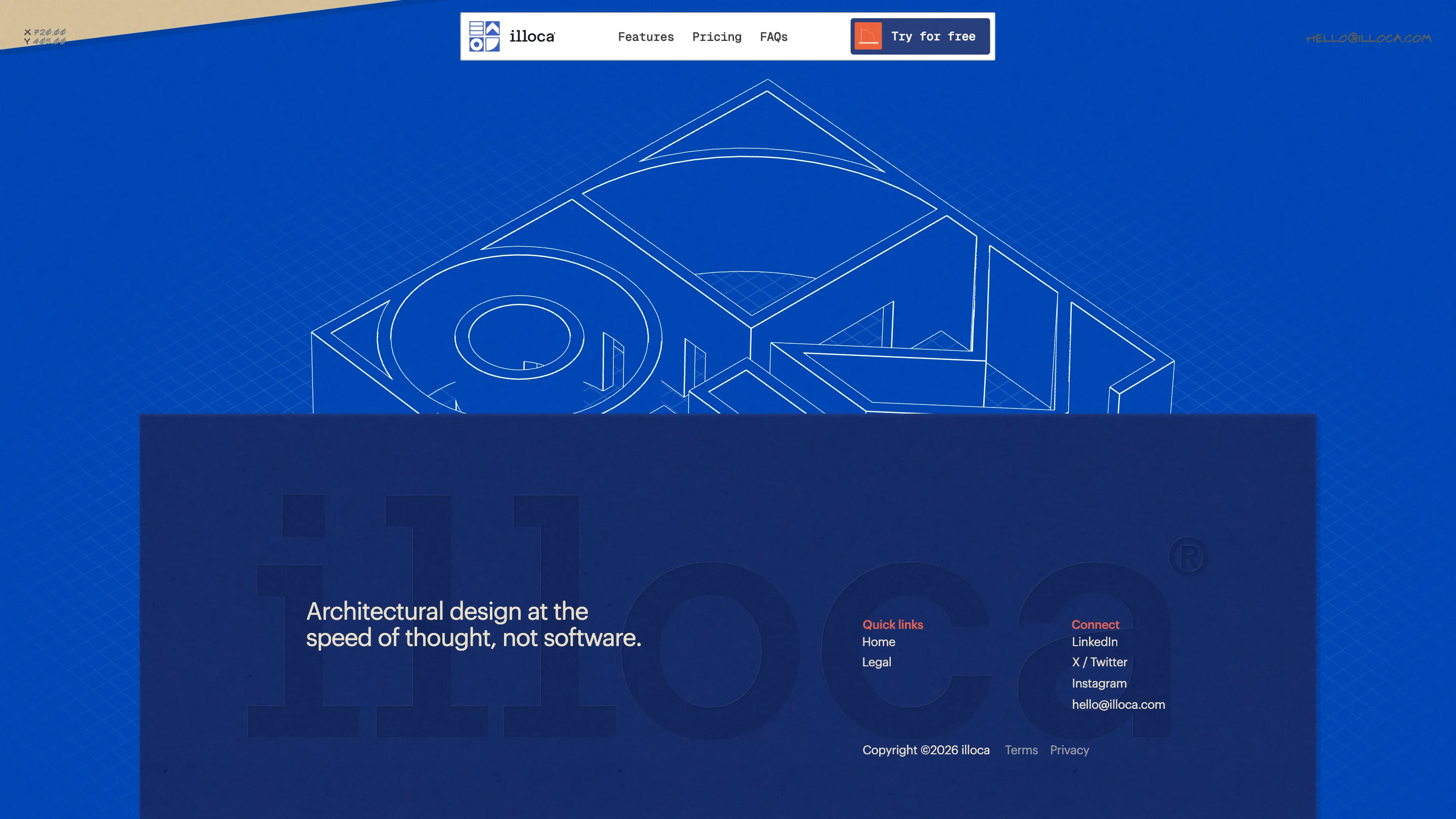
Then the footer inverts everything. Cream goes to blueprint blue, the ruling flips from tan-on-cream to white-on-blue, and a big isometric wireframe floats over it in white line. The wordmark sits embossed in the navy panel underneath, tone on tone. Same sheet, negative. It is the one place the site changes its mind, and it saves that for the last screen.
Where it costs something
The scroll is on rails. The camera moves at its own speed, a fast flick will not get you to pricing any quicker, and the section links in the nav reload the page to a loading logo before they resolve. Usability scored 7.43 against 7.7 for creativity, and that gap is the honest reading of the thing. On a site selling design at the speed of thought, waiting for the camera is where the argument leaks.
Study it anyway, for the discipline. One surface, two colours, one continuous room, and a pencil doing all the labelling.