
FORMAT sets every lesson on design format in its own shape
Obys and DES built a lesson on design format where each block is drawn in the shape it teaches: a tall card, a spinning record, a triangle mask.
FORMAT is a lesson on design format where every block is drawn in the shape it's teaching. The vertical section is a tall card, the circle section is a record, the triangle section is a triangle. Obys built it with Design Education Series as part of DES's Grids Season, and it took awwwards Site of the Day on 19 October 2026 with a score of 7.59, plus the Developer Award. Design scored highest, at 7.85.
The page is the diagram, so you read each format's rules while standing inside it.
A wordmark cut from the same blocks
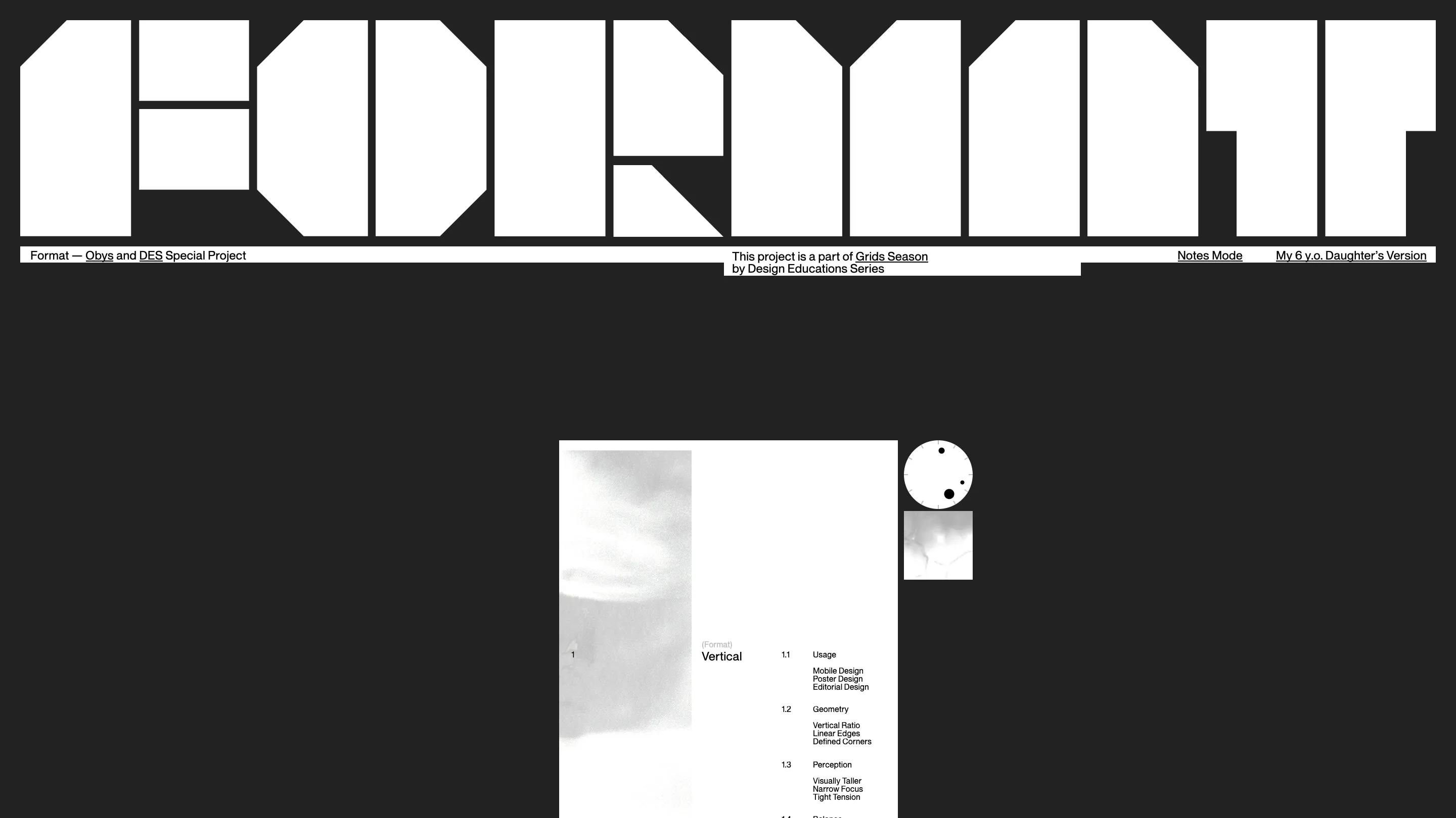
The site opens on its name, set in six letters built from 14 flat white shapes on a near-black ground. Each letter has clipped corners or a missing chunk, so the wordmark already reads as a set of formats before you've scrolled. Every shape rises into view on its own, out of a mask, which is the only intro the page needs.
Under it sits a thin white strip with the credits and two switches: Notes Mode and My 6 y.o. Daughter's Version. Then the first card arrives, a vertical page with a grey photograph down its left side and an index on its right, numbered 1.1 to 1.4: usage, geometry, perception, balance. Beside it a small dial keeps the real time in CEST.
Each design format gets its own object
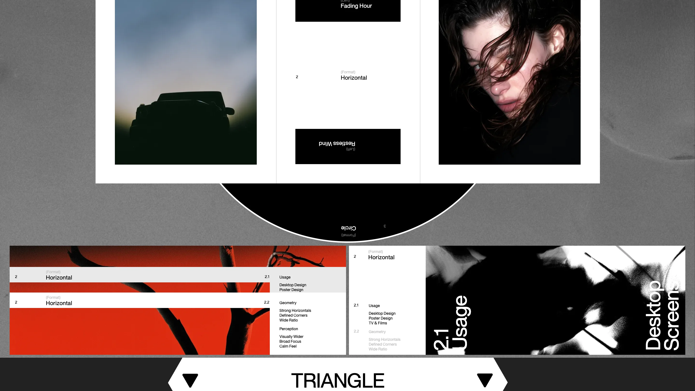
The circle section is where the idea pays off. One disc is a clock face with three balls for hands, each riding the inside of its own ring. The other is a record printed with "Circle format is centered, calm and smooth, curved edges, no sharpness" across Side A and Side B. The words turn with the disc, and a blurred glass lens sits still at the middle so the type passes underneath it.
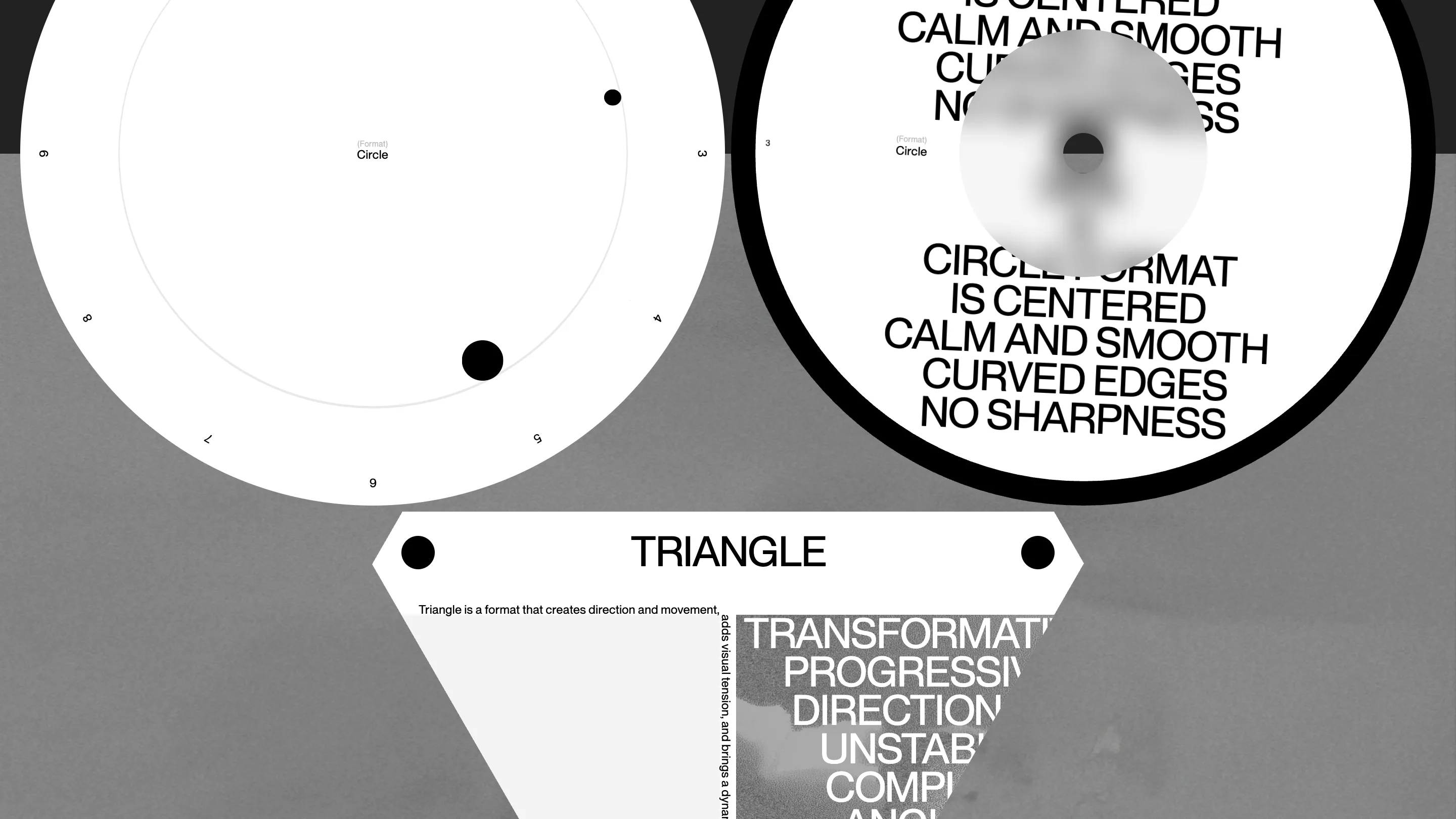
Below it the triangle is a real mask. A photograph and a stack of words ("Transformative, Progressive, Directional, Unstable") run past its edges and get cut off at the slope. Type set inside a shape that crops it is the whole argument for the triangle: direction, tension, a composition that won't sit still.
The horizontal section does the opposite job. Wide bands in red and black, strong baselines, the same four-part index as the vertical card, numbered 2.1 to 2.4. Rounded corners get their own band, labelled "Horizontal (Rounded)", so you can set it against the square version just above.
One shape carries you between sections
The transitions are the developer work the jury rewarded. A single white shape travels the page: it leaves as the small triangle set inside the big one, loses its black on the way, and lands as the shape the next block needs. Obys resampled every outline to the same number of points so one can morph into the next. Complex, the last format, is a circle standing clear of a square, so a second pane grows the square out of nothing.
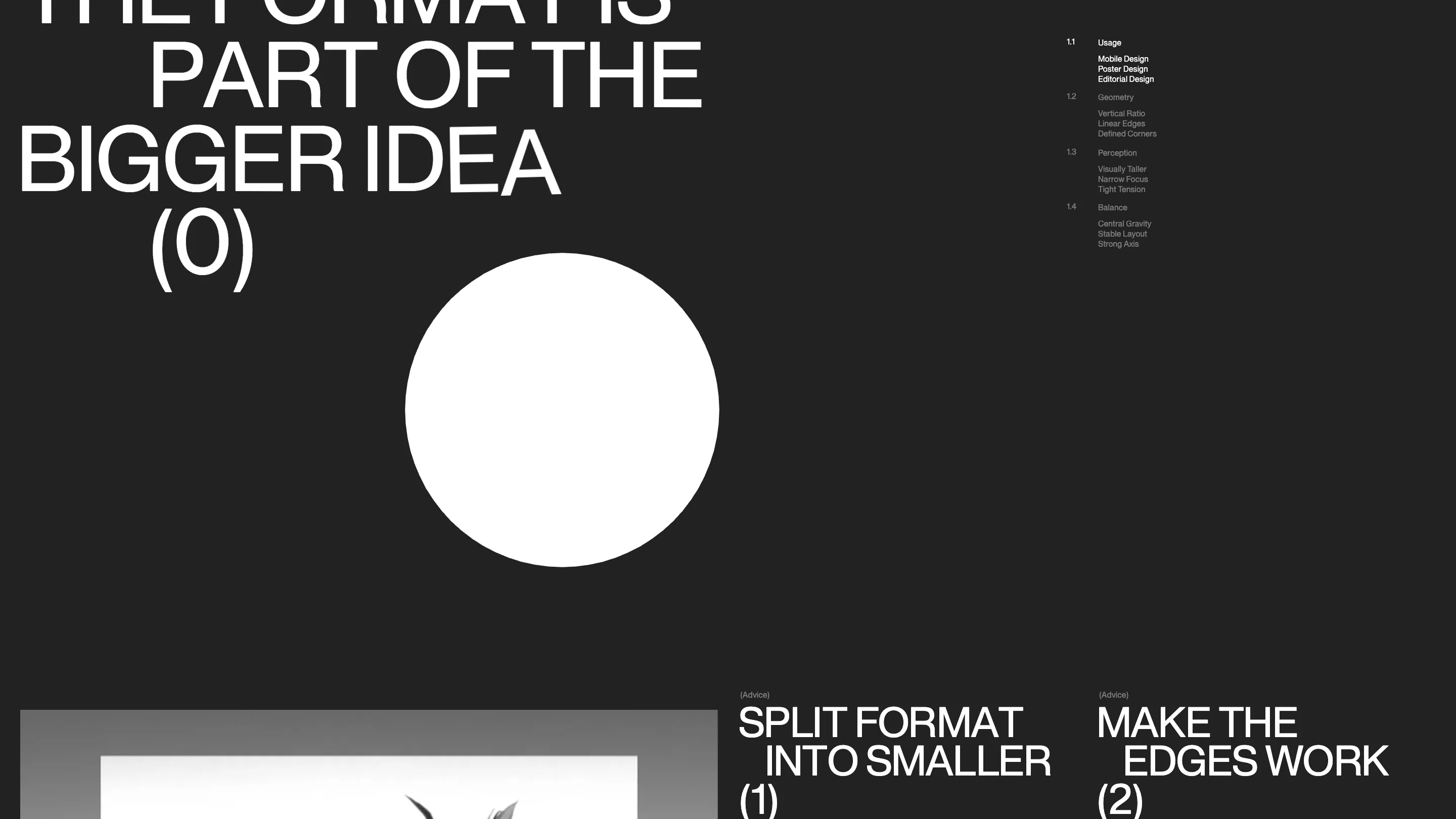
It ends on a poster in big type, "The format is part of the bigger idea (0)", with the white circle coming to rest beside it, then two pieces of advice set the same way: split the format into smaller ones, make the edges work.
The two modes are the teaching
Notes Mode lays small tagged notes over the blocks, each with a tail cut from its own corner. They read like a tutor's margin: "Vertical lines in a vertical format. Simple as that." "Use the boundaries of a complex format to create visual tension." It turns a showpiece into a lesson you can switch on when you want the reasons.
The daughter's version lays a child's pencil drawings over the dial, the record and the cards, with the paper taken out so only the strokes remain. It's a small joke, and it makes the point that a format holds up even when someone draws all over it.
The usability score, 7.2, was the lowest of the four. On a phone you get one dial and a line saying the experience is designed for desktop, since every measure on the page is scaled from a 1440 frame. For a site this tied to proportion, that's an honest trade, and it's the right one.