United Carriers opens its logistics site on a live globe
Bearplus set United Carriers' hero on a Three.js globe of freight arcs, then ran every interior page on port footage and monospace labels.
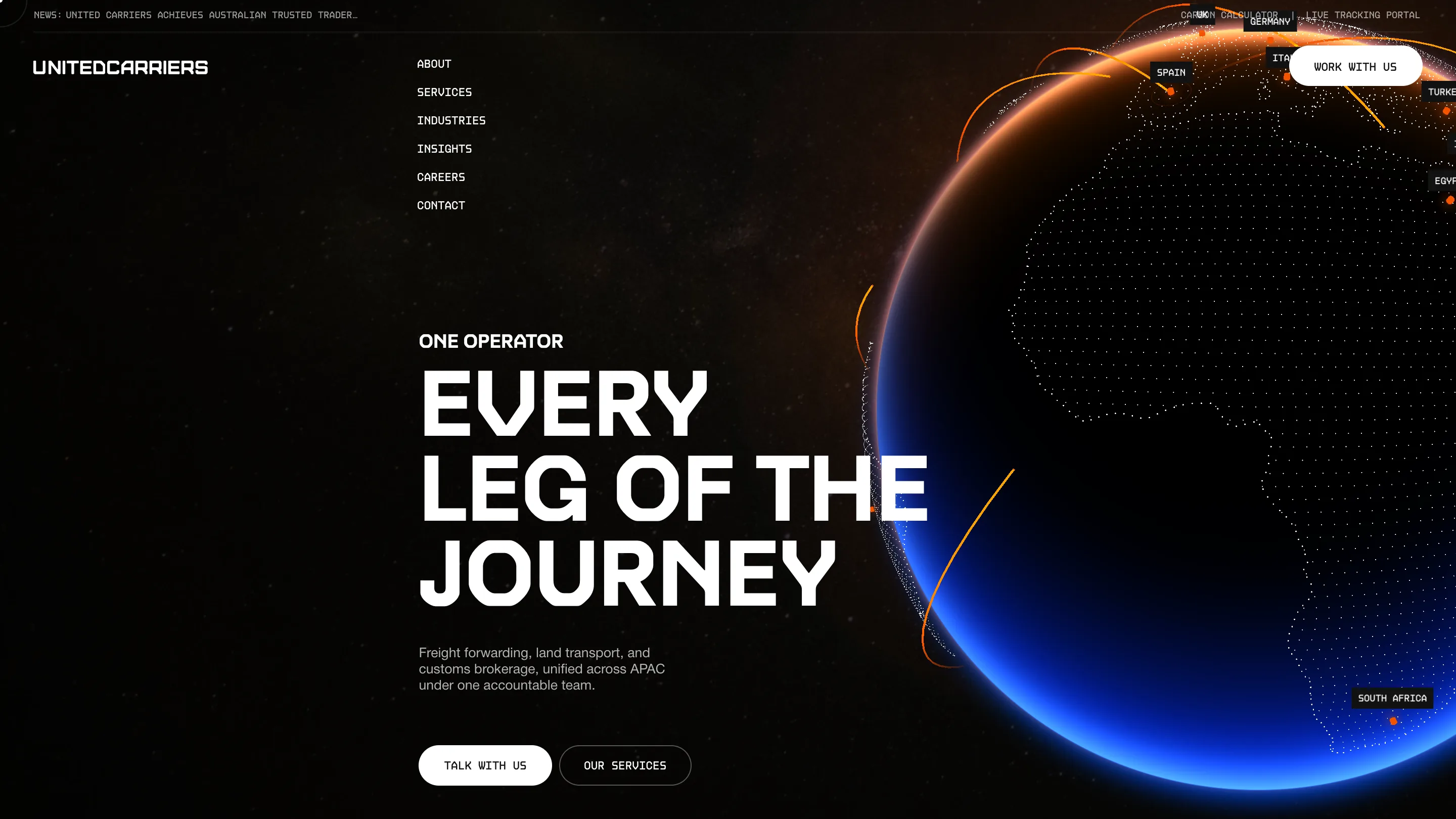
A freight forwarder's website is usually a stock container ship and a quote form. United Carriers gets a black screen, a slowly turning globe, and orange arcs arriving in Spain, Germany, Turkey, Egypt, South Africa. It took awwwards Site of the Day on 6 September 2026 with a 7.28, plus a Developer Award, and the globe is most of the reason.
The build is by Bearplus, designed by Kenny Ho, on Webflow with GSAP and Three.js doing the heavy lifting.
The globe is the pitch
The hero splits down the middle. Type on the left, planet on the right, and the planet runs off the edge of the viewport so you only ever see about two thirds of it. Continents are drawn as dot matrices rather than filled land. The terminator glows orange along the top and cools to a hard electric blue at the bottom, which gives the whole logistics site its two brand colours in one shot. Country names sit in small black mono pills pinned to the surface, so the globe doubles as a coverage map.
The headline next to it, EVERY LEG OF THE JOURNEY, is set in a wide geometric grotesk with squared bowls, tight leading, three lines deep. Above it an eyebrow reads ONE OPERATOR. That is the entire value proposition in five words, and the globe underneath it is the proof.
The wait is part of the argument
The preloader ran long enough to swallow two capture attempts before a clean shot of the page landed. It earns the delay. A grey dotted world map sits centred on black, four blue nodes pulsing over Australia, New Zealand, Hong Kong and southern China. Two columns of text scroll past it: countries down the left, services down the right, both in mono, both cropped mid-line so they read like a feed rather than a list. A percentage counter ticks in the top right corner.
Most preloaders kill time. This one spends it saying where the company operates and what it sells.
Mono for the facts, grotesk for the claims
The type system is two typefaces doing two jobs, and the split is strict. Anything operational is monospace and small: the nav, the news ticker along the very top, the pill buttons, the country tags, the CARBON CALCULATOR and LIVE TRACKING PORTAL links in the corner. Anything the company wants you to believe is set in the wide grotesk at poster scale.
The effect is that the page reads like a shipping document with a billboard laid over it. For a category that usually reaches for corporate blue and a bento grid of icons, that is a real position.
The interior pages hand it to the footage
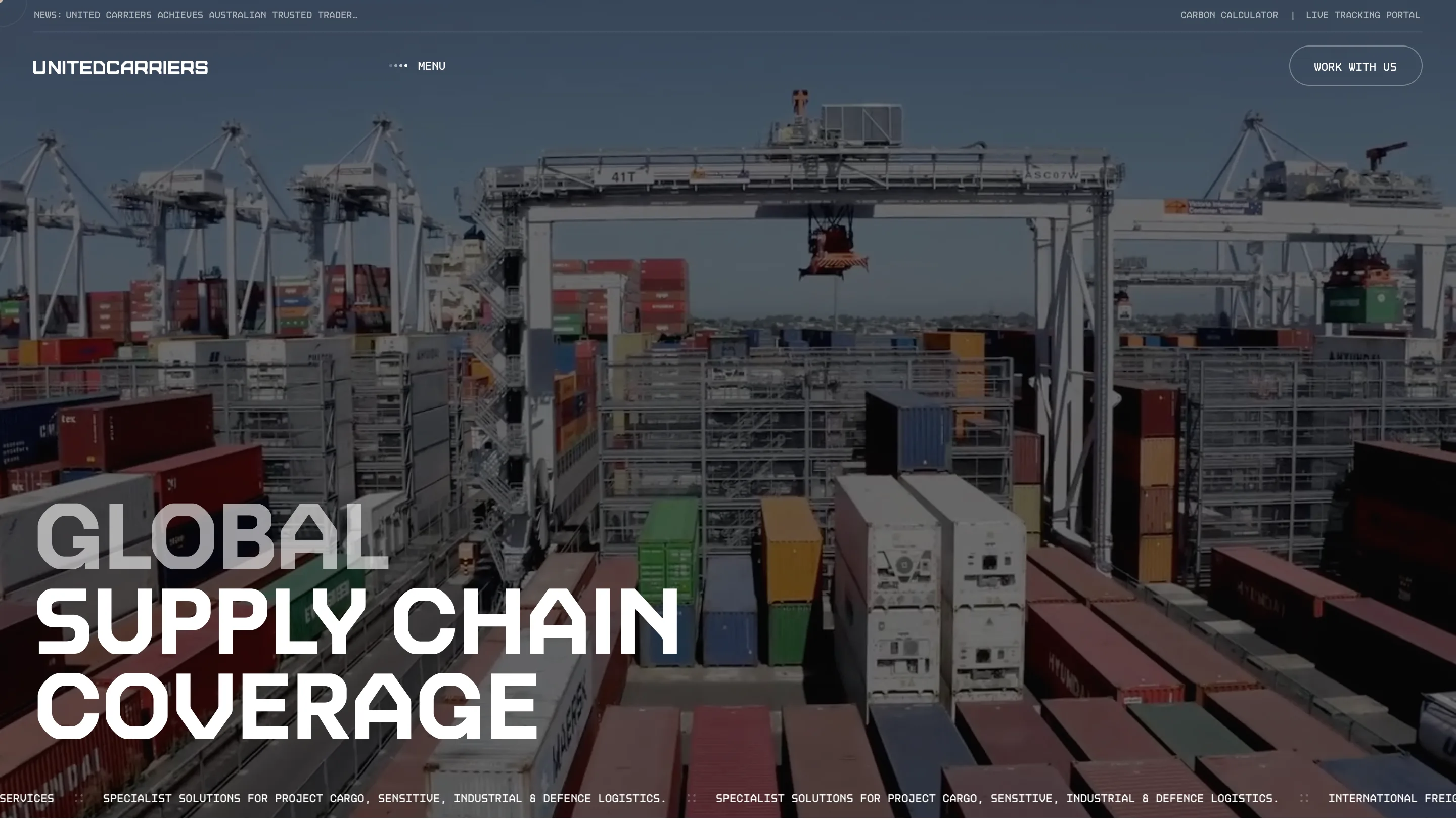
Services drops the globe and opens on aerial footage of a working terminal: gantry cranes, a spreader hanging mid-lift, reefers stacked six high in red, green and yellow. GLOBAL SUPPLY CHAIN COVERAGE anchors bottom left, with GLOBAL knocked back to grey so the two live words carry the line. A mono marquee runs across the bottom edge.
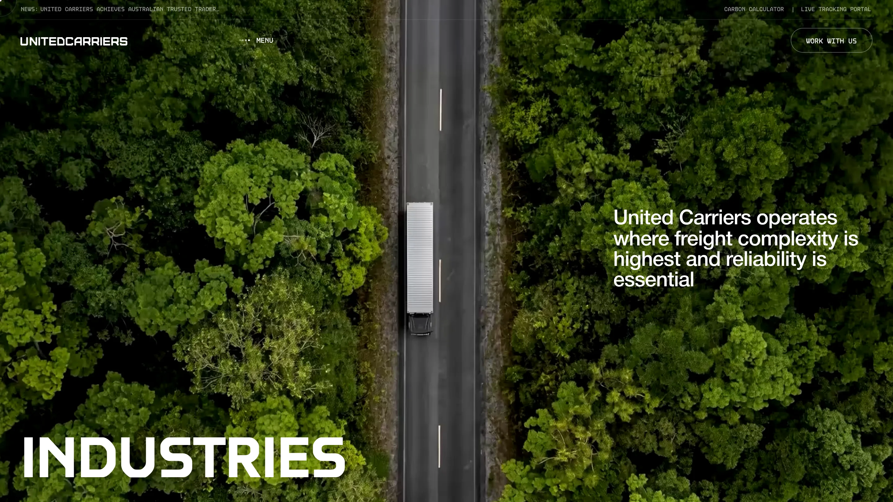
Industries is the best of them. One trailer, one road, shot straight down, the asphalt running dead centre through solid green canopy. INDUSTRIES sits bottom left and a single sentence sits right. Nothing else on the screen. After the black hero, the green hits hard.

About repeats the template with a low tracking shot running alongside a truck at speed, close enough to read the panel gaps. Same anchor, same one paragraph on the right. Three pages, one layout, three completely different pictures.
What the scores caught
Creativity took the highest mark at 7.61 and usability the lowest at 7.00, which reads right. The stacked vertical nav on the home page collapses to a MENU toggle on every interior page, so the site teaches you one navigation and then swaps it. The preloader asks for patience before anyone has agreed to give it.
Those are the costs of the approach. What Bearplus bought with them is a freight company that looks like it runs an operations room, and a homepage a designer will remember tomorrow.