Don't Look Up spends its only colour on who stopped paying
A browser game drawn in black on off-white paper, where yellow, blue and red mark the citizens who noticed, believe and argue. The colour is the game.
Don't Look Up draws a whole satire in black ink on off-white paper and saves colour for one job: telling you who in the crowd has stopped paying. That colour coding is the design idea, and it carries the game. It took the awwwards Site of the Day on 1 November 2026, with a Developer Award, scoring 7.25 (design 6.96, usability 7.58, creativity 7.42). It's the work of Marcelo Reis Melo, built in vanilla JS with Three.js and GSAP.
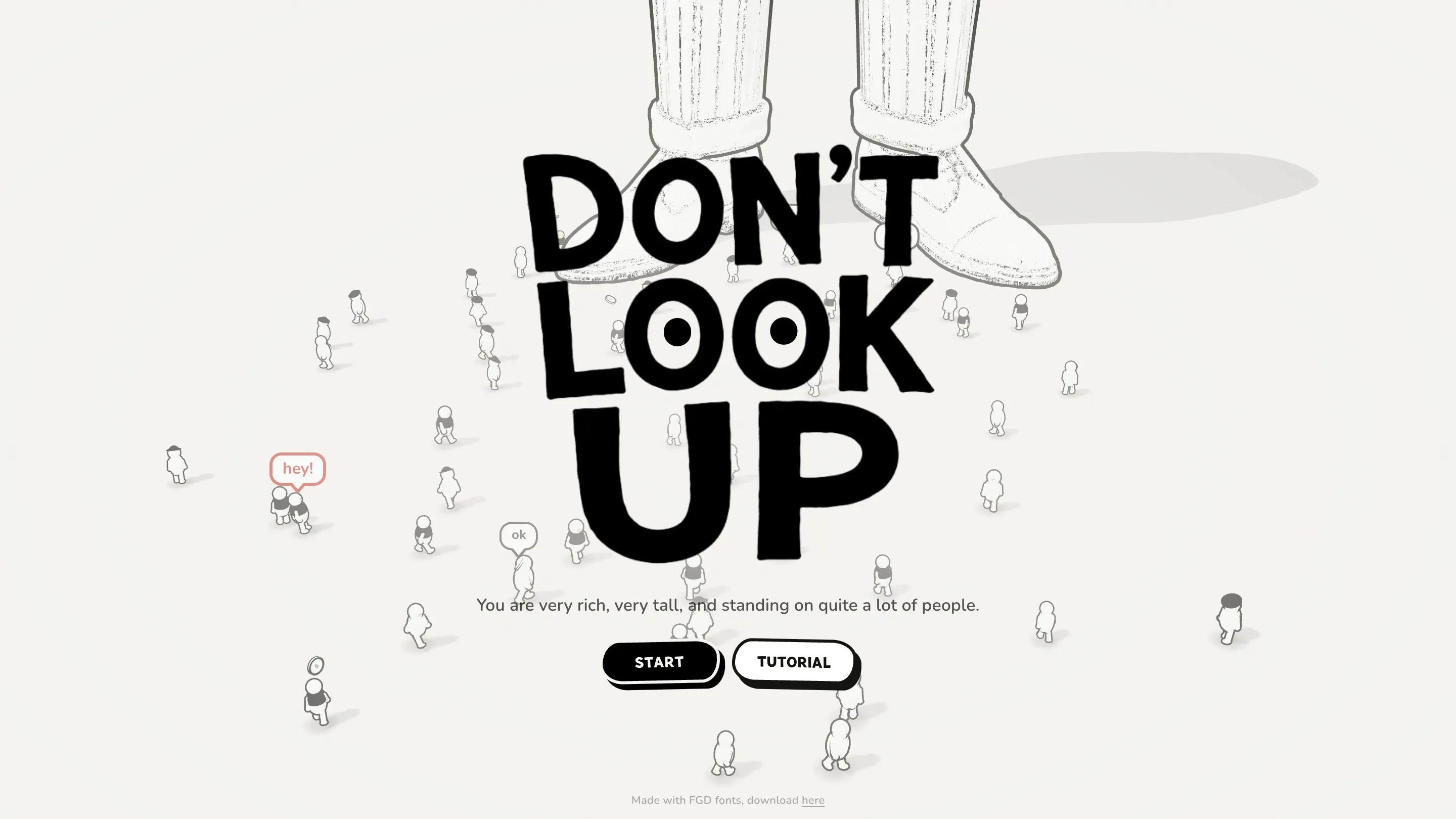
The premise fits on the title screen: "You are very rich, very tall, and standing on quite a lot of people." You collect a fee from the crowd below. You need a trillion. If they look up, they push you over.
A title screen with eyes
The wordmark is set in Marsipan, a fat hand-drawn face, stacked DON'T / LOOK / UP across three lines. The two Os of LOOK get a pupil each, so the word stares back at you. Behind it stand a pair of giant legs in striped trousers and lace-up shoes, drawn with a scratchy pencil texture and a soft grey shadow. Around their ankles walk dozens of tiny round citizens, drawn clean and simple, saying "ok", "hey" and "as usual" in little speech bubbles.
That contrast in line quality does the storytelling before you press Start. The rich man is heavy, textured, cropped at the knee. The people are small, smooth and many. The palette is two values, #F4F3EF and #14140F, and nothing else on the screen asks for attention.
Colour coding as the rules
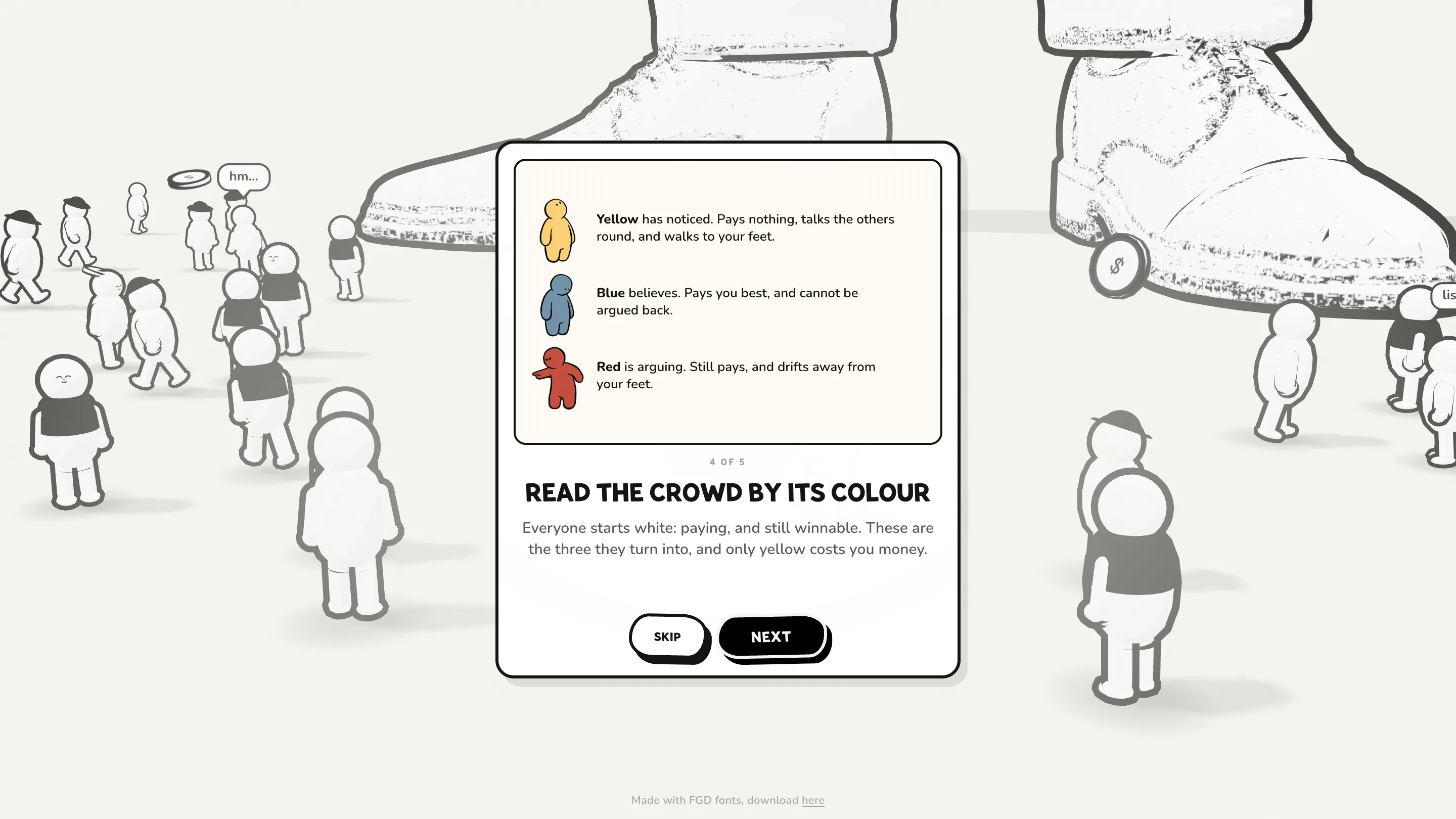
The five-card tutorial spends its fourth card on a legend, and it's the best piece of interface writing in the game. "Everyone starts white: paying, and still winnable." Then three states, each a colour and a sentence. Yellow has noticed, pays nothing and walks to your feet. Blue believes and pays best. Red is arguing, still pays, and drifts away.
Because the world is monochrome, those three colours read from across the screen at a glance. You don't need a minimap or a health bar per citizen. You scan the crowd, and wherever it turns yellow is where you're losing money. The same yellow fills the "at your feet" meter in the bottom corner and the hint card that tells you to raise the fee, so one colour means one thing everywhere it appears.
The interface reads like a ledger
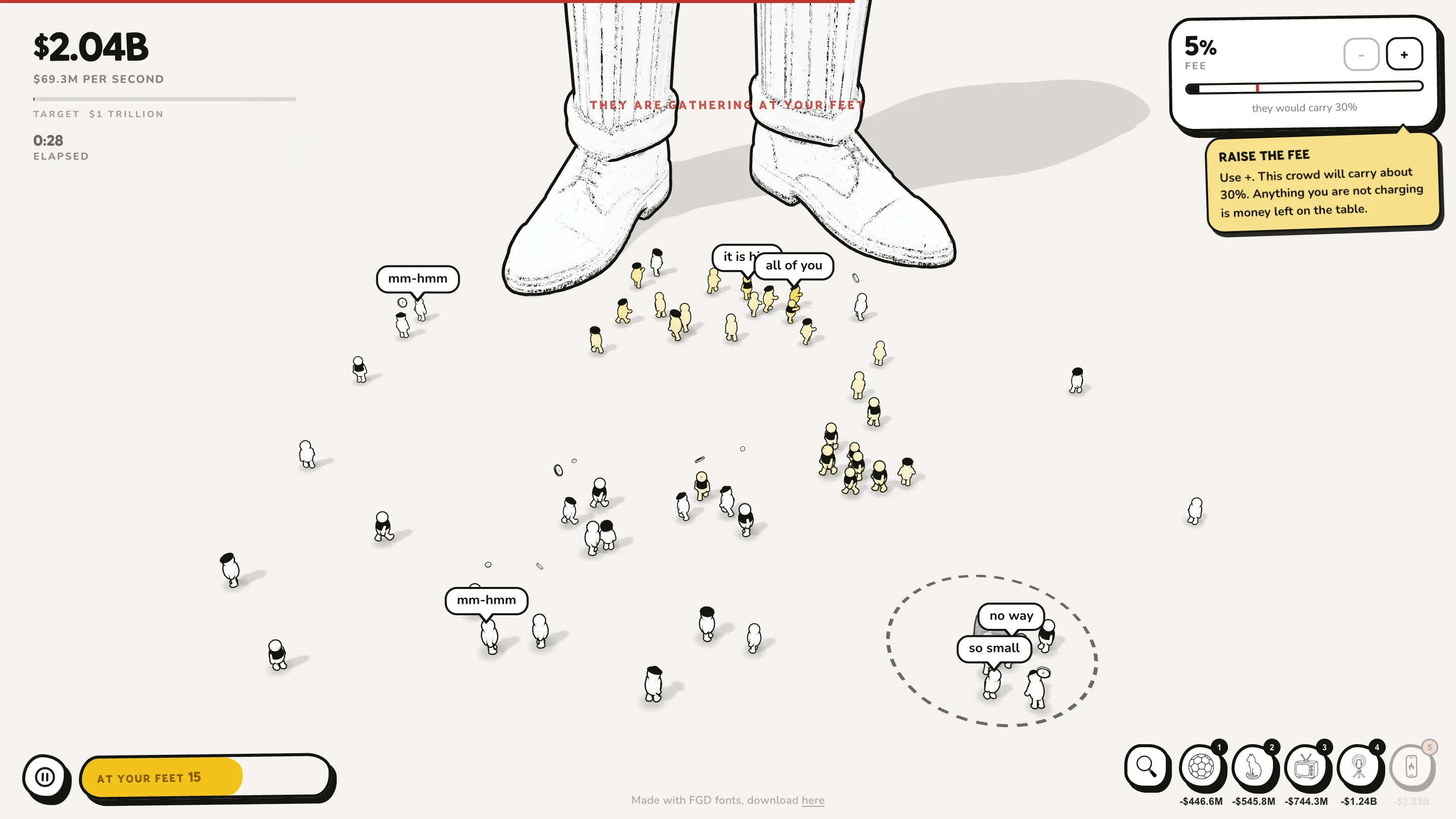
In play, the HUD stays out of the drawing. Top left, a big bold balance ($2.04B, $69.3M per second), the trillion target and the time elapsed. Top right, a fee card with a slider and a thin red line marking the most this crowd will carry ("they would carry 30%"). Bottom right, a row of round distraction buttons with their price underneath: a football, a cat, a TV, a microphone, then the guru, the priest, the politician and the planted story, each bound to a number key.
You press a number and drop the distraction on a knot of yellow, and a dashed circle shows its reach. The citizens inside it go back to their phones. When too many yellows reach the shoes at once, a line of red type runs across the screen: "They are gathering at your feet." Red type on a black-and-white page, and you see it before you read it.
Why it won
The judges scored usability highest, and that's the craft here. A satire about attention needs you to understand a crowd of hundreds in under a second, and Reis Melo gets there with a two-value drawing, three colours and copy short enough to read mid-panic. The writing is dry and specific: the planted story and the politician "set people against each other, which buys you time to cover somewhere else."
The care shows in the source too. The page comments explain why the body face moved from Elms Sans to Nunito: the old font rendered weight 400 and 800 at the same width, so every bold label in the UI was decoration. Small fix, visible result. The spec labels on the cards now look like labels.
Play one round and watch where your eye goes. It goes to the yellow every time.