Mecha's split-screen layout pins the index to the left
Widelab's site for robotics investor Mecha holds a numbered index still on the left while serif headlines and dithered robots scroll on the right.
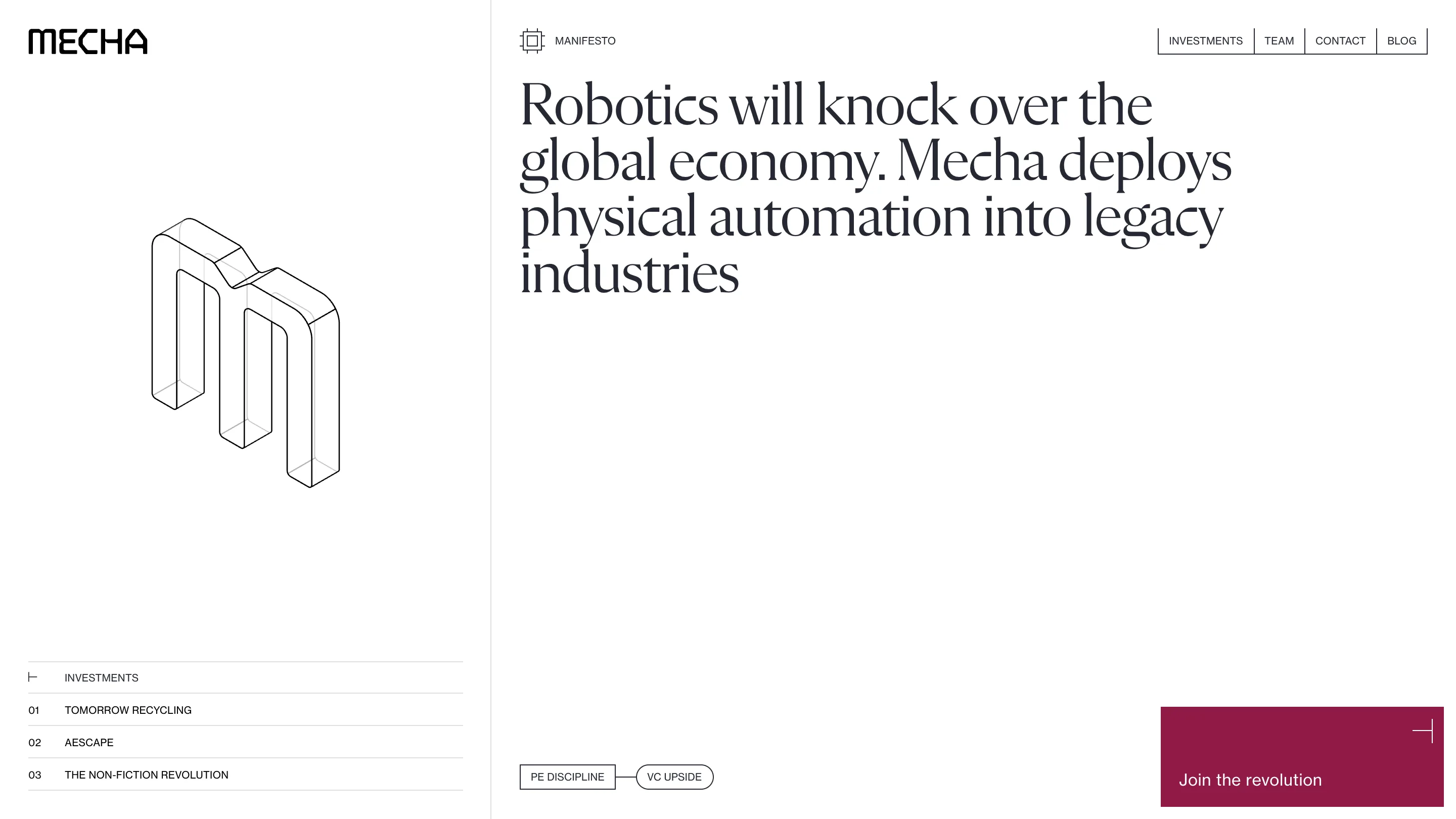
Mecha's site runs on one split-screen layout: a third of the screen stays put, two thirds scroll. The left column holds the wordmark and a numbered index of the firm's investments. The right column carries the pitch. You always know where you are, because the left side never moves.
The site took awwwards Site of the Day on 31 October 2026 with a score of 7.28, plus the Developer Award at 7.27. It was designed by widelab, who did Mecha's strategy and branding as well, with Grzegorz Leśniewicz credited as designer. Mecha is a fund that buys businesses in old, fragmented industries and puts robots into them. You can see the live site here.
A split-screen layout that works as a table of contents
Open the home and the left column shows a wireframe M, drawn in isometric line, standing in empty space. Under it sits a ruled list: Investments, then 01 Tomorrow Recycling, 02 Aescape, 03 The Non-Fiction Revolution. Hairlines between each row, small caps, numbers in their own column. It reads like the contents page of an annual report.
Scroll and the drawing goes, the list climbs to the top, and it starts tracking you. The active row turns black, the others fade to grey, and a thin rule under the current entry fills from left to right as you read that section. It's a progress bar dressed as a table row. You never have to look for a scroll indicator, because the index is the scroll indicator.
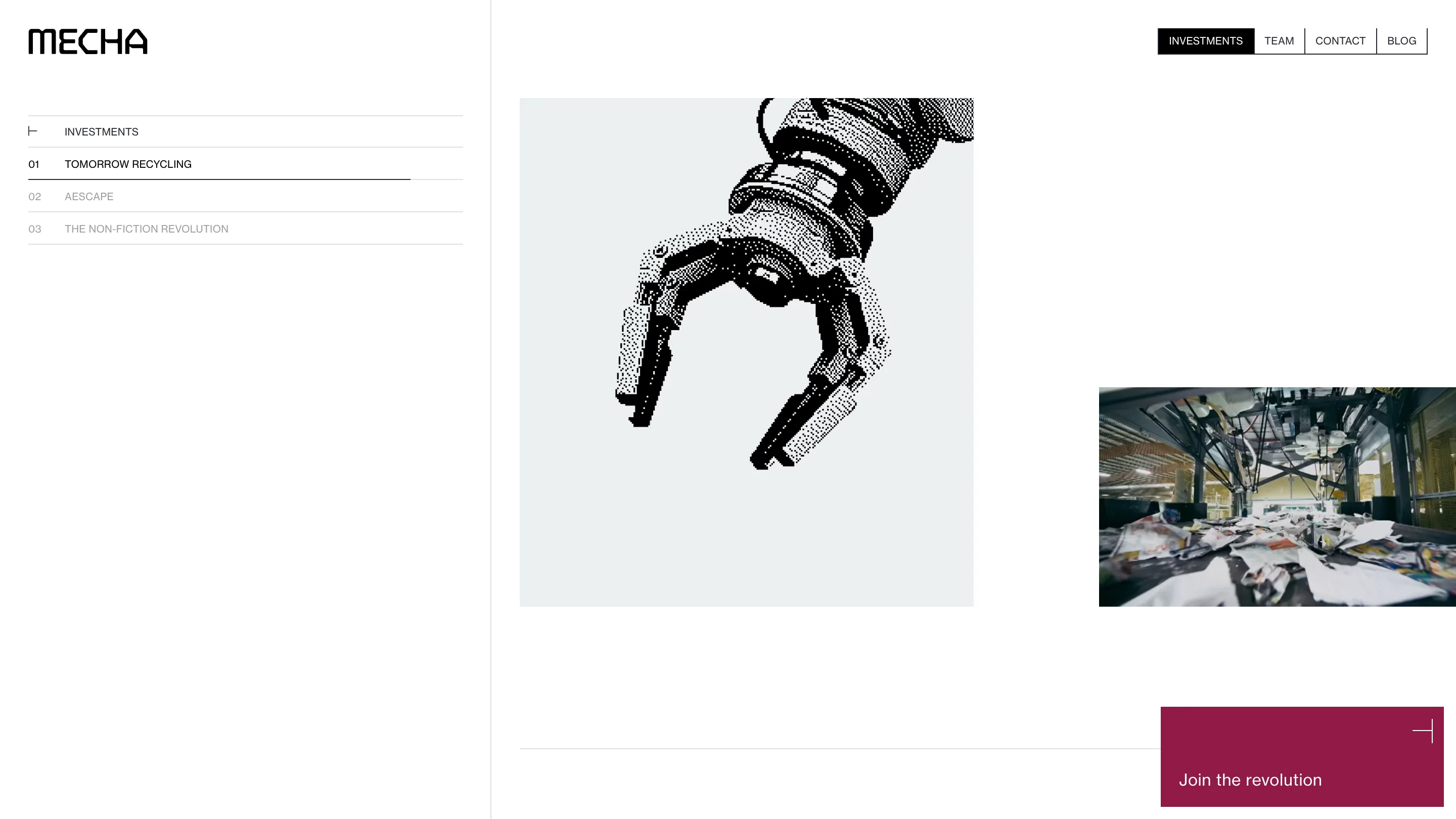
The top nav does the same job at a coarser grain. Investments, Team, Contact and Blog sit in boxed cells top right, and the cell for the section on screen turns solid black. Two systems, one for chapters and one for entries, and they never disagree.
A serif that talks like an essay
The right column opens on a single sentence set huge in a tight, high-contrast serif: "Robotics will knock over the global economy. Mecha deploys physical automation into legacy industries." Four lines, no subhead, no button under it. For a fund, that's a confident move. The serif gives a blunt claim the tone of an essay, and the white space under it lets it sit there.
Everything else is set in a plain grotesk in caps: the nav, the index, the labels, the team credentials. So the type splits the same way the screen does. The serif speaks, the grotesk files things.
Dithered robots and line drawings
The imagery has two registers. The first is a robot gripper rendered in coarse one-bit dither, black dots on pale grey, as if printed on a thermal receipt. It sits next to colour footage of a real recycling line, so the abstract machine and the real one share the same row.
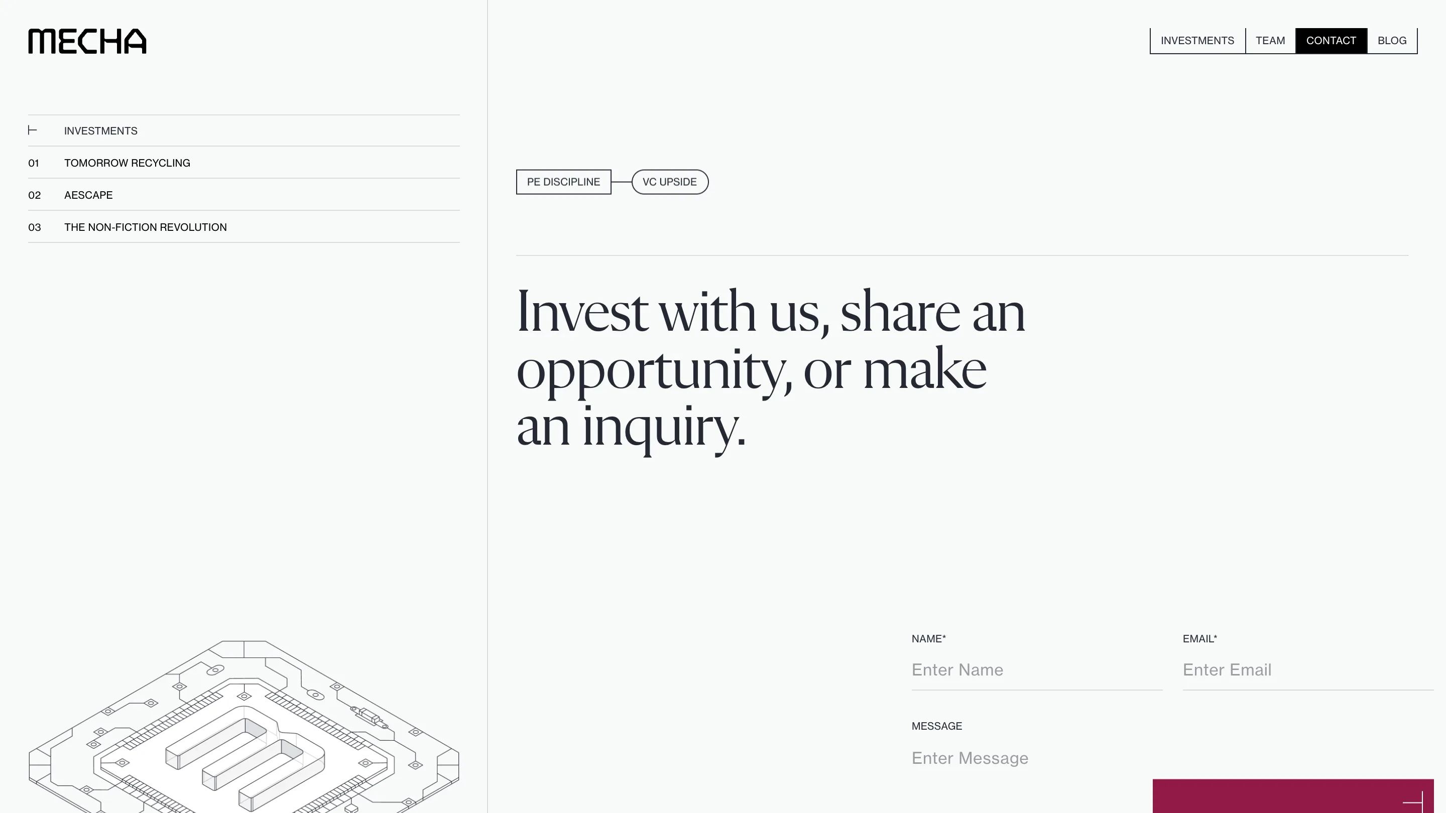
The second is the isometric line drawing. The M on the home, and at the foot of the contact section a flat circuit board with raised letter strokes in its centre, all drawn in single-weight black line. They read like patent sheets. For a firm selling physical automation, technical drawing is the right visual language, and widelab kept it to line only, no fills, no shading.
Colour that changes by chapter
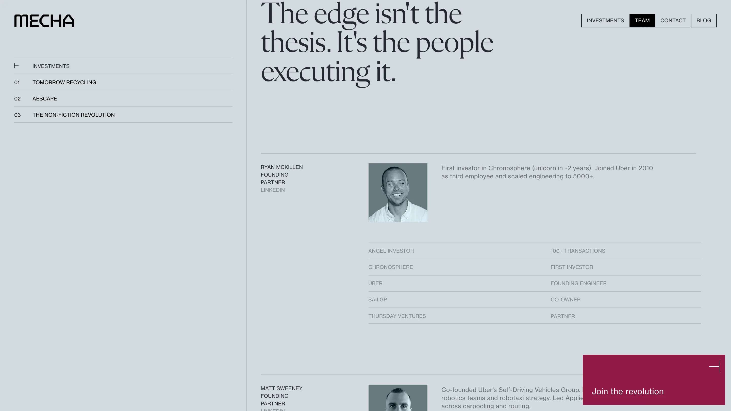
The ground shifts as you move through the page. White for the investments, a cool grey-blue for the team, an off-white for contact. The change is small, a few points of lightness and a hint of hue, and it marks a new chapter without a divider.
The team section reuses the ruled-table idea from the index. Each partner gets a greyscale portrait, two lines of bio, and a two-column table of past roles: Uber, founding engineer; Chronosphere, first investor. The grid stays the same for six people, so you compare them at a glance.
The one loud colour on the site is a deep crimson block pinned bottom right, "Join the revolution", with a thin crosshair mark in its corner. It stays on screen the whole way down. Against all that black, white and grey, it's the only thing asking you to act.
Why it won
The judges scored responsive design highest on the developer side, 7.8, and animations 7.6. The motion here is mostly quiet: rules filling, rows fading, grounds shifting. What it adds up to is a single long page that never feels long, because the pinned index keeps telling you how far you've come. Built in Webflow with GSAP and Three.js, it's a good model for any one-page pitch with more than three sections.