Grids by Obys teaches grid layout by labelling its margins
Obys's course site draws its columns as hairlines, writes 20 PX MARGIN across the screen and steps its syllabus one column in. The lesson is the layout.
Grids, the third season of Obys's Design Education Series, teaches grid layout by drawing the grid on the screen in front of you. The margins carry their own measurements, the columns stay visible as hairlines, and the type sits on them where you can check it. That's the design idea that took it to awwwards Site of the Day on 2 November 2026, with a score of 7.63, from Obys and the designers Viacheslav Olianishyn and Olha Olianishyna.
The course itself is 17 lectures and a little over four hours on composition and grids. The site is its front door. Every screen on it is a worked example of the lesson it sells.
A wordmark built from grid layout modules
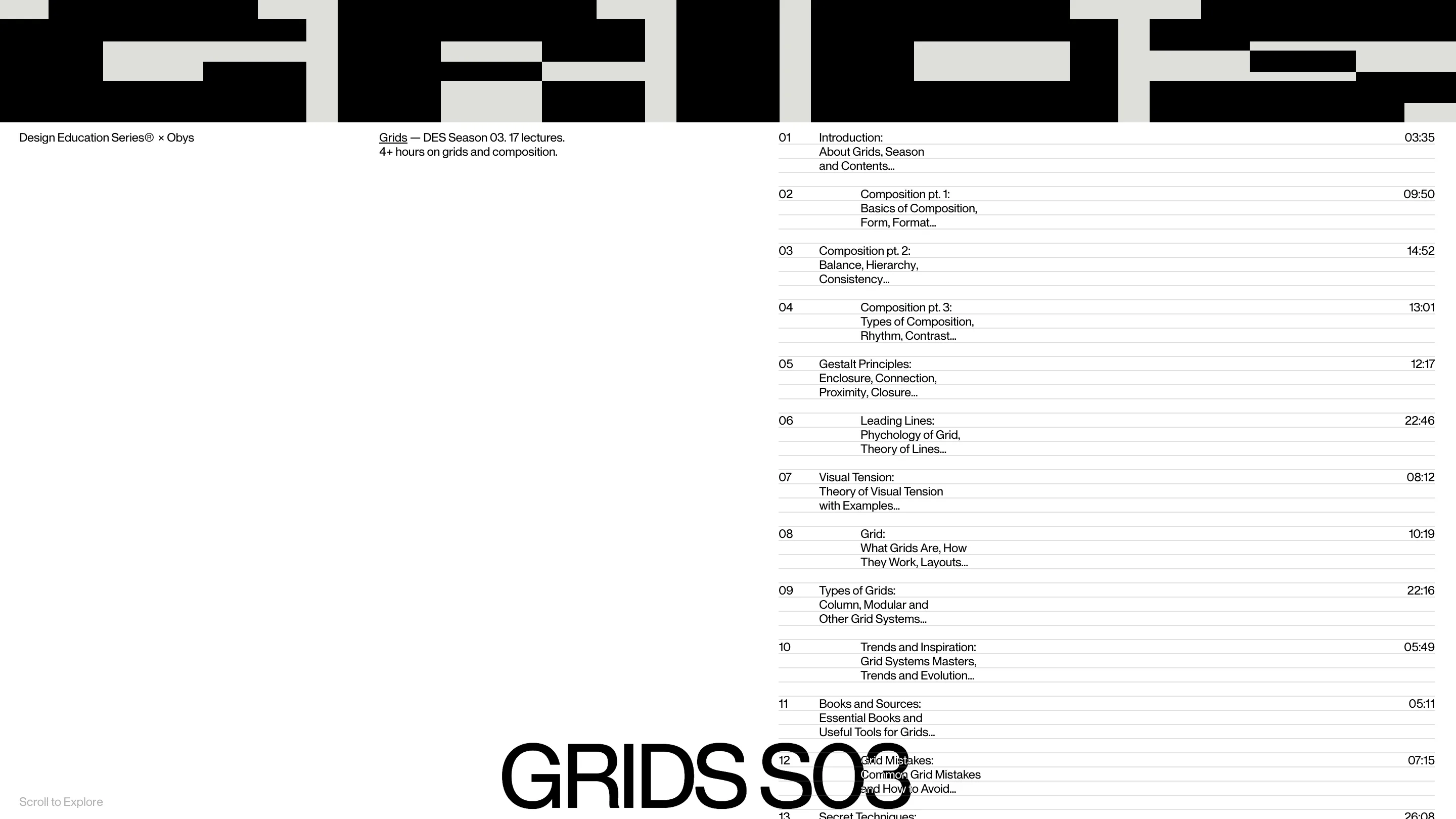
The page opens on GRIDS set in huge black blocks across the full width. Each letter is made of rectangles locked to the same modules, so the counters and the gaps between letters line up as one field of cells. The G in the browser tab is the same letter, its modules stretched to a square and drawn from the typeface by a script, so the favicon can't drift from the word.

Under it, the left third of the screen holds two short lines, "Design Education Series × Obys" and the season's one-sentence summary. The right half holds the syllabus.
Look at how the lecture list is set. Each row has a number on the left, a three-line title and a running time pinned to the right edge, all on ruled lines. Every second title steps in by one column. Lecture 01 sits flush, 02 moves in, 03 comes back. It's a tiny move, and it does two jobs: it makes a long list scannable, and it shows you the column it's using without saying a word about it. The times are real data, from a 3:35 introduction to 26:08 on secret techniques, and they give the right edge a ragged rhythm the titles don't have.
Margins that say how wide they are
Scroll down and the page turns into a diagram. The wordmark shrinks to GRIDS on the left and S03 on the right, the screen splits into four columns drawn as thin grey lines, and the margins fill with a pale band marked "20". Across the bottom, in type as tall as the wordmark, the screen reads 20 PX MARGIN.
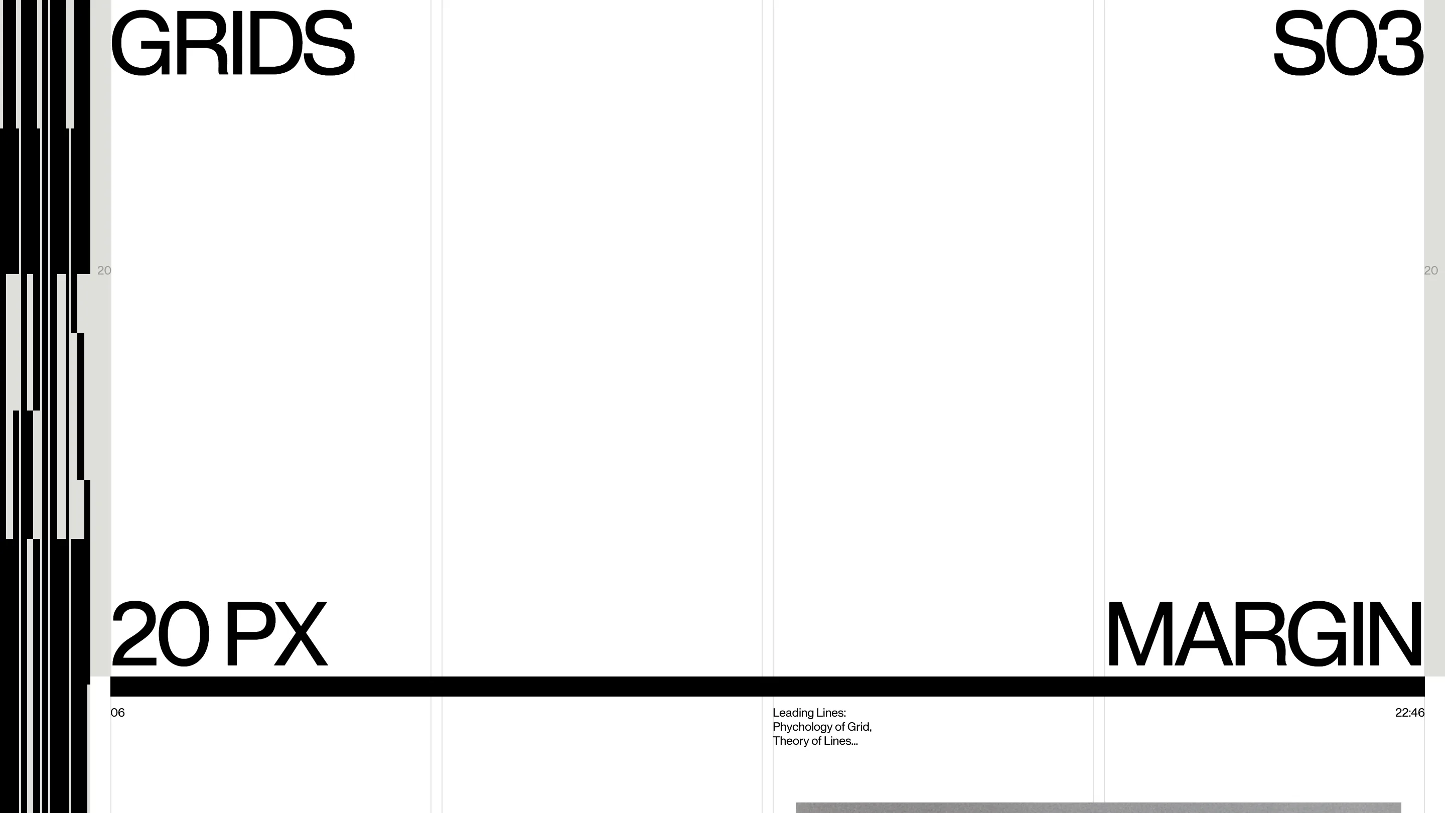
This is the part a judge would rate. The site names the value it's using at the size of a headline, then holds the layout to it. Nothing crosses the shaded band. The black rule under MARGIN runs exactly from one margin to the other. The bundle carries the steps of the sequence too, "Set Up Columns", "Choose Gutter", "Add Margin", so the scroll walks through a layout in the order you'd build one in Figma.
Words placed on ruled lines
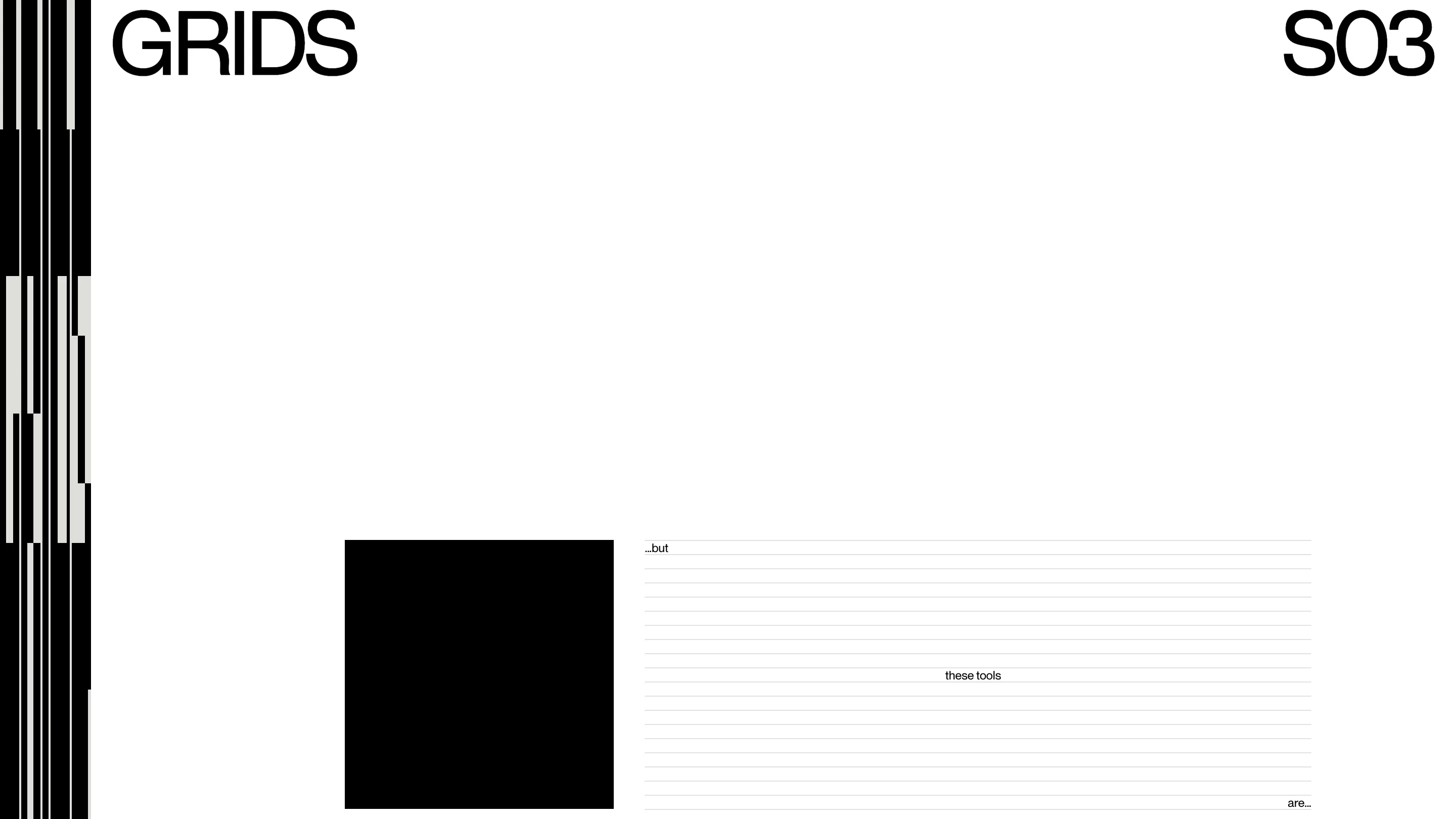
Further on, a black square sits beside a block of ruled lines with three fragments on it: "...but" at the top left, "these tools" in the middle, "are..." at the bottom right. The sentence is spread across the lines so the positions do the reading. Your eye goes corner, centre, corner, which is the leading-lines idea from lecture 06 acted out with three words.
Two colours and one typeface
The palette is black, white and one warm grey for the margins and the letter modules. The type is Obys's own sans, one weight, used at two sizes: the poster size for words that are part of the diagram, and a small text size for everything you read. Restraint like that keeps the attention on the structure, which is the subject.
The motion is the other half of the score. The jury gave the site 8.40 for animations in its developer award, and the transitions, built with GSAP over Locomotive Scroll, move the grid itself: the full-width wordmark you land on ends up as two words parked in the top corners, with the columns drawn in around them. It's desktop only, and it says so plainly on a phone.
Grids launched in 2021 as an Obys project and has had more than 600,000 designers through it since. Season 03 keeps the idea and tightens it. If you teach layout, or you want to see a 20px margin argued for at headline size, open it on a big screen and scroll slowly.