CoMinVi puts the next two pages in every hero
A Mexican mining contractor's site where each full-screen hero ends in two video cards for the next pages. Holographik turned navigation into a chain.
Awards · The Editors · 4 min read ·
Featured: Holographik
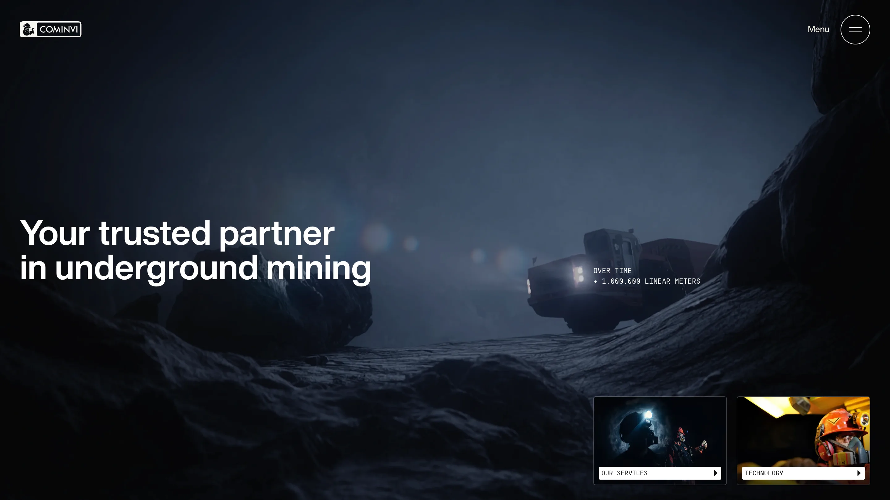
Every page on the CoMinVi site opens the same way: full-screen footage from inside a mine, a headline on the left, and two small cards in the bottom right corner that show you where to go next. That pair of cards is the navigation. Holographik built the whole site for this underground mining contractor from Guanajuato as a chain of heroes, each one handing you the next two pages, and it took awwwards Site of the Day on 30 September 2026 with a 7.44, its best sub-score a 7.71 for design.
The hero as a navigation system
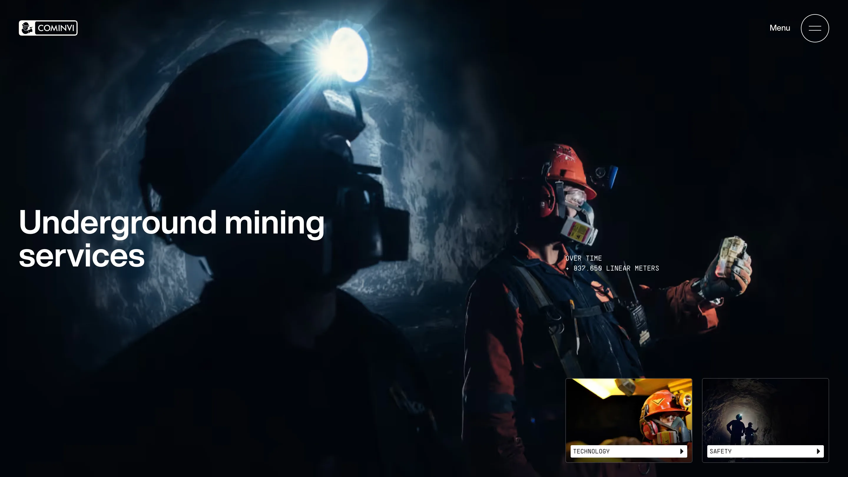
The home page sits you in a dark tunnel with a haul truck's headlights cutting through the dust. Bottom right: Our Services and Technology, each a thumbnail with a white mono label and a play arrow. Open Services and the cards shift along by one: Technology and Safety. Technology hands you Safety and About Us. About Us loops back to Services and Join the Team.
The menu button is still there, top right in its outlined circle. You don't need it. The cards read like a table of contents that only ever shows you the next two entries, so a visitor who knows nothing about mining walks the site in a sensible order without opening a single dropdown. For a corporate site that has to explain services, machinery, safety and hiring to buyers, auditors and job seekers, that's a real piece of information design.
One template, five moods
The layout never moves. Headline flush left at the vertical middle, set in a plain grotesk at a size that fills about 40 percent of the width. A two-line mono caption floats in the right half. Cards in the corner, same size and same gap every time. What changes is the footage, and the grading does the work.
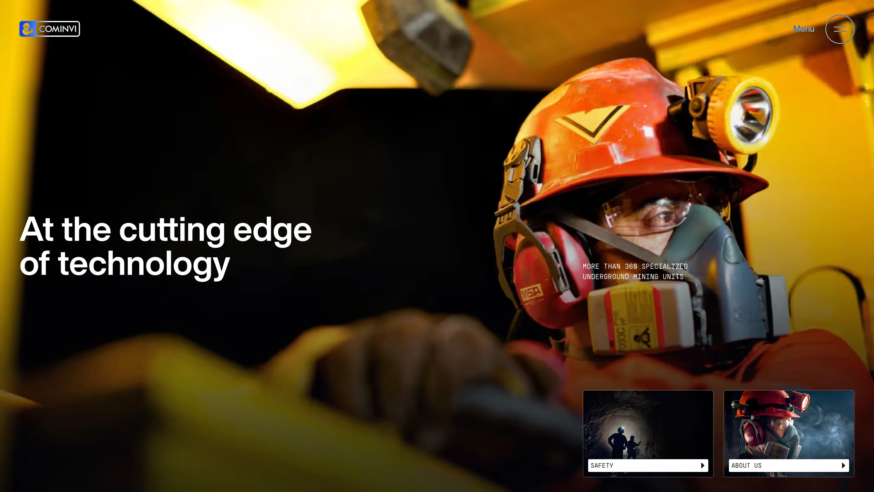
Home is cold blue and almost black. Services drops to a single headlamp flare. Technology flips to hot yellow cab light and an orange helmet so close you can read the filter cartridge on the respirator. The fixed frame lets the photography carry all the variation, and it means each page feels new while you never have to relearn where anything is.
Mono numbers as the second voice
The caption next to each headline is set in a monospace and written like a gauge reading: OVER TIME + 1.000.000 LINEAR METERS on the home page, MORE THAN 360 SPECIALIZED UNDERGROUND MINING UNITS on Technology. The same face runs the card labels and the numbered section markers further down, S.01 through S.07.
That split gives the site two registers. The grotesk headlines talk like a company. The mono talks like the equipment, and it's where the hard figures live: 20 million tons of mineral extracted, 1.7k direct jobs, 36 projects delivered, gold and silver output in tonnes with the year beside each one. A buyer scanning for proof finds it in one typeface and never has to hunt through paragraphs.
Portraits shot at working distance
The About Us hero is the one people will remember. A miner fills the left half of the frame, helmet lamp on, respirator taped and scuffed, breath turning to smoke against a blue background. The headline sits right across his face, 20 years of business strength and experience, and the photo is strong enough to take it.
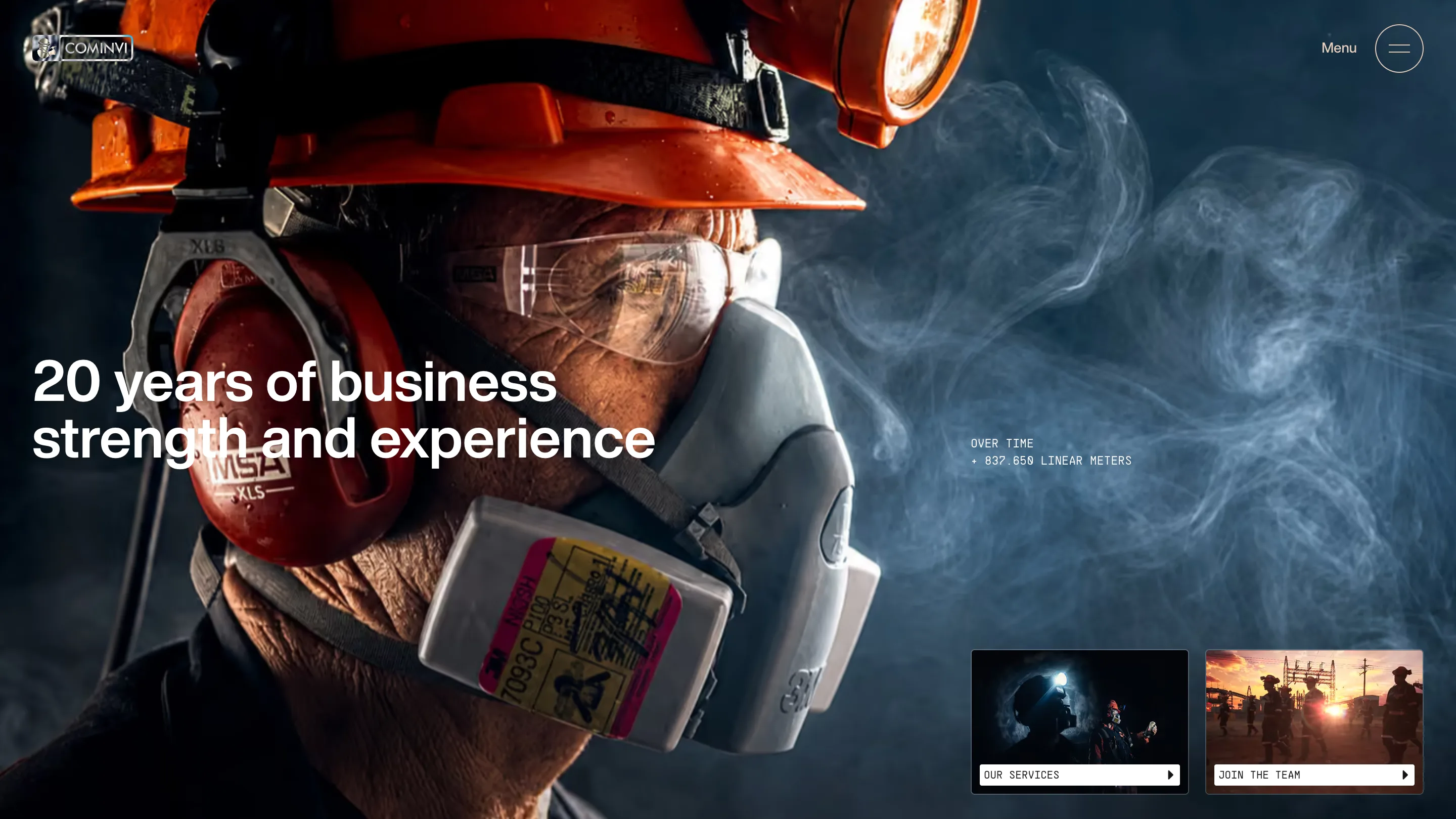
CoMinVi works underground, so Holographik kept the camera underground and close to the people. You see the dust on the gear, the stickers on the cartridges, the light from one lamp doing all the work.
Why it won
The judges scored design highest, and that tracks. The whole site is one hero template held with discipline across every page, footage graded per page, a mono layer for the numbers, and a two-card chain that does the navigating for you. It's built in Webflow. Any studio could copy the structure tomorrow. The hard part is shooting footage good enough to sit under it.