Teenage Engineering's website treats its product catalogue like a control panel
The nav is a legend, not a menu. The store reads like a parts list. A close look at how Teenage Engineering makes a product catalogue feel like lab equipment.
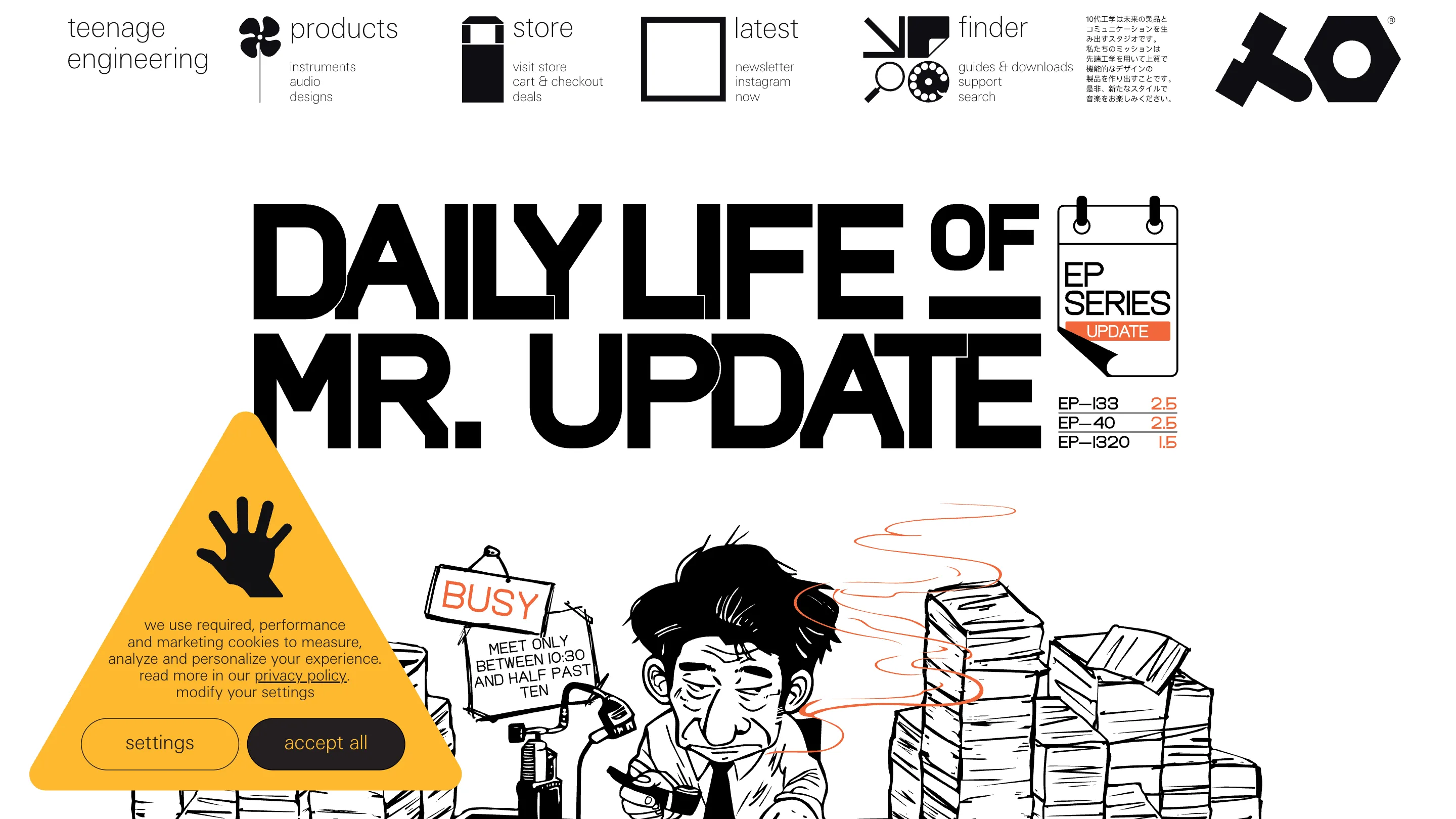
Teenage Engineering builds synthesizers that look like lab equipment, and its website treats the product catalogue the same way. Open teenage.engineering and the top of the page isn't a menu bar. It's a control panel. Four small engineering pictograms sit in a row, each with a stack of micro-labels underneath, laid out like the legend printed on a circuit board.
The navigation is a legend, not a menu
The wordmark sits top left, lowercase, teenage engineering, no logo flourish. Then the four groups. A cloverleaf icon for products, with instruments, audio, designs stacked under it. A box for store, reading visit store, cart & checkout, deals. A square for latest, with newsletter, instagram, mix. A machine glyph for finder, holding guides & downloads, support, search. A block of Japanese runs to the right, and the stylised TE mark anchors the far corner.
Every label is set in the same small grotesque at the same size. There's no dropdown, no hover reveal, no hierarchy of type. The whole header is flat, so you scan it the way you'd scan a spec sheet: read the column, find the row, go. It asks more of a first-time visitor than a normal nav does, and it tells you within a second what kind of company made it.
Two registers, one deadpan voice
The homepage doesn't lead with a product. It leads with a comic. DAILY LIFE OF MR. UPDATE runs across the top in heavy black display type, propped up with a yellow accent and a line drawing of a man buried in paperwork, next to a calendar of EP series firmware dates. It's a firmware changelog dressed as a newspaper strip.
Walk into the instruments and the tone flips to studio photography. The audio and synthesizers page opens on the K.O. Sidekick, a two-channel stereo mixer shot on pure black, silver casing catching a hard rim light, red knobs, the katakana ミキサー set beside the English name.
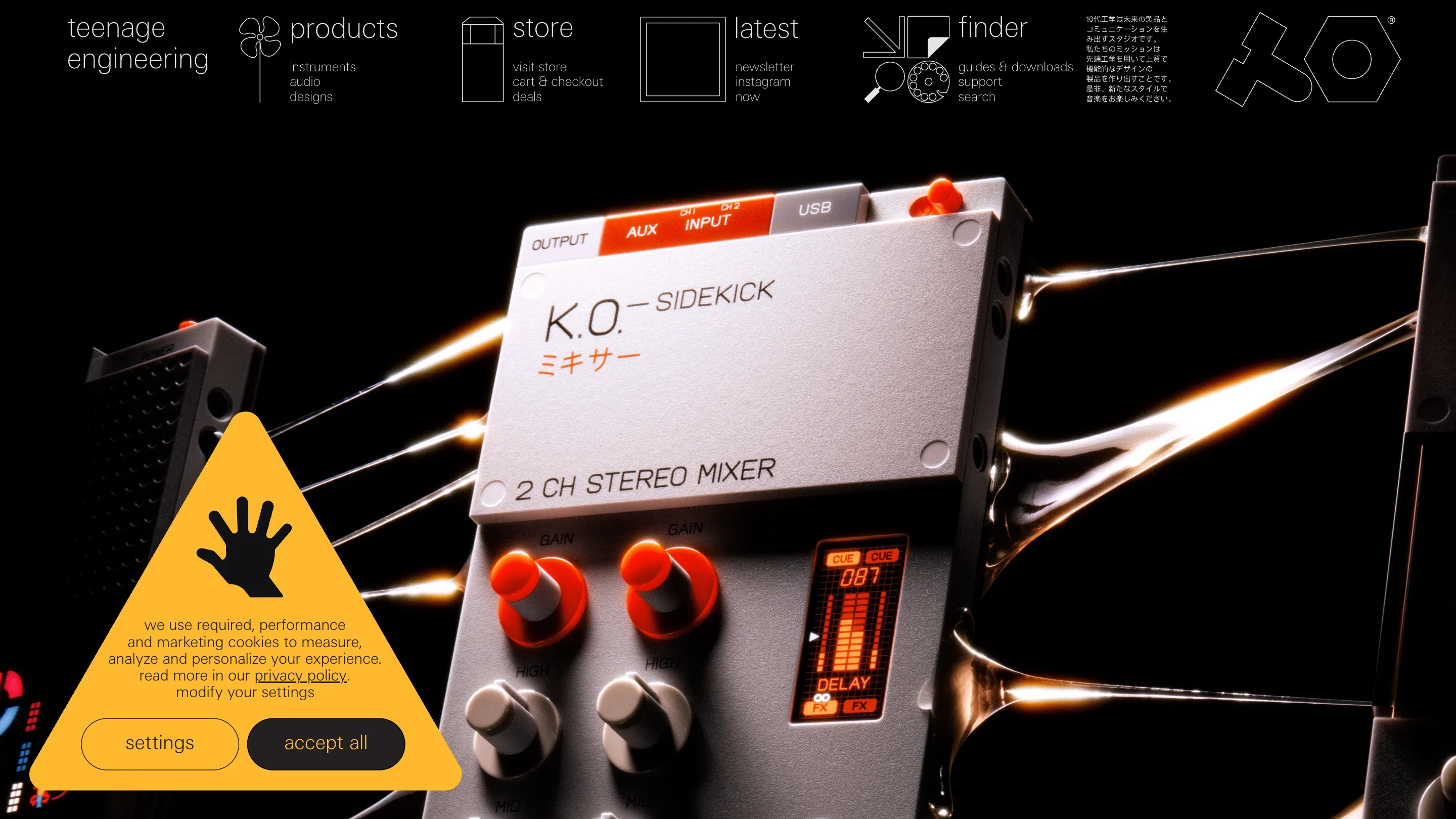
One page is a joke, the other is a jeweller's plinth. Both are deadpan, and both trust the reader to sit with an image before any copy explains it. The site never raises its voice.
The store is a catalogue, not a funnel
The store is where the product catalogue idea shows its hand. A campaign image sits up top, OP-XY, OP-1, OB-4 and choir gear wearing flower crowns on a flat green field, captioned as the summer deals. Below it, a single line of text filters: all products, pocket operators, field system, ep series, synthesizers, audio, cables, bags & cases, apparel, accessories, special offers. On the right, a plain counter: 153 products.
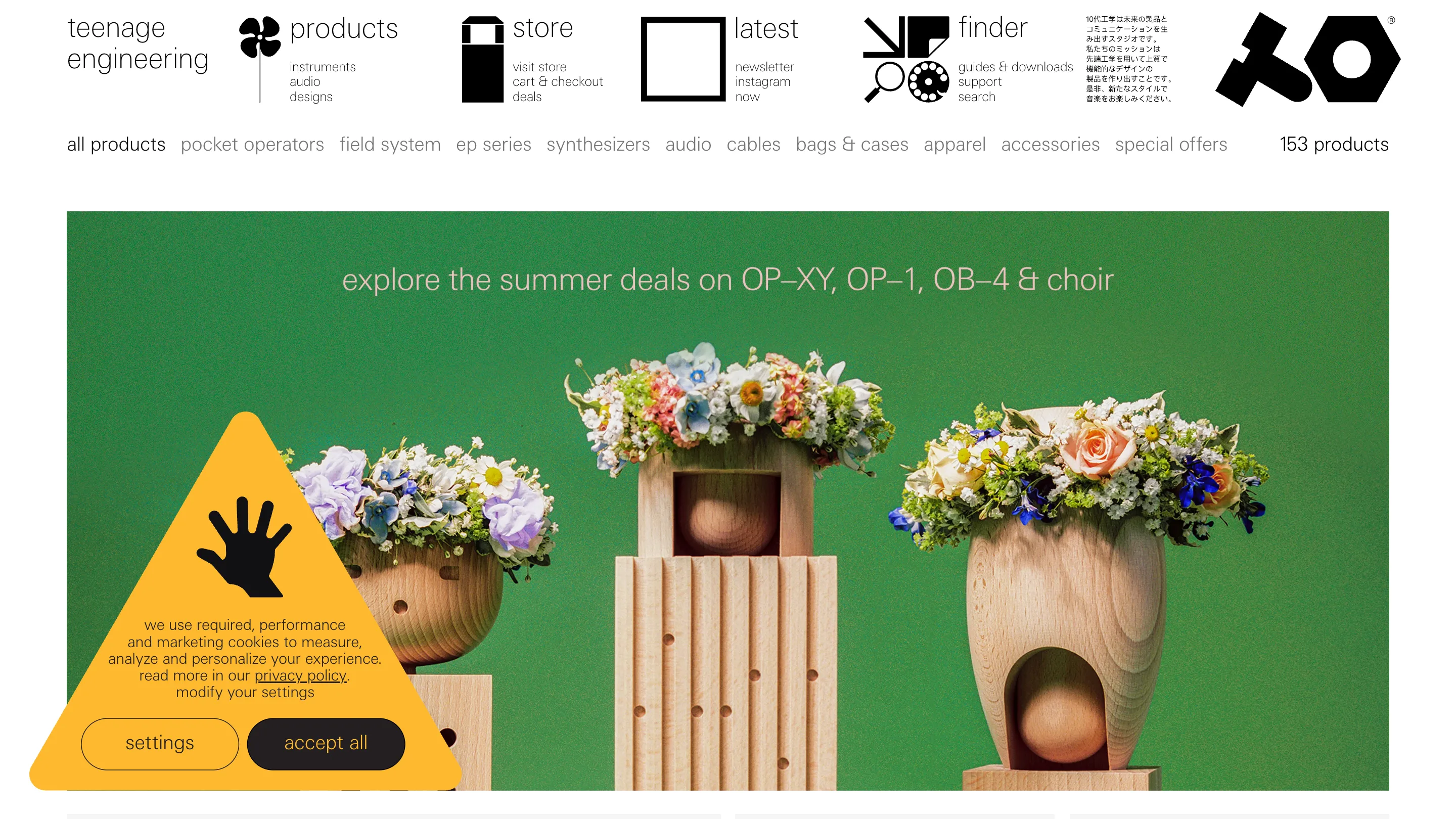
No cards with drop shadows. No urgency banners, no only 3 left. The filters are words in a row, and the count is a number. Buying here feels like flipping through a parts catalogue, which is the point. The restraint reads as confidence: the objects are good enough that the shop can get out of the way.
The same frame holds everything
The designs page proves how far the system stretches. It's the studio's work for other people, and here it's a run of record sleeves and vinyl on black, sharing the exact header, the exact type, the exact quiet.
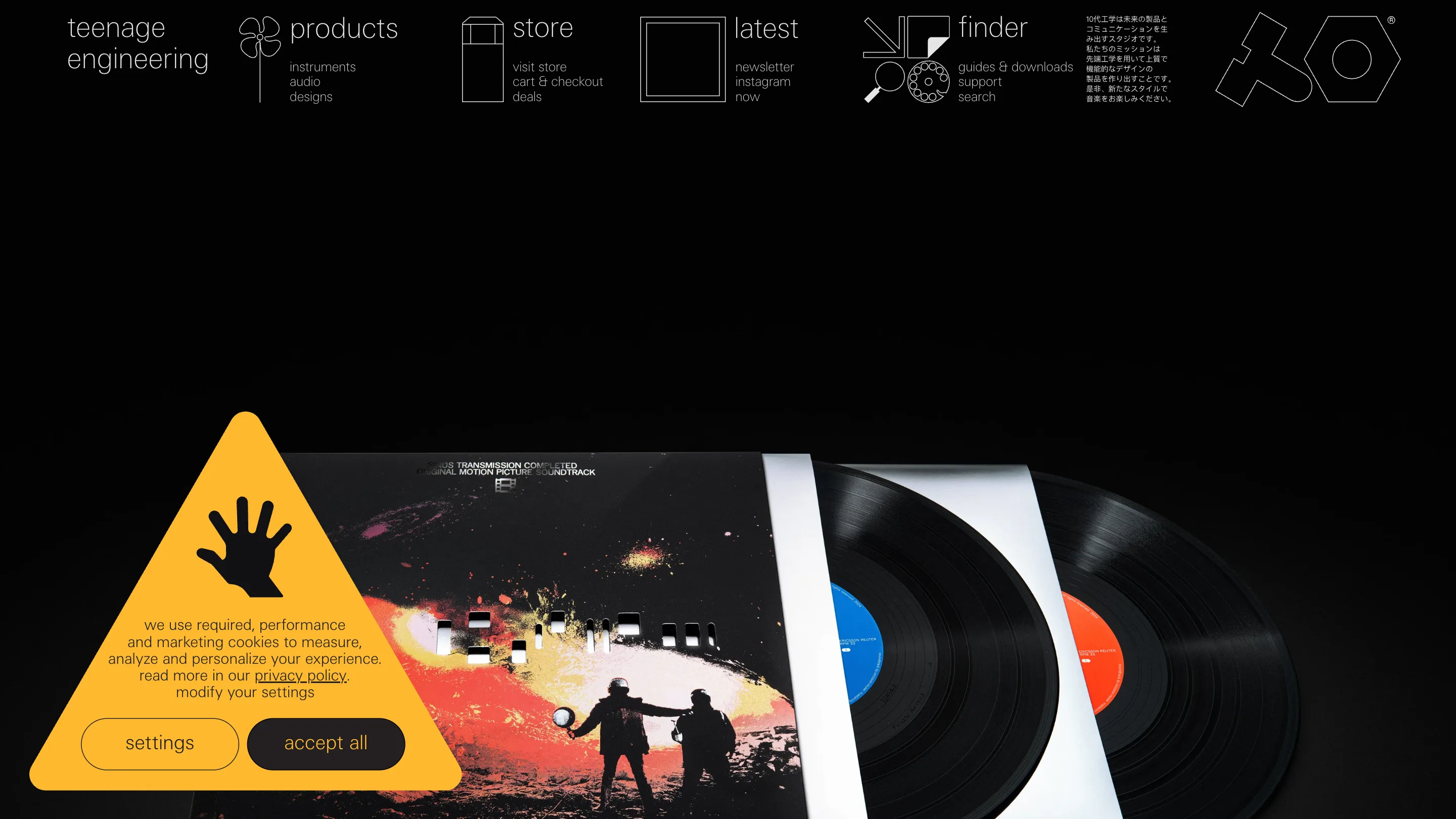
That's the whole trick. Teenage Engineering picks one frame, a control-panel header and a lot of black space, and runs it across the campaign poster, the synth render, the store, and the design portfolio without softening it for any of them. Most product catalogues get busier as they grow. This one stays a manual, and reading it feels like operating the hardware.