CcTimeline is a type specimen site that shows its own math
Koto's new foundry, CcType, launched CcTimeline with a specimen site that puts the font's metrics and Bézier points on the page instead of a mood board.
Most type foundry sites sell you a mood. Koto's new foundry does the opposite: it hands you the drawing. CcTimeline, the first release from CcType, is a type specimen site that treats the visitor like someone who reads font metrics for a living, and it works.
The whole thing is one scrolling page. Near-monochrome, one clean grotesque doing all the talking, almost no chrome around it. The nav across the top reads like a table of contents for a type buyer: Overview, Styles, Glyphs, Specimen, Features, In Use, Technical, then Trials and Buy. Every section is a step you'd actually take when deciding whether to license a face.
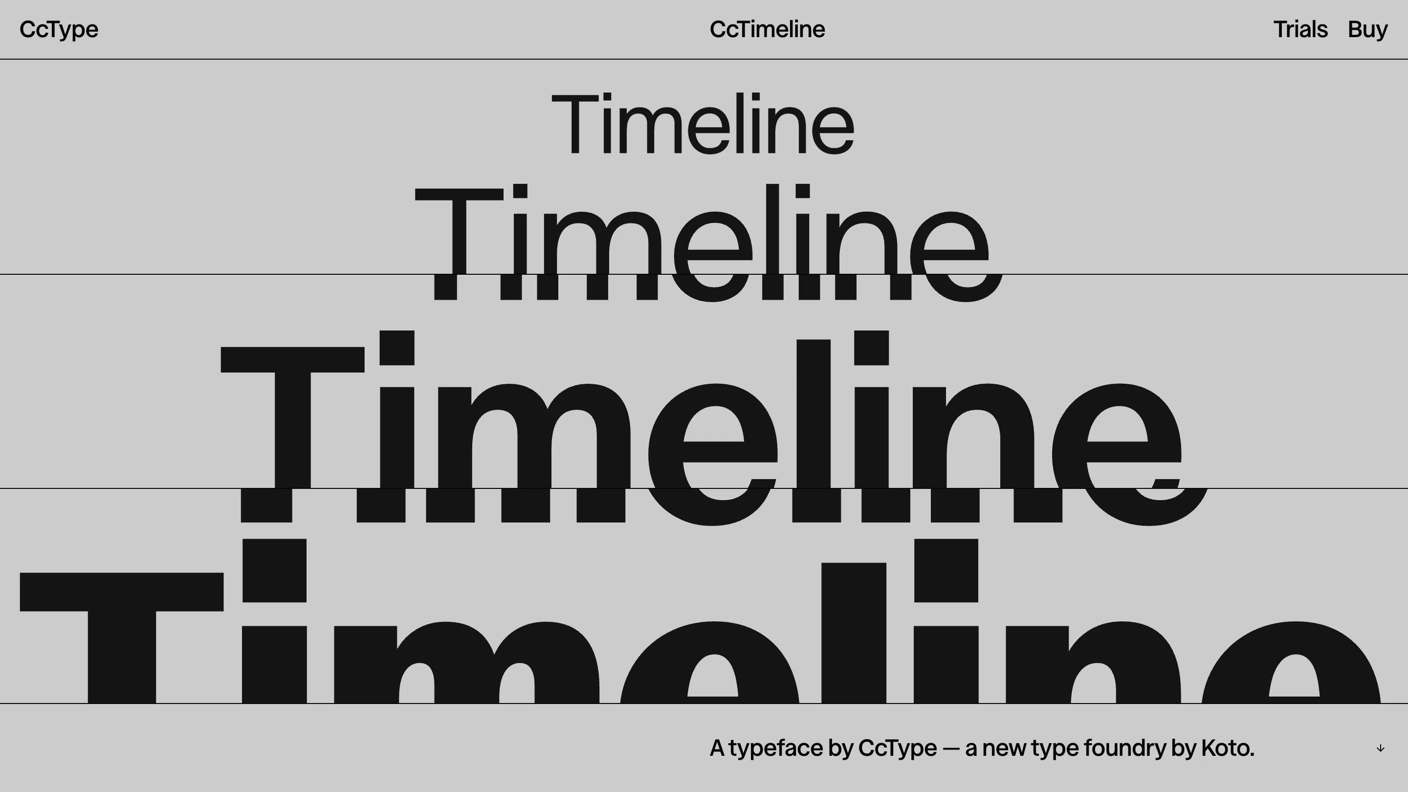
The hero repeats one word until the point lands
Load the page and "Timeline" stacks down the screen, each line bigger than the last, from a size you'd set a caption at to one you'd only use on a building. There's no headline explaining the range. The word just grows, and you watch the letterforms hold their shape at every step. CcType argues in words elsewhere that this face should work across product UI, campaigns, motion, and out-of-home. The hero proves it before you've read a sentence.
A glyph inspector that reads like a spec sheet
Scroll and the background flips to black for the glyph view. A single capital A sits against labelled rules: ascender at 1000, cap height 700, x-height 540, baseline 0, descender -300. To the side, a live readout names whatever glyph you land on, down to the Unicode: "Latin Capital Letter A, decimal 65, hex 0041."
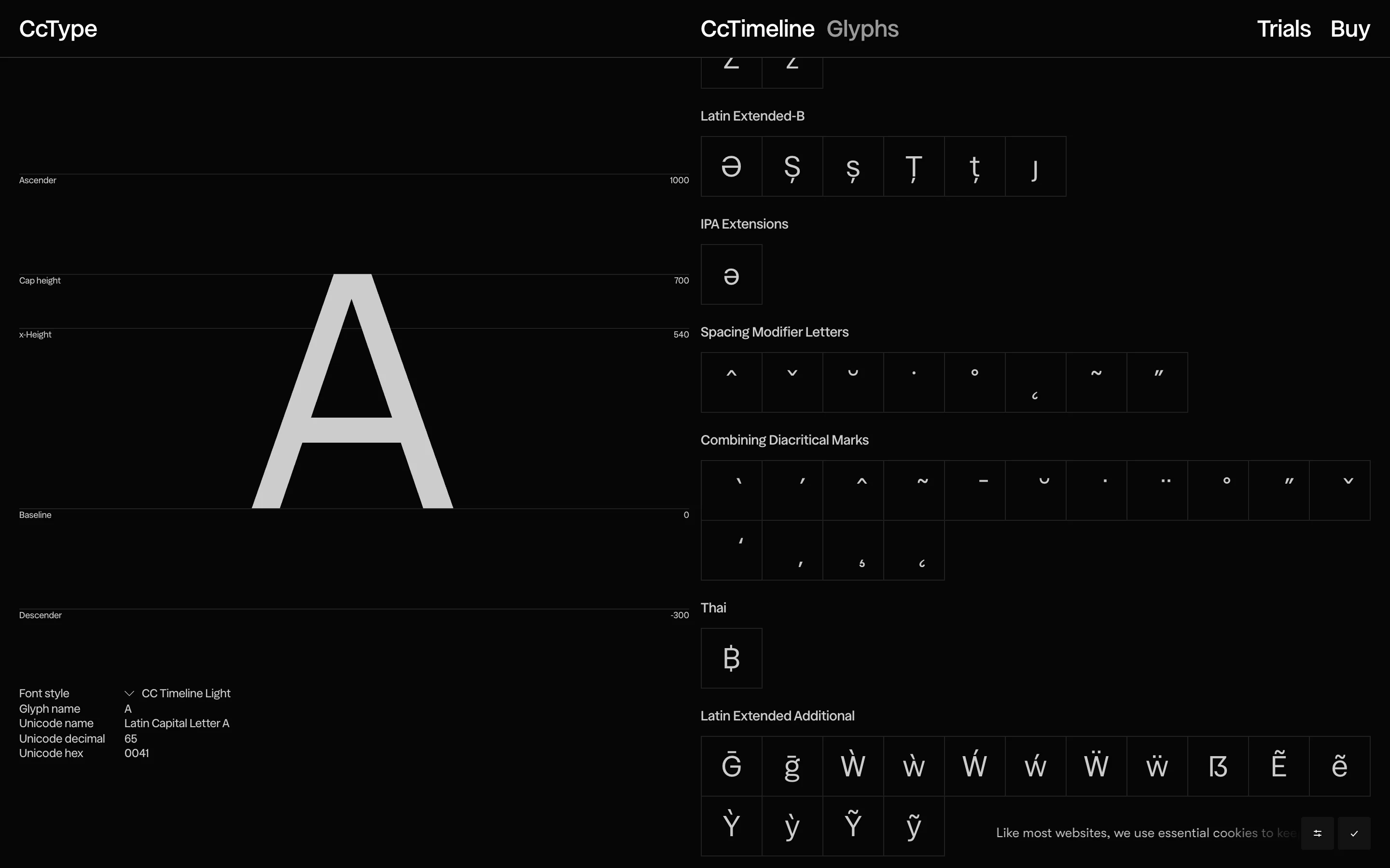
The character set on the right runs deep. Latin Extended-B, IPA Extensions, spacing modifiers, a Thai baht, the full run of fractions from a half through five-eighths. Most foundry sites bury this in a downloadable PDF. Koto put the em-square on the page and made it the marketing. A type tester higher up lets you push size, tracking, line height and OpenType features on your own text, so you can check the fit against the words you'll actually set.
The outro shows the Bézier points
The best decision is at the very bottom. Two big Cc's sit side by side. The right one is solid, the way you'd set it. The left one is the same shape drawn as an outline, every control point on the curve tagged with its coordinate: 305,22 at the apex, 535,228 where the terminal cuts in, on around the bowl.
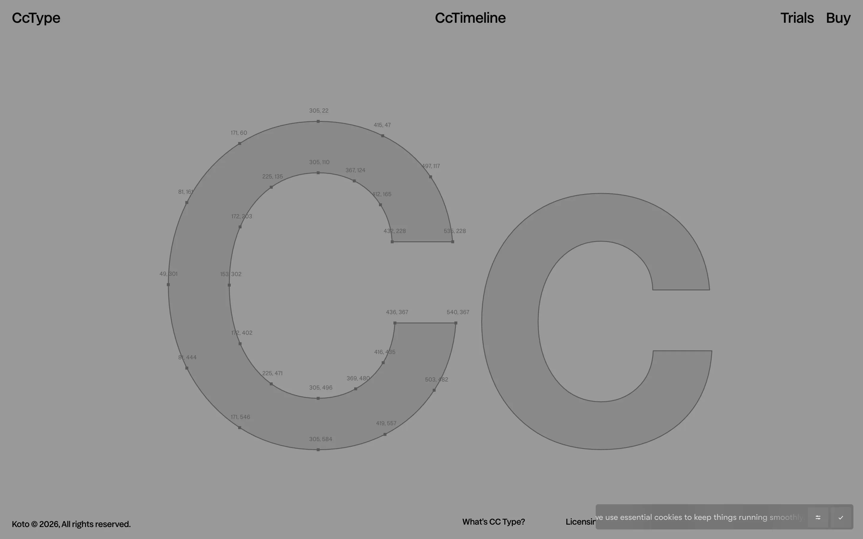
It's the vector math behind the letter, shown next to the finished letter. For a foundry, that's the whole argument. The curves are considered, and here's the proof, in numbers.
Why it holds up
The restraint is the craft. Koto could have wrapped a launch like this in WebGL and scroll gimmicks. Instead the motion stays limited to a marquee of the wordmark and those jumps in scale, and every screen does a job a type buyer has anyway: judge the face across sizes, check the language coverage, trust the drawing. CcType frames the foundry as type built for how brands work in 2026 rather than a historical revival, and the site makes that case by behaving like an instrument you can measure with. Putting the metrics and the point coordinates on the page is a confident way to sell a typeface to the people who'll have to live with it.