Raycast's product marketing site runs one motif through every page
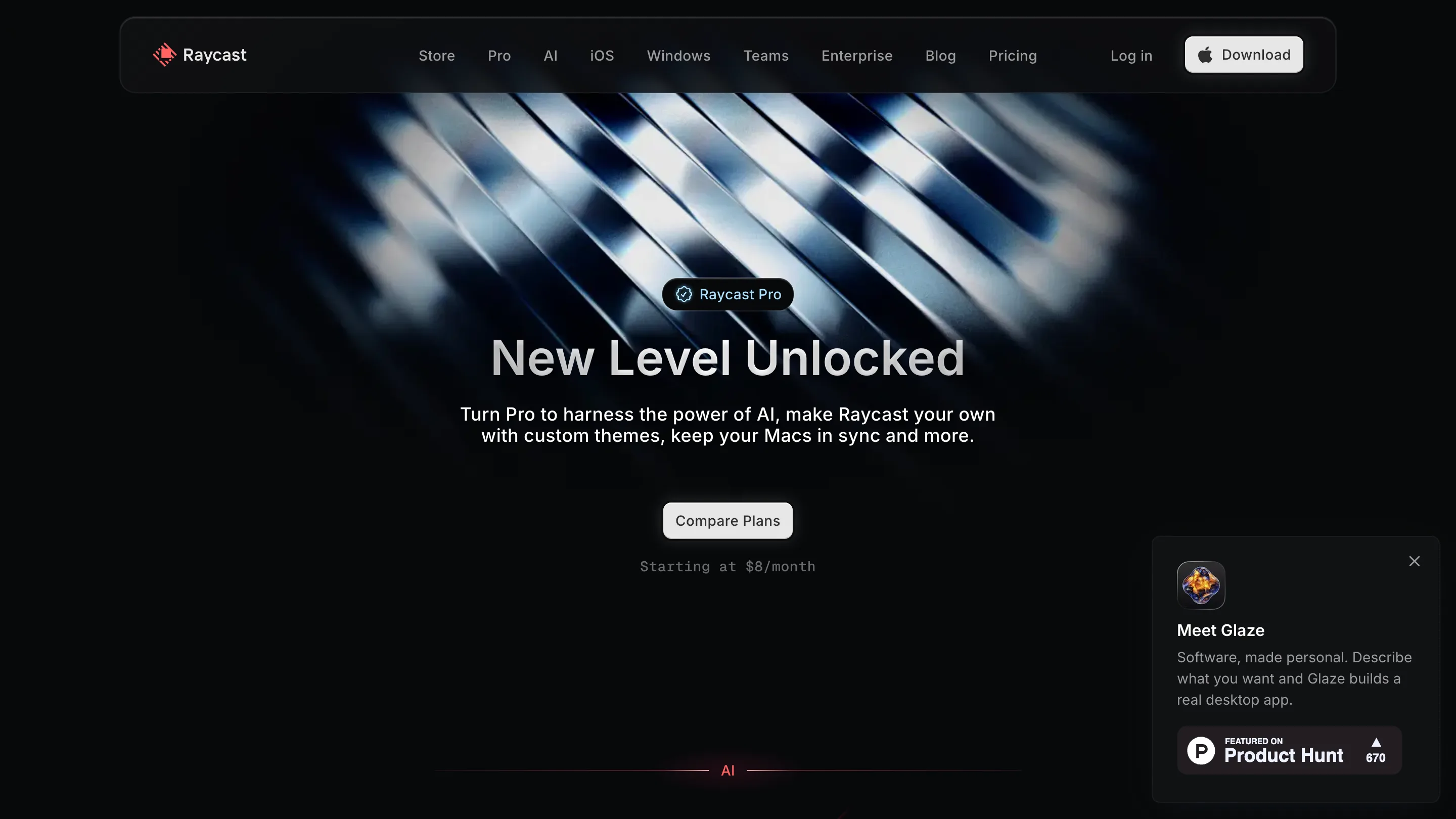
Raycast runs a single diagonal light motif through its whole site and recolors it each time: red on the home page, chrome on Pro, halftone dots on the manifesto. One small decision holds the product marketing site together.
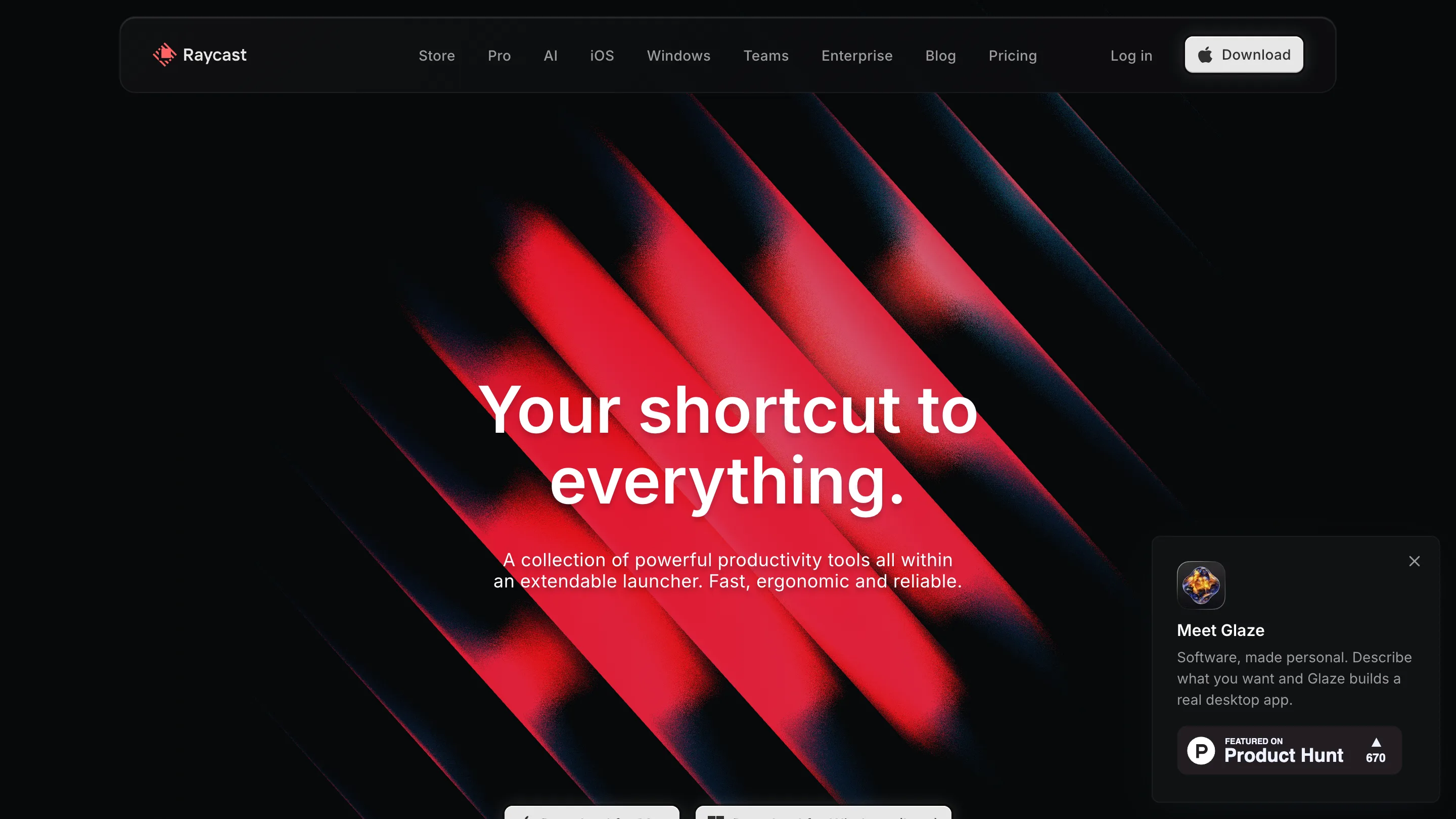
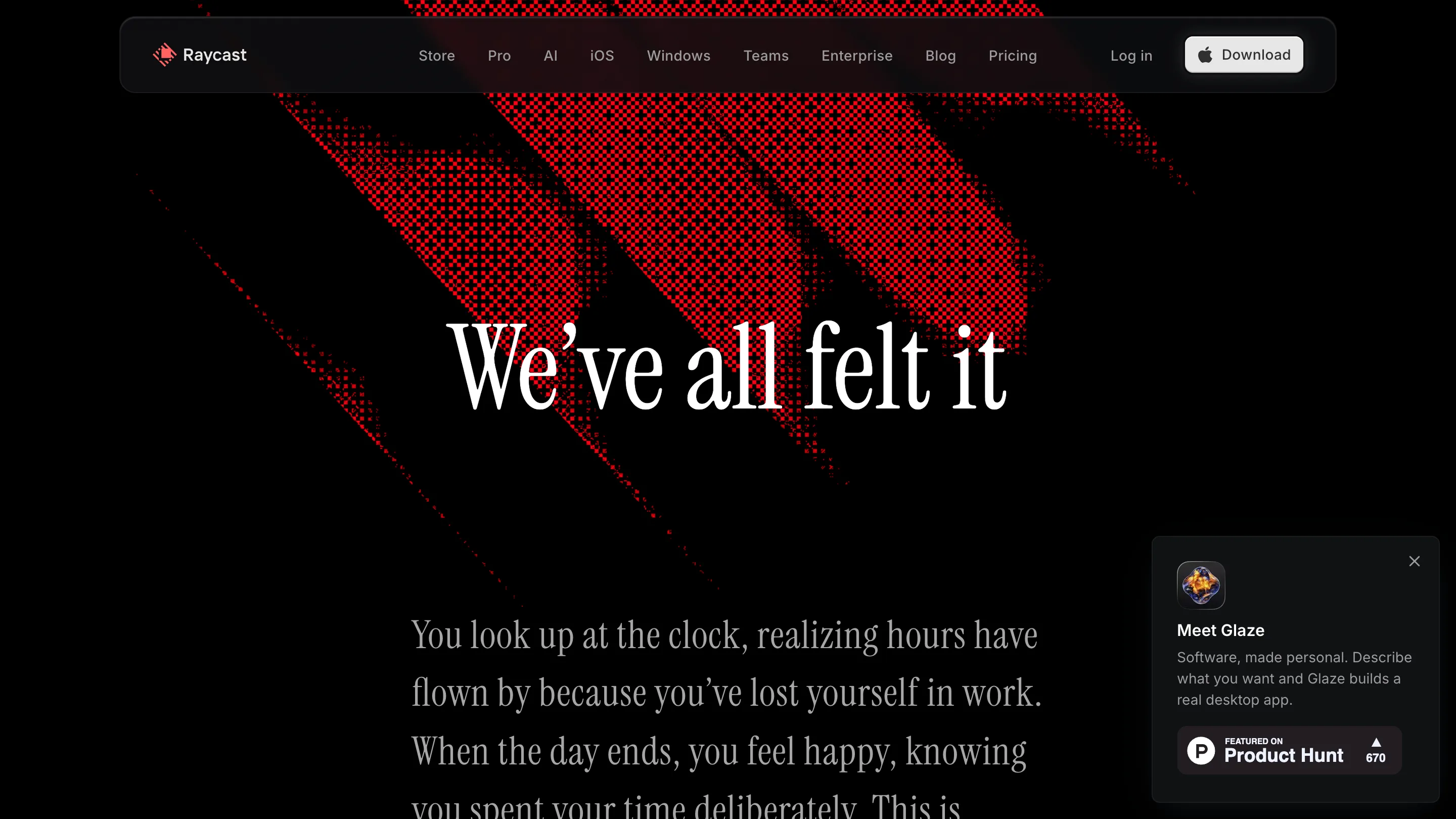
Raycast's site opens on a near-black screen with red light ribbons cutting across it on a diagonal. Go to the Pro page and those ribbons come back, brushed silver this time. Open the manifesto and they show up again as a field of red halftone dots. Same shape every time, a different material each time. That one decision is why Raycast's product marketing site holds together across every route instead of reading like a pile of pages built by different people.
One motif, recolored per page
A lot of product marketing sites reset the visual on every route. New hero, new gradient, new stock render, and by the third click the site has forgotten what it looks like. Raycast does the opposite. It picks one form, the diagonal ribbon of light, and lets color and texture be the only things that change.
The home page runs it hot: saturated red glass against the dark. The Pro page cools it to chrome and steel, which quietly says premium tier without a line of copy doing that job. The manifesto page renders the same ribbon as red dot-screen halftone, rougher and more editorial, to sit under the long-form writing. Three pages, one idea, and the moves between them feel deliberate.
The nav floats and the product does the talking
The top bar is a rounded capsule that sits detached from the edge of the screen, dark and slightly translucent, holding Store, Pro, AI, Teams, Enterprise. It reads like a piece of the app rather than a website header, which is the point. The whole site borrows the app's material language.
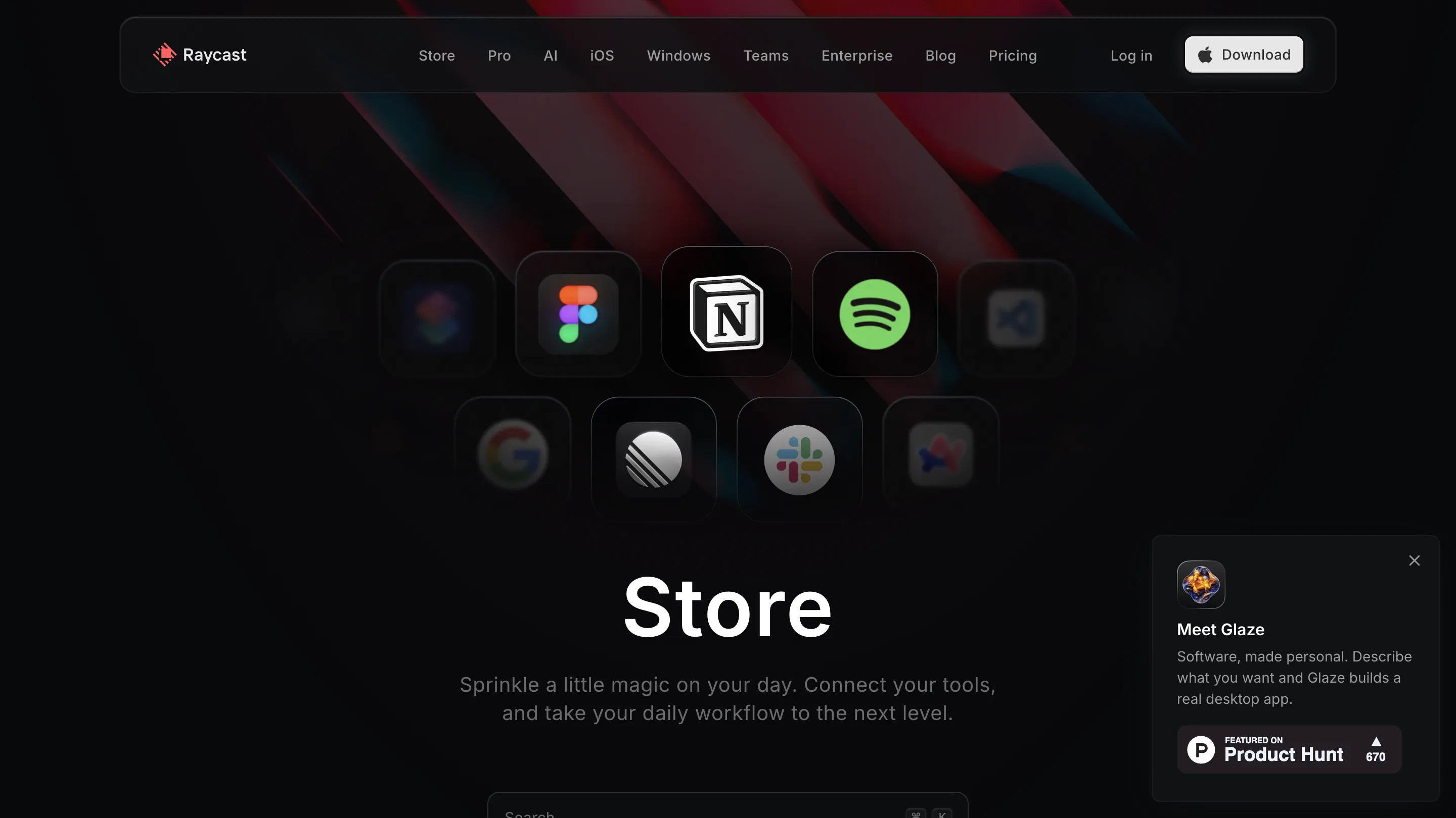
Nowhere is that clearer than the Store page. Instead of an illustration of integrations, Raycast shows the icons themselves: Figma, Notion, Spotify, VS Code, Slack, Chrome, each a rounded app tile floating in a loose grid over the red wash. The marketing image is the product surface. You're looking at the thing you'd see inside the launcher, scaled up and given room.
A serif for the part about feelings
Every headline on the site is set in the same clean sans, tight and functional, until you reach the manifesto. "We've all felt it" is set in a serif display face, and the register shifts with it. The sans sells the tool. The serif carries the argument about time and attention. One typeface swap, on one page, doing more than a paragraph of copy could.
The card that rides along
Pinned to the bottom-right of every page is a small glassy card promoting Glaze, dismissible, always in the same spot. It's a nice bit of restraint: one persistent promo instead of five popups fighting for the corner, styled to match the panels so it feels like furniture rather than an ad bolted on.
The takeaway for anyone building a product marketing site: pick a form before you pick a palette. Raycast decided what its pages are made of, then let color carry the difference across them. That's why a dark, busy, heavily animated site still feels calm. The parts all came out of the same box.