Paper Tiger's studio website bets everything on one giant typeface
The New Jersey agency rebuilt its own site twice and won Awwwards Site of the Day. The whole design rests on one condensed display face set enormous, a flat color per page, and headlines that split around the image.
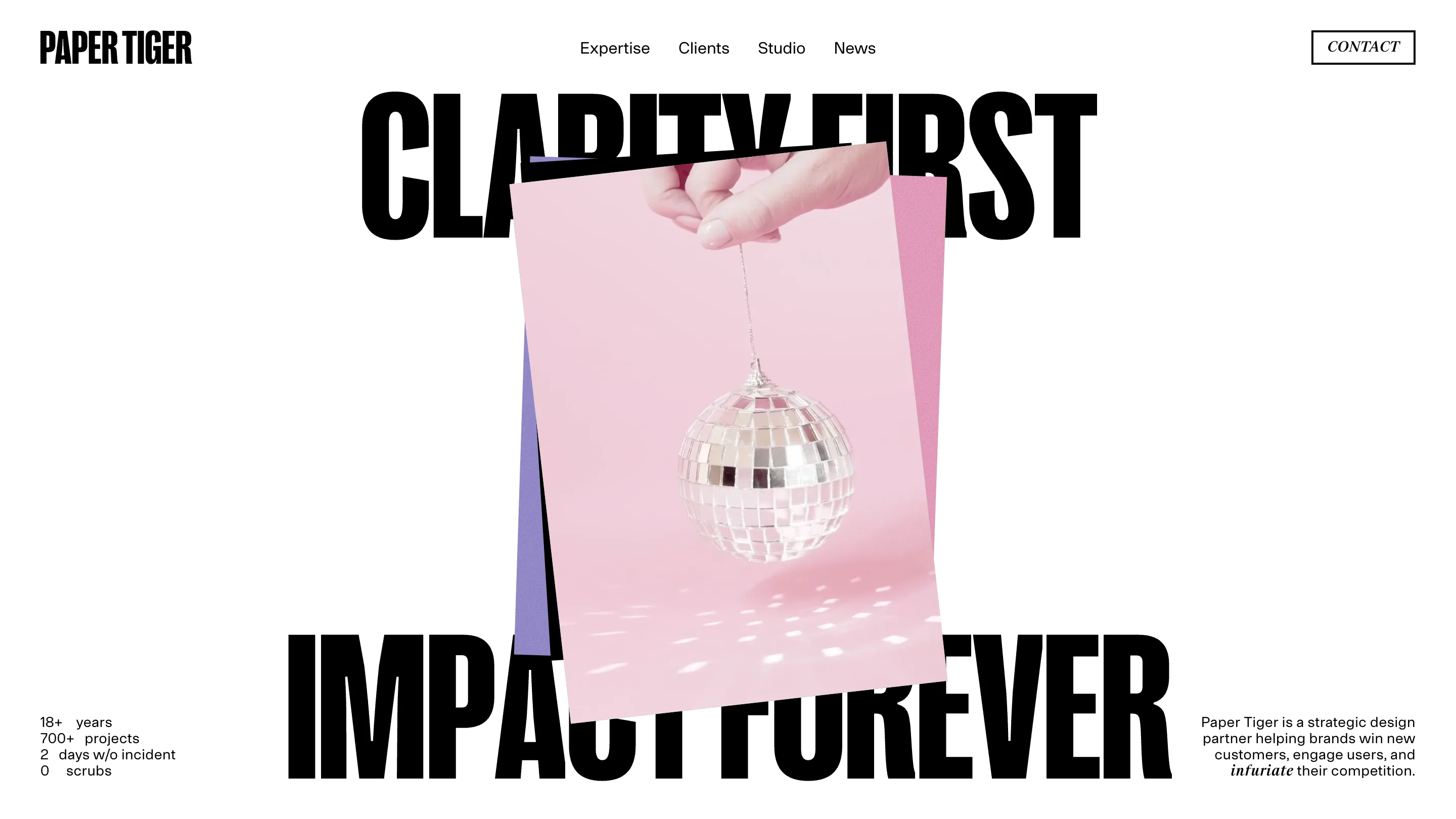
Paper Tiger rebuilt its own website twice before shipping it, and the result is one of the cleaner arguments you will see for restraint in studio website design: pick one typeface, set it enormous, and let it carry the page. The Ridgewood, New Jersey agency won Awwwards Site of the Day for the redesign in January. Look at it for a minute and you can see why. Almost every decision points back to a single condensed grotesque, printed black and blown up until the words run off the edges.
One typeface, set as big as it goes
The face is a heavy condensed gothic, the kind that stacks tight and reads like a protest poster. On the home page it spells CLARITY FIRST across the top and IMPACT FOREVER across the bottom, each line nearly the full width of the screen. No secondary display font fights it. Body copy drops to a quiet neo-grotesque, and a single italic serif shows up only to lean on one word at a time: "infuriate" in the intro line, "growth" further down. That serif is the whole supporting cast. Everything loud is the one typeface.
A color per page, and nothing else
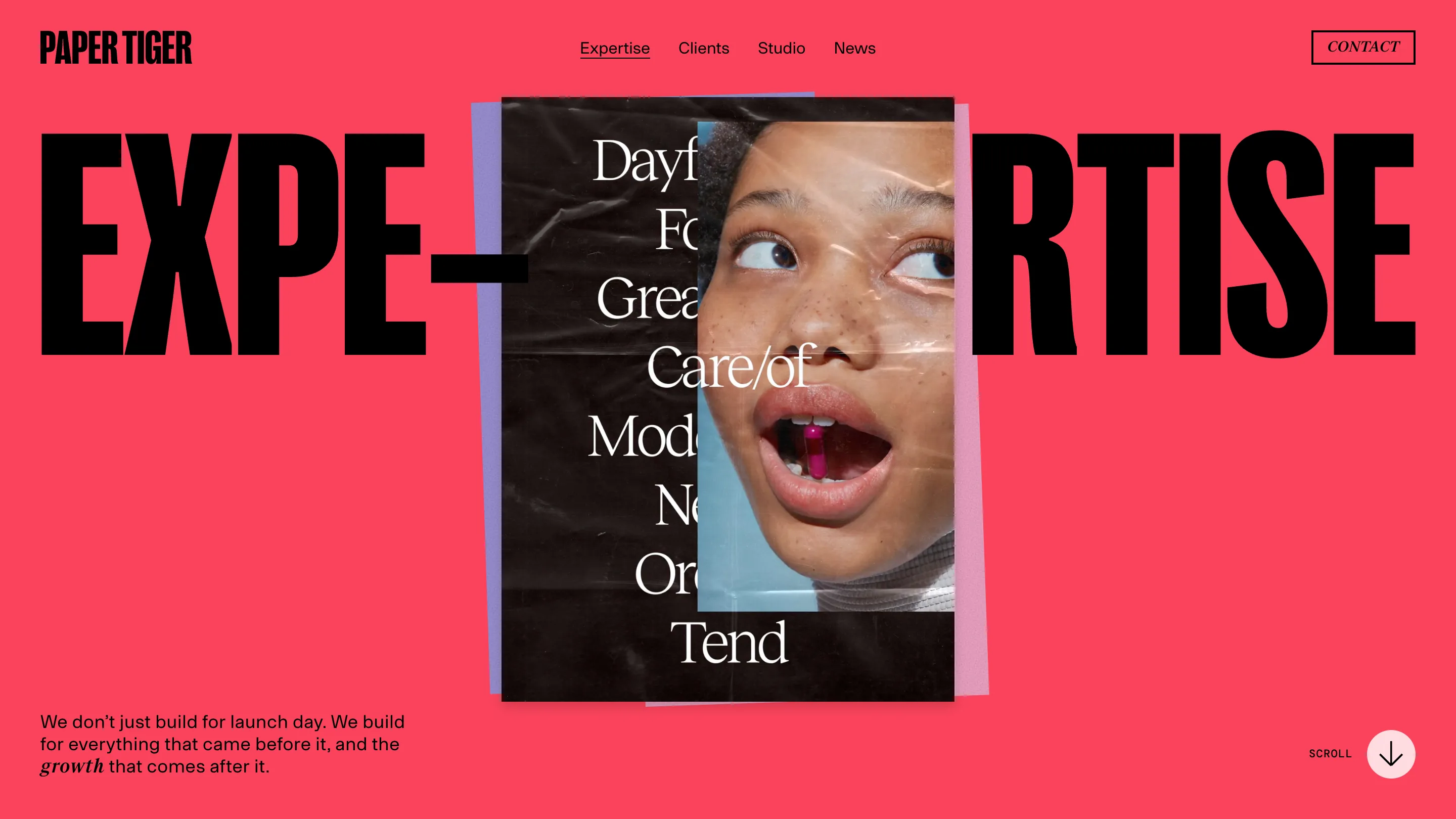
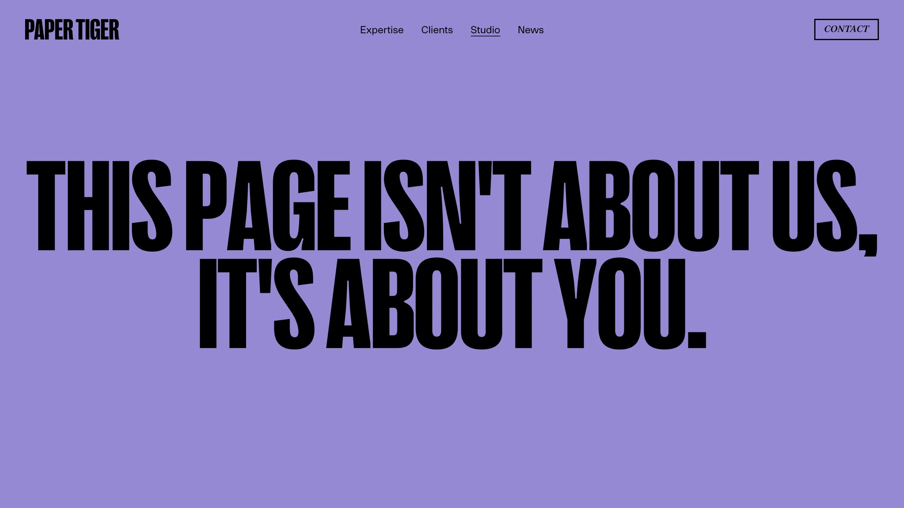
Each page gets exactly one saturated flat background and holds it edge to edge. Home is bubblegum pink. Expertise is a hot coral red. The Studio page is flat lavender. No gradients, no texture on the fill, no photography bleeding behind the type. The color is the wayfinding, so you know you have changed pages because the whole screen changed hue. It is a confident move, because a flat fill leaves nowhere to hide a weak layout.
Type that breaks around the image
The move that keeps it from feeling like a poster generator is how the headline and the image share space. On the Expertise page the word EXPERTISE is split down the middle, EXPE and RTISE, with a curled poster of a kid's face wedged into the gap. The type sits in front of the image on the home page too, the letters of IMPACT FOREVER cutting straight across a photo of a hand holding a disco ball. The image is always a scrappy printed poster, scanned rather than rendered, curling at the corners. Against the clean vector type it reads like something taped to a studio wall.
The copy is doing real work
The writing carries as much personality as the type. The home page stat block counts "18+ years, 700+ projects, 2 days w/o incident, 0 scrubs," which tells you these people have a sense of humor about agency-stat theater. The Studio page opens with one line at full display size: "This page isn't about us, it's about you." The Expertise lede reads "We don't just build for launch day. We build for everything that came before it, and the growth that comes after." Plainspoken, a little cocky, and a good match for a site this loud.
Paper Tiger calls the redesign the hardest job in the room, the studio's own site being the weirdest client relationship in the building. You can feel the second-guessing in how disciplined the final version turned out. One face, one color per page, one scrappy image per headline. They shipped a site that could have collapsed into noise and instead kept it to a handful of ideas, turned all the way up.