Squarespace's brand guidelines site is six pages and one enormous word
Squarespace put its brand foundations on the open web. Six sections, one giant word on each, and a custom typeface named after the office door.
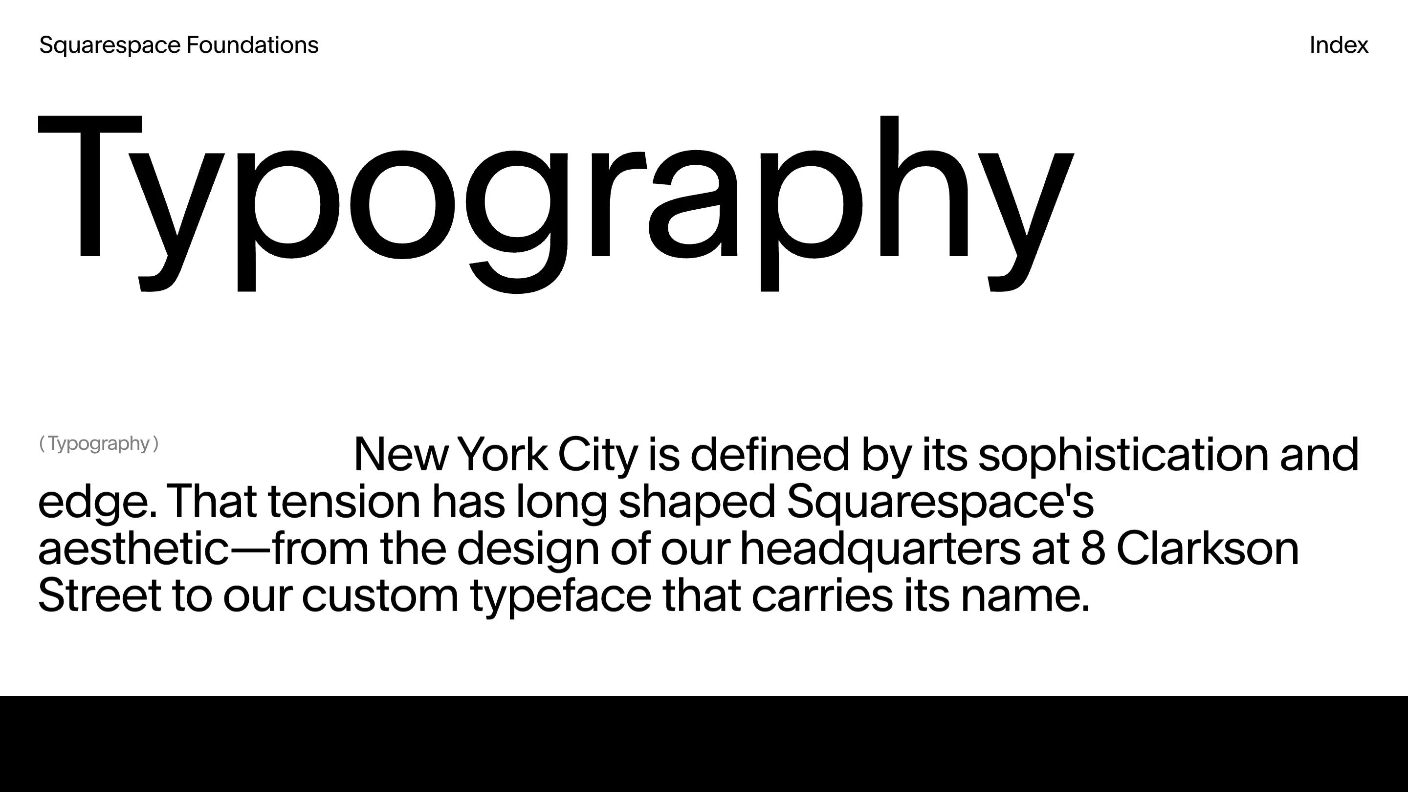
Squarespace's brand guidelines site opens on the word "Logo" set roughly 190 pixels tall, one paragraph underneath it, and nothing else above the fold. Then "Color". Then "Motion". Six sections at brand.squarespace.com, each one a single word the size of a small building.
That's the whole idea, and it holds up better than it should.
One size, six words
Here's the decision a designer will notice first. The section titles aren't fitted to the line. They're all set at the same size, and the word gets whatever room it needs.
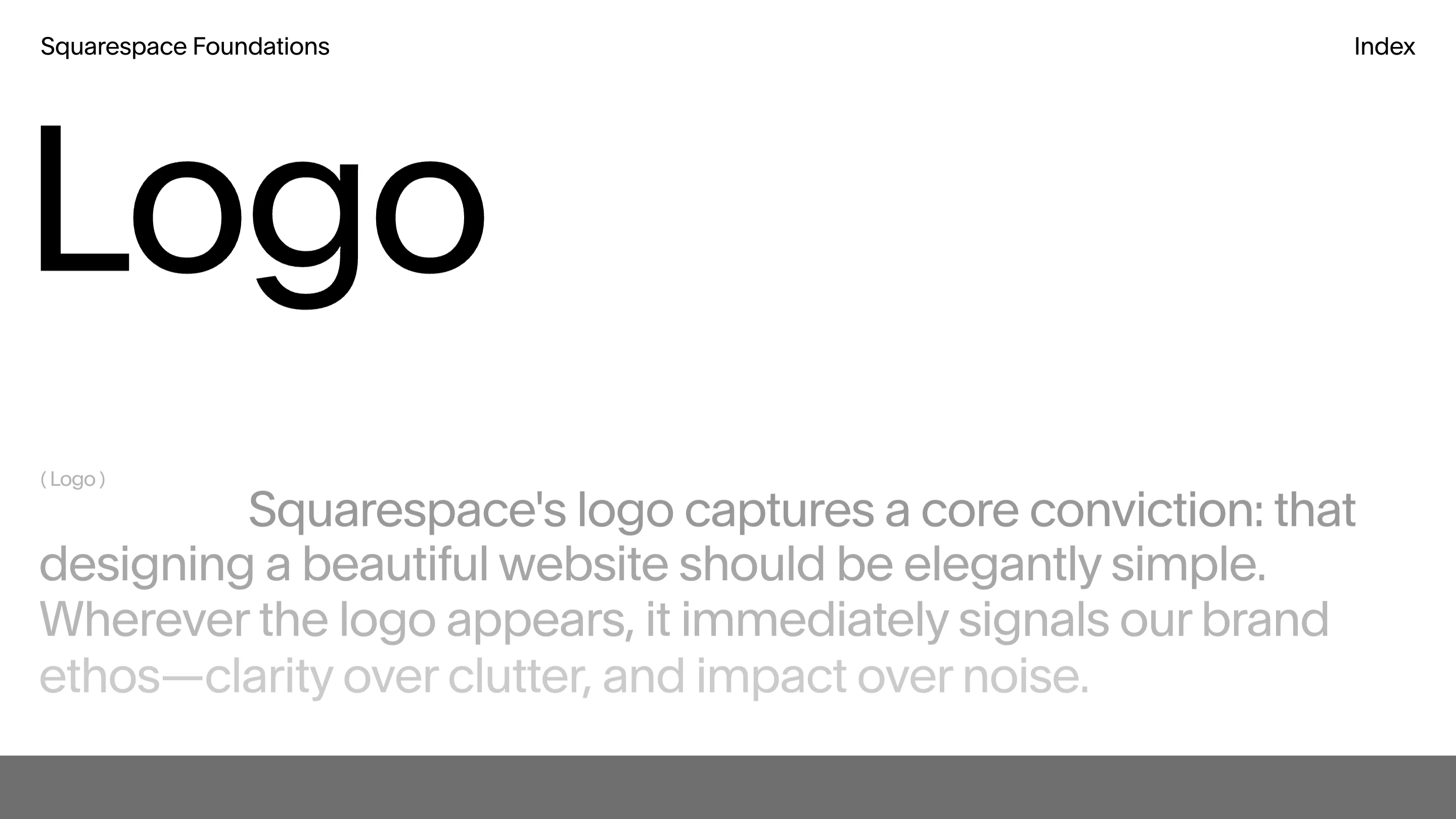
Measure them. "Typography" runs about 1,060 pixels across ten characters. "Color" runs 490 across five. "Motion" 610 across six. "Logo" 440 across four. That's around 105 pixels per character every time. Nobody scaled the word to fill the measure, which would have been the tidier choice and would have made every page look deliberate in a mockup.
So "Typography" nearly touches the right margin and "Logo" stops a third of the way in, leaving a shelf of white space that does nothing. Letting it do nothing is the point. The pages are visibly the same system rather than six compositions that happen to rhyme.
The paragraph is doing print things
Under each title sits one paragraph, and it's set with a first-line indent. An actual indent, the kind you'd find in a book, on a web page in 2026.
Out in the left margin, level with that first line, there's a small grey label in parentheses: ( Typography ), ( Color ), ( Motion ). It repeats the word you're already looking at. As information it's redundant. As typography it's a marginal note, and it anchors the left edge so the indent reads as a decision instead of a broken text-indent rule.
The paragraph itself is set wide and large, around 48 pixels, ragged right, tight leading. At that size a lede stops being body copy and starts being the layout.
Clarkson, named after the door
The typeface is Clarkson, and the typography section explains the name: Squarespace's headquarters at 8 Clarkson Street. It was drawn by François Rappo and released through Optimo in 2018, when DIA built the kinetic identity around it.
Scroll the typography section and the specimens arrive as tiles on a staggered grid, different sizes, sitting at different heights, captioned in small grey text. "Clarkson". "Clarkson Condensed". Black square with white letters cropped hard, a rust-red panel with a row of A's marching off the edge. It reads like a contact sheet someone pinned up, and the irregularity gives the section the only real texture on the site.
The color section shows almost no color
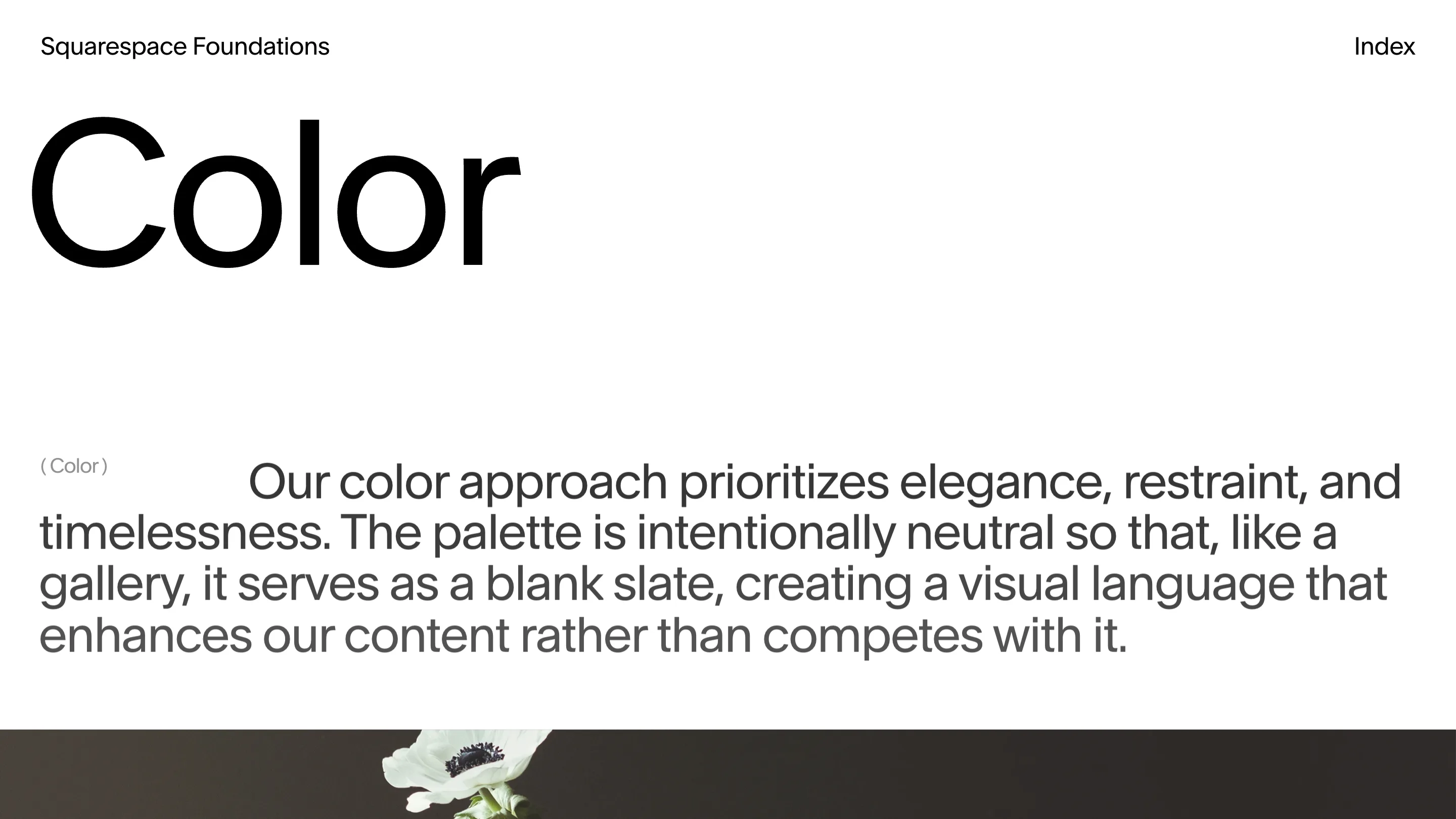
"Our color approach prioritizes elegance, restraint, and timelessness," the color page says. "The palette is intentionally neutral so that, like a gallery, it serves as a blank slate." Below the fold: a white anemone against near-black.
A color page that declines to show you a swatch wall is a position. Squarespace is saying the palette is a stage for other people's photographs, which is what a website builder's brand has to be. The page argues it by demonstration rather than by hex value.
Where it strains
Two things. The template is so fixed that by the fourth section you've learned the shape and start scrolling past the fold on arrival, and the writing under the titles is thinner than the setting deserves. "Clarity over clutter, and impact over noise" is a sentence that could sit under any logo.
The bigger cost is structural. Every word on the site is rendered by JavaScript, so the HTML that comes back holds a title tag and nothing else. Nobody can quote the guidelines from a view-source, and search engines see an empty room. For a public brand reference, meant to be looked up and cited by people building on the platform, that's a strange place to land.
Still. The site obeys the rules it documents: clarity over clutter, one word per page, and the nerve to leave the rest of the line empty. Squarespace built it in-house, and the discipline is the argument.