Komma Komma turns each case study into scroll-driven storytelling
The Reykjavík studio stages its work as physical objects, shot and lit, then walks you through it one section at a time. A clean lesson in scroll-driven storytelling.
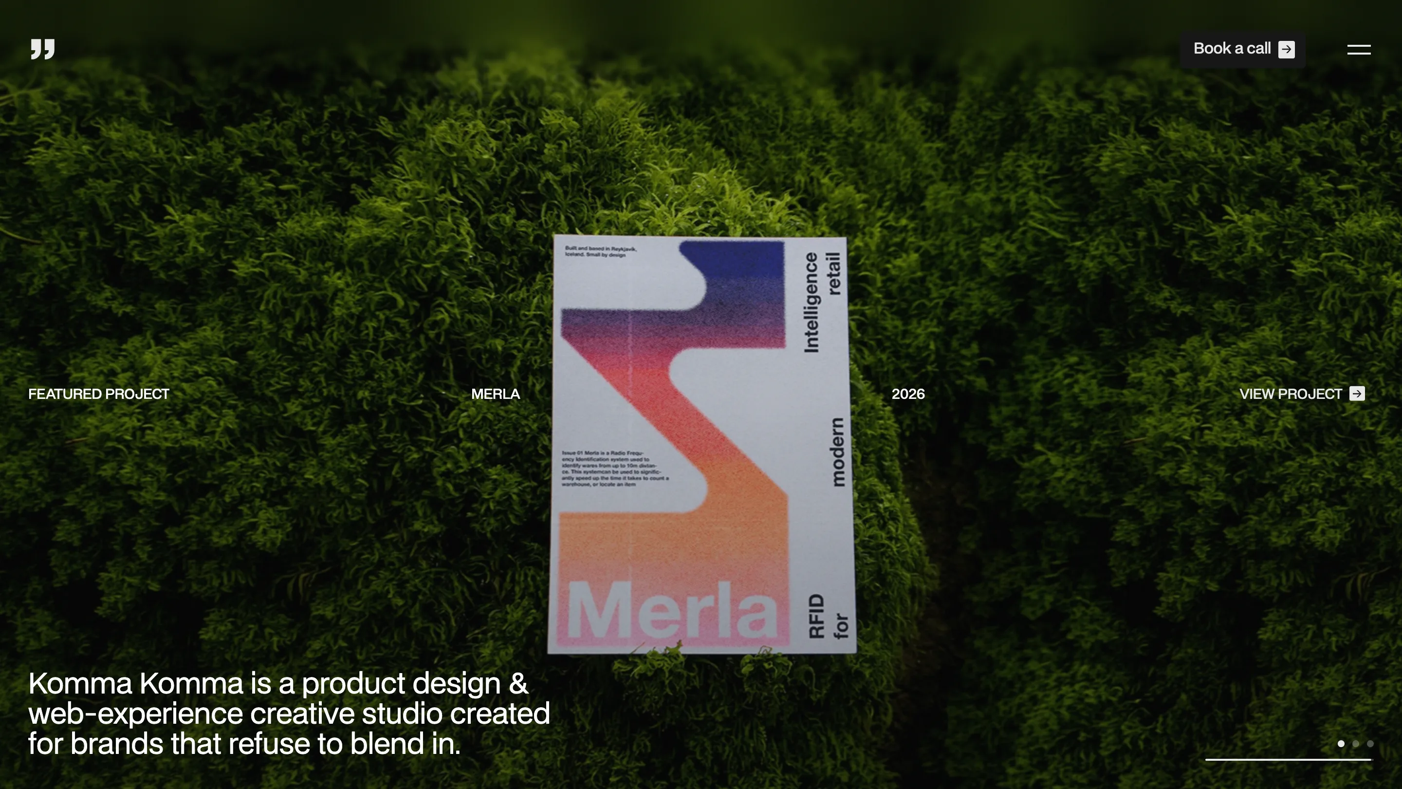
The home page of Komma Komma opens on a printed poster lying face-up on a bed of moss, its RFID retail identity for a project called Merla catching the light. Keep scrolling and the whole site behaves this way: a piece of design shot as a real object, staged, then walked past one frame at a time. It's scroll-driven storytelling done by two people who clearly enjoy the format. Óliver and Freyr run Komma Komma out of Reykjavík, and they built the site themselves.
The tagline under the hero tells you the posture: "a product design and web-experience creative studio created for brands that refuse to blend in." The site earns that line before you've read a word of a case study.
The case study is one long reveal
Open the Merla project and the page hands you the name first, set enormous and centered, before any picture loads.
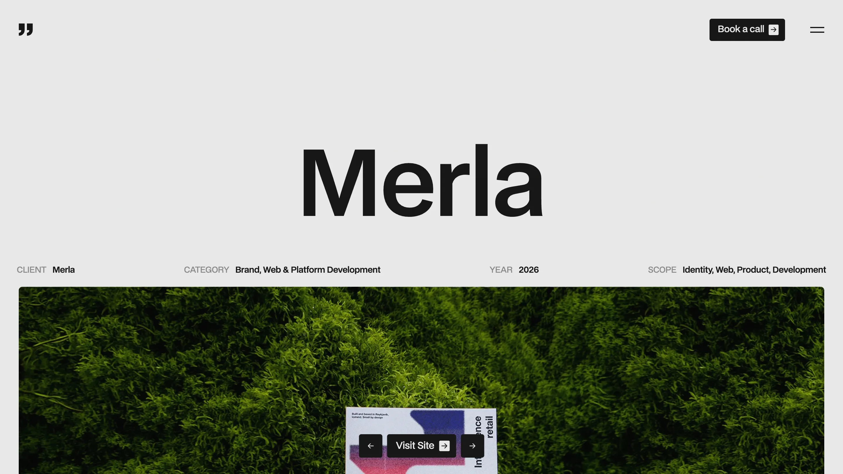
Under the wordmark sits a single quiet row: client, category, year, scope. Brand, Web and Platform Development. 2026. Identity, Web, Product, Development. That's the whole header. No hero paragraph, no manifesto. The reader gets the facts and then the work scrolls up to meet them. It reads like a printed monograph that happens to move.
The restraint is the craft here. Most portfolio detail pages front-load a wall of context. Komma Komma trusts the reader to keep going, so the title carries the weight and the images do the arguing.
A studio page that floats
The studio page throws that calm out and does something braver.
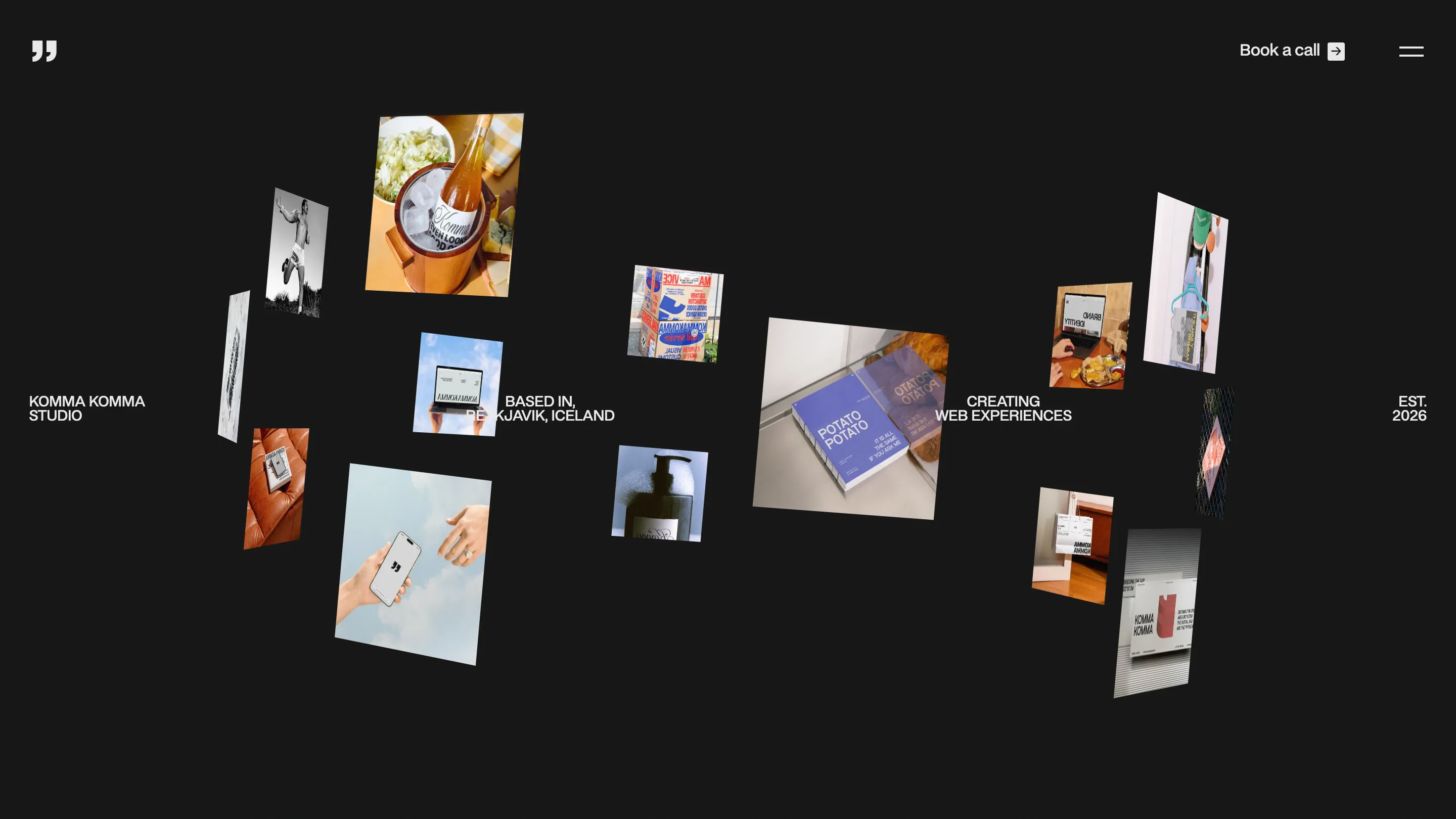
Black background, and two dozen project photos hung in 3D space at different depths and angles. Four short labels anchor the corners: "Komma Komma Studio," "Based in Reykjavík, Iceland," "Creating web experiences," "Est. 2026." It could read as a gimmick. It doesn't, because the photos are good and the depth gives you a reason to move your eyes around instead of down a list. The studio page becomes a room you look into rather than a bio you skim.
Motion with a reason
All of this runs on GSAP, and the studio credits it openly. What makes the motion work is that it's tied to meaning every time. The poster on moss settles as you arrive. The wordmark holds still while the imagery slides under it. The floating gallery parallaxes as you scroll, so nearer photos move faster than the ones set deep. Nothing spins for the sake of spinning. Each move points your attention at the next thing worth seeing.
Why it holds up
The Perla case study makes the same template carry a different story: UX research, product design and AI orchestration for Pearl Group Iceland, shown through a phone mockup instead of print.
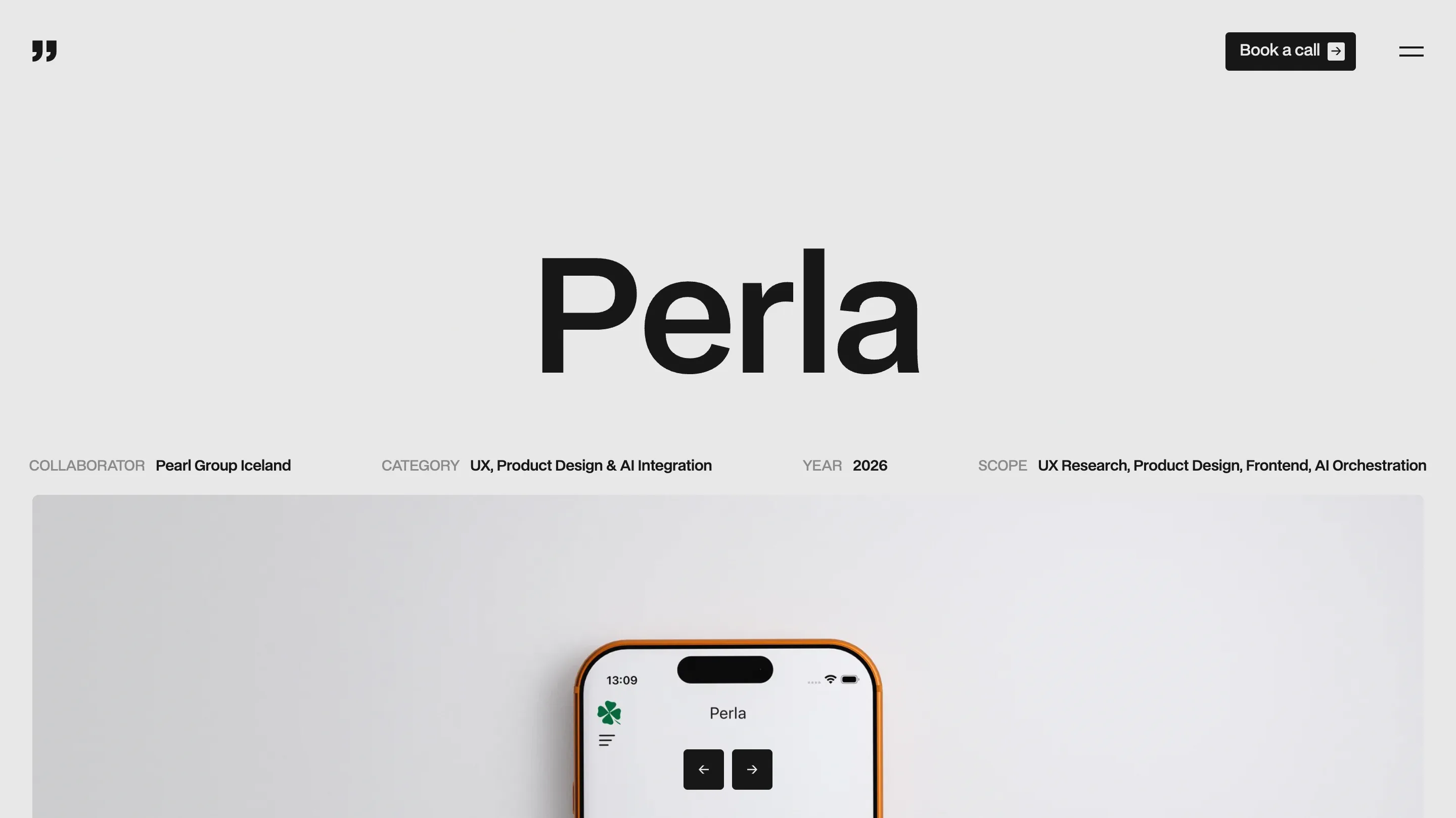
That's the tell of a real system. One layout holds a retail identity and an AI product without bending, because the structure is doing the work: giant name, four facts, then the imagery in order. If you're building a studio site this year, this is the reference to study. Say less at the top, shoot your work like it matters, and let the scroll do the talking.
Found via Minimal.gallery, where it went up this week.