Karol Ortyl's annotated portfolio numbers every project like a figure
The designer captions each project FIG. 1 through FIG. 35 and keeps a running index in the margin. It turns a portfolio into a catalogue you read.
Open Karol Ortyl's site and every piece of work wears a caption. FIG. 11 sits under a Protobuf console. FIG. 14 marks a set of phone screens. By the time you reach the bottom you've passed FIG. 35. Ortyl built his portfolio as an annotated figure index, the way a print catalogue or a lab paper numbers its plates, and it changes how you move through the work. You read it more than you scan it.
FIG. 1 through FIG. 35
The numbering is structural. Each project gets a range, and the ranges are grouped by client or theme: FIG. 1-6 for Buf.build, FIG. 7-12 for Studio B, FIG. 13-19 for a folder he calls Mobile Apps Dump, FIG. 20-25 for a Schema Registry, FIG. 26-30 for selected web works, FIG. 31-35 for the archive. Because the captions run in sequence, the whole page reads as one document with a spine. A thumbnail on its own is an image. Labelled FIG. 24 in a run of thirty-five, it becomes an entry.
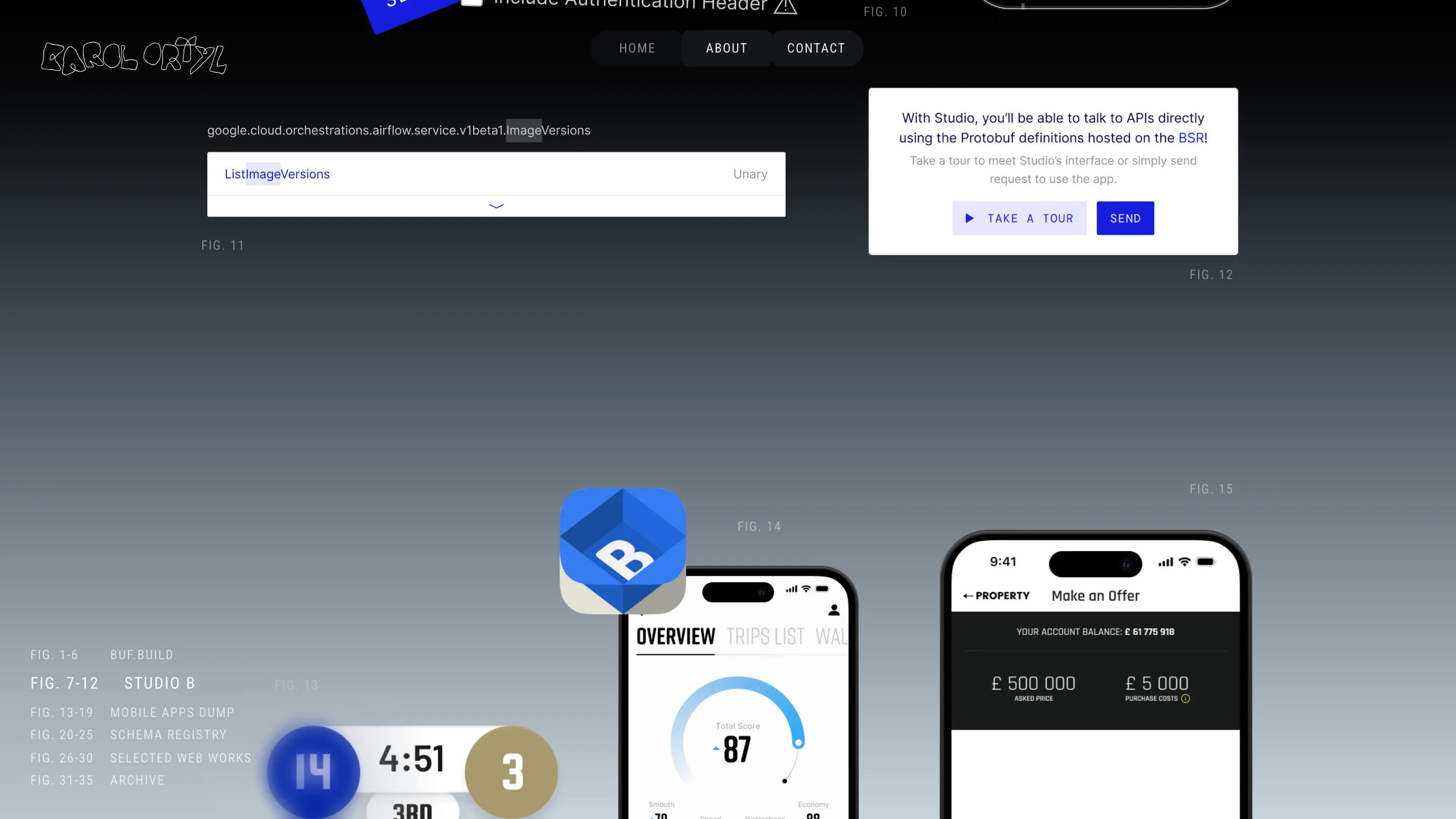
An index that stays in the margin
Down the left edge sits the legend, and it never leaves. FIG. 1-6 BUF.BUILD, FIG. 7-12 STUDIO B, and so on down to ARCHIVE. It's the table of contents you'd find on the first page of a catalogue, except Ortyl pins it to the side so you always know where you are in the set. Scroll into the Selected Web Works block and the heading ghosts up behind the work in oversized grey type while the small FIG. 26-30 marker keeps its place in the margin. Two type sizes, two jobs: the big one sets the mood, the small one keeps the record.
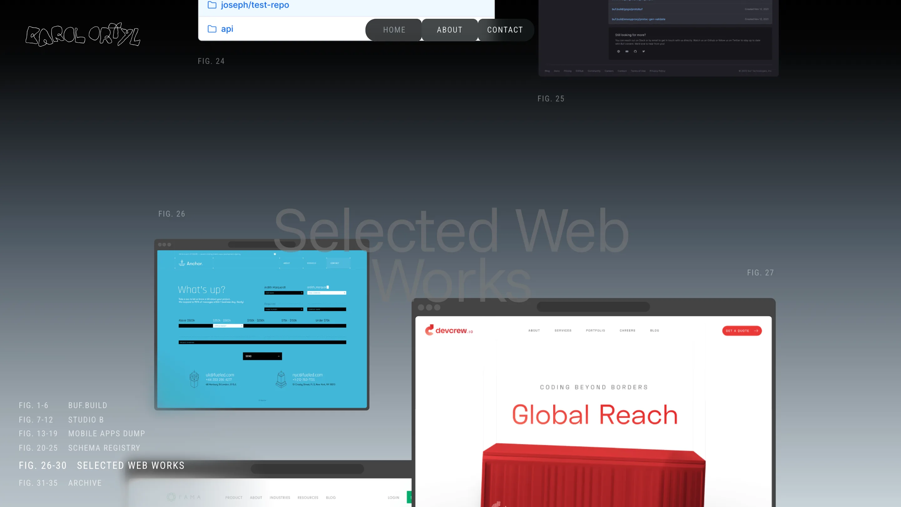
A logo that does real work
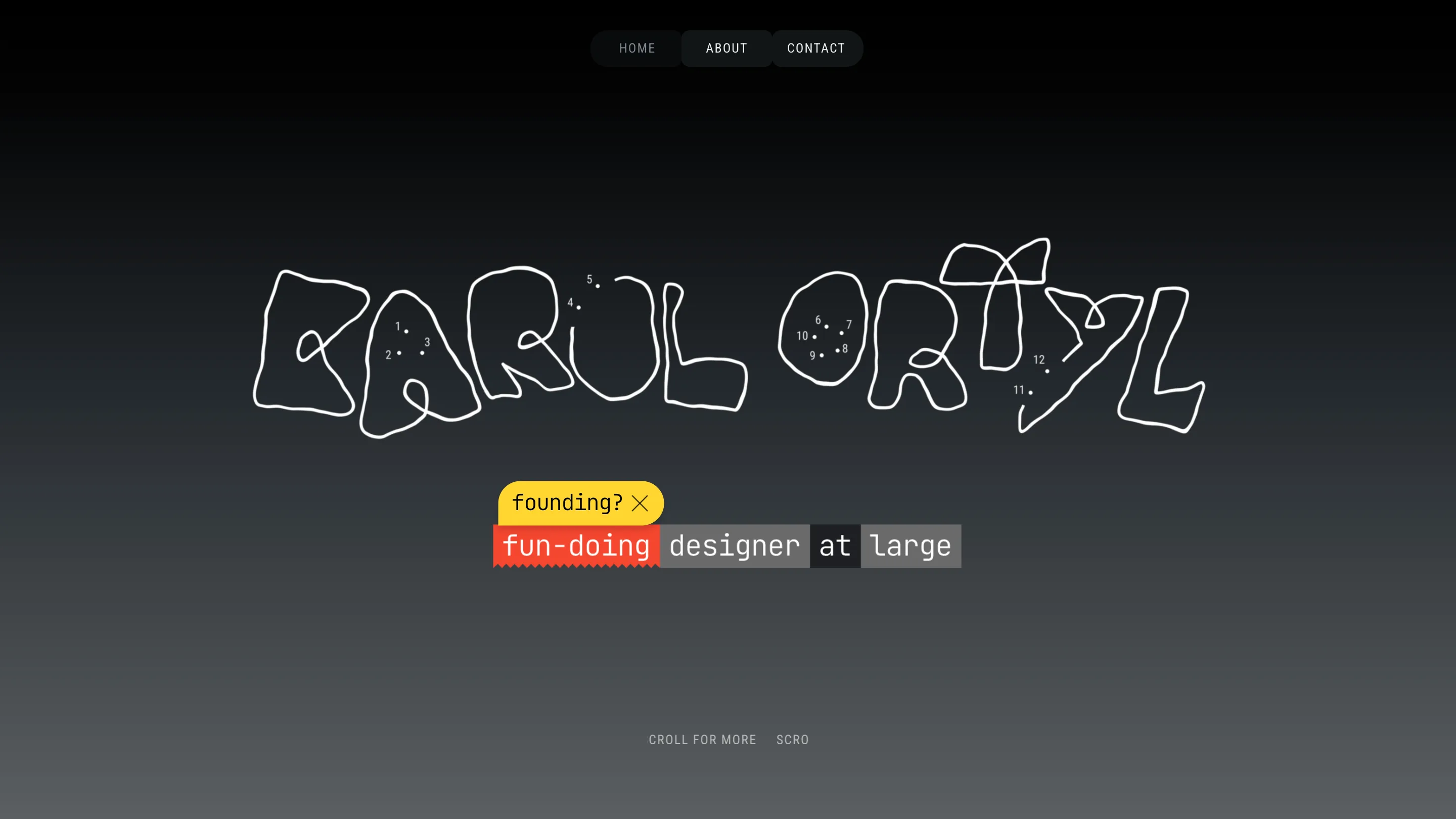
The wordmark up top is drawn by hand, wobbling letters with little numbered dots scattered through them like a connect-the-dots puzzle. Under it, a marker-highlighted line reads "fun-doing designer at large", with the word "founding?" struck through beside it. It's a small joke about the founder title everyone claims now, and it tells you more about the person than a paragraph would. The disciplines he lists (web, product, system, brand, sound) sit in the same casual hand. The top of the page is warm before you've seen a single project.
The ending is a joke, and it lands
Scroll to the bottom and the dark grey gives way to concentric red rings closing in on a Looney Tunes "that's all folks", set in that cartoon cursive. It's the iris-out that ends every old short. On a portfolio it does two things at once: it signs off with personality, and it makes the page feel finished, bounded, like a reel that just ran out. The contact links sit quietly underneath.
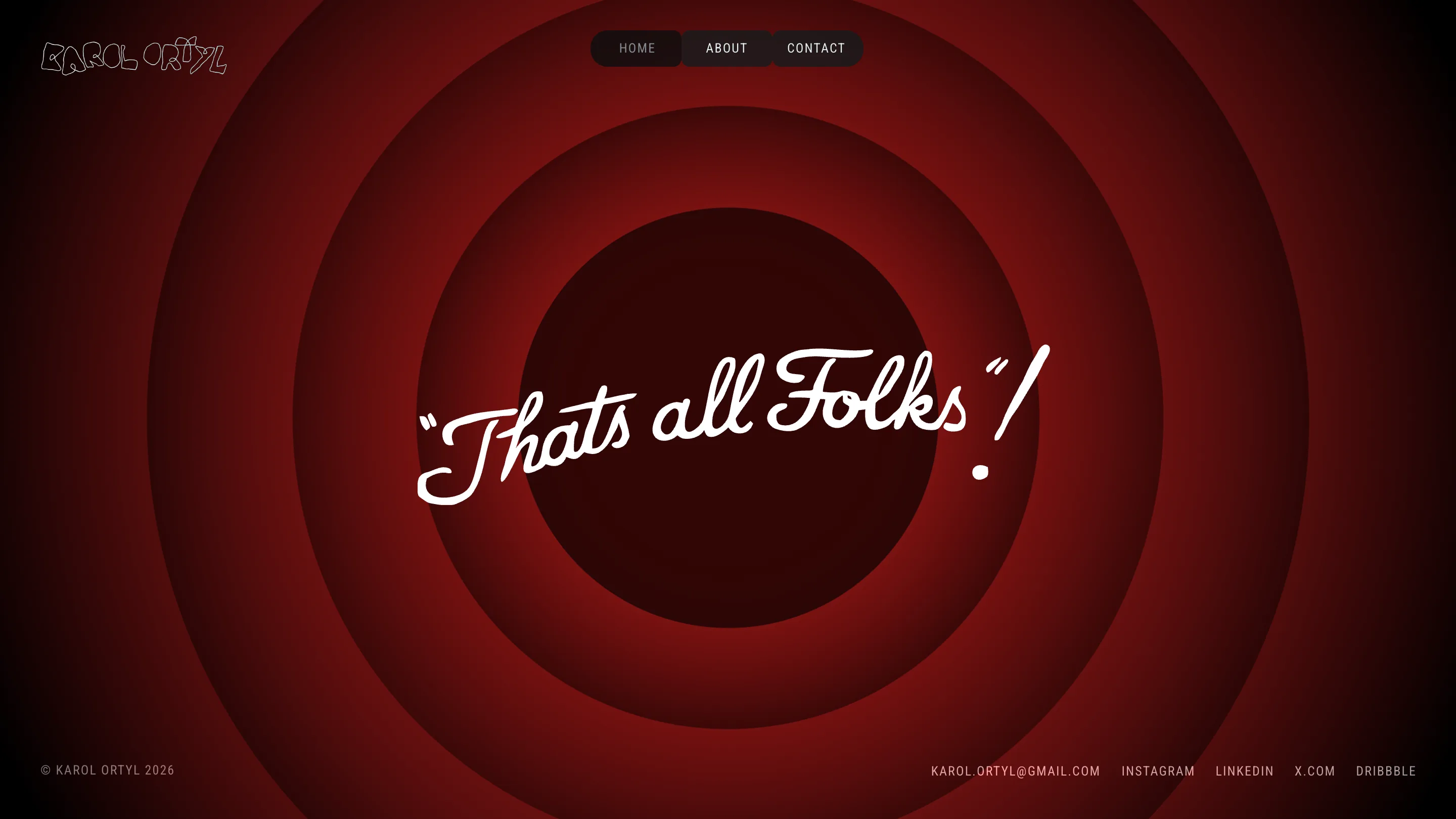
The site works because the system and the personality pull the same direction. The figure numbering is disciplined, almost clinical. The hand-drawn type and the cartoon ending are loose and funny. Held together they read as one designer who's serious about the craft and relaxed about himself. Found via minimal.gallery. See the whole thing at Karol Ortyl.