StageCrew's index-style portfolio layout lets the work speak first
The design studio pairs a scrolling image column with a running project index. It shows the work and explains it on one screen, no case-study clicks required.
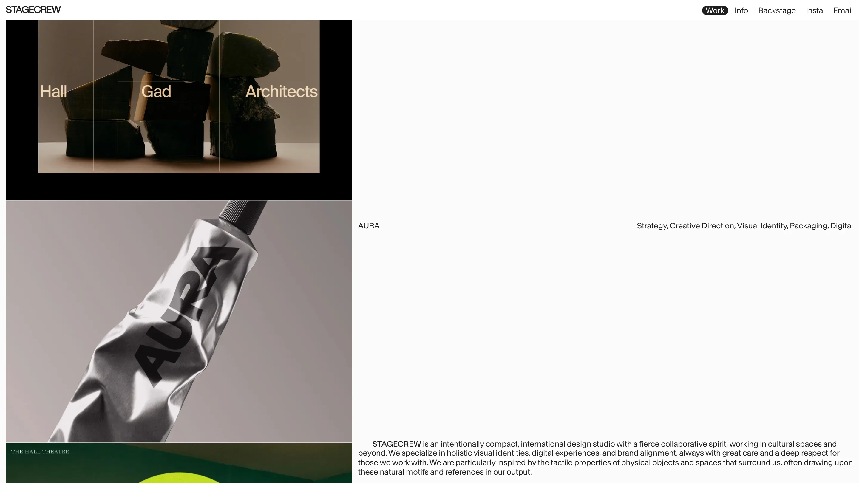
Open StageCrew and the first thing you notice is what's missing. No hero headline stretched across the viewport. No autoplay reel. The page splits in two: a column of work on the left, a running project index on the right. That index-style portfolio layout is the whole idea, and it lets the work speak before the studio says a word.
StageCrew calls itself a compact international design studio working in cultural spaces. The site reads like one. Every choice points attention at the projects and away from the frame around them.
The index does the navigating
Down the right side sits a list. A project name, then the disciplines that went into it. "AURA", and beside it: Strategy, Creative Direction, Visual Identity, Packaging, Digital. That one line does two jobs. It names the work, and it tells you exactly what StageCrew was hired to do, in plain terms. You scan five words and you know the scope.
The left column carries the images. A Hall Gad Architects case up top, a silver AURA tube shot like a sculpture, The Hall Theatre sitting under a disc of acid green. As you scroll, the picture column and the index stay in conversation. The image shows the craft, the index labels it. You never land on a separate services page, because the services are pinned to the proof.
The top nav keeps the same discipline: Work, Info, Backstage, Insta, Email. Five words, no dropdowns. "Backstage" is the only wink, and even that earns its place by promising the process behind the finished work.
Small type, big pictures
The typography is deliberately quiet. The wordmark up top is set small. Captions sit at the size of a footnote. Project metadata runs in a light grey you lean in to read. On most sites that would read as timid. Here it's a decision: shrink the type so the photography owns the page.
It holds up because the images can take the weight. The product shots are lit and styled with real care, the tactile physical surfaces StageCrew says it draws from. When the pictures are this good, oversized display type would only get in their way.
Near-monochrome, one accent
The palette is mostly black, white, and grey, which makes the single hit of acid green in the Hall Theatre block land hard. One colour, used once, reads as confidence. It also keeps the eye moving block to block, with no section shouting over the one above it.
What a designer can take from it
The part worth stealing is the structure. Pairing a scrolling image column with a fixed project index solves a problem every studio site has. You want to show the work and explain it without sending the visitor into ten separate case pages. StageCrew answers that in one screen.
If you build your own, the index has to be honest. StageCrew's works because the disciplines are specific and the images back them up. List "Strategy" next to a weak logo and the layout exposes you. That's the trade with an index-style portfolio layout. It gives the work room, and it gives you nowhere to hide.
Found on minimal.gallery. Site by StageCrew.