Huts turns a custom home service into a productized catalogue
Huts sells slow, bespoke country homes. The site Milkshake Studio built makes that service browsable, naming eight house types and drawing each one, so a fuzzy commission feels like picking a product off a shelf.
Huts designs and builds homes on rural land across the US. That's a bespoke service, months of work per client, the kind most firms sell with a portfolio and a contact form. The site Milkshake Studio built for them does something smarter. It turns the service into a productized catalogue you can browse before you talk to anyone.
Name the thing, then draw it
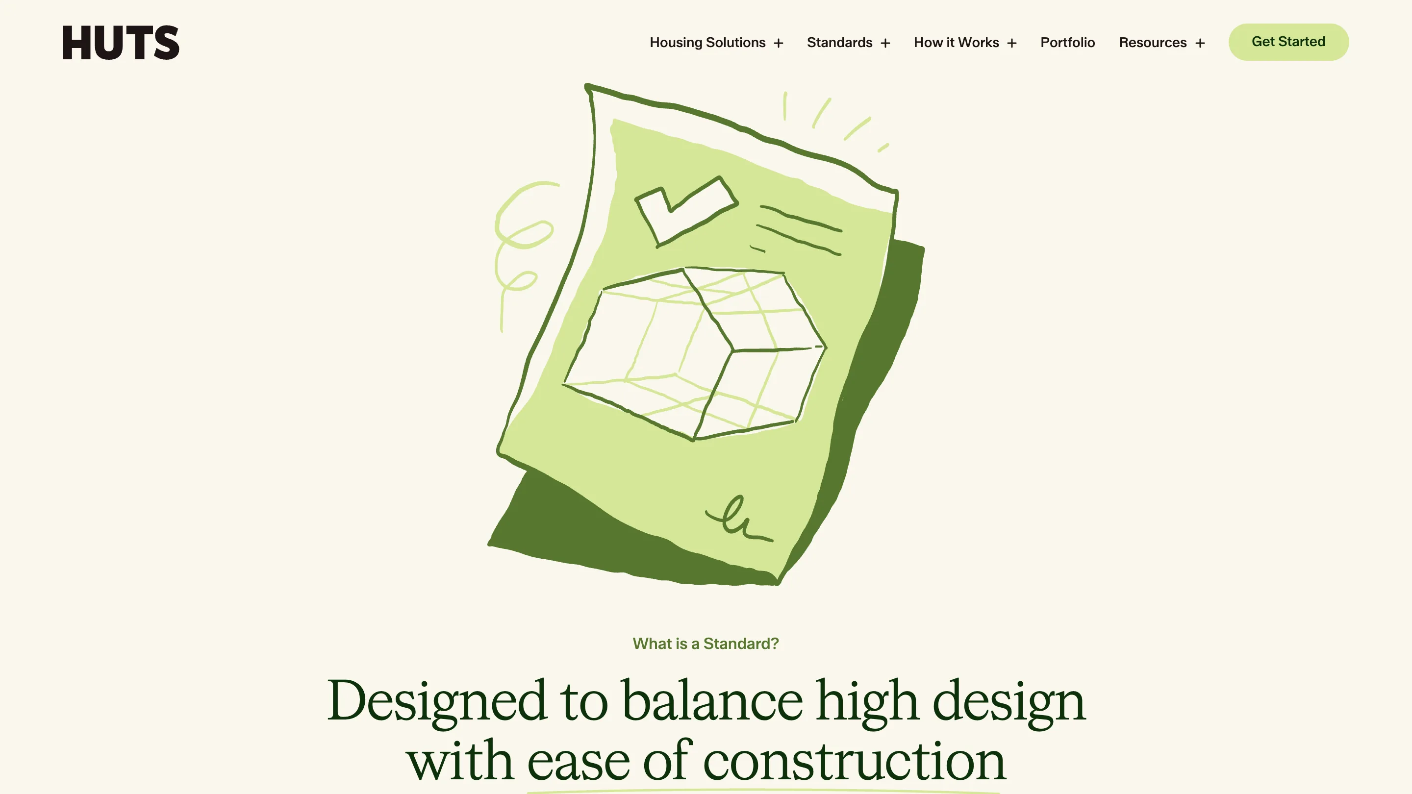
The heart of the site is a page called Standards. On it, Huts breaks every home it makes into eight named types: ADU, Small Bar, Medium Bar, Big Bar, Small L, Big L, Dogtrot, and Village. Each one carries a bed and bath count and a clean axonometric drawing. Underneath them all sits a 16-foot grid that keeps construction cheap and waste low.
That naming is the whole trick. "We design custom homes" is abstract, and abstract is hard to buy. A shelf of eight named products with specs is concrete. You can point at the Dogtrot the way you'd point at a chair in a catalogue.
Serif type over drone footage
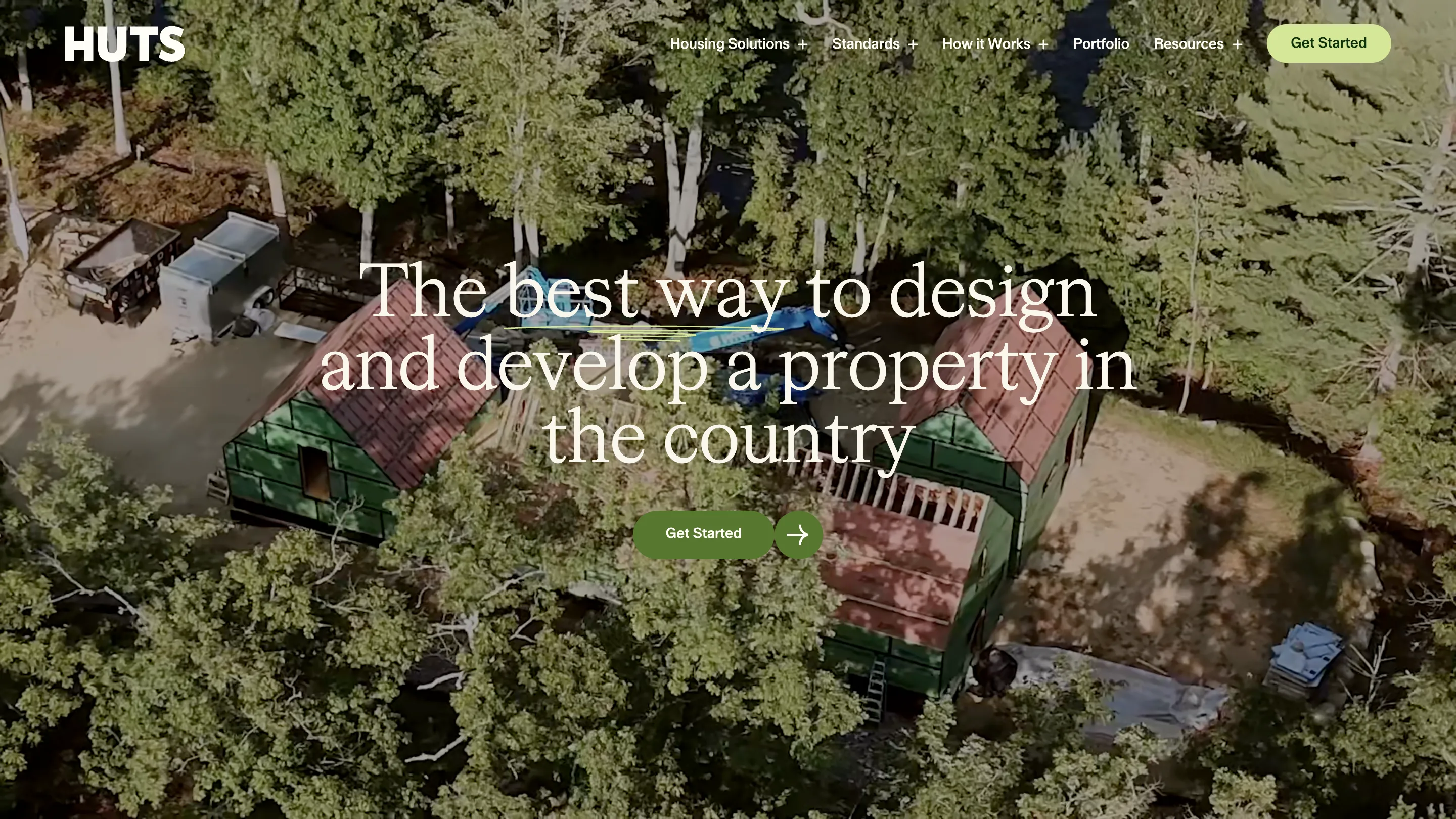
The homepage opens on an aerial shot of a green-roofed cabin buried in forest, with a book-weight serif set large across it: "The best way to design and develop a property in the country." The palette is cream, moss, and the greens of the trees themselves. The one button, a soft green pill, says Get Started.
The type choice does a lot of quiet work. A transitional serif reads architectural and editorial, closer to a design monograph than a proptech dashboard. It tells you Huts cares about the object itself, before you've read a word of copy.
The spec sheet closes
Click into a standard and you get a product page. The Dogtrot render shows a dark two-gable cabin split by a central breezeway, stepping stones crossing water to the door, mist in the trees. The name sits bottom-left. Two chips read 2 Bed and 1.5 Bath. That's it: a picture, a name, a spec, a plan.
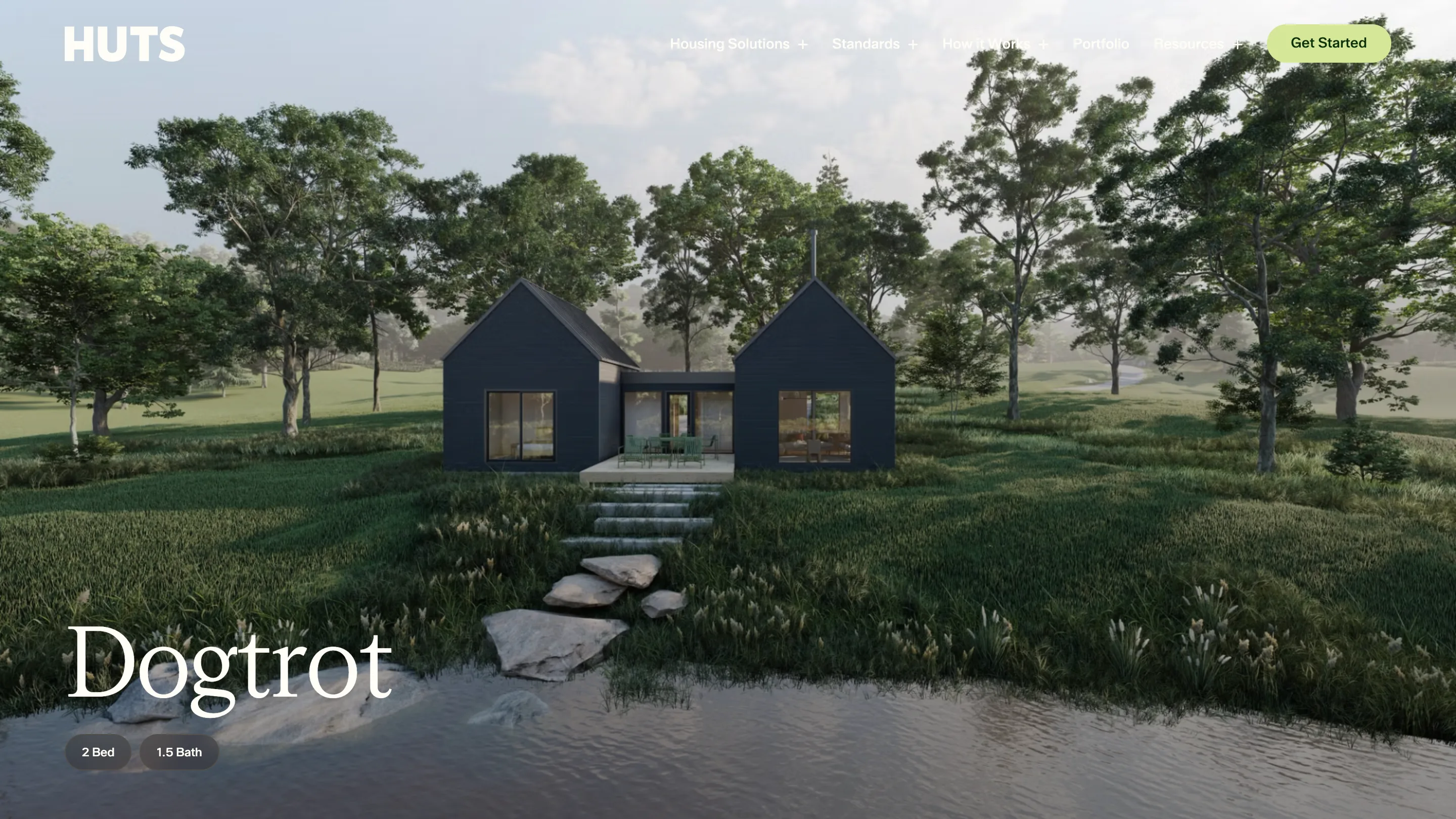
Every standard page follows the same shape, so once you've read one you can read the rest in seconds. The render sells the feeling, the spec answers the practical question, and the plan proves it's real. A months-long commission starts to feel like something you can hold in your head.
Why a productized service works here
Big custom purchases scare people because the price and the outcome stay fuzzy until late. A productized service pulls both forward. You see the range, the specs, and the design quality on your own time, and the sales call becomes a conversation about which of eight things you want. The hard part, trusting a stranger with a blank commission, is already mostly done.
Milkshake Studio didn't invent the pattern, but the execution is worth studying: the naming discipline, the shared grid, the restraint of one serif and one green. I found Huts on Siteinspire, still one of the better shelves for work like this.