Counter Forms runs its type foundry web design on grey cards and a single orange
A Melbourne platform for antipodean type designers sets every essay in the faces it sells, sizes each catalogue card to the family it holds, and spends its only colour on the tester controls.
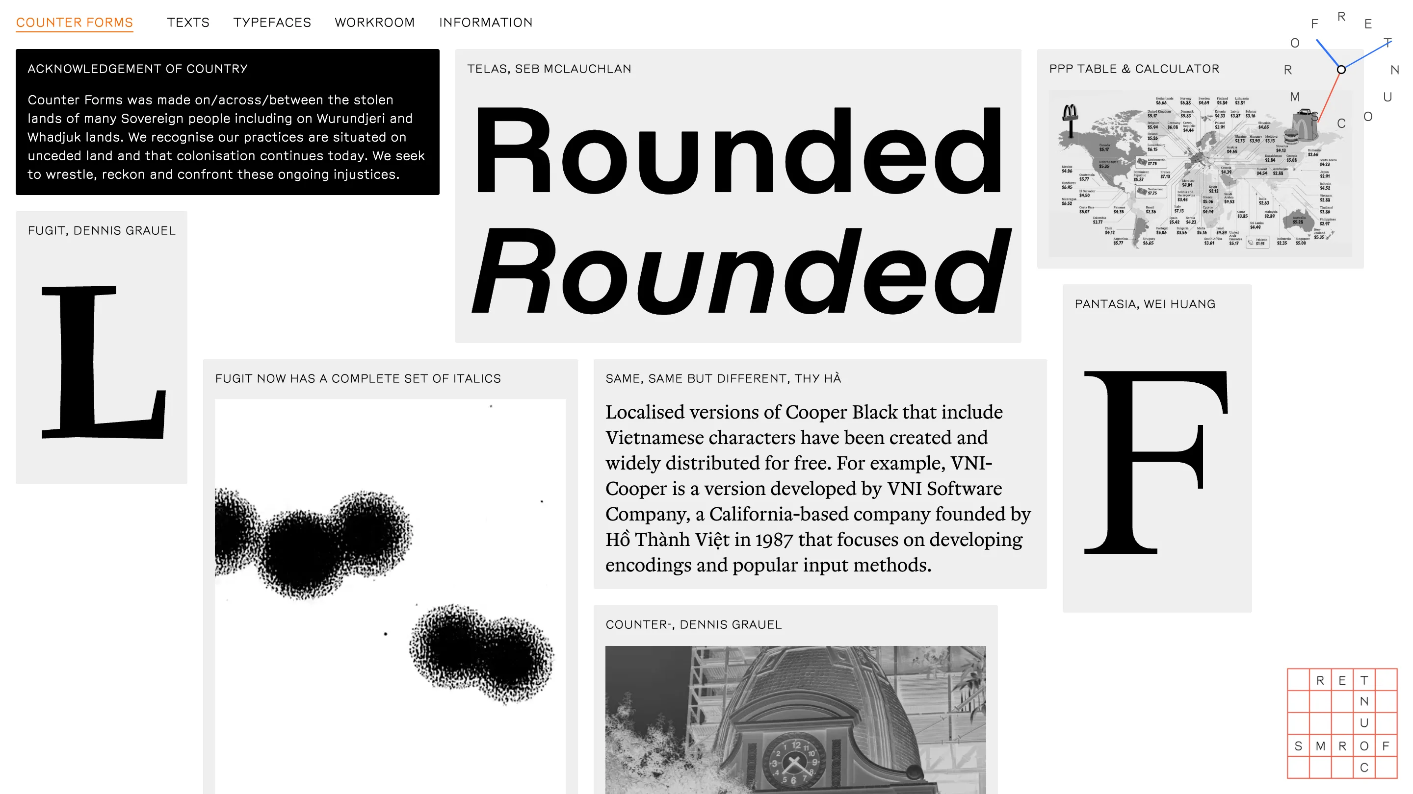
Counter Forms sells five typefaces and sets every word it publishes in them. The site is a foundry, a magazine and a research project at once, and it carries all three on a white page with grey cards and one orange. It's the most disciplined type foundry web design I've read this year, and the discipline is the point: every choice on the page is a choice about type, argued in type.
Counter Forms runs out of Melbourne, founded by Dominic Hofstede, Vincent Chan and Robert Janes, and calls itself a platform for emerging, discursive, antipodean type designers. Five families are out so far: Fugit by Dennis Grauel, Eyja by Thy Hà, Telas by Seb McLauchlan, Pantasia by Wei Huang, Herbik by Daniel Veneklaas.
The card is the size of the family
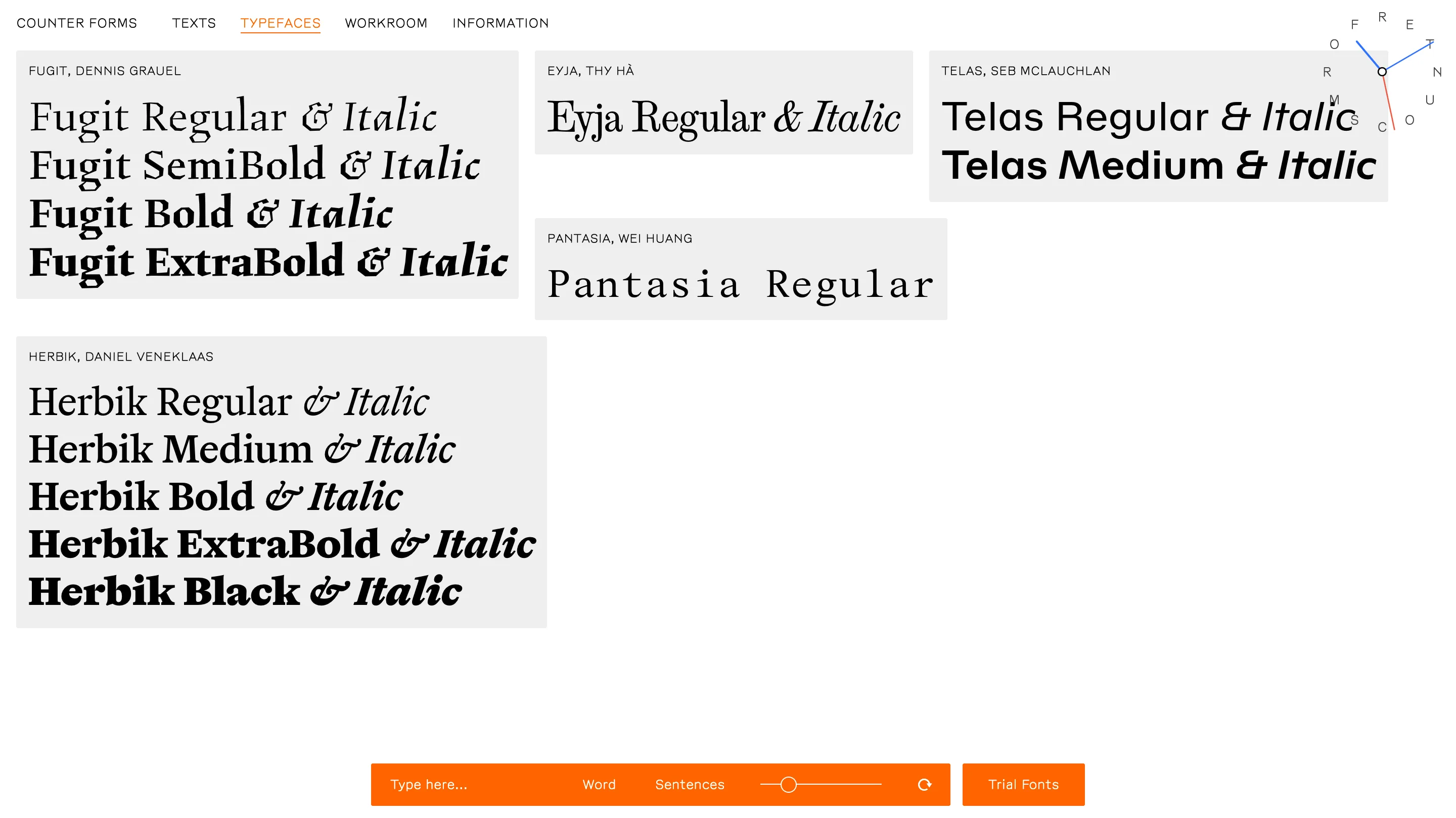
On the typefaces page each family gets one grey card, and the card is as tall as the family is deep. Herbik ships five weights with italics, so its card runs ten lines and holds the left column on its own. Pantasia has one weight, so its card is a single line and sits small beside the rest. Nothing explains this. You read the catalogue and you already know the shape of every family before you click.
A sticky orange bar sits at the bottom: a text field reading Type here, a Word and Sentences toggle, a size slider, a reset, Trial Fonts. The catalogue doubles as the tester.
The specimen edits in place
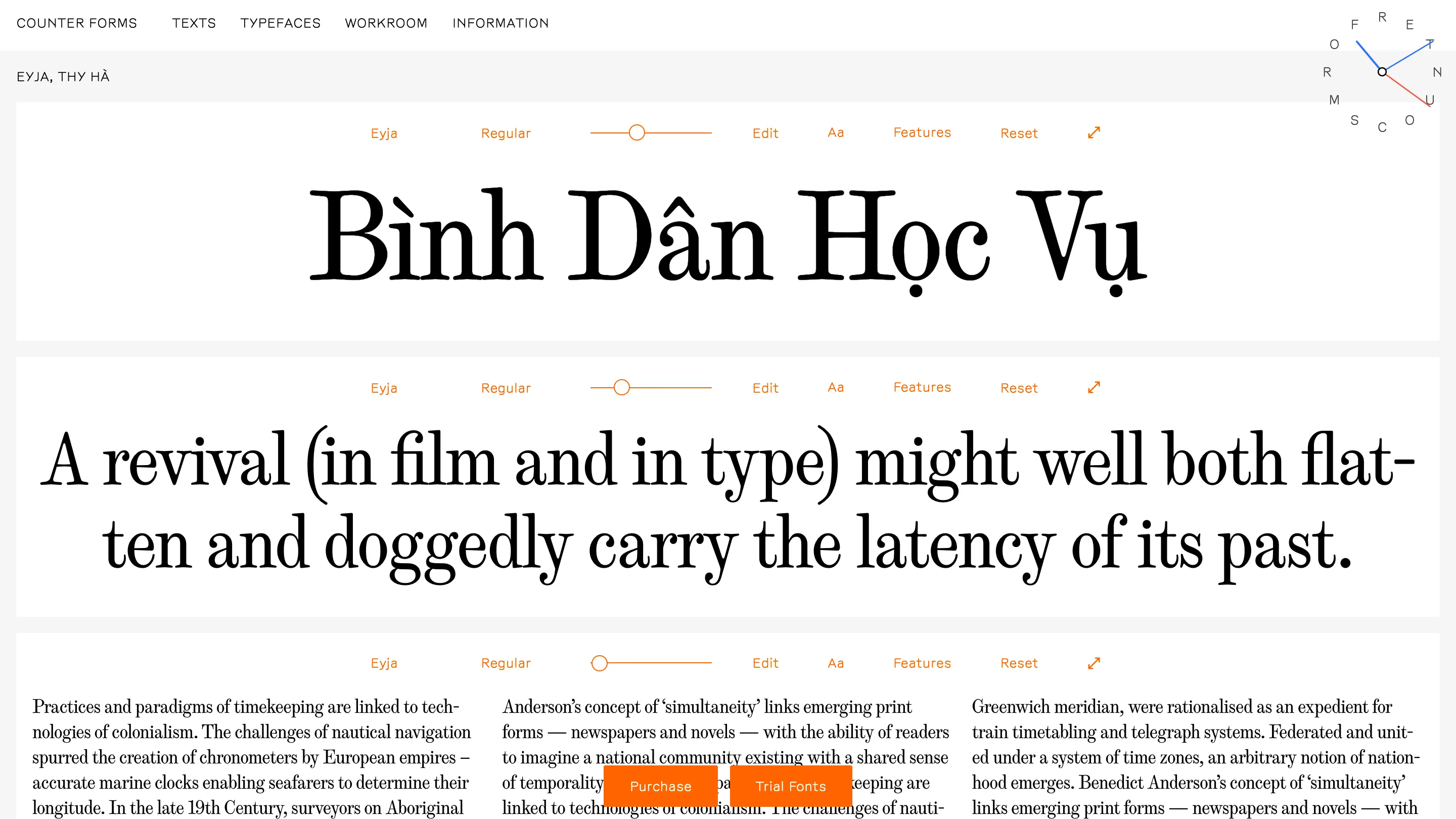
Every specimen band on a typeface page carries its own toolbar: family, weight, size slider, Edit, Aa, Features, Reset, expand. All of it small, orange, sitting above the type it drives. The bands work one at a time, so you can pull one line apart and leave the paragraph under it alone.
Eyja opens on "Bình Dân Học Vụ" at display size. Thy Hà drew it as a revival of a serif she found in an 1852 Icelandic travel book, bought from a Facebook Marketplace collector during Melbourne lockdown when the antique shops were shut. The face covers more than 200 languages. Opening its specimen on Vietnamese diacritics, big, says more about how the thing is drawn than a support list would.
The mark is a clock running backwards
Top right of every page, the wordmark doesn't sit in a line. The letters of COUNTER FORMS run around a circle, with two hands, one orange and one blue, reaching out from a node at the centre. It reads as a clock. A counter-clock, and it comes straight out of Dennis Grauel's essay "Counter-", on the clock atop Bolivia's Congress building in La Paz being reconfigured in 2014 to run anti-clockwise, described at the time as a symbol of decolonisation and an expression of southernness. The logo is the thesis.
The writing gets the same type as the product
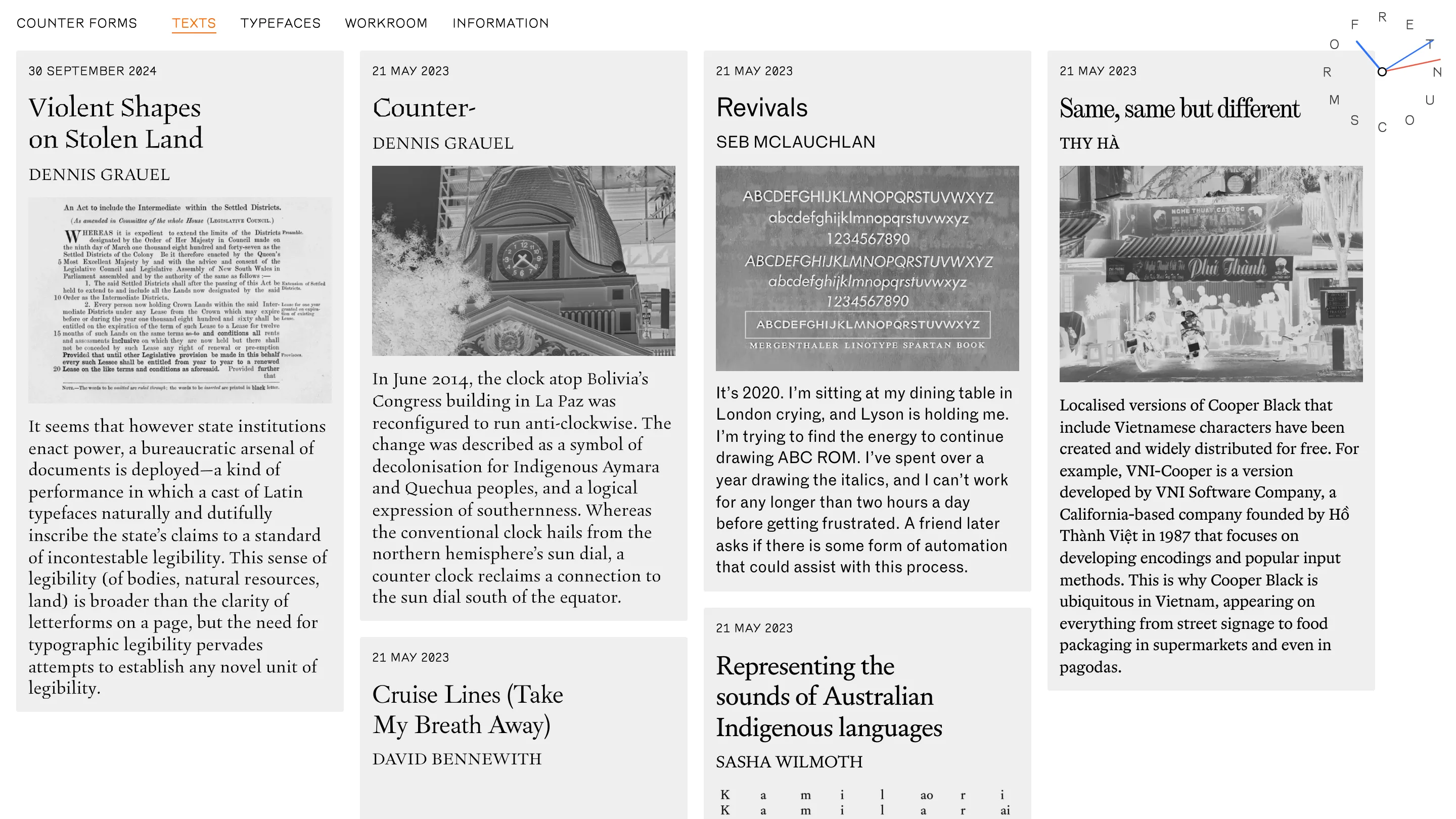
The texts page holds six essays as cards, each title set in one of the five faces. Sasha Wilmoth, the project's Aboriginal language advisor, writes on representing the sounds of Australian Indigenous languages. Grauel writes on how state institutions lean on Latin typefaces to inscribe a standard of incontestable legibility. Thy Hà writes on VNI-Cooper, the localised Cooper Black that VNI Software built for Vietnamese in 1987 and gave away, which is why Cooper Black turns up on street signage, food packaging and pagodas across Vietnam.
The first card on the home page is black, and it's an Acknowledgement of Country. It runs before anything is for sale.
What type foundry web design can take from this
The palette is white, one grey, black, one orange. The orange only ever marks something you can touch: the live nav item, a tester control, the trial button. Everything else on the page is type selling itself by being read.
Found via Httpster.