Beats In Space is the best argument for archive-first web design
Thomas Hervé Studio rebuilt the Beats In Space site around 27 years of radio. Every section opens as a column instead of a page, and the mix never stops playing.
Tim Sweeney has been running Beats In Space since 1999, first on WNYU 89.1FM in New York, now weekly on Apple Music. Thomas Hervé Studio rebuilt the show's site this month, and it's the sharpest piece of archive-first web design I've seen all year. The archive isn't filed away behind the site. The archive is the site.
It went up on siteinspire on 6 July, which is where I found it.
Archive-first web design opens on the shelf
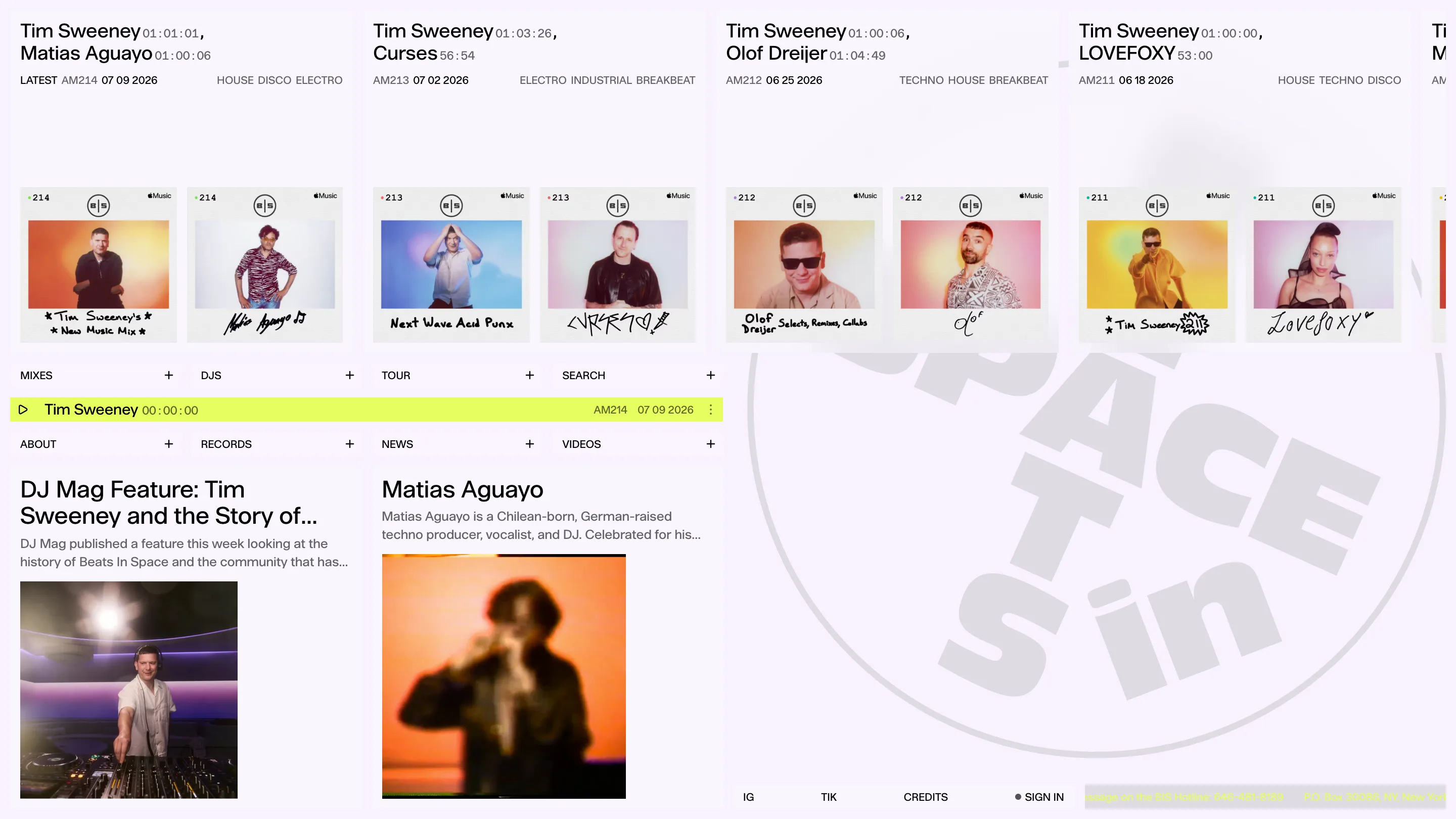
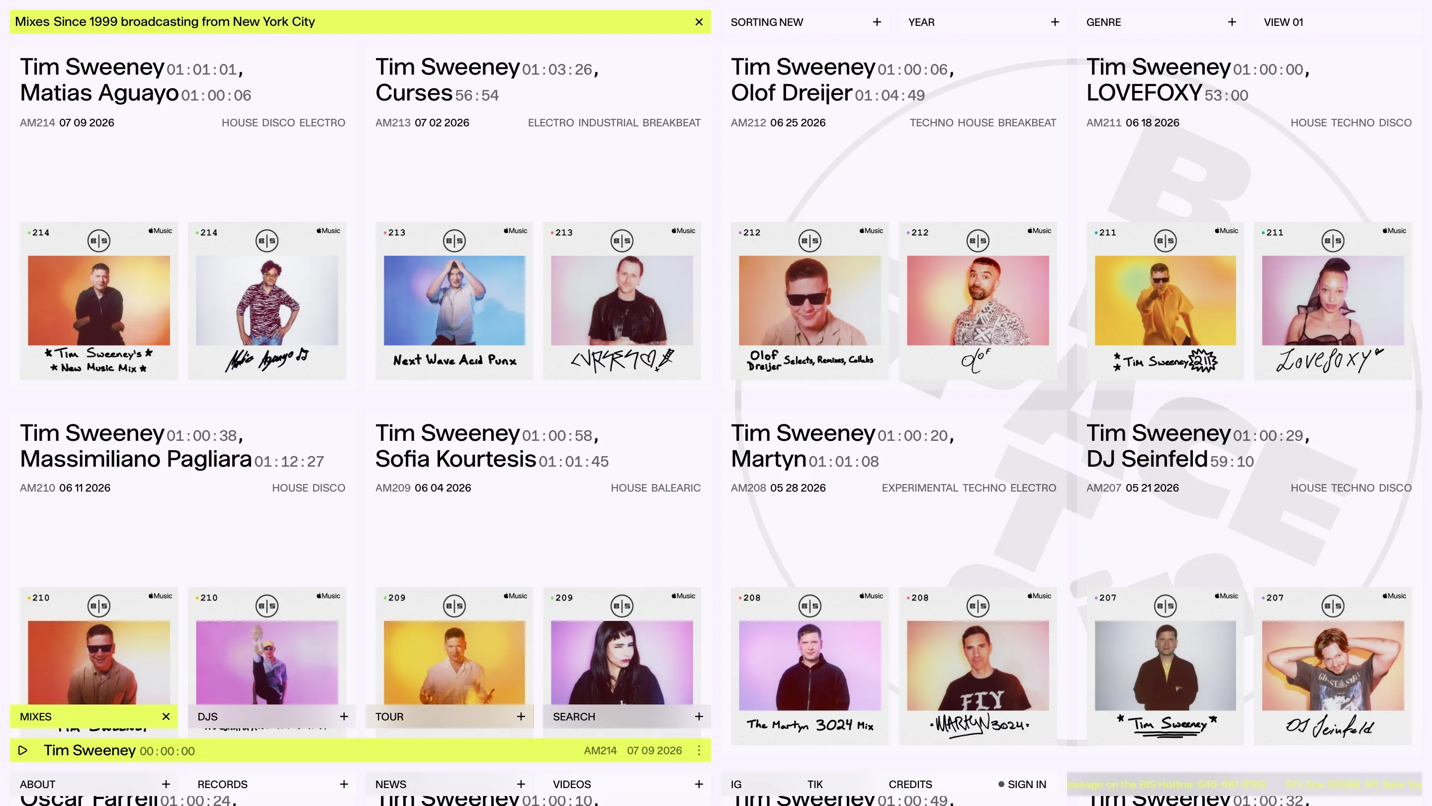
Load beatsinspace.net and you get no hero, no mission statement, no drone shot of a crowd with their hands up. You get mixes. Newest first, running sideways off the right edge of the screen, each one a card with the DJ's name, the runtime, the show number, the date, the genres. The newest is AM214, dated 07 09 2026. The one behind it is AM213. You can keep going.
The header strip of that column says "Mixes Since 1999 broadcasting from New York City" and then gets out of the way. Twelve words of positioning, and the studio trusted the shelf to do the rest.
What sits next to that line is the real tell: SORTING NEW, YEAR, GENRE, VIEW 01. Those controls are the first interface element on the page, ahead of any marketing. A radio show with 27 years behind it has one question a visitor actually arrives with, which is "what do you have", and Hervé answered it by putting the query on top.
Columns, not pages
Eight sections run along the bottom of the screen like drawer handles: MIXES, DJS, TOUR, SEARCH, ABOUT, RECORDS, NEWS, VIDEOS. Each has a plus sign. Hit it and the section opens as a full column beside the one you were already reading, and the plus flips to an ×. Hit that and the column closes. Nothing navigates. Nothing reloads.
So you can have the mix archive open on the left, the DJ wall in the middle, and the about text on the right, all at once, and close them in any order you like. It reads like a stack of index cards fanned out on a desk.
The reason this is the right call rather than a party trick is the yellow bar pinned across the bottom. That's the player. On a site whose entire product is hour-long mixes, a page navigation that kills the audio isn't a design decision, it's a bug. Columns let Sweeney's set keep running while you dig through 1999.
The type splits the labour
Two jobs, two treatments. Names get a grotesque, set big and tight: Tim Sweeney, Matias Aguayo, Sofia Kourtesis, DJ Seinfeld. Everything factual drops to mono and shrinks: AM212, 06 25 2026, TECHNO HOUSE BREAKBEAT, 01:04:49.
That runtime is the detail I'd steal. It's set as a timecode, hours to seconds, in the same mono as the catalogue number. So 01:00:06 and 56:54 line up as data rather than as copy. It's a small move that tells you the studio understood it was designing a library catalogue rather than a landing page.
Colour does almost nothing, which is why it works. The whole thing is off-white and near-black, with acid yellow reserved for exactly two things: the player, and whichever column you currently have open. One colour, one meaning.
The DJs page is the flex
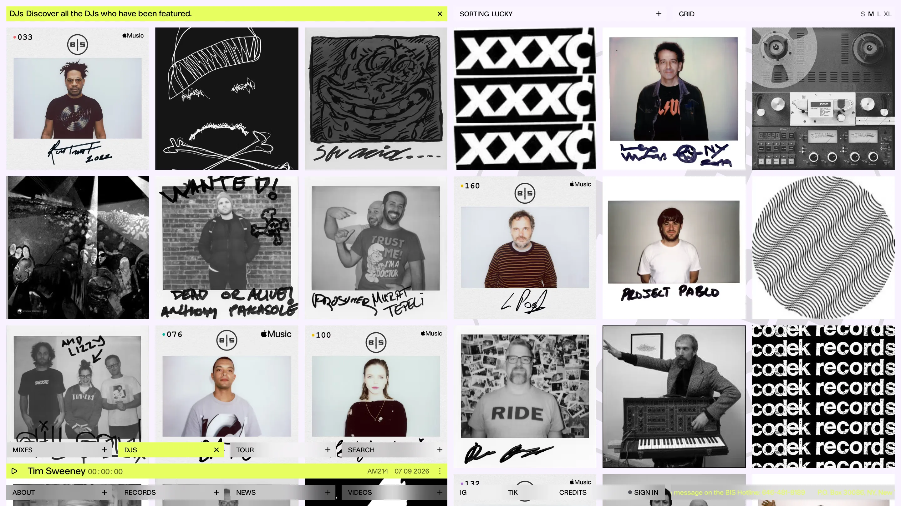
Open DJS and you get a wall of polaroids, most black and white, every one signed by hand across the bottom by the DJ who played. Anthony Parasole scrawled "DEAD OR ALIVE". Project Pablo wrote his name in block caps. Somebody drew a face.
Those signatures are 27 years of guests physically marking a card in a booth in New York, and the site puts them at full size on a grid you can resize with S M L XL. The sort control offers a mode called LUCKY. A studio that gives you a lucky-dip button on a talent index knows the archive is the entertainment.
One page of prose in the whole site
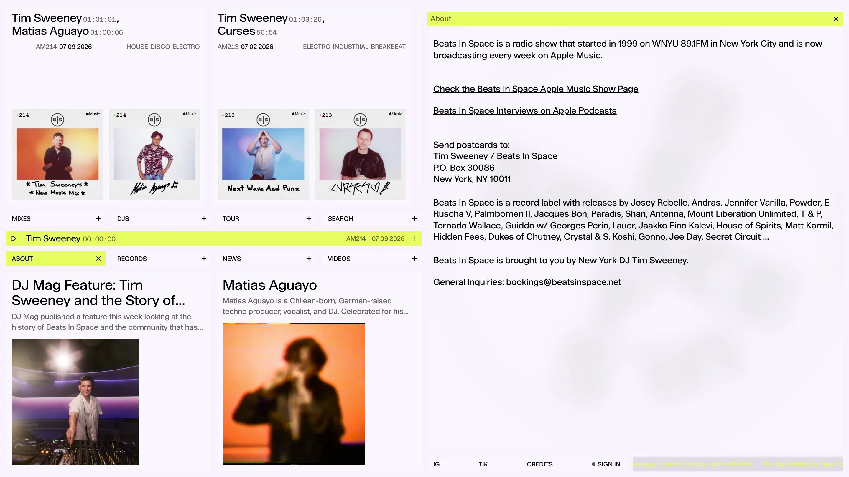
The about column is maybe 90 words, a P.O. box, and a list of the label's releases. No founder story. No values. It tells you the show started in 1999 on WNYU, it's on Apple Music now, and you can send postcards to NY 10011.
That restraint is what archive-first buys you. When the work is stacked in front of the visitor and sorted five ways, the site doesn't need a paragraph explaining that the work is good. Hervé built the shelf and let 214 mixes make the argument.