Coca-Cola's global visual identity is now one design system
On 20 July Coca-Cola put 200+ markets on a single visual identity built by JKR, with a Brand Center and AI trained on the archive to police it.
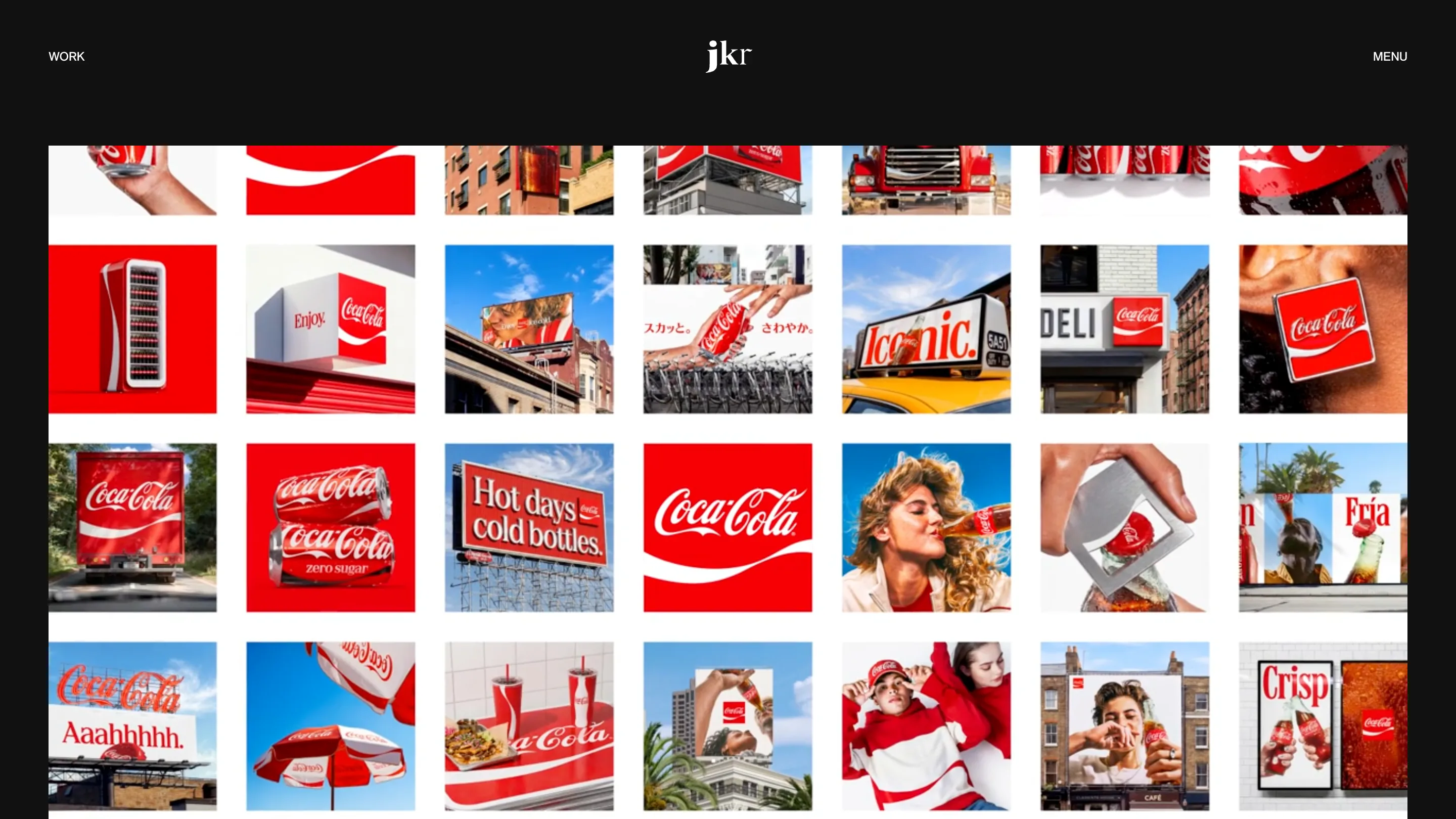
Coca-Cola spent the last decade letting 200-plus markets interpret the red. On 20 July 2026 it stopped. The company published a single global visual identity system, led by branding agency JKR, and shipped the governance layer alongside it: a Brand Center, packaging standards, photography standards, and a set of AI tools trained on the brand archive.
The design work is the smaller half of that sentence. The interesting half is the second one.
What actually changed on the can
Four assets got promoted: the red and white palette, the Dynamic Ribbon, the Arden Square (the framed red block first drawn in 1969), and the Spencerian script. Nothing was invented. The system decides how often each one shows up and at what size.
On cans the wordmark rotates from horizontal to vertical, which buys it height on a shape that has almost no width. Multipacks drop the stretched wordmark across the sleeve and use a horizontal photograph of the can instead, so the pack reads as the product rather than as a banner. Brody Associates wrote the type specs. The Superultrarare built the packaging system.
Coke Zero Sugar took the bigger hit. The logo flips from black to white, "Zero Sugar" grows into a large serif, the Dynamic Ribbon on the can turns black, and the PET bottle gets a black cap. Zero Sugar drinkers will notice this in a shop before they notice anything else in the refresh.
The Coca-Cola visual identity is a governance problem
Read the press release and the word that keeps surfacing is consistency, not newness. "This refresh is about being clearer and more consistent in how we show up, wherever people experience our brand," said Arnab Roy, president of Coca-Cola Global Category. Rapha Abreu, the company's global VP of design, framed the goal as one recognisable brand experience rather than one new look.
That is the same problem a product team has with a design system at a fraction of the scale. You can draw the components. Getting 40 squads to use them without a private fork is the work. Coca-Cola has agency partners in more than 200 markets, all producing assets in parallel, most of them never in the same room.
So the rollout ships three things product designers will recognise. A Brand Center, built with Forpeople and Monks, which is the documentation site. A set of "Design Intelligence" tools built with Adobe, internally called Project Fizzion, with models trained on Coca-Cola's own archive. And photography standards, set with Guy Aroch, Anna Palma and Martin Wonnacott, so the image layer stops drifting market by market.
AI as the linter, not the designer
Project Fizzion is worth watching because of where it sits in the pipeline. It is not generating campaigns. It is trained on decades of approved work and pointed at the output of hundreds of teams, which makes it closer to a linter than to a design tool. The archive becomes the rule set. The model checks the work against it.
If that pattern holds, the deliverable at the end of a large identity project changes shape. A PDF of rules is a document someone has to read. A model trained on the archive is a check that runs whether or not anyone read the document. Design systems teams have been arguing for exactly this with tokens and lint rules for years, on interfaces rather than on packaging.
The rollout
Europe, the Middle East and India are live now. Latin America and Asia follow. North America lands in 2027, which tells you how long a system this size takes to reach every cooler, truck and drive-through menu board.
JKR has held Coca-Cola for years and its own positioning line is "Be Distinctive Everywhere." This is the everywhere part, made operational. The logo did not change. The permission to reinterpret it did.