Trevor Noah's site drops a prop into every page title
One rule holds trevornoah.com together: every page opens on a giant pink word with a real object pushed through the middle of it.
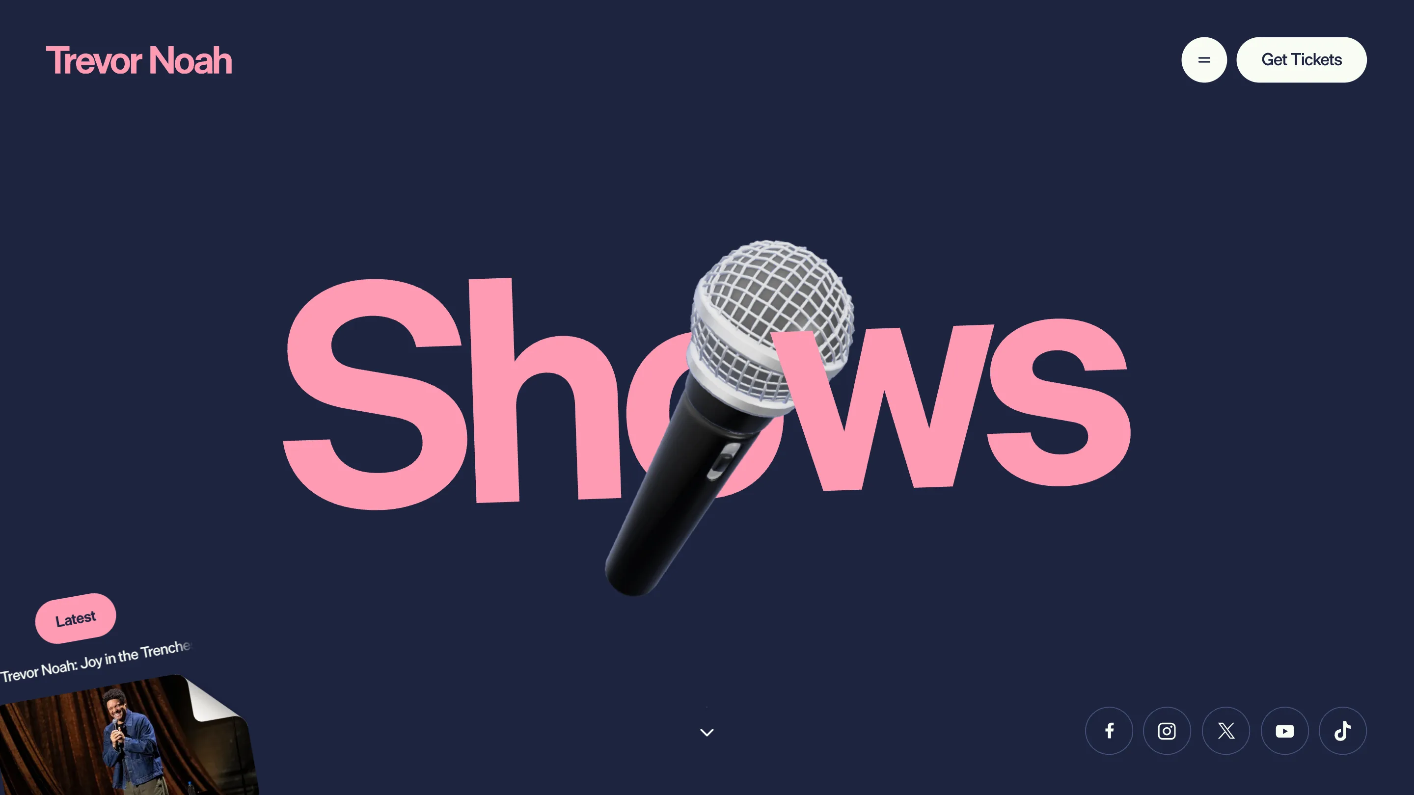
Load trevornoah.com/shows and the page title is the page. One word, Shows, pink, running most of the width of the screen on navy. A chrome microphone hangs diagonally through the middle of it, big enough to swallow the O and cover half the W. Above the fold there is nothing else: a wordmark, a menu button, a Get Tickets pill.
That page title design is the rule for the whole site, and it's most of why OFF+BRAND took awwwards Site of the Day on 3 September 2026 with a 7.45, and a 7.78 on creativity.
The same move, four times
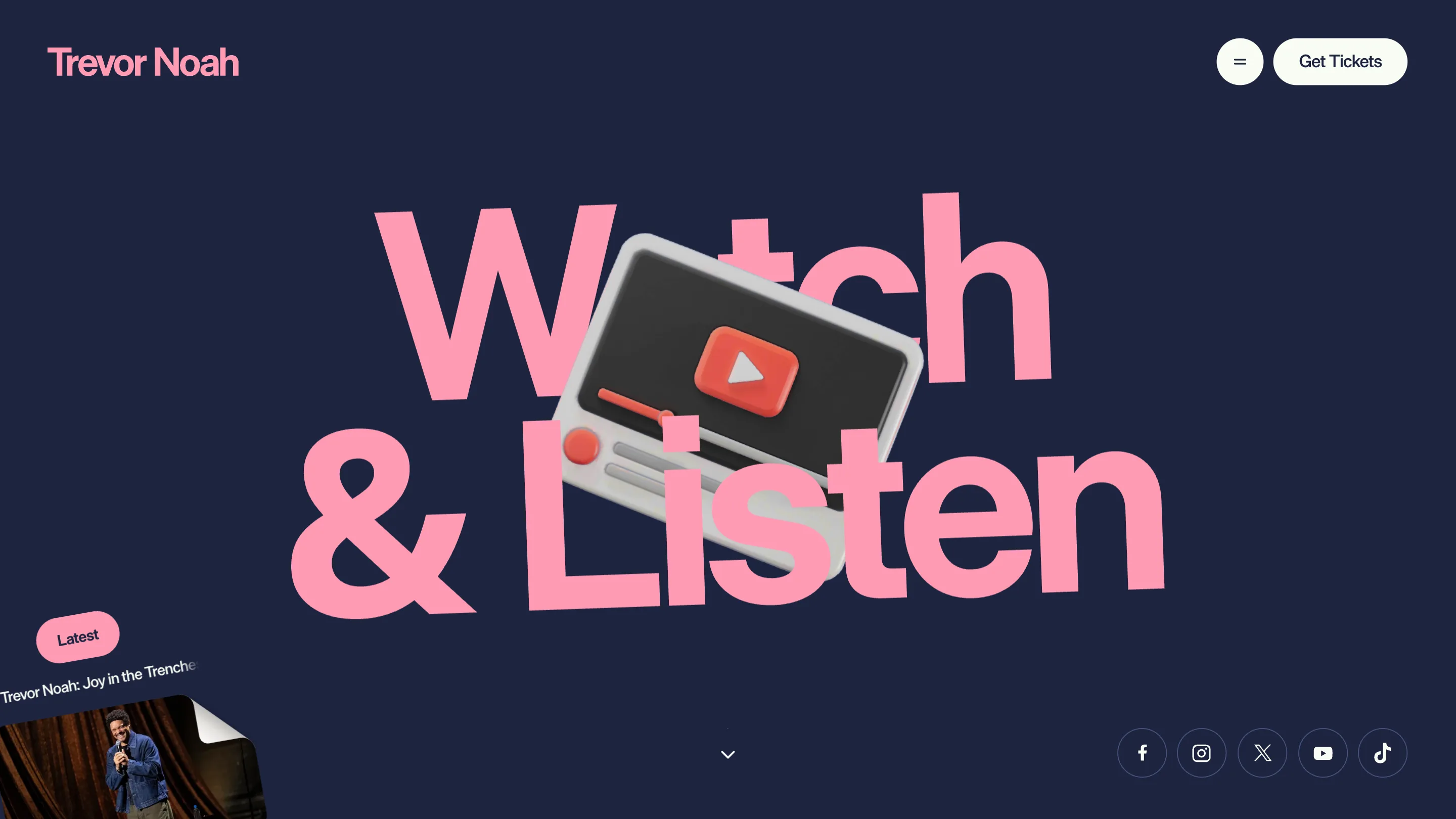
Watch & Listen gets a chunky media player, tilted, its red play button landing in the gap between the two lines of type.
Books gets three of his own covers, fanned and standing on the baseline, so the word behind them reads as a shelf. Born a Crime and Into the Uncut Grass sit high enough to cut the letters in half and low enough to leave the tops legible.
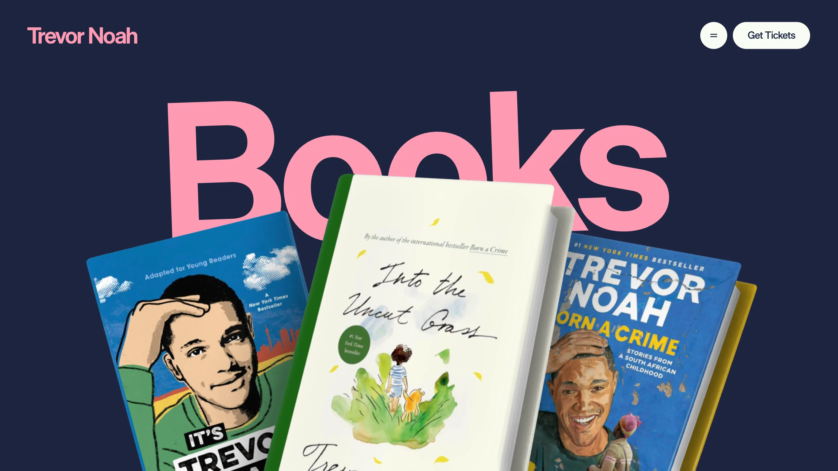
Each prop is a 3D render with a hard studio shadow, and each one is scaled to the type rather than to the page. That's the discipline. The object never floats decoratively in a corner. It lands in the middle of the word and takes a letter with it.
The type helps. It's one tight grotesk, one weight, one size per page, set so the counters are big enough to hold something. A condensed face would have nowhere to put the mic.
About is where it pays off
On /about the prop is his face. A cutout head with a white sticker outline, eyes wide, dropped exactly into the O of About.
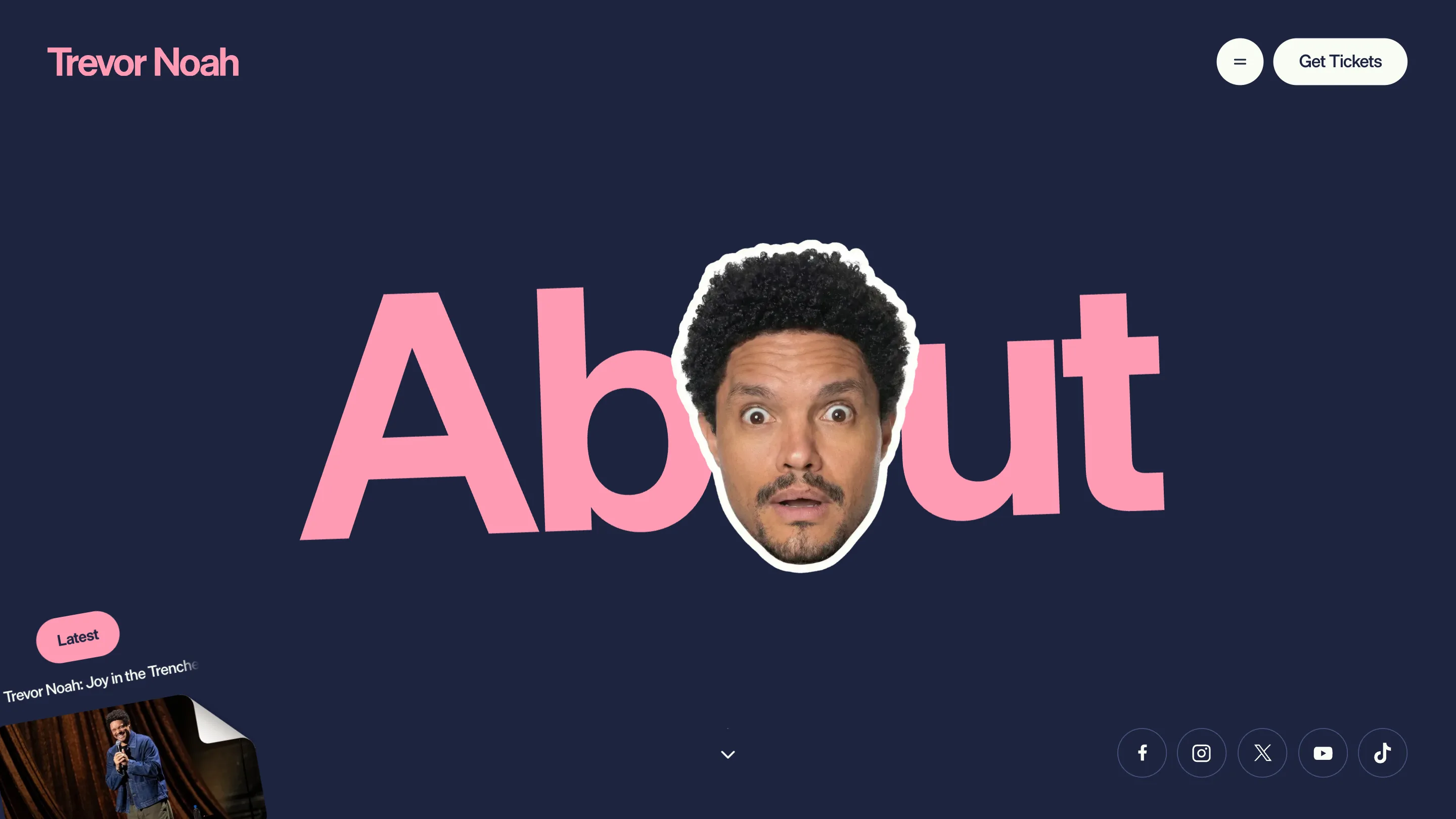
The gag only works because the pages before it trained you to expect an object in that slot. A microphone, a media player, a stack of books, then the guy himself. Set up, set up, set up, turn. It's a comedian's structure wired into navigation, and it means the About page is already funny before a word of copy loads.
Two colours, and the props do the rest
The palette is #FF9BB4 on #1D2440. Pink type, navy ground, white for the props and the pills. There is no third colour on any of the section headers, which is what keeps the renders from fighting the type. Held to pink on navy, the object is the only thing on screen with material and shadow in it, so the eye goes straight there.
The menu keeps the same restraint: five items in white on the same navy, with the cutout head leaning in from the left edge, looking up at the list. The one thing I'd argue with is the 01 to 05 numbering in front of Shows, Watch & Listen, Books, About and Store. Those five aren't a sequence and they aren't a ranking. The numbers add a hierarchy the site doesn't have.
What the scores say
The breakdown reads design 7.38, usability 7.32, creativity 7.78, content 7.4. Creativity is the outlier, and that's the honest read. Nothing here is technically hard. It's a Webflow build with some WebGL, which is worth saying out loud: the idea doesn't need a custom engine. It needs somebody to decide that the page title is the whole design, then hold that decision across five pages without blinking.
The persistent bits do the boring work. A Get Tickets pill stays pinned top right on every page, and a Latest card for the new Netflix special sits bottom left throughout. Those two never move, so the headers can be as loud as they like.
A comedian's site has to sell tickets, books, a podcast and a Netflix special at once. This one sells all four with the same typographic move, run five times, and saves the punchline for the page about him.