The film studio site that keeps a running timecode
RISK, a Marseille production studio, wraps its whole portfolio in a live timecode counter. The clock does the art direction, and it just took awwwards Site of the Day.
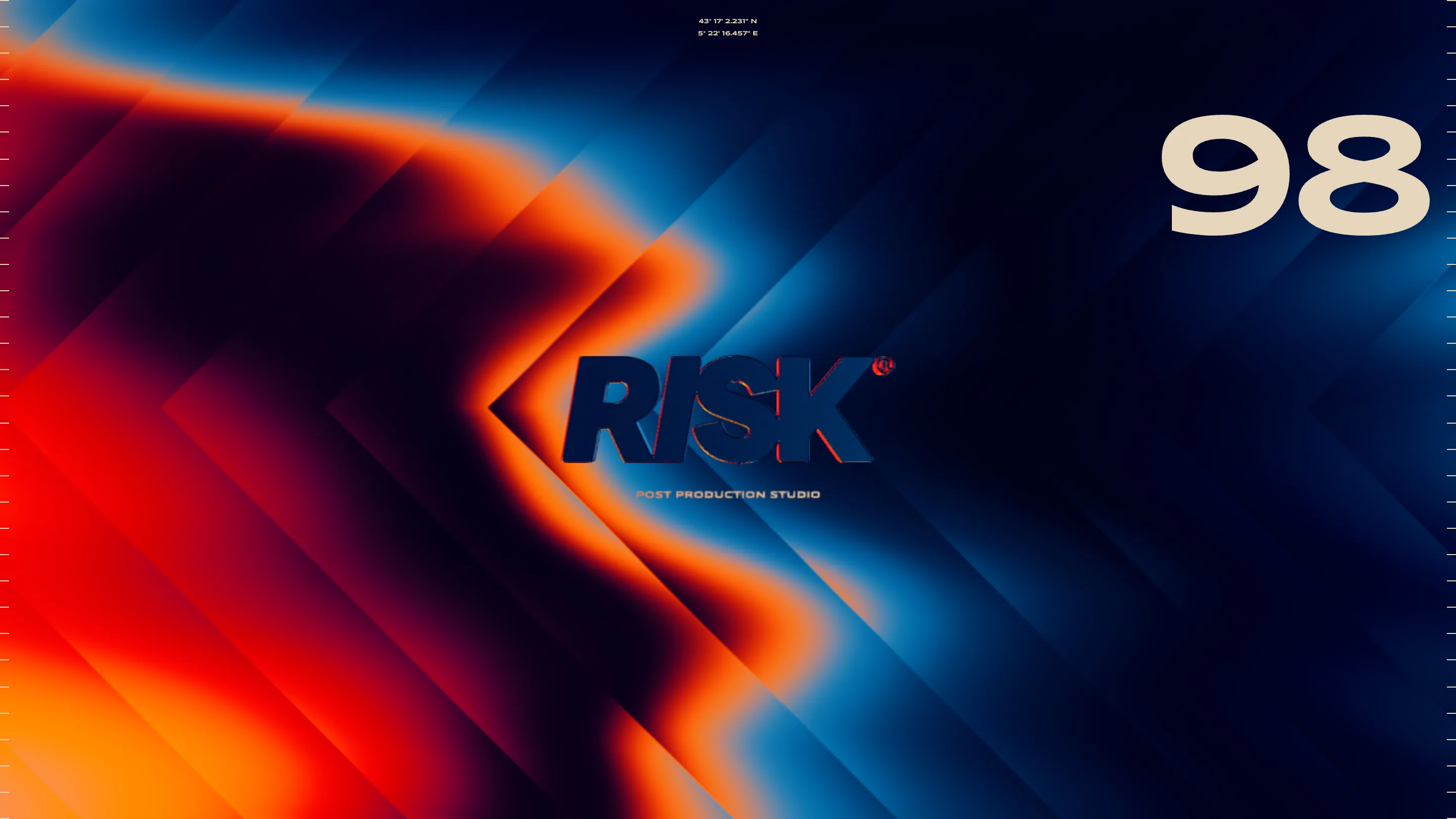
RISK put a timecode counter on its website and let the clock run the show. The Marseille film production studio built its site around a 00:00:00 readout, the kind you see scrubbing across a video editor, and that one decision holds the whole thing together. It took awwwards Site of the Day on July 15, 2026, and the reason is worth looking at closely.
The timecode is the whole idea
Most studio sites reach for a big headline. RISK reaches for a clock. The running timecode frames every screen as a frame in an edit, which is exactly what a film studio spends its days inside. It reads as concept, not decoration. The tagline sits underneath, plain: not taking a risk is the real risk. Add the location coordinates pinned to Marseille and the site starts to feel less like a portfolio and more like a slate.
That coherence is what a judge rates first. The name is RISK, the work is film, and the interface behaves like the timeline you cut film on. Nothing on the page argues with anything else.
Monochrome that gets out of the way
The palette is black and white, high contrast, close to nothing else. On a lesser site that reads as a safe default. Here it's a job. The studio's reel covers music, sport, and brand work for Deezer, Pepsi, and Salomon, and every one of those films carries its own color. Strip the interface back to ink and paper and the video thumbnails become the only bright thing on screen. The restraint is doing the pointing.
The works page reads like a reel
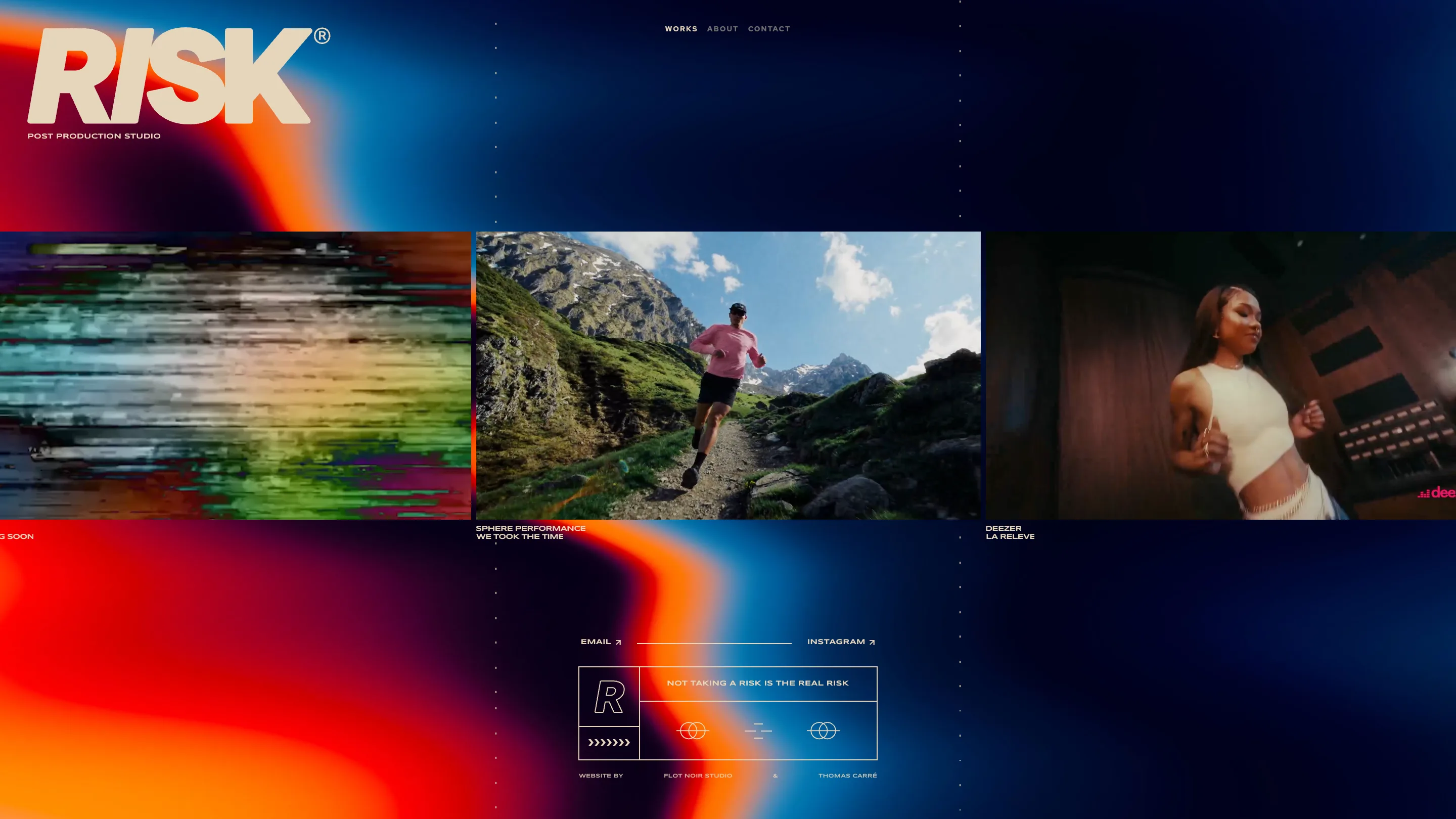
Open the works index and the grid behaves like a contact sheet. Full-width project blocks, generous space between them, type kept small and quiet so the moving footage does the talking. It's a film studio site that understands its own medium: you don't sell motion work with a still hero, you sell it by letting the clips play and getting the chrome out of the way.
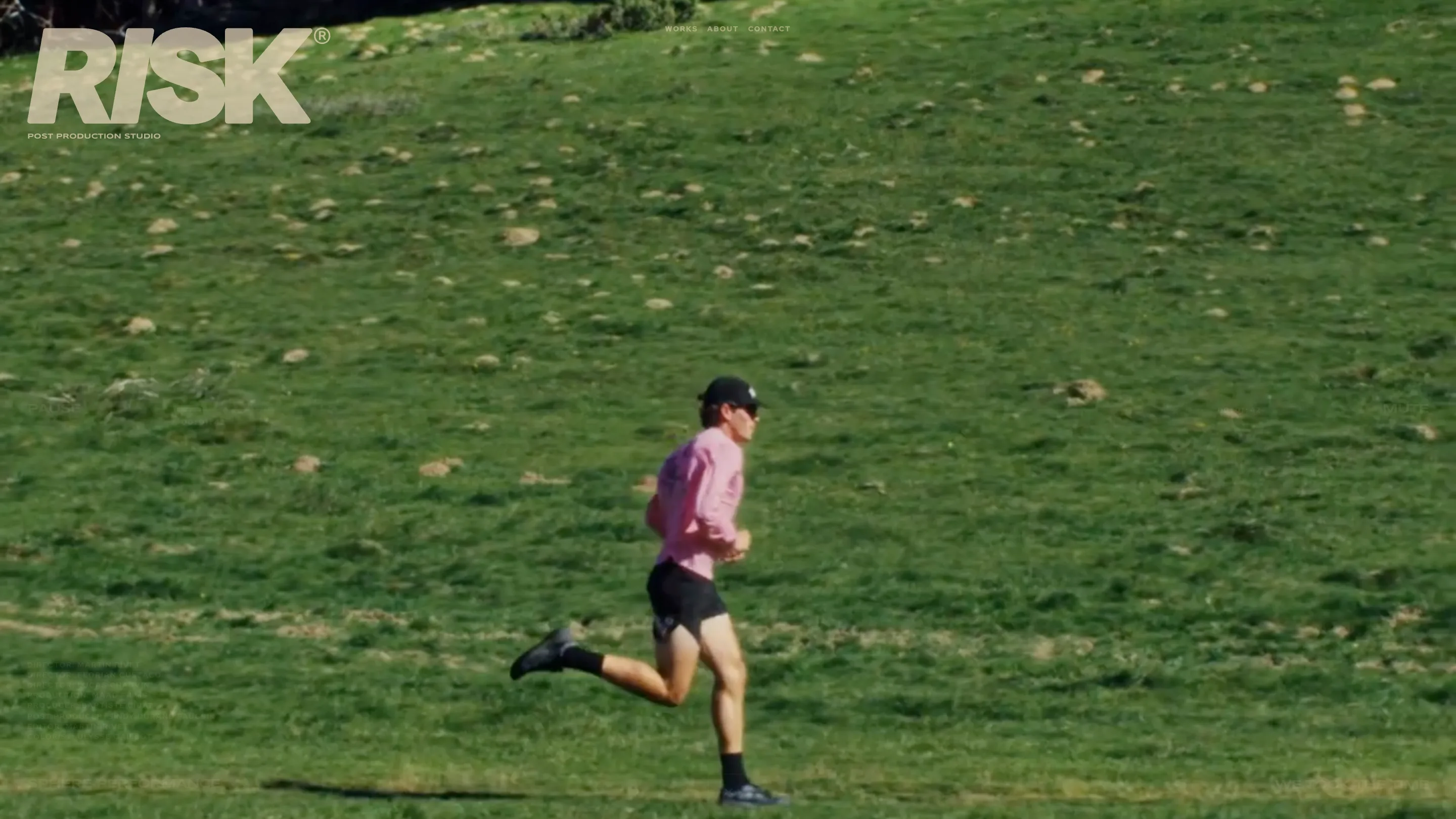
Each project sits on its own page with room to breathe. We Took The Time runs nearly edge to edge, the timecode still ticking in the corner, so even a single case study feels like it's playing back rather than sitting there.
Restraint carries through to the credits
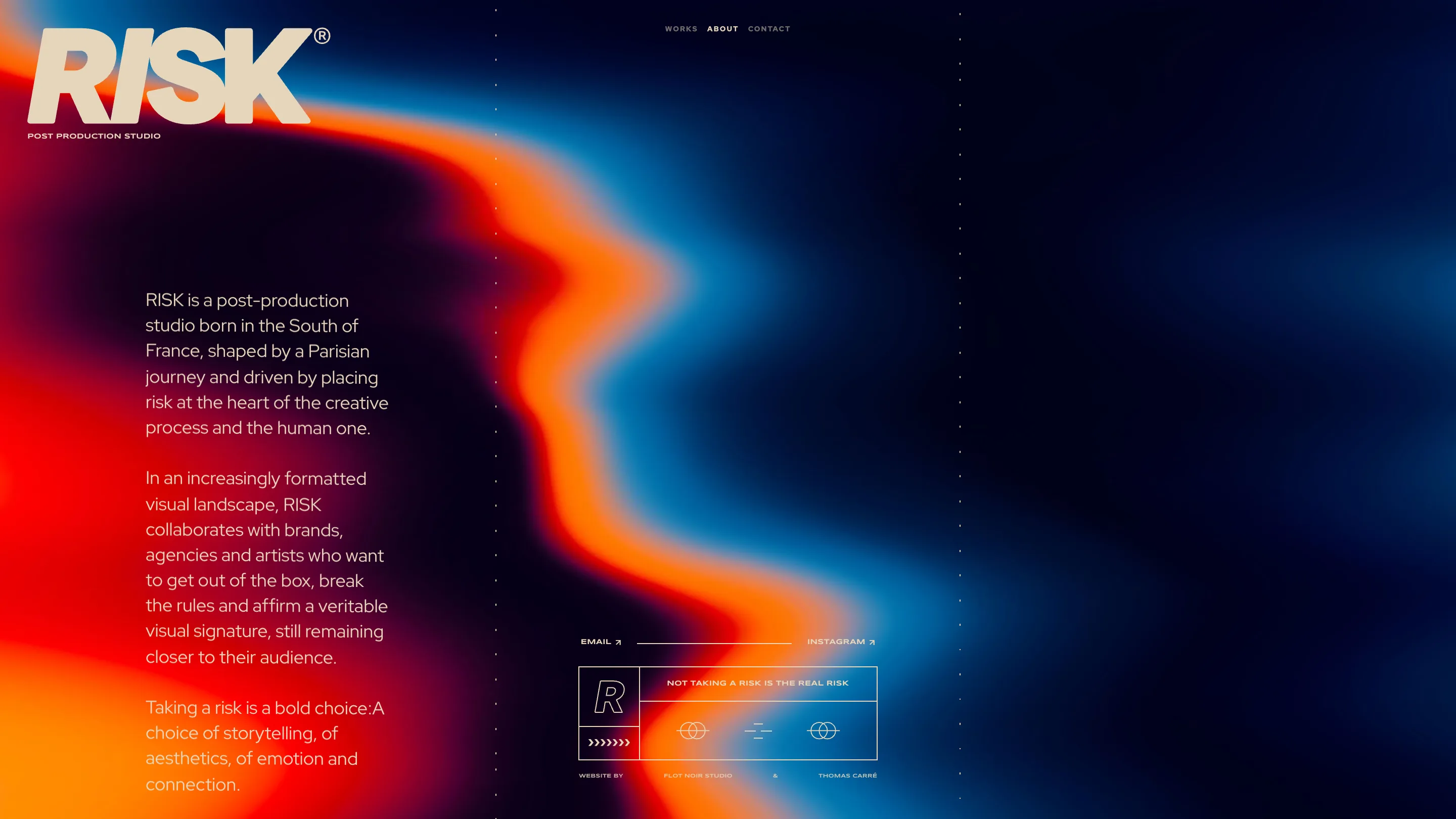
The about page could have turned into a wall of adjectives. It doesn't. It names the directors, Martin Rivet, Florian Cuszacq, Antoine Bal, and the youth collective, and lets the roster stand. Same discipline as the rest of the site: state the fact, hold the space, trust the reader. When a studio resists dressing up its own bio, you believe the work more.
Why it wins
Strip the site down and the craft is in the match between idea and execution. A film studio built a site that runs like an edit, kept the palette out of the way so the films could speak, and never once broke character. Flot Noir and Thomas Carré built it, and the timecode was the right call: one small mechanic that tells you what this studio does before you've read a word.
That's the lesson under the award. A single strong concept, executed with restraint, beats a page full of clever moves that don't add up to anything.