

A type specimen that reads like a Montreal travel guide
Demande Spéciale built the site for Pangram Pangram's PP Neue Montreal as a guidebook to the city it's named after, and let the typeface do all the art direction.
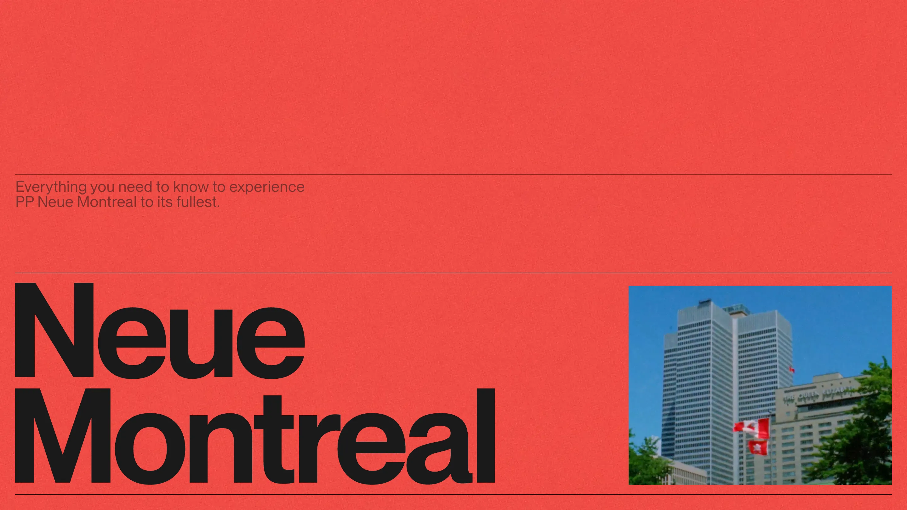
Pangram Pangram's PP Neue Montreal is one of the most-used grotesques on the web, and its new type specimen does something most specimens never try. It reads like a travel guide to the city the font is named after. Demande Spéciale, the Montreal studio that built it, took awwwards Site of the Day and a Developer Award on 13 July 2026, at a 7.41. Here's the craft that earned it.
The type is the art direction
Look at the home screen. Two colors do the whole job: a tomato-red field and black text. One photo, small, a modernist tower with a flag, tucked to the side. Everything else is the word "Neue Montreal" set enormous in the display weight, the letters running almost to the edges of the page. No hero illustration, no gradient, no WebGL. The typeface carries the frame by itself, which is the correct call for a specimen. The product is the type, so the type gets to perform.
That restraint is a decision, and it's a hard one to hold for a full page. Most specimen sites reach for a second idea by the third scroll. Demande Spéciale never does. The red and the black stay put top to bottom, so the only thing that changes as you scroll is the type, which is exactly what a designer wants to study.
A specimen structured like a guidebook
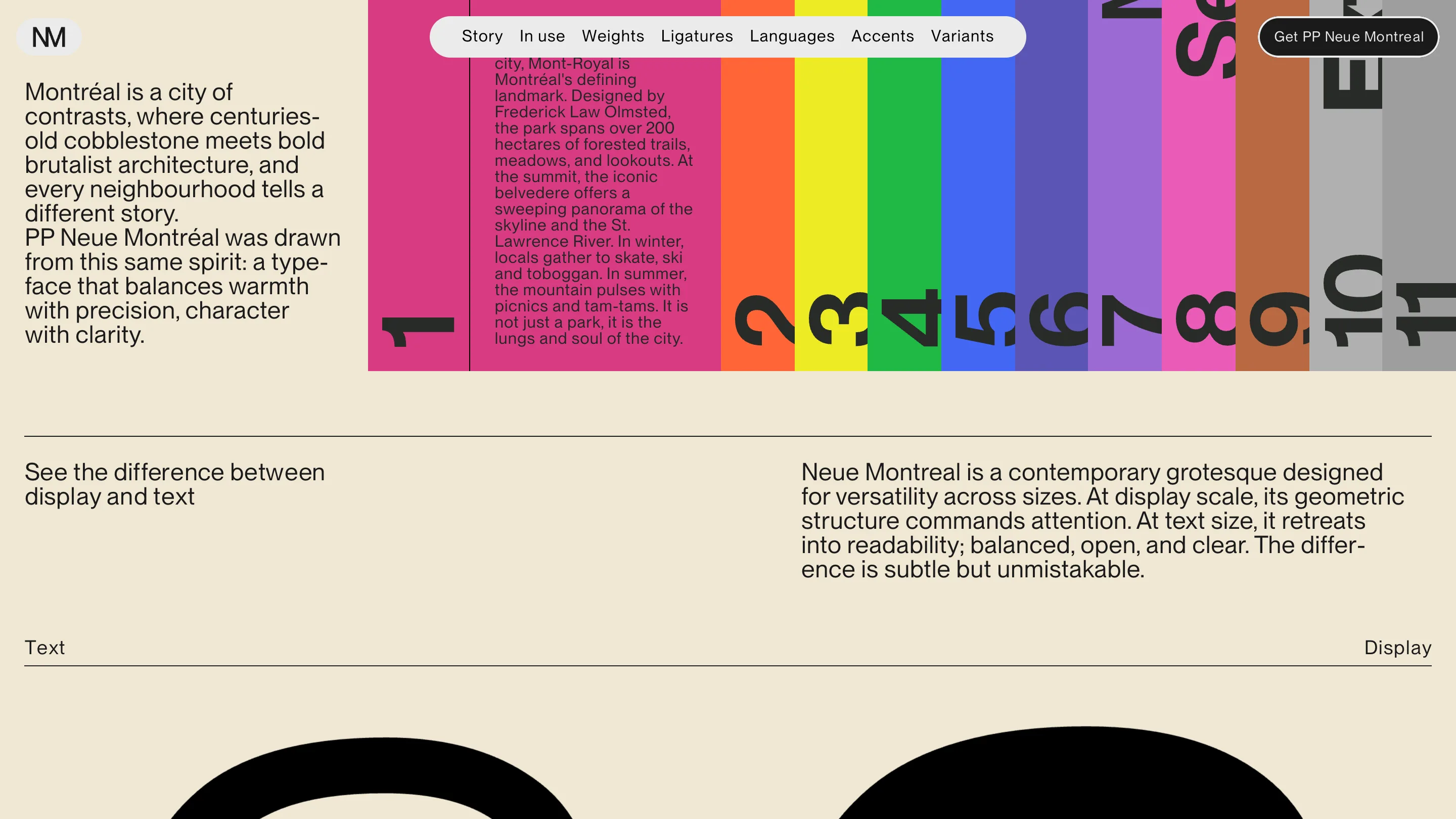
The conceit is what makes it stick. Instead of the usual weight chart and paragraph filler, the page is organized as an itinerary. A pinned pill at the top holds the sections like a table of contents: Story, In use, Weights, Ligatures, Languages, Accents, Variants. A numbered guide runs 1 through 11 down a stripe of shifting color, and each stop pairs a real Montreal landmark with a demonstration of the font. Mont-Royal, Vieux-Montréal, the Basilique Notre-Dame. The copy about the city doubles as specimen text, so you read about the place and read the typeface at the same time.
The standout teaching moment is the text-versus-display comparison. The same sentence sits side by side, one in Text Medium, one in Display Extrabold, with the labels "Text" and "Display" anchored to the margins. At display size the geometry commands attention. At text size it settles back into something plain and readable. Seeing both against the identical line is worth more than any spec sheet.
The details a judge actually rates
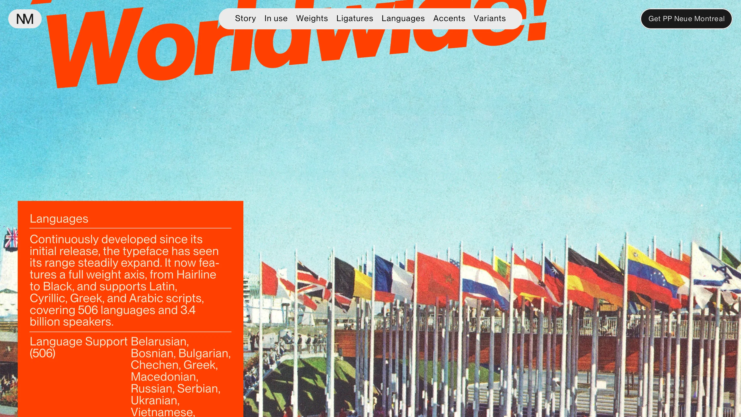
Deeper down, the guide earns the Developer Award badge. A section titled Worldwide sets red outline lettering over a washed photo of flags, then backs it with the real numbers: a full weight axis from Hairline to Black, Latin, Cyrillic, Greek and Arabic scripts, 506 languages, 3.4 billion speakers. The ligature and accent sections show the diacritics up close, the kind of proof a foundry needs and a specimen usually skips.
What a judge rewards here is coherence. The concept, the two-color system, the huge display setting and the technical depth all point at one idea, and none of them fight. The travel-guide framing could have turned cute. It stays useful because every page of the trip is really a page of the font.
Why it won
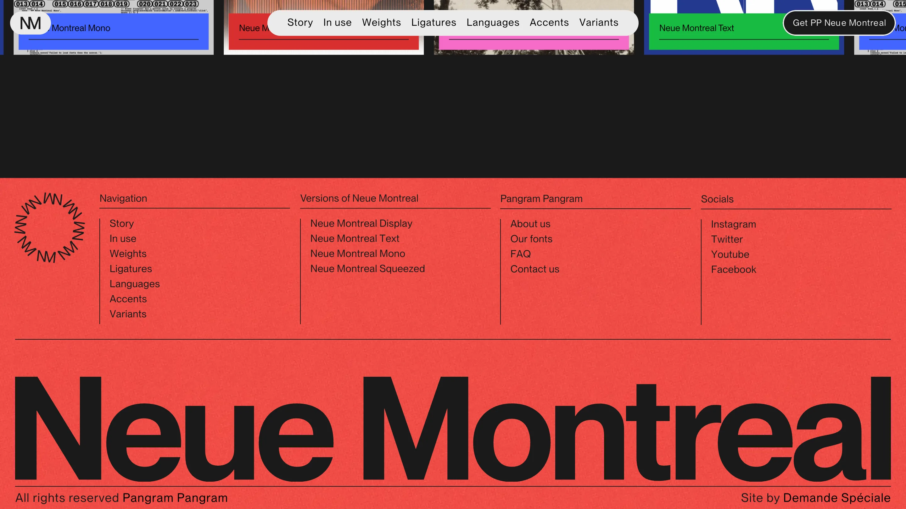
The footer says the quiet part. "Neue Montreal" one last time at full width, the foundry credited on the left, "Site by Demande Spéciale" on the right. A type specimen wins Site of the Day when it makes you want to set something in the face by the time you reach the bottom. This one does that with two colors and a good idea, and lets the typeface take the rest.

