

Vectr dresses nuclear staffing in oversized editorial type
Utsubo built an industrial staffing site the way you'd build a print magazine: huge grotesque headlines, a paper-white palette, and one layout held with discipline. It picked up an awwwards Developer Award.

Vectr staffs nuclear plants and gas turbine outages. The website looks like a design quarterly. Utsubo built it around oversized editorial type, a paper-white background, and almost no color, and it took an awwwards Developer Award on July 11, 2026. The subject is about as unglamorous as B2B gets. The craft is what makes you stop scrolling.
Oversized editorial type doing the work
The headlines run enormous. "Staffing the World's Critical Systems" fills the top of the page in a tight grotesque, set at the kind of scale you see on a fashion cover, not on a staffing vendor. It sits hard against the left margin. The supporting sentence gets pushed into a narrow column on the right, small and grey. That gap in size is the whole hierarchy. No rule lines, no gradient behind the words, no shadow. The type is big enough to carry the page by itself, so nothing else has to.
One layout, repeated with discipline
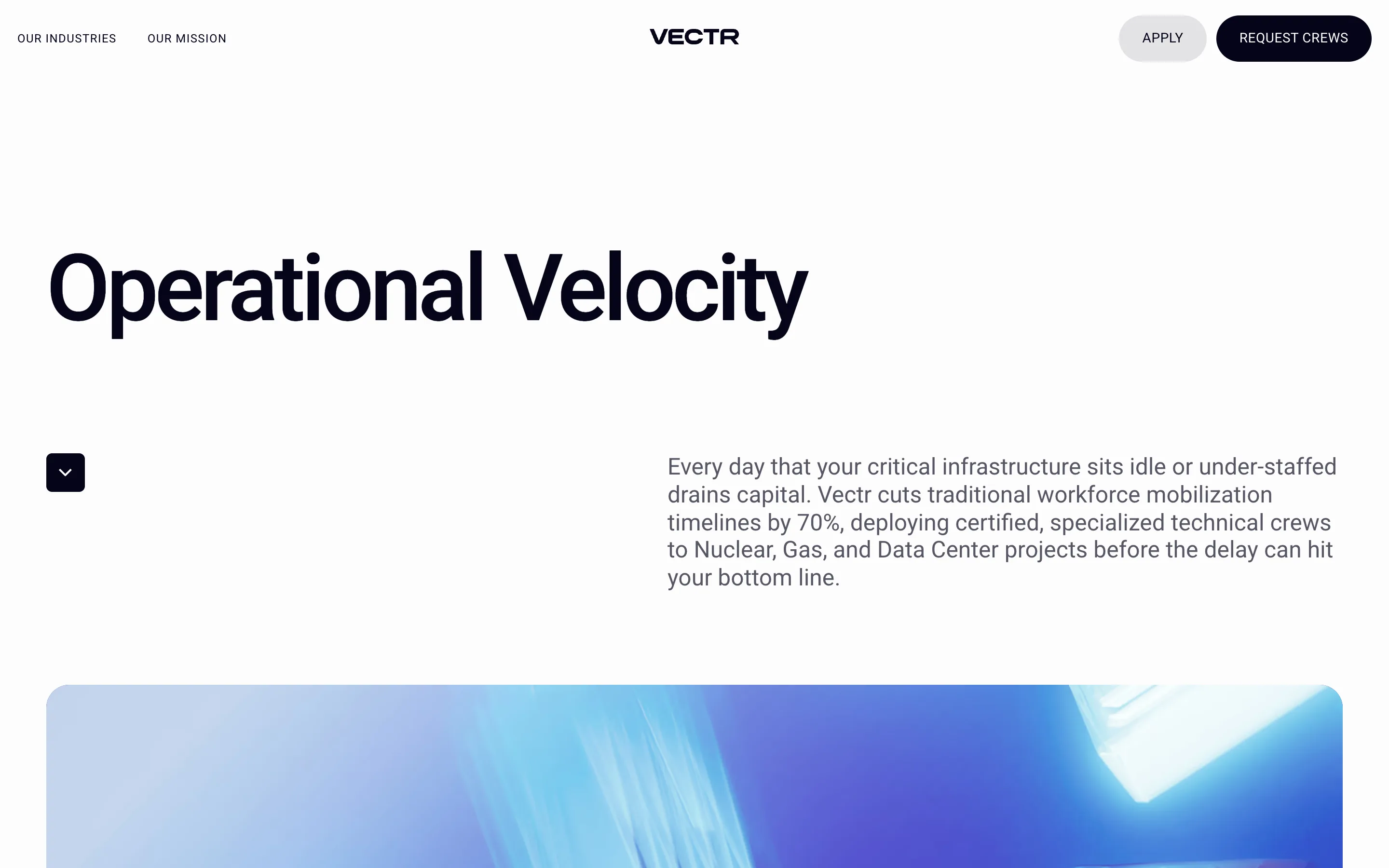
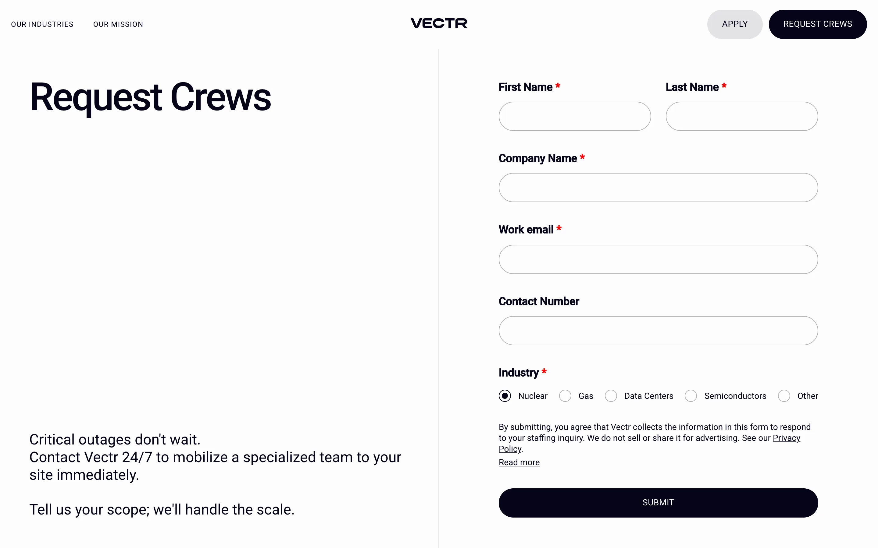
Every page runs the same move. Giant headline top-left, a small black square button with a downward chevron tucked under it, a paragraph of body copy sitting off to the right. "Operational Velocity" on the mission page. "Request Crews" on the contact page. Same grid, same rhythm, different words. Repetition like this is a bet. It only pays off if the type is strong enough to hold a screen on its own, and here it is, so the site reads as one confident voice instead of a stack of templates.
The palette is almost nothing
Warm off-white paper. Black text. A grey pill and a black pill in the nav. That's the system. Color shows up twice on the whole page: a golden-hour shot of a transmission tower under the hero, and an abstract blue render further down. Two images across a long scroll. When the field is this quiet, a single photograph does a lot of work, and Vectr rations them so each one lands.
A mark and a loader worth the detail
The wordmark is a wide-tracked VECTR, centered up top between two uppercase nav links. The logo mark is a small arrow built from square pixels, and the preloader spins two dotted orbital ellipses around it while the page assembles. It's a five-second moment most people will see once, and someone still sweated it. That instinct, to finish the parts nobody asks about, is usually what separates a good build from a rated one.

Why a judge would rate it
Restraint is the hard thing to pull off, because there's nowhere to hide. One weak headline and the whole approach falls apart, since the headline is the design. Utsubo held the line all the way to the form page, where labels, four radio buttons for Nuclear, Gas, Data Centers and Semiconductors, and a single black Submit still sit inside the same grid. The dull screen keeps the system. That's the tell of a site built by people who cared past the hero, and it's why the oversized editorial type reads as a decision rather than a trend.
The lesson travels. You don't need much color or motion to make a page feel expensive. You need type you trust and the nerve to leave the rest empty.

