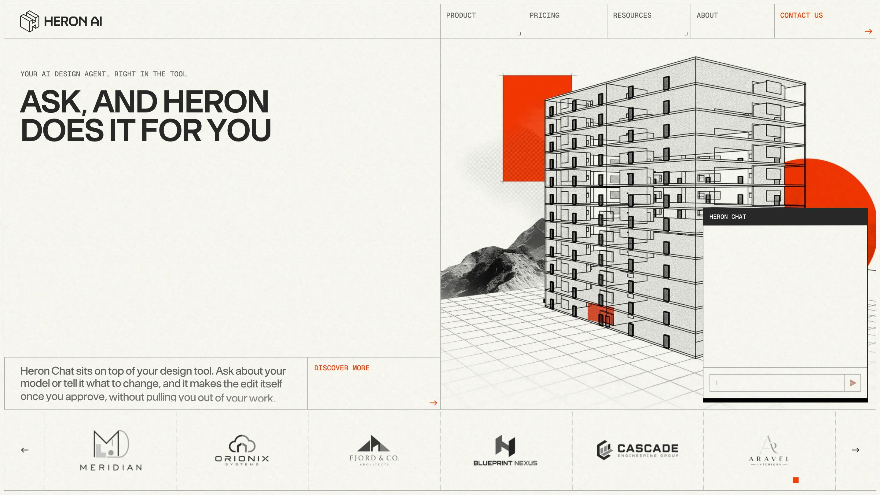
House of Honey pairs a fat-face serif with a running pink script
The interior studio's site rests on two type moves: a heavy display serif for the name, and an oversized cursive script that sweeps behind every page. Edoardo Lunardi's build took awwwards Site of the Day.
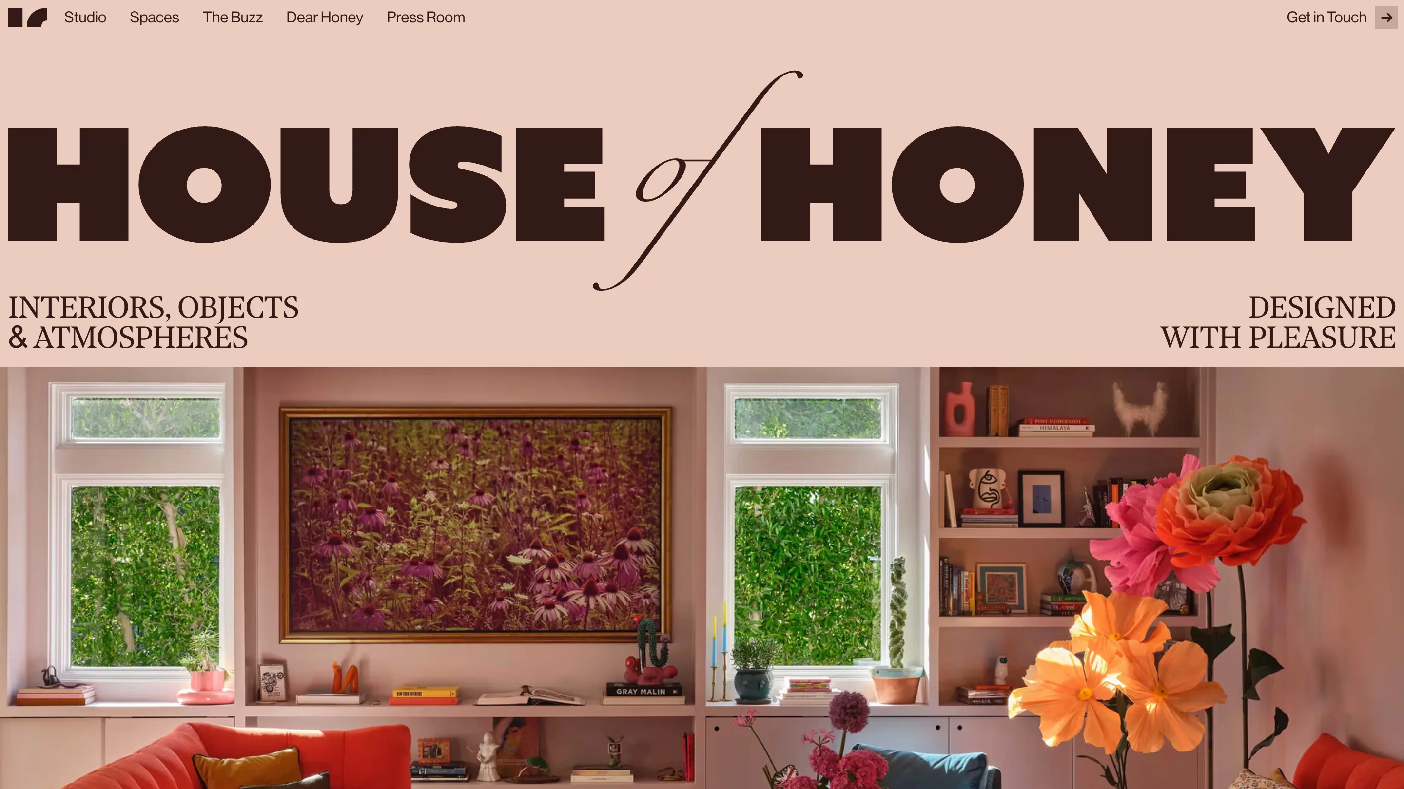
The name does the work here. House of Honey sets its title across the top of the homepage in a fat-face serif, all caps, the letters nearly touching, with one cursive "of" looping between HOUSE and HONEY on a long swash that ties the two words together. It reads like a magazine masthead more than a studio logo. The site took awwwards Site of the Day on July 14, 2026, along with a Developer Award, and the typography is the reason.
The type pairing
The display face is a fat-face serif: thick verticals, hairline serifs, the high-contrast Didone look that print magazines used on covers for a century. Set at that scale, filling the full width of a blush-pink page in deep espresso brown, it turns two ordinary words into the loudest thing on screen. The cursive "of" is the hinge. It drops the register for a beat, then the swash carries your eye back up into HONEY.
Around the headline, small all-caps serif labels do the quiet work. "Interiors, objects & atmospheres" sits bottom left, "designed with pleasure" bottom right, each set tiny and tracked out. Three type sizes, one family feeling, no clutter. A designer reads the hierarchy in a second.
The pink script that runs through every page
Open any inner page and a giant hot-pink cursive word is already there, laid behind the photography. The projects page runs "Our Spaces" across the middle in magenta script, half cut off by the edges of the viewport so it feels bigger than the screen holds.
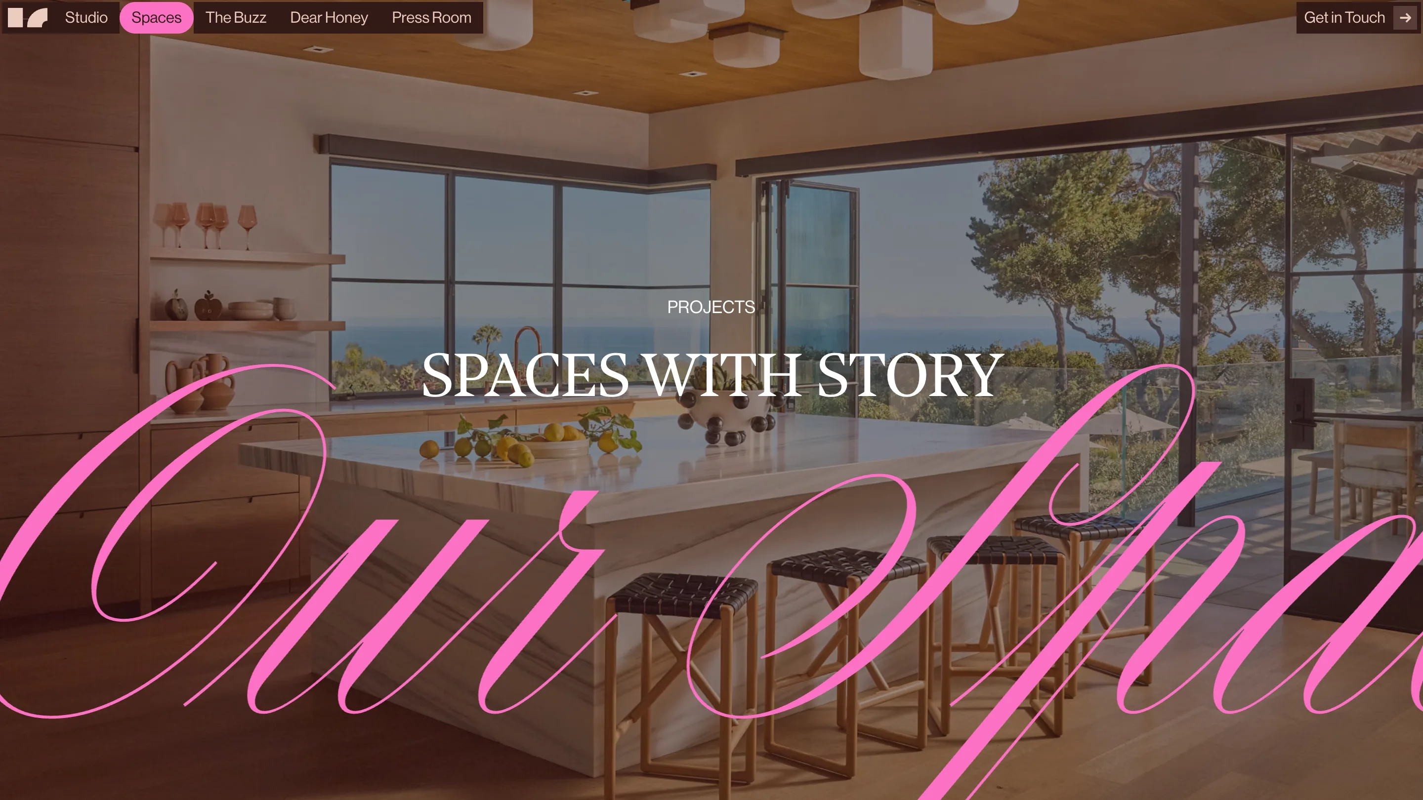
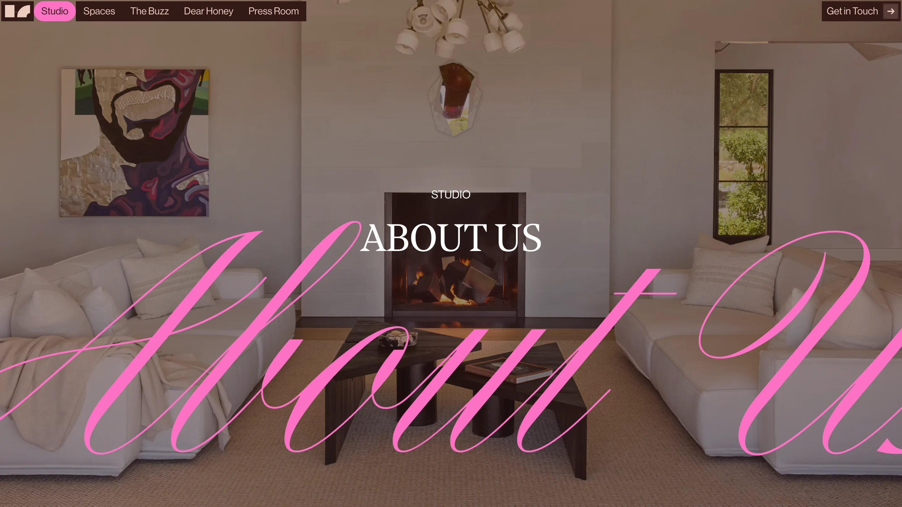
The studio page does the same with "About Us", the script curling behind a living room and a lit fireplace. The column does it with "Dear Honey". It's one device, repeated, and it does the job a section logo usually does: you always know which room of the site you're standing in, and the pink brands the place without a single icon.
An interior portfolio that acts like a magazine
House of Honey is a collective of interior designers, and the site treats their rooms as editorial. Projects live under "Spaces with story". The writing sits in a column titled "Dear Honey, a design column, unfiltered", with entries numbered like issues, N.004 dated 15 · JUN · 26.
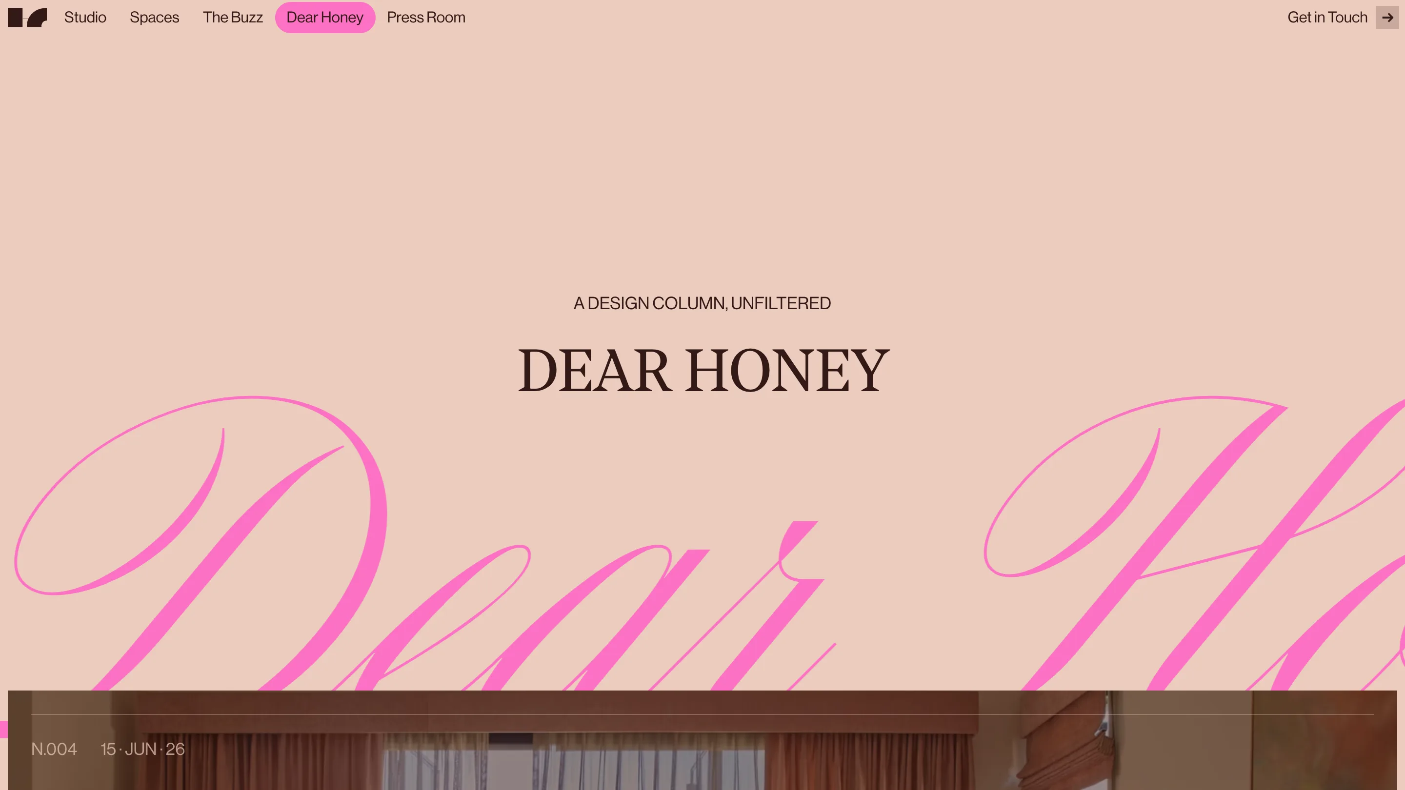
That framing is a real decision. Most studios in this field publish a grid of hero shots and stop. Building a named column and dating the posts turns a portfolio into something a reader might come back to, and it gives the type system somewhere to keep performing.
The restraint underneath
The reason it holds together is the palette. Three values carry the whole site: blush paper, espresso ink, one hot pink. The pink does double duty, running as the oversized script and as the fill on the active nav pill up top, so the loudest color and the wayfinding are the same color. Nothing else competes. The photography stays warm and slightly muted, which lets the type and the pink sit on top without a fight.
That's what a judge rates. The idea is small and the discipline is total: a fat-face serif, a cursive accent, one accent color, and a script device carried to every page without wobble. Edoardo Lunardi built it, and the awwwards Site of the Day and Developer Award both landed on the same day.