The real estate site that changes color by the section
The Normal is Boring property site swaps its whole palette from section to section, and its logo reads boring upside down. Here's why it won.
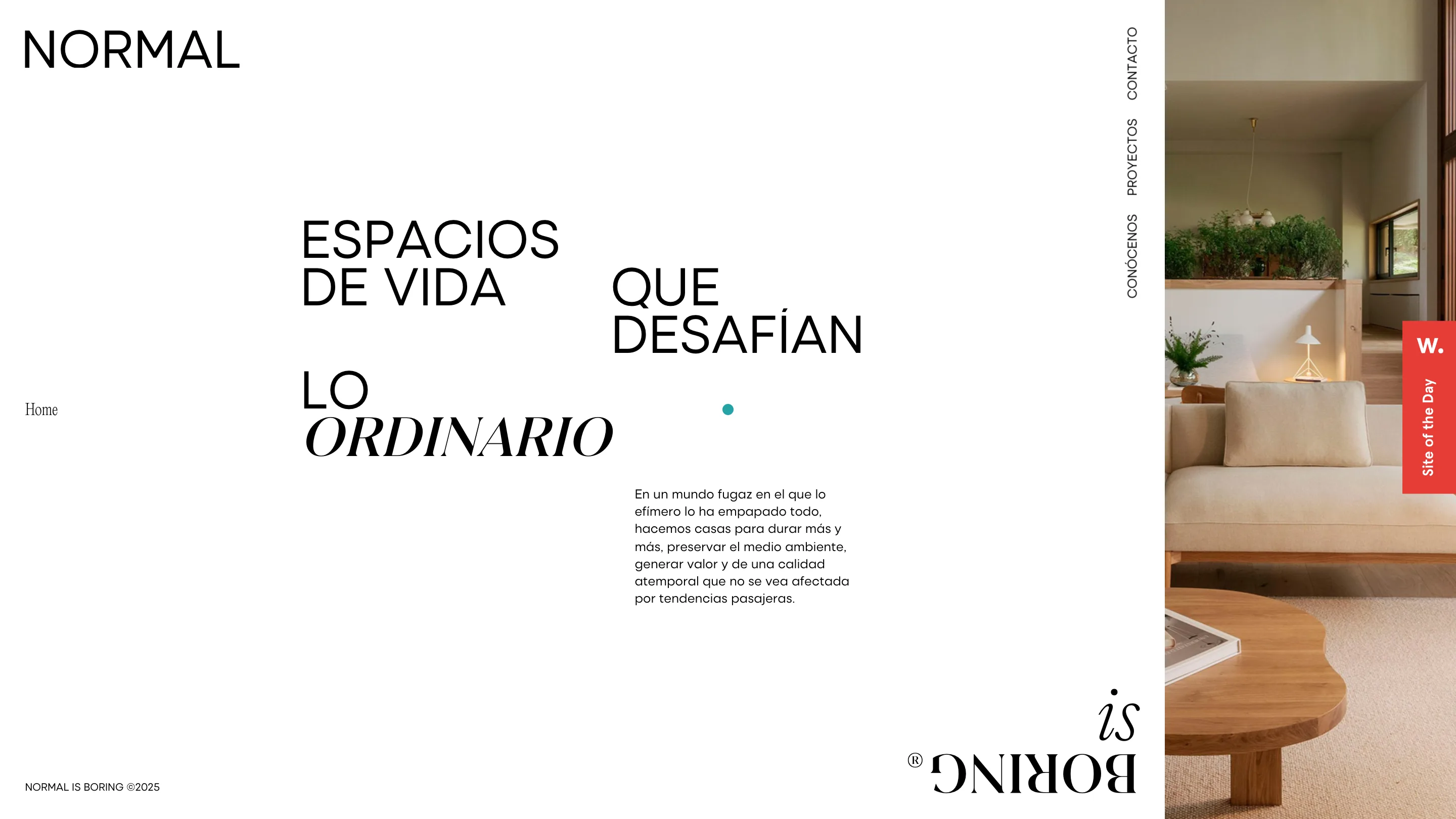
Normal is Boring is a property developer in Galicia, and its website behaves like a magazine that can't sit still. Scroll from the home into a project and the background jumps: white, then warm limestone, then black, then a flat coral red. The photography of oak floors, plaster walls and sea views stays exactly where it is while the interface swaps its color around it. LaNegrita built the site, and it took awwwards Site of the Day plus a Developer Award on July 23, 2026.
That award is the reason we're looking at it, but the award isn't the interesting part. The interesting part is how much argument the design carries. The company is called Normal is Boring. The site spends every scroll proving it.
Color that resets every section
Most property sites pick one calm palette and hold it for the whole page. This one refuses. Each section owns its background, and the cut between them is hard, no fade. The amenities block goes full black with a gym render floating in the dark. The next apartment goes coral, a red so saturated it turns the framed kitchen photo into a jewel. The trick works because the architecture underneath is quiet. Warm wood, white walls, big glazing looking at the Atlantic. The renders never fight the color, so the color reads as art direction instead of noise.
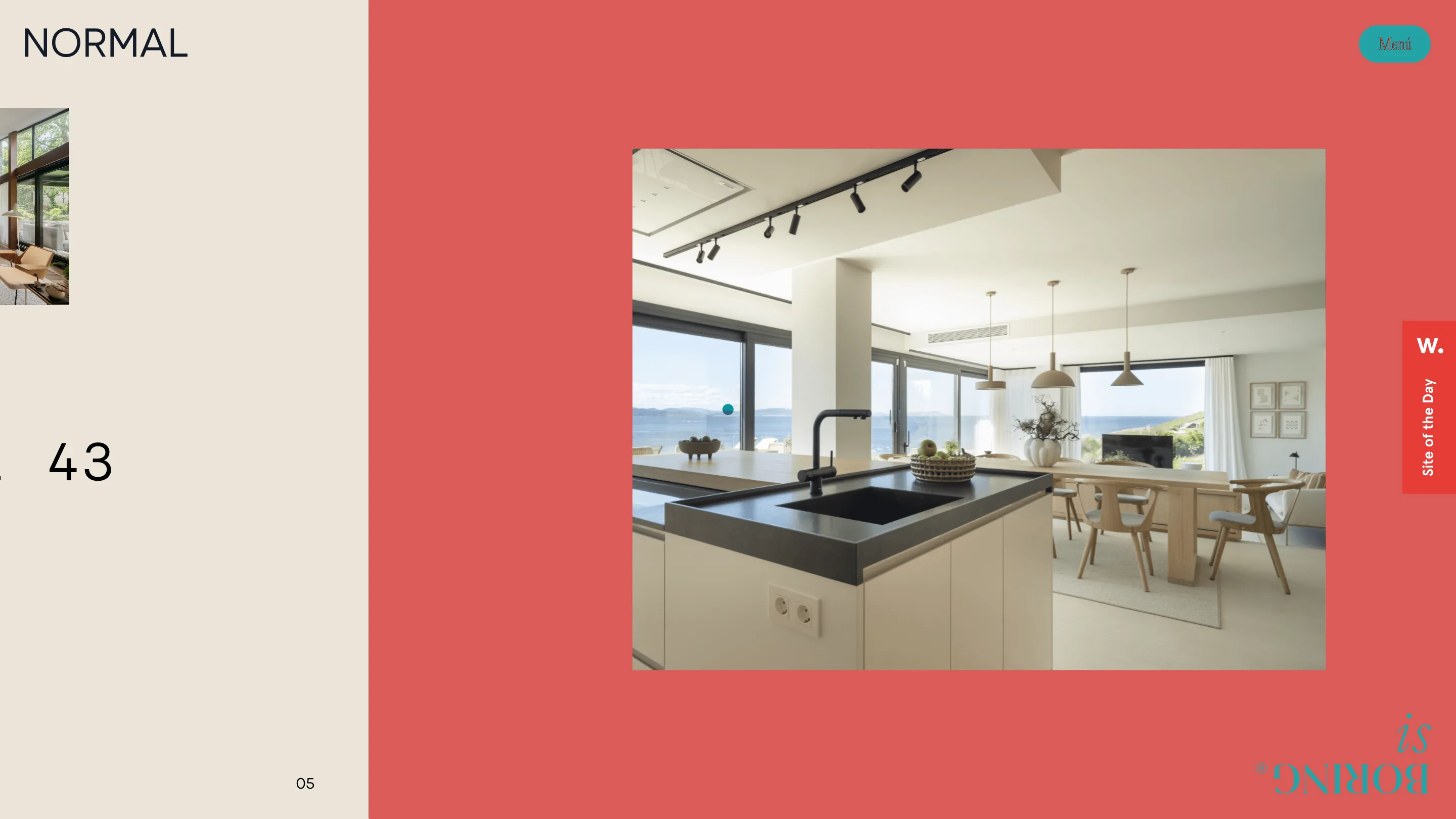
There's a single accent dot that travels with you and recolors to match: teal on the light sections, red on the dark ones. It's a small thing. It's also the kind of detail that tells a judge someone sweated the whole system, not just the hero.
A logo that flips boring over
The wordmark is the concept in one mark. NORMAL sits upright. BORING sits directly under it, mirrored and turned upside down, with a teal dot for the O and a small registered symbol tucked in. Read it straight and the brand literally inverts the word boring. The lockup lives pinned to the bottom-right corner the entire time, so the joke never leaves the frame.
It would be easy to overplay a gag like that. LaNegrita underplays it. The mark is set in a restrained display serif, sized small, left to sit in the corner while the photography and the color do the loud work.
Type that does the heavy lifting
The home headline mixes two voices in one line. "ESPACIOS DE VIDA QUE DESAFÍAN LO" runs in an uppercase grotesque, tight and neutral, and then "ORDINARIO" drops into a serif italic. One word in a different typeface, and the whole sentence gets a lean. The words are scattered across the grid too, offset instead of stacked, so reading the line feels like moving through a spread rather than a banner.
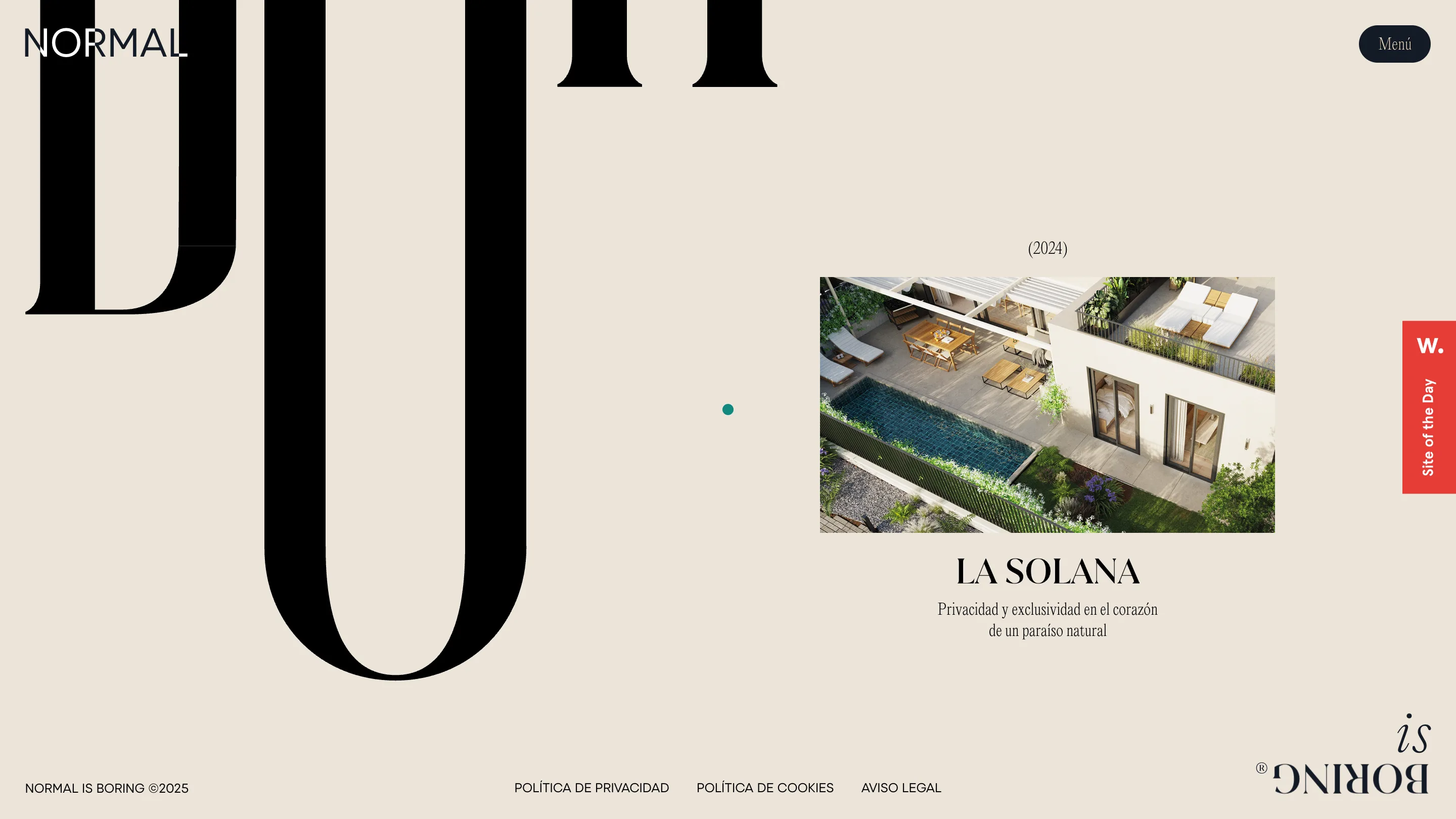
On the project intros the serif blows up until single letters run off the edge of the screen, half in frame, working as texture more than text. Next to that, a small tidy card carries the project name, the year in parentheses, and one line of copy. Big and quiet in the same view.
The details a judge rates
There's a running index threaded through the whole thing: "03 • Comodidades", a lone "05", a "(2024)" over a project. It gives a long scroll the feel of turning numbered pages. Space does a lot of the work too. Copy sits in narrow columns with plenty of room around it, so nothing feels crowded even when the type is enormous.
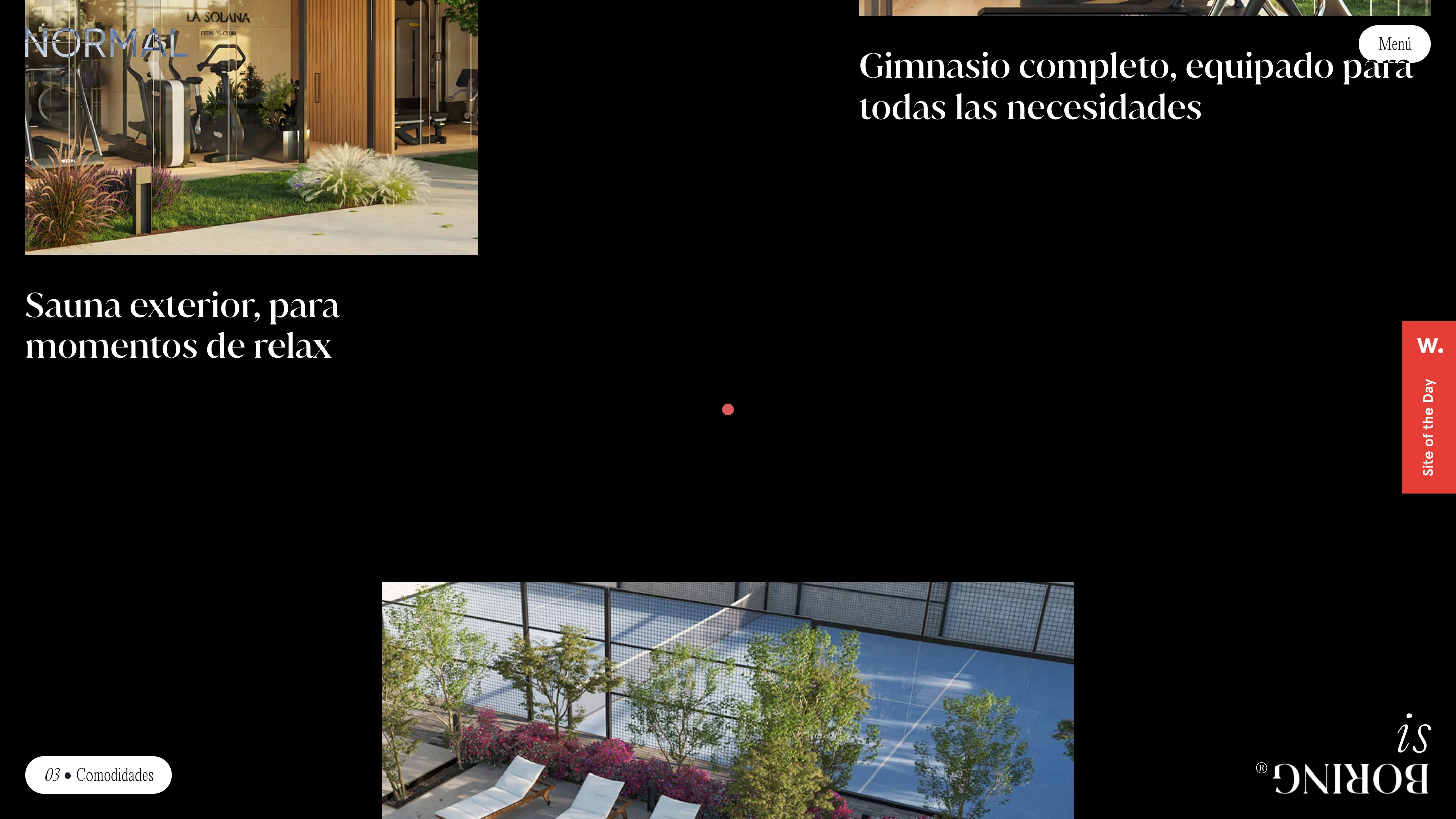
What wins an award here isn't one flashy effect. It's that every decision points the same way. The color swaps, the flipped logo, the serif that runs off the page, the accent that keeps changing hue. They all say the same thing the name does. A developer selling calm houses could have made a calm, forgettable site. LaNegrita made the case that calm and boring aren't the same thing, and built it into the interface.