

Longbow won awwwards site of the day by designing the way it builds cars
Digital Butlers took the July 12 award with a monochrome Webflow site for a British EV sports car. It won on restraint, not effects.
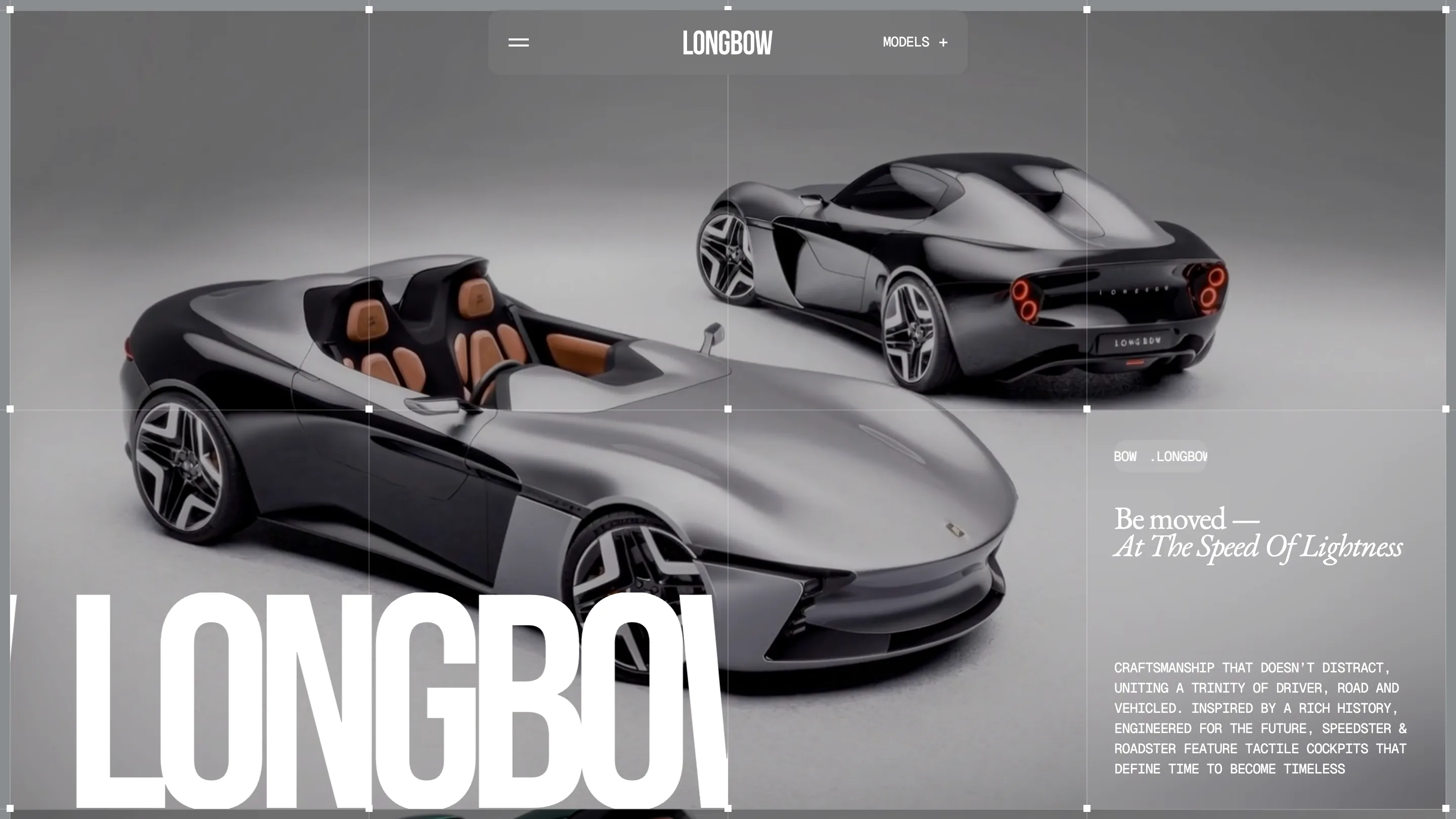
Longbow took awwwards Site of the Day on July 12 with a 7.21, and the interesting part is how little the site does. Digital Butlers built it for Longbow Motors, a British maker of hand-built electric sports cars, and the whole page runs on the same idea the cars do: speed through lightness. The brand even puts it in Latin, Celeritas Levitas. The site takes that literally and strips almost everything out.
That restraint is why it scored. Creativity came in highest at 7.31, design at 7.27, and both come from the same decision: let the photography carry the color and keep everything else black, white, and grey. Most car sites reach for 3D configurators and drone footage. This one trusts a handful of moody stills and a lot of empty space.
Type that breathes
The headlines are the loudest thing on the page, and they still whisper. "BE MOVED, AT THE SPEED OF LIGHTNESS" runs large and wide, set against body copy that stays small and tight. The gap between those two sizes does the work. You read the big line first, then drop into the detail, and the pacing feels unhurried on purpose. It reads like the brand talks: fewer words, more air.
That contrast is a real typographic choice, not a default. When a headline gets that much room, every other element has to earn its place or get cut. Most of them got cut. The navigation is a few links. The buttons say "Reserve" and little else.
Scrolling as a reveal
Digital Butlers numbers the sections .01, .02, .03 and lets each one arrive on its own. You scroll, a new chapter of the story loads, the car shows a little more of itself. The Speedster and the Roadster each get a page, both priced at 125,000 pounds, and the site never dumps the spec sheet on you. It paces the disclosure instead.
That's the craft a judge notices. The Digital Butlers build keeps the animation smooth and quiet, so motion supports the reading rather than interrupting it. The jury scored usability at 7.05, which is the honest number here: a site this reduced asks the visitor to scroll and trust it, and that trades a little wayfinding for a lot of mood.
Art direction over interface
The photography is doing the heavy lifting. High-contrast black-and-white shots alternate atmosphere with craft detail, and because the interface is nearly colorless, the images become the color. That's the move that makes a monochrome site feel rich instead of empty. Cut the palette everywhere except the pictures, and the pictures land harder.
The footer got called out too, and it's worth studying. It stays as spare as the rest of the page, no link farm, no newsletter shouting for attention. A car this expensive doesn't need to chase you at the bottom of the page, and the design knows it.
What it costs
The honest weakness sits in the numbers. Development came in at 6.9, the lowest of the scores, covering animation, responsive behavior, accessibility, and SEO. A site built this visually, on Webflow, with type and imagery this dominant, tends to leave accessibility as the thing that slips. It's the usual bill for a page that leads with art direction. Worth watching if you're building in this style.
Still, the award holds up. Longbow won because Denis Poluhovich and the Digital Butlers team matched the design to the product with real discipline. A car sold on lightness gets a site that removes weight. The idea and the execution say the same thing, and a working designer can feel that agreement before they can name it. That's what the score is really rating.

