Hiroto Sato turns portfolio navigation into a Tokyo street signal
A yellow street sign, a blue arrow, a convex mirror and a three-lens traffic light, rendered in 3D on a white page. Sato's portfolio does its wayfinding with the furniture of a Tokyo intersection.

Hiroto Sato hung his portfolio on a street pole. A yellow sign carries his name, a blue arrow points at the projects archive, a chrome convex mirror sits under it, and a three-lens signal head hangs off the side. All of it rendered in 3D, all of it dropped in the middle of a white page with nothing else on it. It took awwwards Site of the Day on 17 July 2026 with a 7.24, and creativity was the highest of the four sub-scores at 7.48. Hiroto Sato is a creative developer in Tokyo. The site is his portfolio, and the portfolio navigation is the pole.
This could have been a gimmick. The reason it holds up is that every piece of the pole is doing a job a nav bar normally does, and doing it in the idiom of a Japanese intersection.
The signal head is a state indicator
Land on the page and the bottom lens is lit cyan. Scroll, and the whole pole rotates on its axis while the middle lens comes on yellow and the bottom one goes dark. Nothing tells you this is happening. There's no label, no progress bar, no percentage. The signal just changes the way a signal changes, and you read it without being taught.
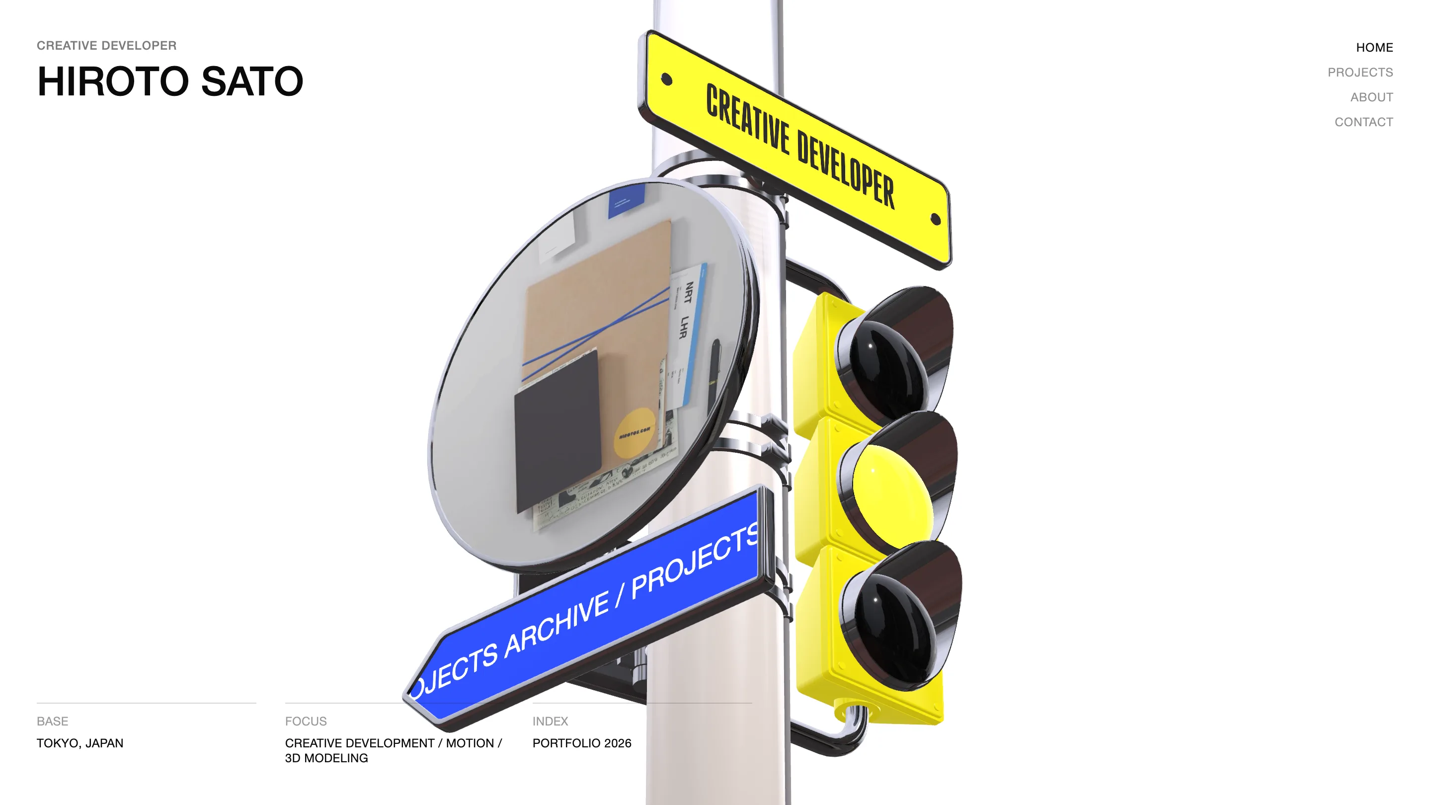
The sign swaps its text on the way round. HIROTO SATO at the top of the page, CREATIVE DEVELOPER further down. Same yellow plate, same condensed all-caps set on a curve, new words. He gets to say two things in the space where most portfolios pick one and centre it.
The mirror holds a second scene
Convex mirrors exist on Japanese streets to show you what's around the corner. Sato's shows something different depending on where you are. At the top it's a soft warm gradient, peach and orange smeared across the chrome. Scroll down and it's a desk: a manila envelope, blue rubber bands, a notebook, two baggage tags stamped NRT and LHR, a yellow sticker with hirotos.com printed on it.
That's the only autobiography on the page, and he put it in a reflection you have to look into. Narita and Heathrow, an envelope, a sticker with his own URL on it. A three-line about section would have said less and taken more room.
The page around it refuses to compete
The restraint is what makes the render land. Flat white background, no shadow under the pole, no texture. The name sits top-left in a plain black grotesk with CREATIVE DEVELOPER as a small grey overline. The nav is four words stacked top-right, current page in black, the rest in grey. Along the bottom, a three-column meta strip in small caps: BASE, Tokyo Japan. FOCUS, creative development / motion / 3D modeling. INDEX, portfolio 2026.
One loud object, everything else set quiet. Usability still scored 7.25 on a site whose main control is a sculpture.
The trick stops at the door
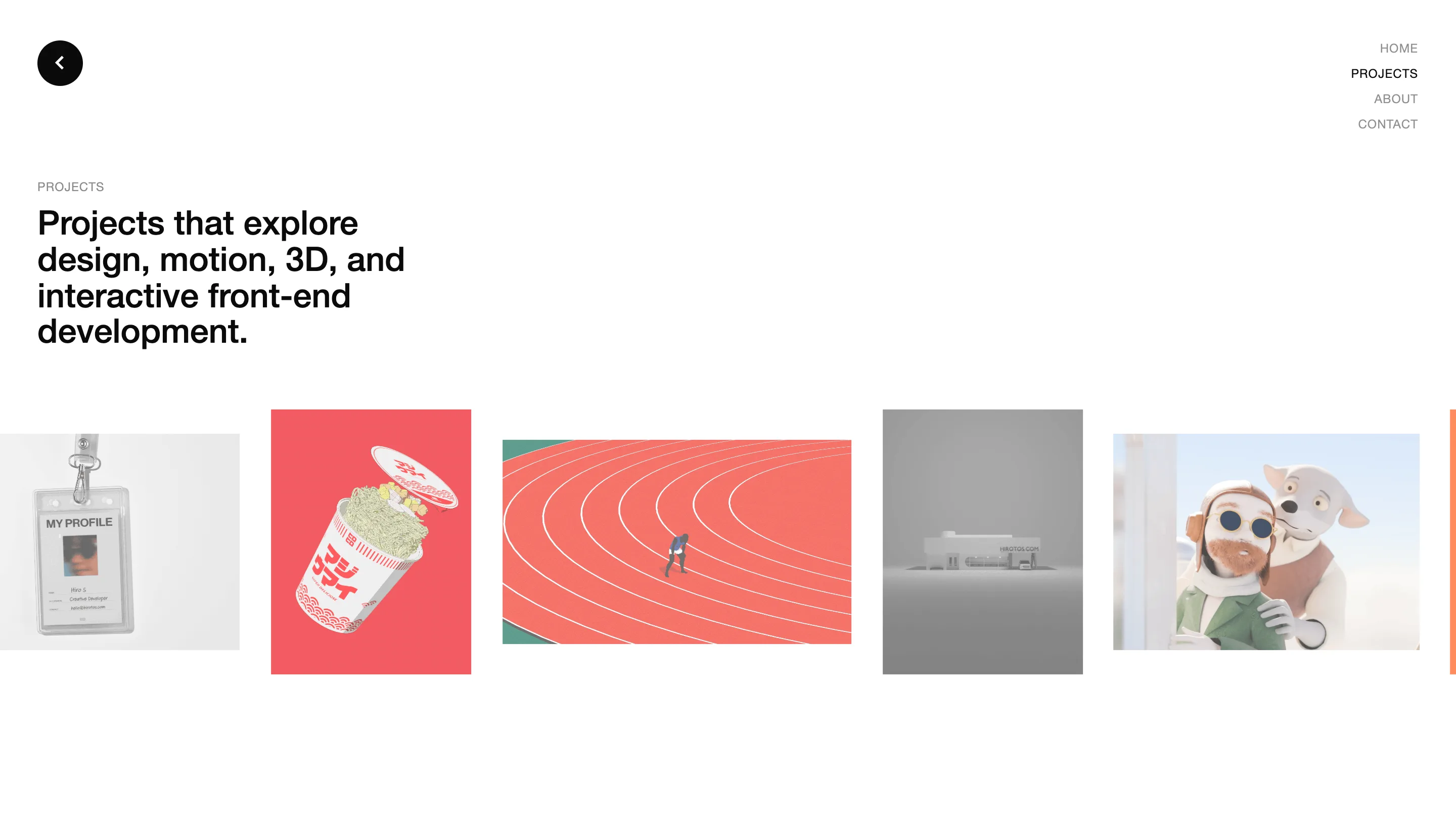
Click through to the work and the 3D is gone. The projects page is a horizontal filmstrip of thumbnails at deliberately mismatched heights and ratios: an ID badge on a lanyard, a cup of instant ramen with Japanese packaging type, a running track shot from above with one figure on it, a grey massing model of a building with HIROTOS.COM on the facade, two claymation characters. The strip runs off the right edge and you drag it. That's the whole interface.
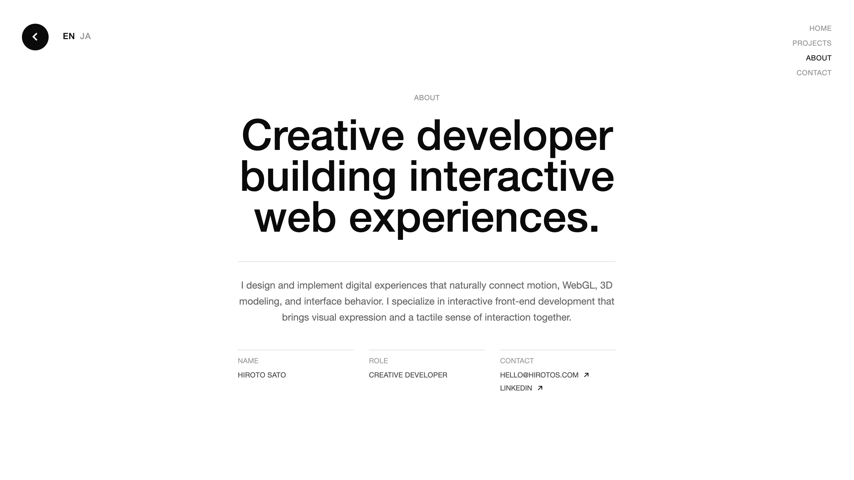
About is one centred sentence at display size, three lines of copy under a rule, then NAME, ROLE, CONTACT in the same meta strip the home page uses. There's an EN/JA toggle at the top left. Contact is two links and a full stop.
What a judge is actually rating
The craft here is knowing where the effort goes. Sato spent his budget on one object, built it in Blender, wired it to GSAP, and let it carry the whole first impression. Then he made the four pages behind it as plain as a spec sheet, which is why the pole reads as a decision instead of a demo.
The work in the strip has range: 3D, illustration, claymation, packaging type. The site never argues about that. It points at it, with a blue arrow, in the right lane.