The roaster does the art direction on CoffeeTech's site
CoffeeTech Engineering sells industrial coffee roasters. MAKETHECUT gave the machines a black stage, one rust accent, and nothing else to hide behind.
CoffeeTech Engineering builds coffee roasters, machines that cost as much as a car and spend their lives at the back of a warehouse. MAKETHECUT® put one on a black stage and lit it like a watch. The machine does the art direction here, and there's almost nothing else on the page. It took awwwards Site of the Day on 16 July 2026 with a 7.18, and picked up a Developer Award alongside it.
The machine is the only image
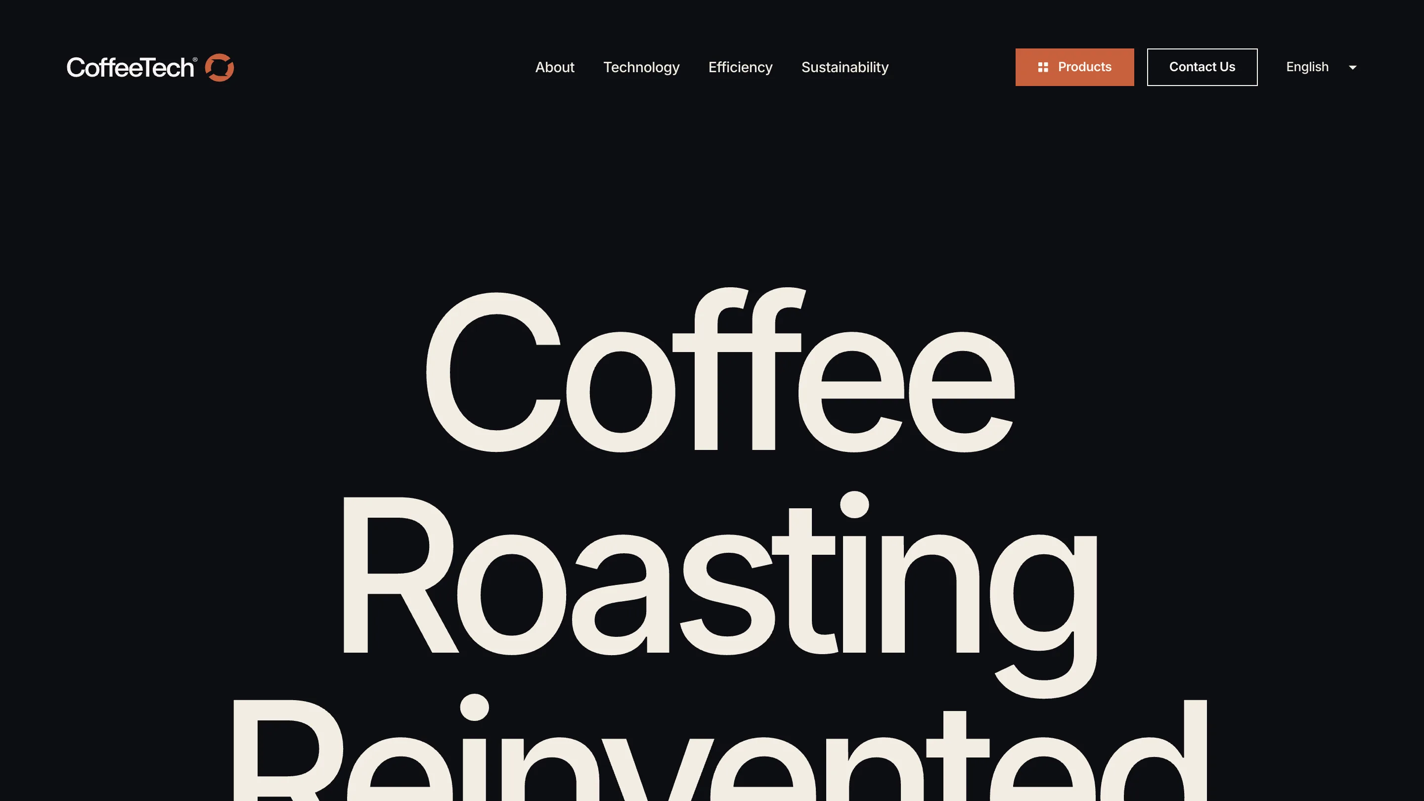
The home page opens near-black. "Coffee Roasting Reinvented" sits in a wide grotesk at display size, cream on ink, three lines tall, taking most of the viewport before you scroll. The roasters arrive as cut-out renders on the same dark ground. No lifestyle shot, no beans falling in slow motion, no hands around a mug. Every image on this site is a machine.
That brief is harder than it sounds. Once the styling is gone, the product has to hold the frame by itself, which means the render has to be good enough to survive being the only thing there.
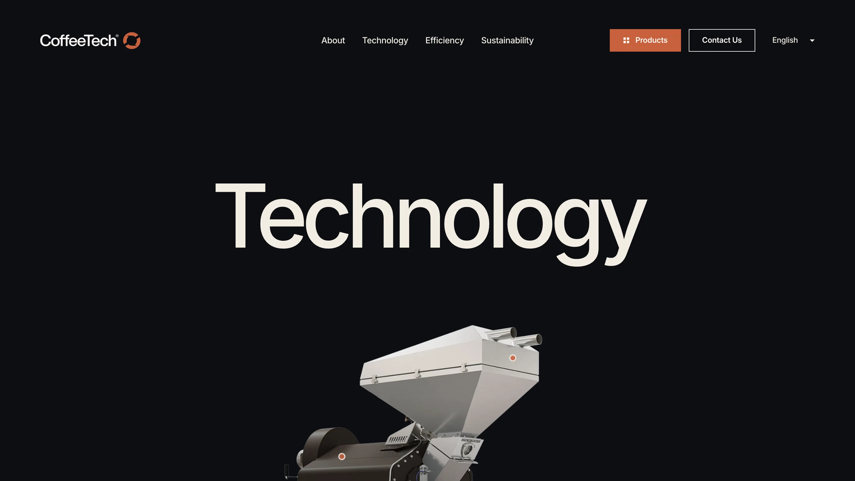
The Technology page is the clearest version of it. One word, centred, set huge. Then a stainless hopper drops in from below, angled, half in shadow, a hard rim light running down the chute. The photography carries information: bolt heads, the brushed grain on the steel, the weld where the cone meets the drum. It reads like a spec sheet that decided to be beautiful.
One orange, doing a job
The palette is ink, bone, and a single rust orange. That orange shows up three places: the logo mark, the Products button in the nav, and a small dot on the machines themselves, one on the hopper and one on the drum housing. Same colour on the brand and on the hardware. It makes the quiet point that the identity came off the object rather than arriving on top of it.
The type stays in one family throughout, a neutral grotesk pushed to display size and left mostly alone. No second face for contrast, no serif brought in to signal craft.
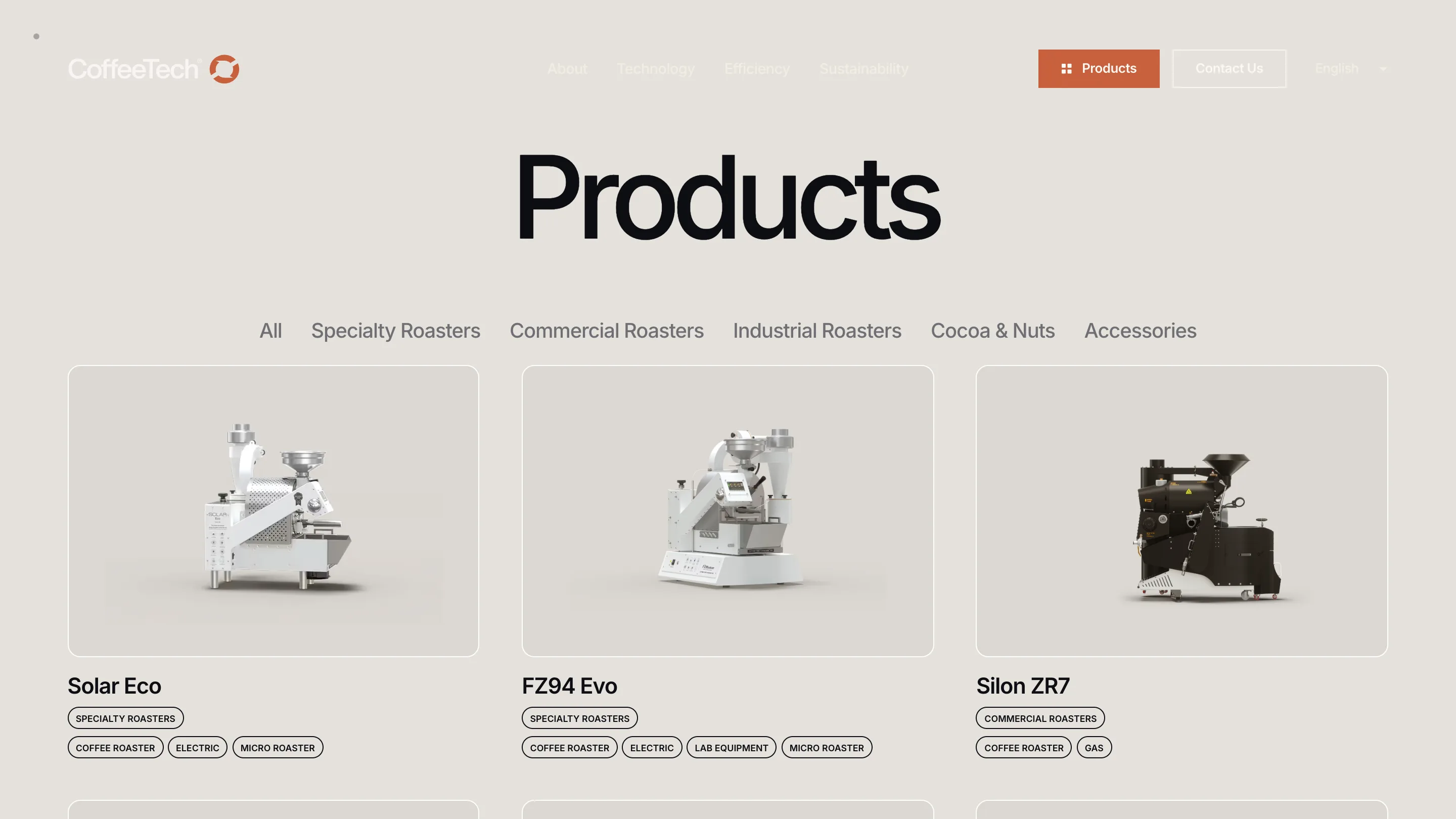
The catalogue turns the lights on
Hit Products and the whole palette inverts. Bone background, dark type, the same roasters shot on the same neutral. Solar Eco, FZ94 Evo, Silon ZR7, each in a soft grey card with the model name under it and pill tags below that: SPECIALTY ROASTERS, ELECTRIC, MICRO ROASTER.
The switch earns its place. Dark pages are the pitch, light pages are the catalogue, and the flip tells you which room you walked into before you read a word. A filter row sits above the grid and does the rest of the work with no chrome around it.
Type on metal
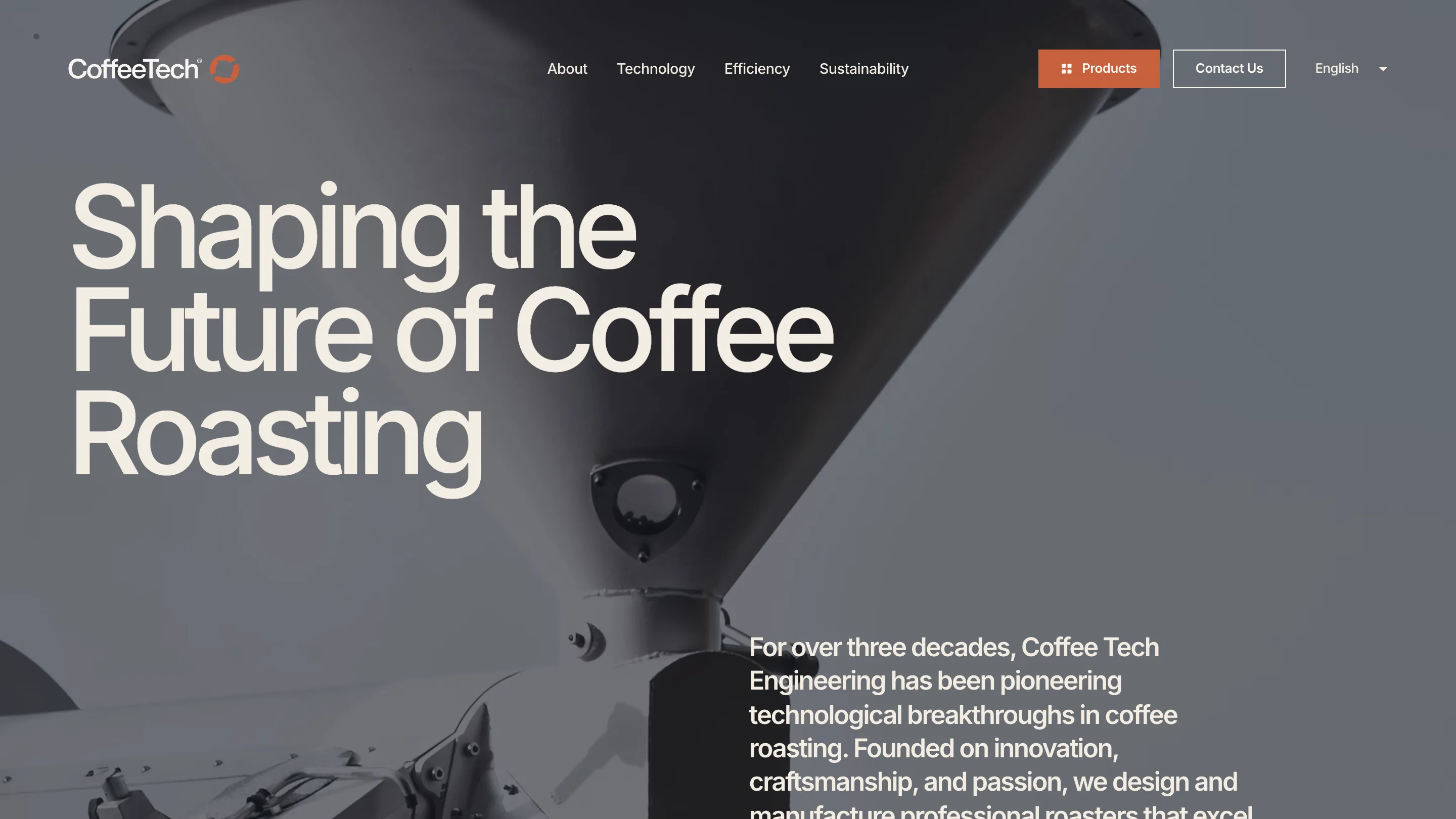
About goes the other way and drops the type onto the machine. A tight crop of a roaster cone fills the frame in cold grey, and "Shaping the Future of Coffee Roasting" sits over it in cream, left-aligned, three lines. The counters of the letters land on the darkest part of the funnel. Someone checked that. Move the crop 200 pixels and the headline falls apart.
Why it rates
Restraint is easy to claim and hard to survive. When a site runs on one image type, one accent and one typeface, everything shows: every crop, every tracking call, every edge on a cut-out render. CoffeeTech holds it across the home page, four content templates and a product catalogue without reaching for a rescue. The 7.18 is a fair read, and the Developer Award says it runs as clean as it looks.