Izanami blurs every photo so the serif stays in focus
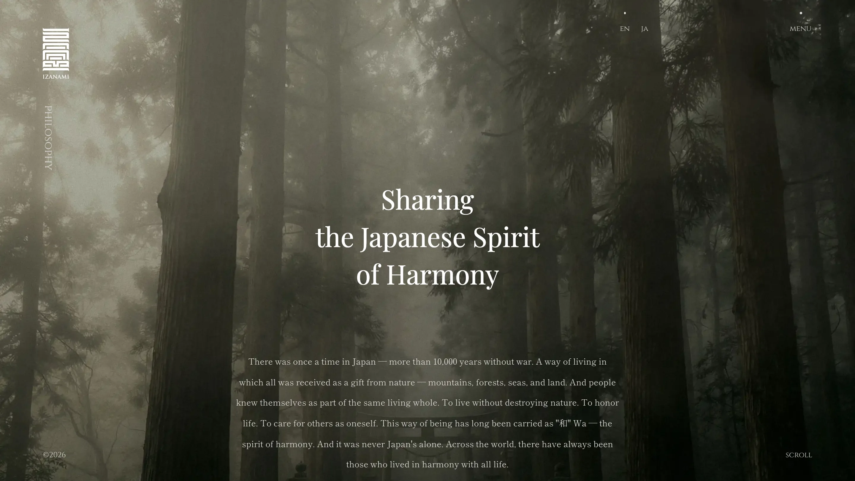
A dark editorial serif sits on top of fogged cedar forests and incense smoke. Every image on the site is soft. The type never is.

Izanami's homepage gives you fog, a cedar ridge, and five words set in a serif. Nothing else is in focus. The trees dissolve, the mist eats the horizon, and "Remember who you are" sits there mid-screen, crisp as printed ink.
That contrast is the whole design. baqemono.inc. built the site for Izanami, a Japanese wellness group running schools, craft and retreats out of Tokyo and Dubai, with Tomoyuki Nakata on design. It took awwwards Site of the Day on 18 July 2026 with a 7.19.
Every image is soft on purpose
Look at what's in the photo library. Fog over a forest. Cedar trunks in low light. A thread of incense smoke in a dark alcove. None of them has a hard edge anywhere in frame. Contrast is pulled down, saturation is close to gone, and grain is added back on top.
Then the type lands and it's the sharpest object on the screen by a wide margin. Your eye has nowhere else to settle. It's an old photography trick moved onto a web page, and it does the job a hero animation would usually be handed.
One serif, down to the clock
There's no second family anywhere on the site. The headline serif also sets the nav, the language toggle, the copyright line, the two footer clocks (GST Dubai and JST Tokyo) and the word SCROLL in the corner. All of it in small caps with wide tracking.
The decision costs something. Small serif caps at that size are harder to read than a sans would be, and the awwwards dev jury put accessibility at 6.4. What it buys is an interface that stops announcing itself as one. Chrome and content speak in the same voice, so a nav label reads like a caption in a book.
Body copy on the philosophy page runs centred with line-height near 2. Long measure, a lot of air between lines, and it reads slowly. That's clearly the intent.
The plate, and the type that crosses it
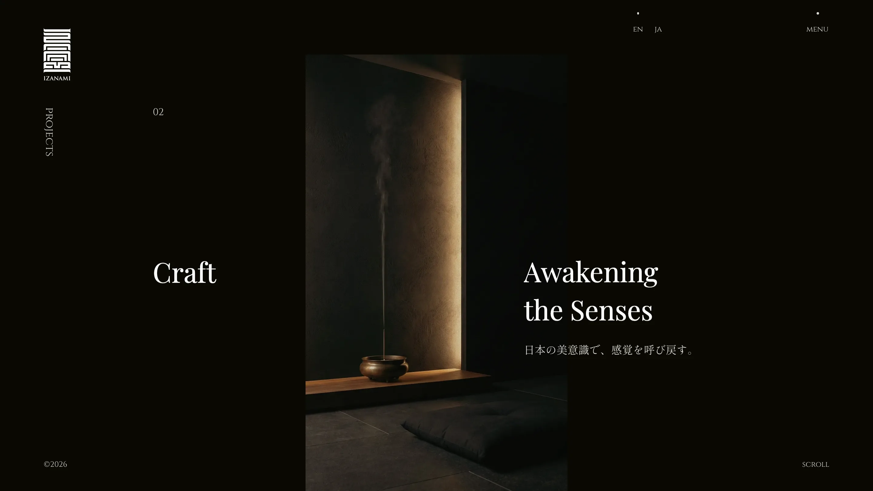
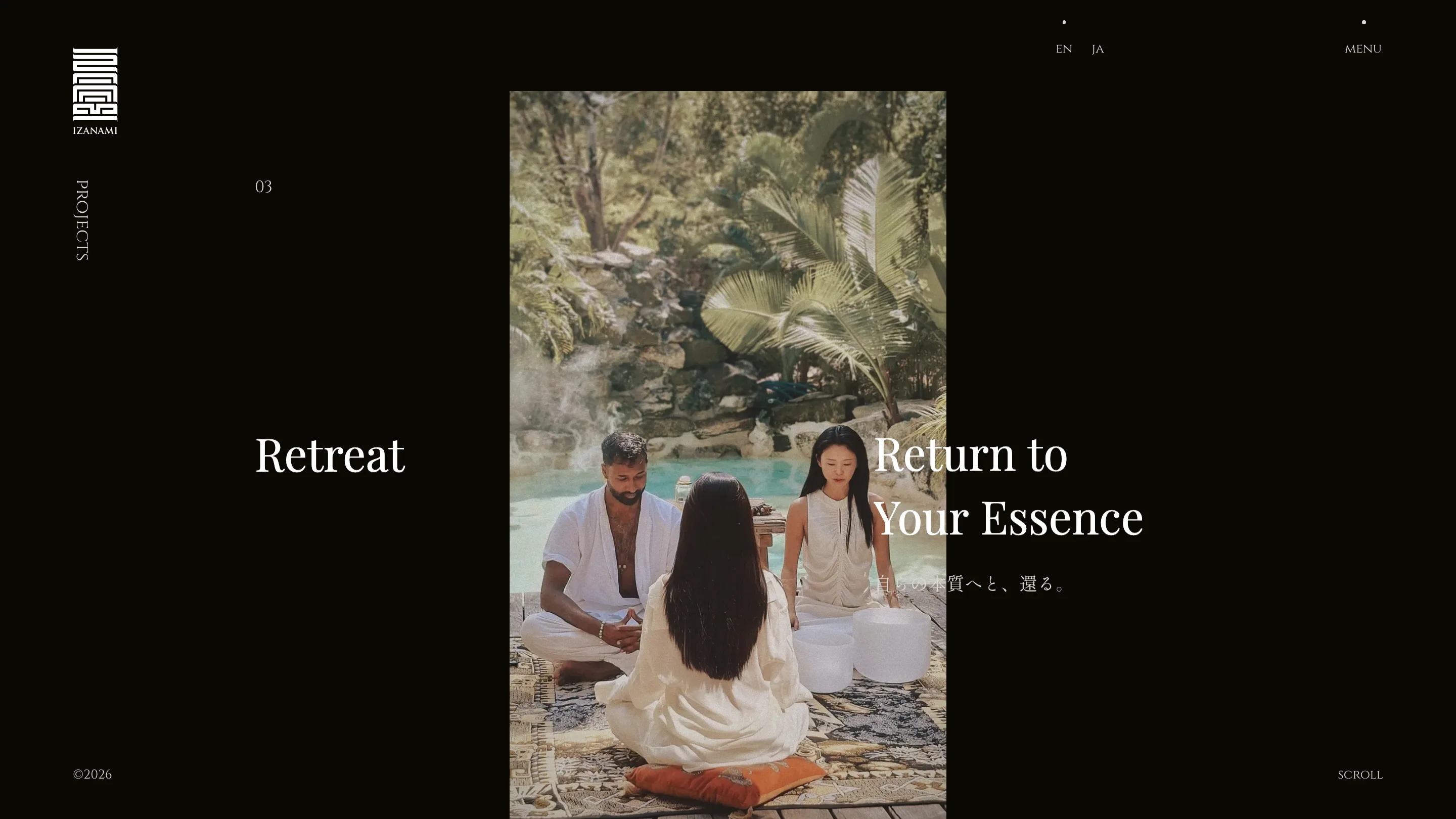
The project pages use one layout move and repeat it. A single portrait image, centred on near-black, about a third of the viewport wide. The section name sits to the left of it in the margin. The English and Japanese subheads sit to the right. A section number floats up top (02 for Craft, 03 for Retreat) and the word PROJECTS runs vertically down the left edge.
The good part is the overlap. On Retreat, "Return to Your Essence" starts on the black field and runs straight across the photograph, white type over a sunlit pool, with the Japanese line beneath it dropping to a low opacity where it crosses the image. Setting type over a photo is easy to get wrong. Here the picture is already soft enough that the letterforms hold their edge.
Where the 7.19 came from
Creativity scored highest at 7.34, then content at 7.29, design at 7.16, usability at 7.1. That order tracks with what's on screen. The build runs WebGL and GSAP, and the dev jury gave the animation an 8.4, but the motion isn't the thing you carry away. What you carry away is a site that decided it was a book.
The move worth stealing: pick the one element allowed to be sharp, then soften everything else until it is.