Huts turns real estate website design into eight named plans and a map
Milkshake Studio's site for the country-home builder names eight house plans, builds them on a 16-foot grid, and opens the portfolio on a map. It makes a bespoke business browsable.
Huts builds houses in the American countryside, and the first thing its website does is teach you a vocabulary. Eight plans, each with a name: ADU, Small Bar, Small L, Medium Bar, Dogtrot, Big Bar, Big L, Village. Milkshake Studio made the brand and the site, and that naming is the spine of the whole thing. It's real estate website design for someone who'd rather browse than book a call.
The Standards page opens with a definition
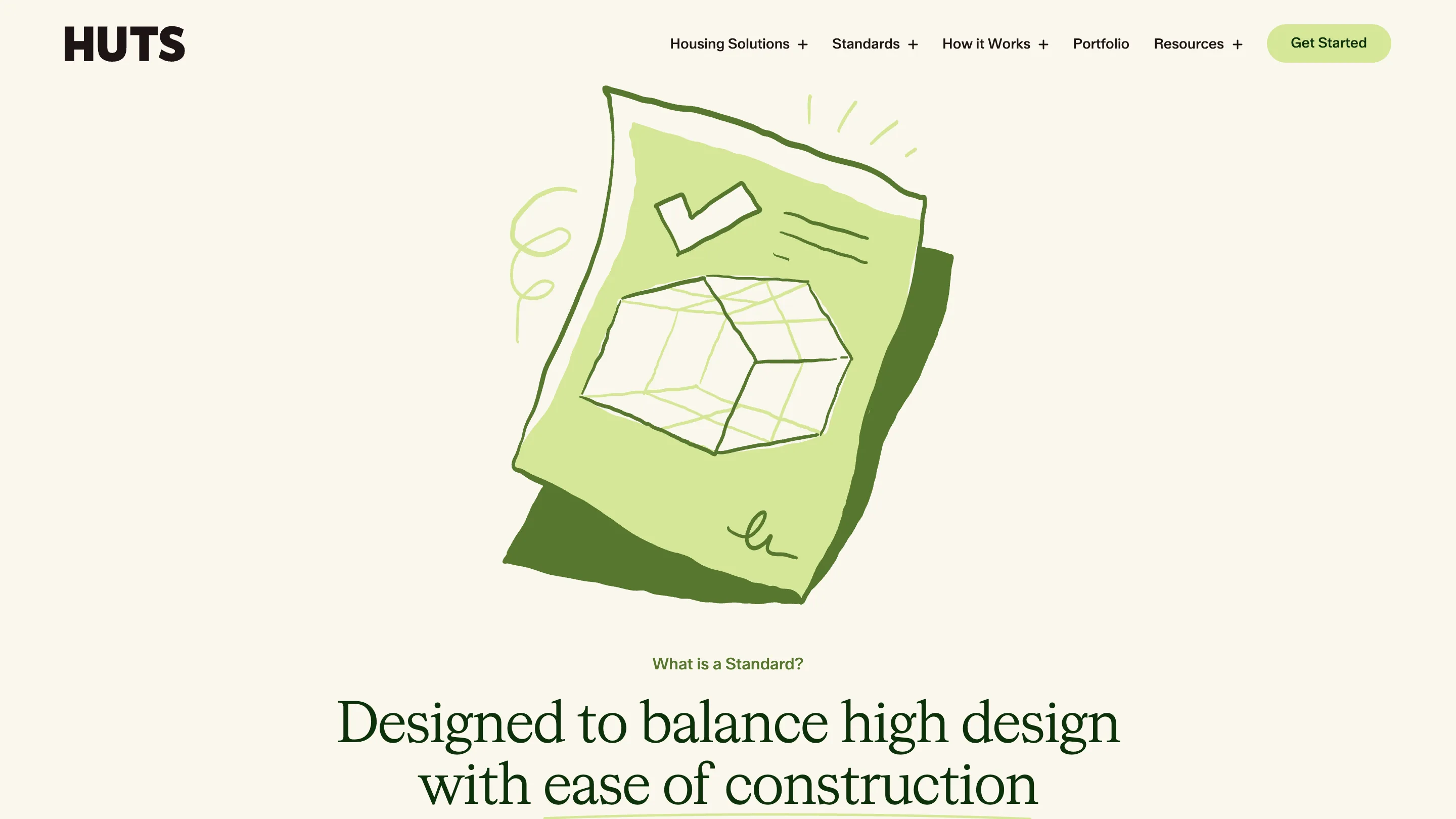
The /standards page opens on a question, set as a green overline: "What is a Standard?" Under it, a serif headline, "Designed to balance high design with ease of construction", and above both, a lime drawing of a spec sheet with a wireframe house sketched on it.
Then the definition, which is the best copy on the site: "Standards are a collection of plans that put you in the editor's seat. Based on a 16' grid, they work with much of the existing standardization of the American construction trade."
Sixteen feet is the module American framing already runs on. Cut to it and you waste less lumber, and any contractor can read the plan without a translation. Huts took a construction constraint and made it the sales argument at the top of a marketing page. The eight plans follow, each with its bed and bath count: 1 bed and 1 bath at Small Bar, 3 bed and 2.5 bath at Village. You can see the range in five seconds.
One serif does the headlines and the reading
The type system is two faces with a clean split. HW Cigars, a serif, sets the display and the body copy. ABC Walter Neue, a grotesk, is held back for the wordmark, the nav, the buttons, and the small labels. So the HUTS logo hits you as a heavy squared sans, and every sentence you actually read is a serif.
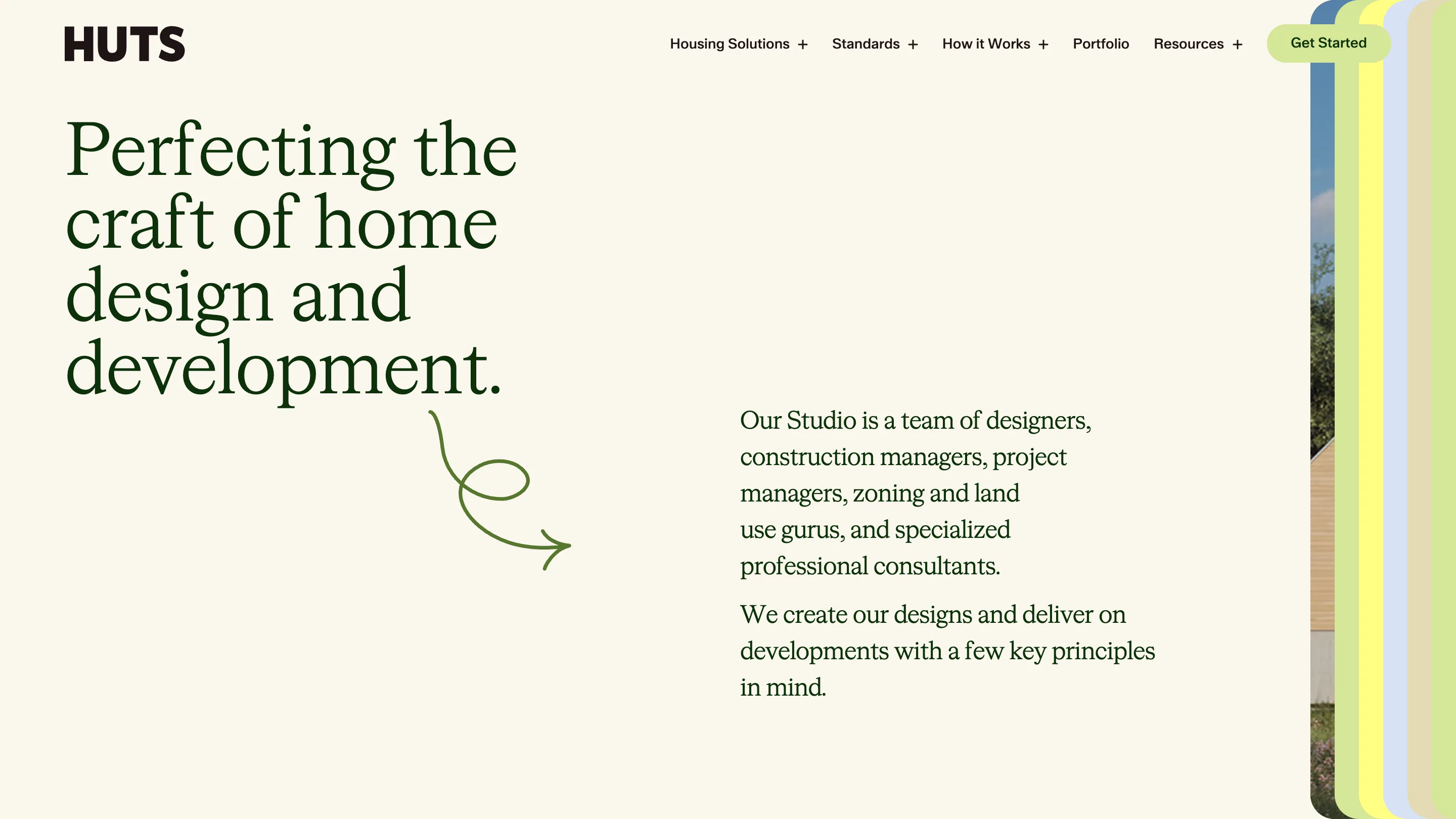
Serif running text is a commitment on the web, and the approach page shows why it pays here. "Perfecting the craft of home design and development." runs four lines deep in dark green, left column, set tight. The body copy sits to the right in the same face at reading size, loose leading, short measure. A hand-drawn arrow loops out of the headline and points across to it. The page reads like a letter about houses, which is roughly what it is.
The portfolio is a map first
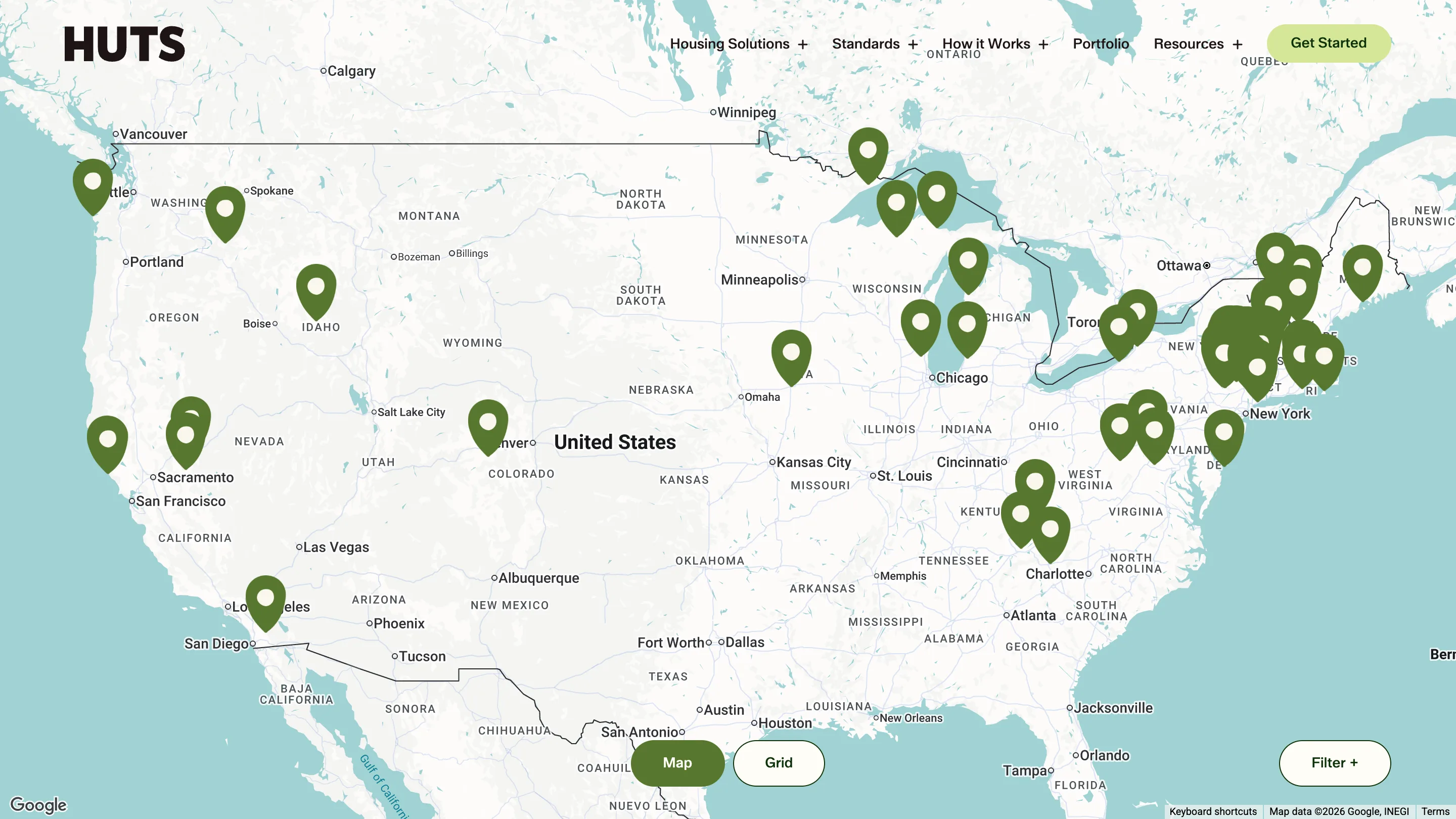
Huts builds across the US and into Canada, so the portfolio opens on a Google map: green pins scattered through Washington, Idaho and Colorado, then clustered thick around New York and New England. A Map / Grid toggle sits at the bottom center. Filter at the right.
The grid view exists. It's the second click. For a nationwide builder, the first question a visitor brings is whether you work anywhere near their land, and the map answers it before they ask. A card grid would have made them read captions to find out.
The drawings hold it together
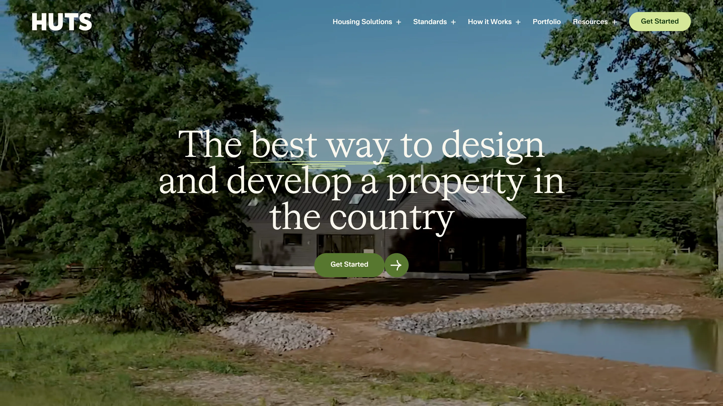
The lime squiggles are doing quiet work. One underlines "best way" in the hero headline. One loops on the approach page. The spec sheet sits on Standards. They're loose and clearly drawn by hand, and they lie on top of a hero video of a real black barn-shaped house on a real site, fresh pond, bare dirt, power lines still in shot.
That pairing is the character of the site. The photography carries the proof. The drawings carry the voice. The eight plans carry the argument.