Ardor's CRT web design puts an AI agent on phosphor
Ardor sells a cloud AI agent on a curved WebGL tube: one bitmap face, inverted highlights, eight phosphor colours and a keyboard-driven tour.
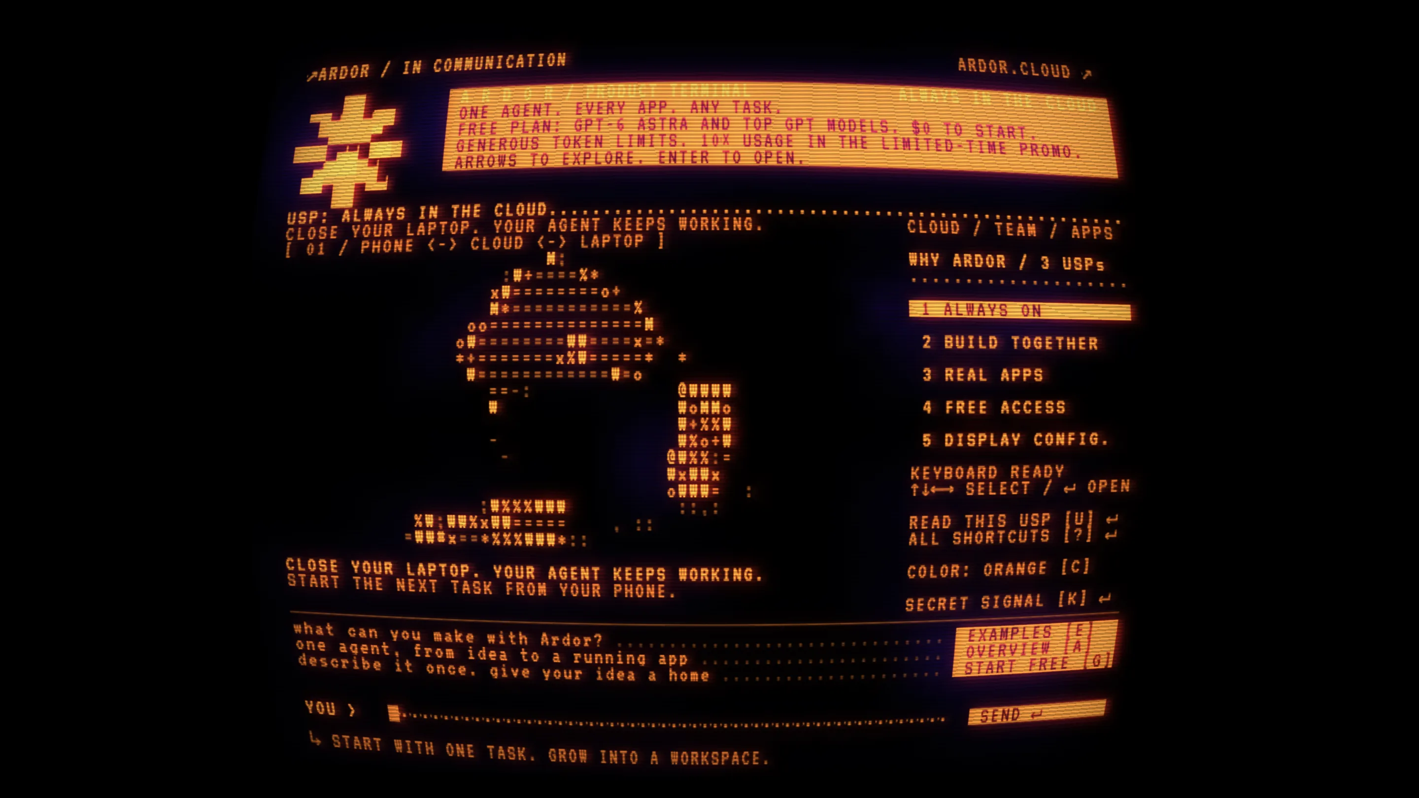
Ardor's Retro Computer page is the most committed piece of CRT web design we've seen in months. It takes a cloud AI agent, the least physical product you could sell, and puts it inside a curved glass tube that glows orange. Every line of the pitch sits on that screen. You read it the way you'd read a terminal in 1986: arrows to move, Enter to open.
Ardor's Retro Computer, directed and built by Viacheslav Sheikin, turned up on Minimal Gallery this month. It's a side door to the main Ardor site, and Ardor links it from its own showcase as "Ardor on a 1980s phosphor CRT".
How the CRT web design holds together
The whole page is one WebGL canvas. The text is rendered into it, then bent by barrel distortion so the corners pull away from you, with scanlines and a soft bloom on every bright pixel. Switch WebGL off and you get a single line: "THE VISUAL LINK IS UNAVAILABLE." That's honest. The effect is the page.
What keeps it from being a filter is the type. One monospaced, all-caps bitmap face does everything, and hierarchy comes from inversion. The promo block at the top is a solid orange slab with dark text knocked out of it. The selected menu item gets the same treatment. Everything else is orange on black. There are two weights of emphasis, on and off, which is exactly what the hardware it imitates could do.
The layout follows a terminal's habits too. A dotted leader runs from "USP: ALWAYS IN THE CLOUD" to the right edge. Labels sit in square brackets, "[ 01 / PHONE <-> CLOUD <-> LAPTOP ]". Shortcuts are printed beside the thing they open: "COLOR: ORANGE [C]", "EXAMPLES [E]". You learn the interface by reading it.
Choose your phosphor
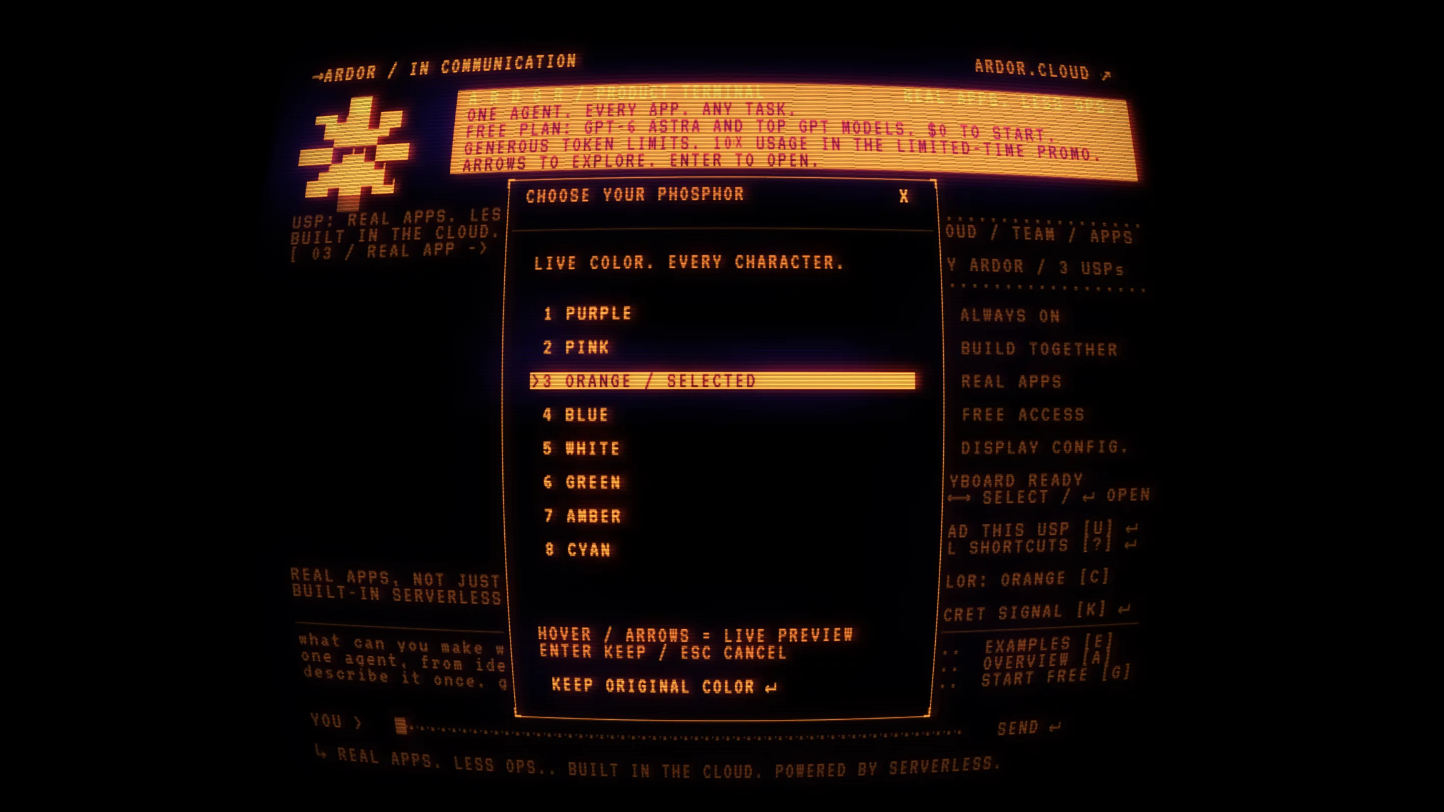
Press C and a dialog opens over the screen: "CHOOSE YOUR PHOSPHOR. LIVE COLOR. EVERY CHARACTER." Eight options, purple through cyan, each previewed live as you arrow past it. Real monitors shipped in green, amber or white depending on which one your office bought, so the picker is a period detail and a theme switch at once.
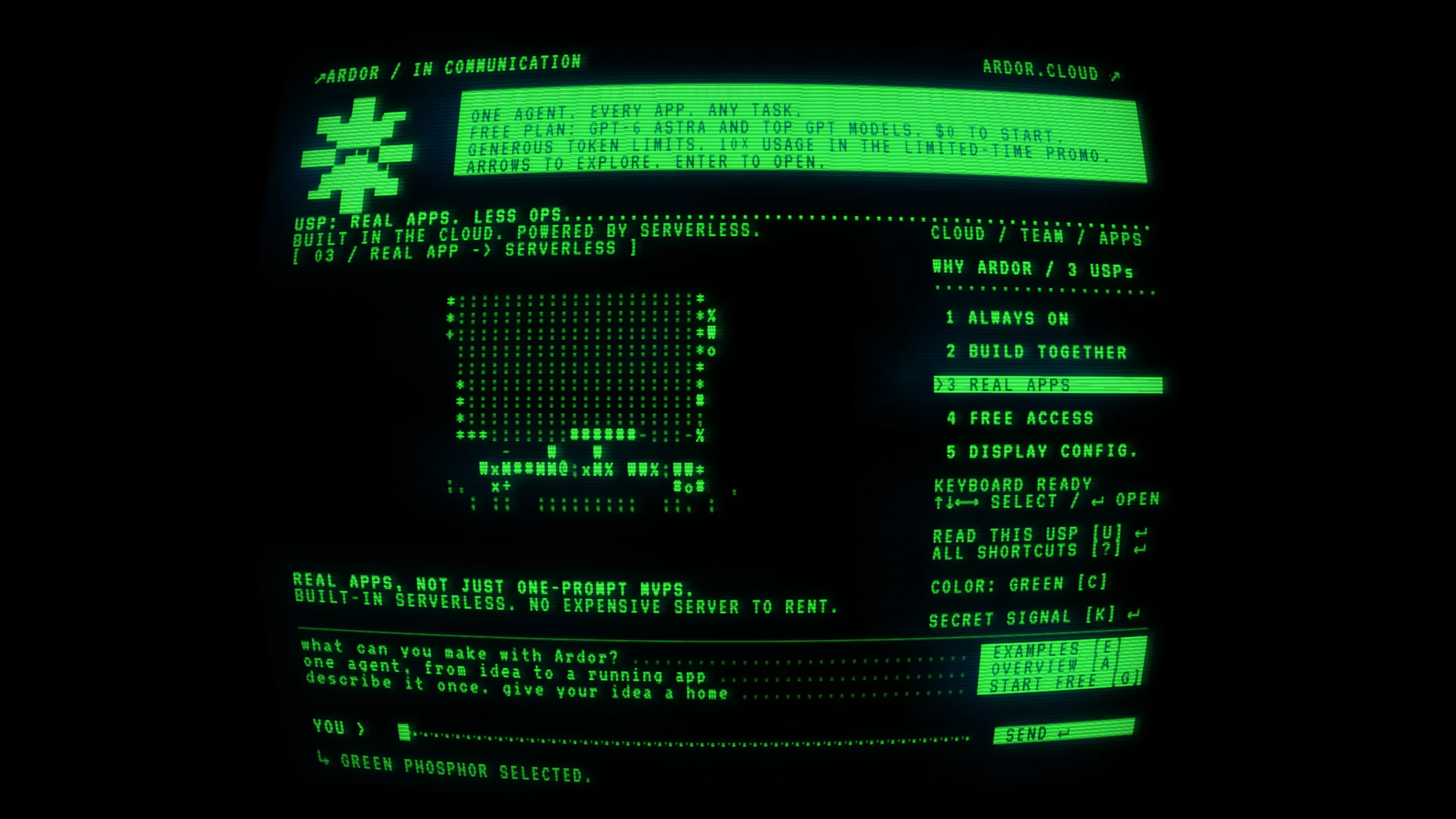
It's also the smartest decision on the page. A single colour carries the entire brand here, and Sheikin hands it to the visitor. Orange is the default. Pick green and the page turns into the computer from every film you've seen, and the status line at the bottom confirms it: "GREEN PHOSPHOR SELECTED."
ASCII drawings that carry the pitch
The centre of the screen holds an animated ASCII drawing, and it changes with the selling point you've picked. "Real apps" draws a laptop out of colons, pound signs and percent marks, and the drawing keeps moving while you read. Each drawing is a diagram of the claim in the caption under it.
That caption copy is short and plain. "Close your laptop. Your agent keeps working." "Built-in serverless. No expensive server to rent." The CRT treatment gives the words room to be blunt. On a glossy SaaS hero the same lines would need a gradient and a screenshot to feel finished.
A product tour you drive with the keyboard
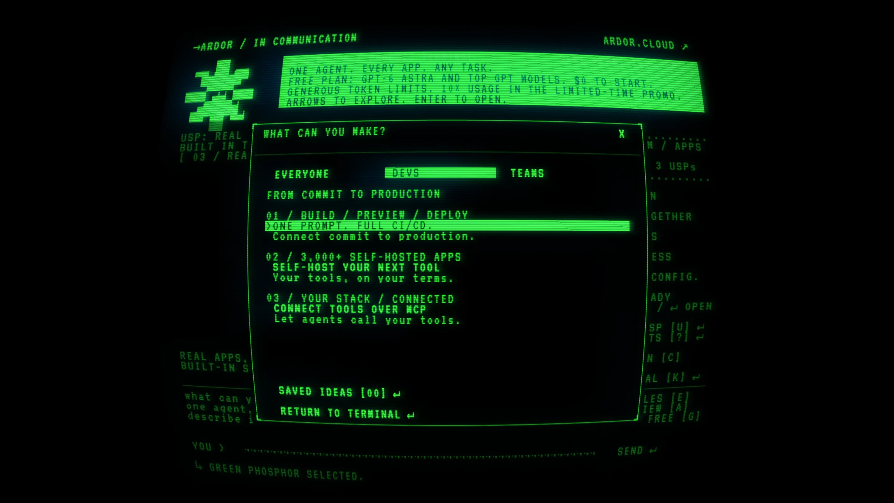
Press E and you get "WHAT CAN YOU MAKE?", a dialog with three tabs, Everyone, Devs and Teams. The Devs tab lists three jobs, each with a numbered label, a headline and one plain line: "Self-host your next tool. Your tools, on your terms." Underneath sit "SAVED IDEAS [00]" and "RETURN TO TERMINAL". At the bottom of the main screen, a prompt line reads "YOU >" with a blinking block cursor, so the page ends where the product starts: you type a task.
This is the part worth stealing. The page is a product tour with a menu, a details view and a call to action, and the retro frame makes keyboard navigation feel native. Nobody needs to be told that arrows move the highlight on a CRT. If your product lives in a command line or a chat box, a terminal-style landing page lets visitors use the product's own grammar before they sign up.
Go and press every key. Try K for the secret signal.