Flow Creative launched Oh Nice, a design studio built for one kind of client
Manchester's Flow Creative has spun out a second studio aimed only at charities and campaigning groups. Greenpeace, WWF and Medical Aid for Palestinians are already on the list.
Flow Creative has launched a second studio. It's called Oh Nice, it's in Manchester, and it takes one kind of client: organisations trying to change something. Greenpeace, WWF, Medical Aid for Palestinians and NICE are already on the roster, which is a strange thing to say about a studio that has only just put up a site.
The launch showed up in Creative Boom's July roundup, next to Mother Design opening a shop in Los Angeles and MOX starting an experiences division. Oh Nice is the one worth a working designer's attention, because it's the narrowest.
A purpose-driven design studio with a single client type
Flow has been doing this work for years under its own name. Karl Doran's team built the identity for Greenpeace's Global Plastic Treaty campaign, launched in Paris in May 2023: a stamp mark drawn five ways so each continent got its own globe, an icon set cut to match, and a typographic system that had to hold up across several alphabets. That's a brief with real constraints in it. The mark has to work on a placard and inside an Arabic-language layout, and Greenpeace's own brief said it had to hold across offices in different countries.
Oh Nice gives that experience its own front door. The service list is five words long: branding, campaign, illustration, digital and web, motion. The process is five more: insight, strategy, creative, storytelling, delivery. None of it is novel, and that reads deliberate. A charity's head of comms has a board to explain the spend to, and plain words survive that meeting.
The type does the sorting
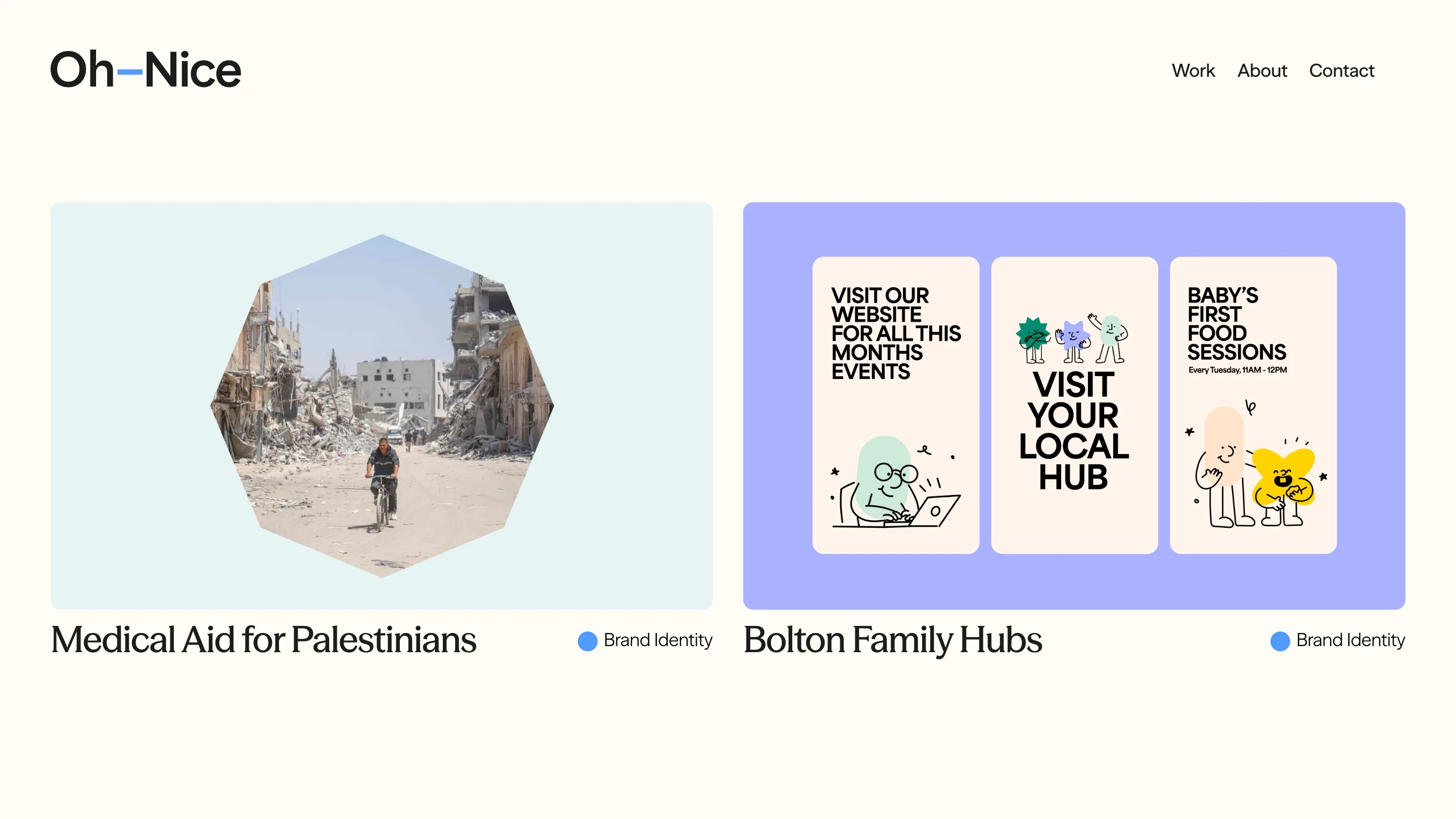
The work page runs two projects across the fold, each on a flat pastel tile with the photograph masked into an octagon. Medical Aid for Palestinians sits on pale blue, Bolton Family Hubs on periwinkle. Underneath, the project names are set in a high-contrast serif while the nav, the discipline labels and the body all stay in a neutral grotesk. One switch of family, and the hierarchy is settled: the client's name is the headline, everything else is furniture. A small blue dot carries the discipline tag.
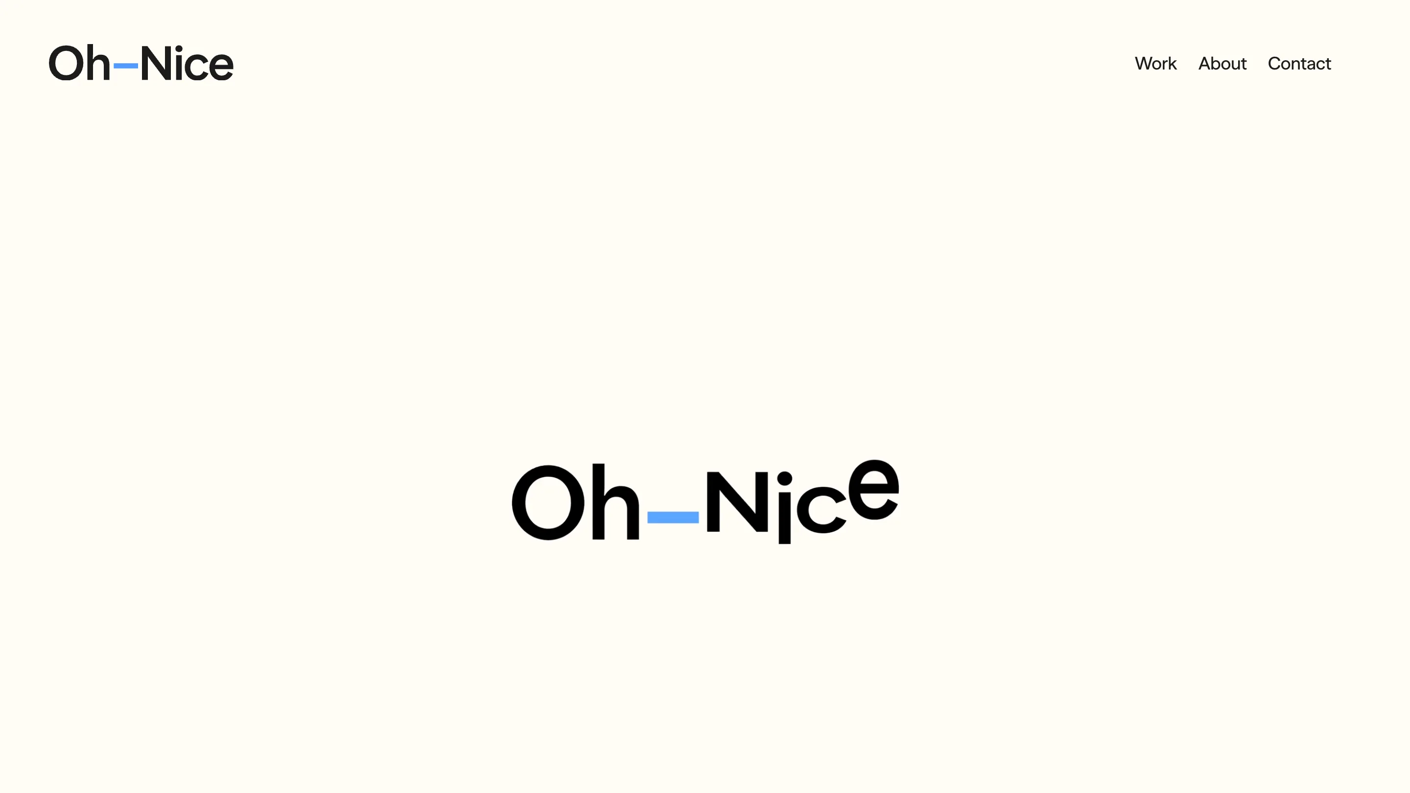
The cream ground, somewhere around #FDFAF0, runs through every page. No dark mode. No scroll hijack, no loader, no cursor trick. The site loads and then sits still, which on a studio site is now a position.
The wordmark does the only playful thing on the page. The letters of "Oh-Nice" sit on a wobbling baseline, the N and the j dropping while the e rides up, with a blue dash where the hyphen goes. It's one idea, executed once, and it carries the whole identity.
Case studies that open with a sentence
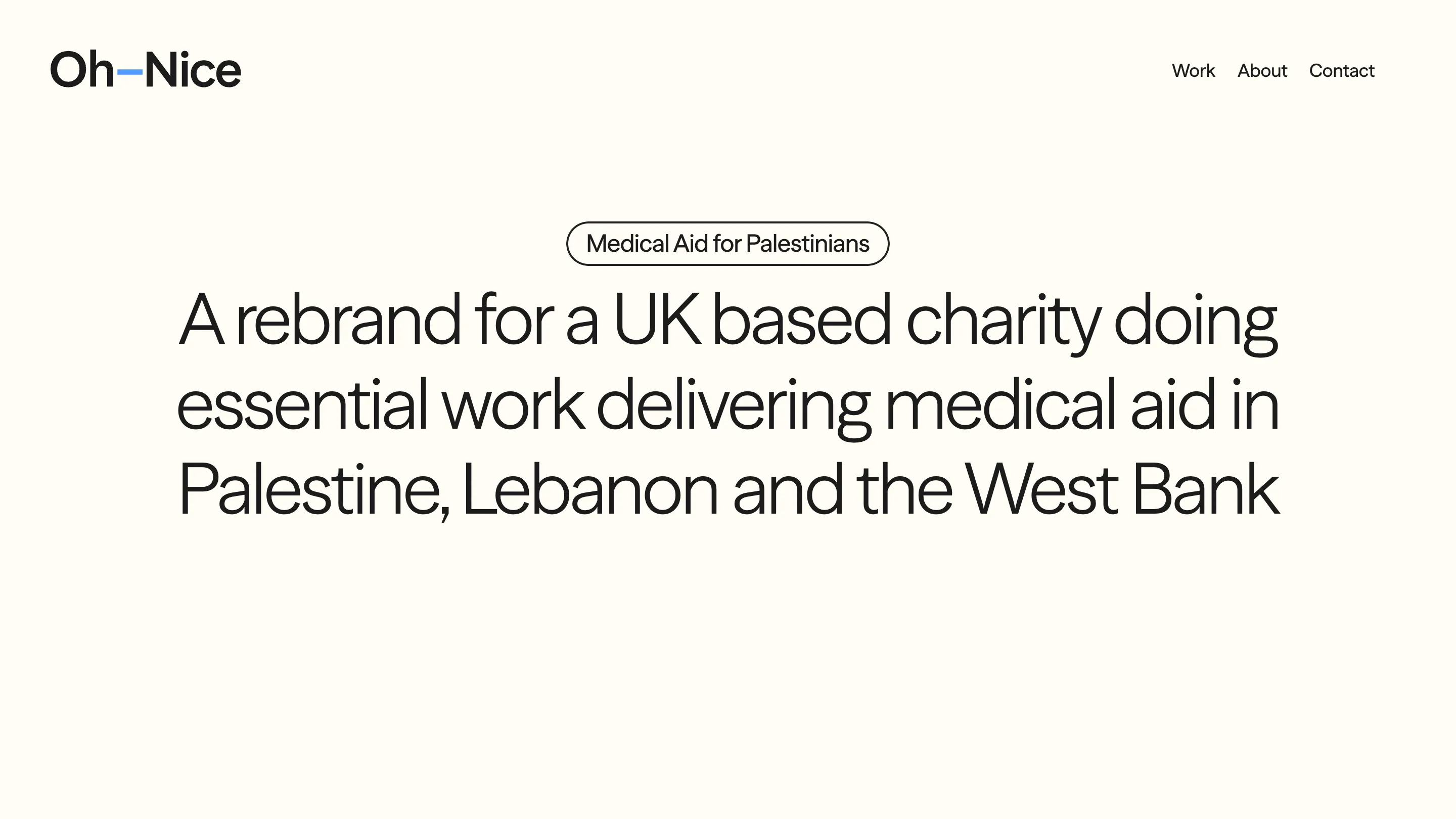
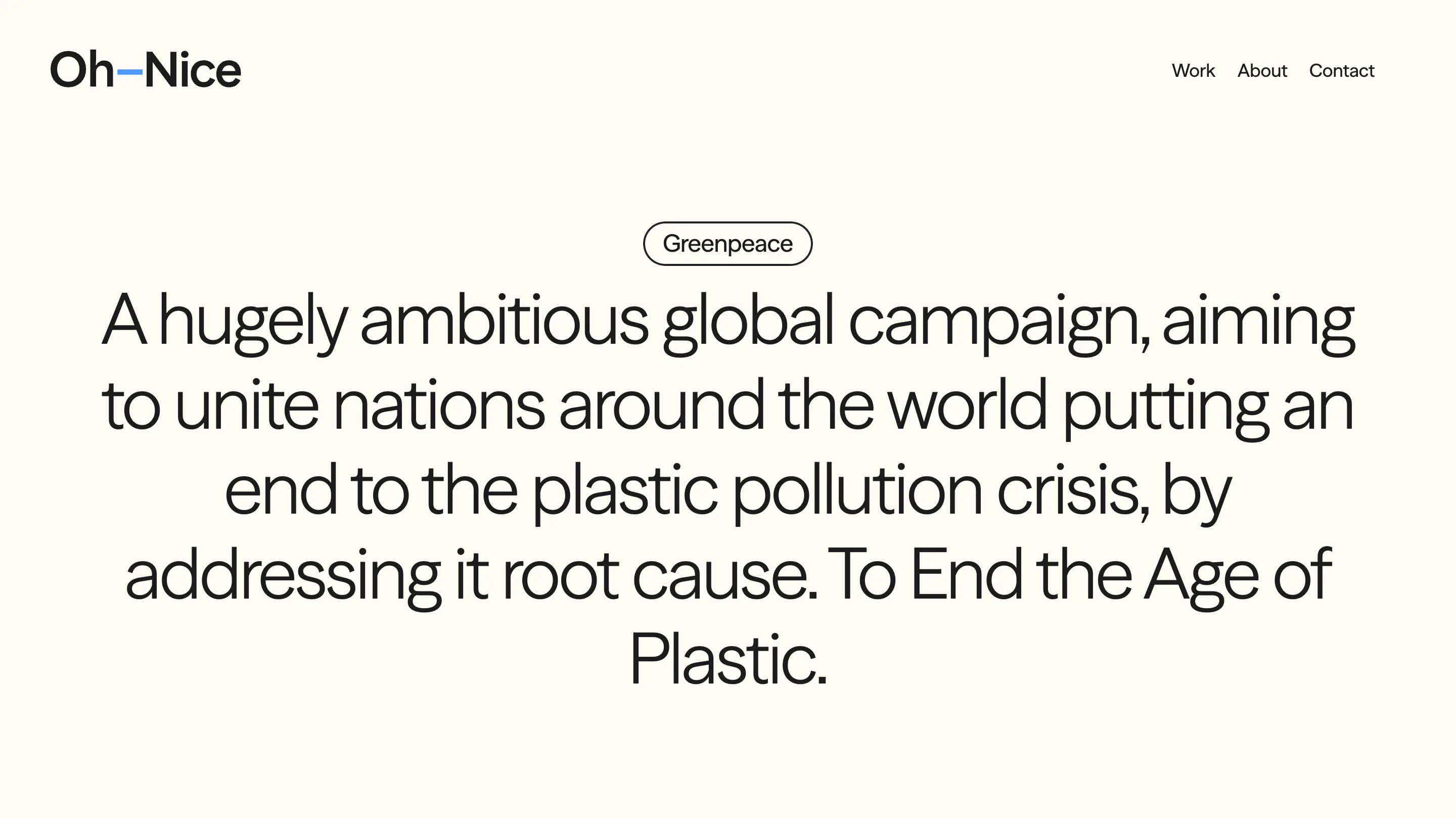
The project pages take a risk. Open the Medical Aid for Palestinians page and you get a pill-shaped client chip, then a centred paragraph set large: "A rebrand for a UK based charity doing essential work delivering medical aid in Palestine, Lebanon and the West Bank." There is no hero image above the fold. The Greenpeace page does the same, opening on the ambition of the campaign before it shows a single mark.
You read why the job existed before you see what it looked like. For a charity choosing a studio, that ordering answers the question they actually have, which is whether these people understood the last client's problem.
Why the split is the interesting part
Flow could have kept this work on its own site as a sector page. Instead it built a separate name, a separate identity and a separate URL. That costs money and splits the marketing.
What it buys is a room where the answer to "who is this for" is never ambiguous. Everything on oh-nice.studio can assume a reader with a cause, a small budget and a deadline tied to a policy moment. The copy doesn't hedge for a fintech that might also be reading. That's the same discipline a product team applies when it stops serving two personas from one screen, and it's why the site reads faster than a generalist studio's.
The cost is real too. A specialist studio lives or dies on one sector's budget cycle, and charity marketing budgets move with the news. Flow keeping its own name running alongside is the hedge.
Source and screenshots: Oh Nice.