Ravi Klaassens turns A24's library into a stack of discs
An unofficial A24 site puts every film on a printed disc you spin through, then sets each title page like a poster in one tall serif.
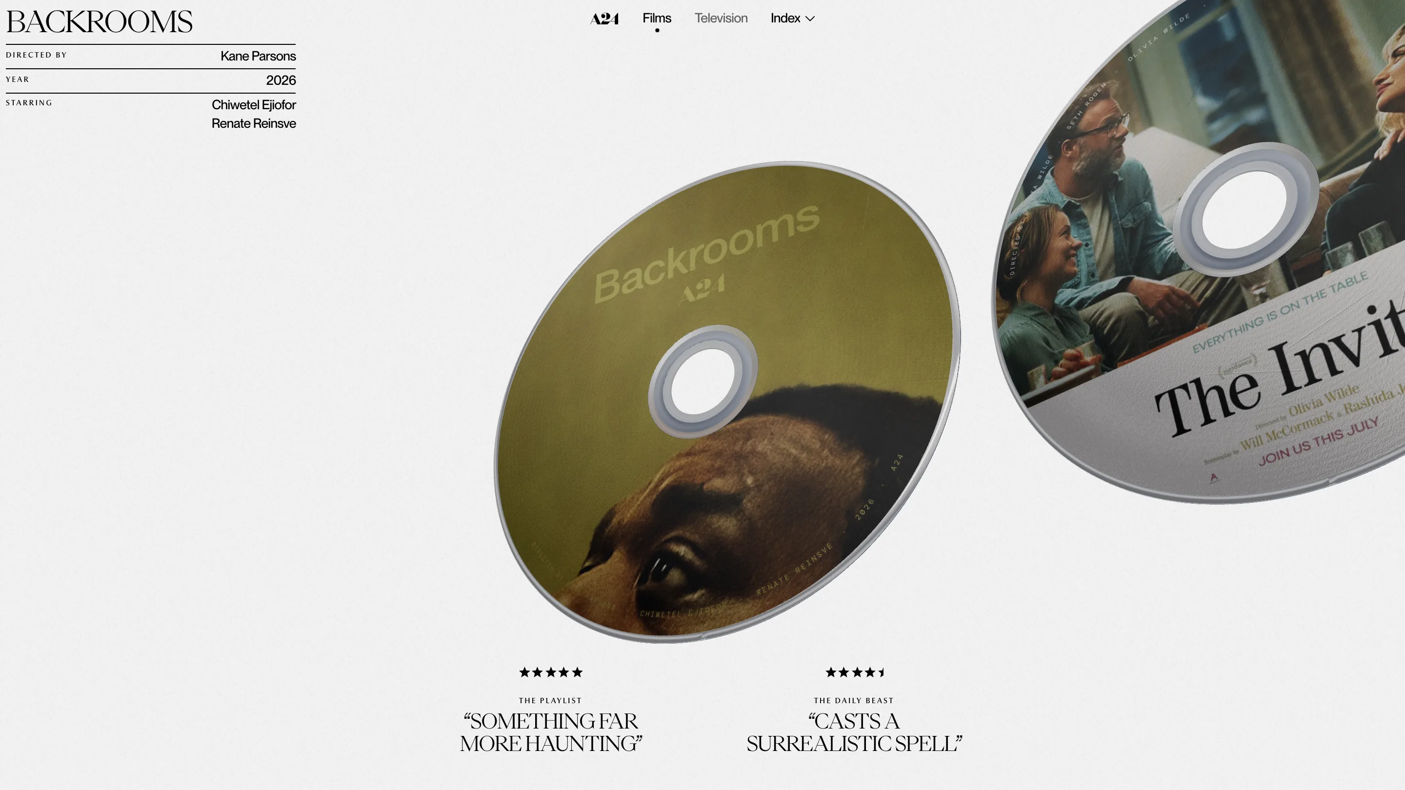
Ravi Klaassens rebuilt A24's catalogue as a stack of 3D discs, one per film, and that single object carries the whole site. You land on Backrooms printed on a disc, tilted in space, with The Invite already sliding in from the right. Scroll and the next one rolls into place. It took awwwards Site of the Day on 26 October 2026 with a 7.65, and its highest marks were usability (8.01) and creativity (7.95).
It's a personal, non-commercial concept by Ravi Klaassens, built on GSAP, Three.js and Barba, and it sits next to the rest of his portfolio. A24 didn't commission it. That freedom shows in how far he pushes one idea.
Why a 3D disc works as an index
A24's audience still buys physical media. The studio sells its own Blu-rays and collectors line them up on shelves. So a disc is the most honest container Klaassens could pick for a film: everyone knows what it is, it has a front you print on, and it spins.
Each disc is a full piece of print design. The Backrooms one is olive, with the title set in a washed-out sans and Chiwetel Ejiofor's eyes looking up from the bottom edge. The cast runs around the rim in spaced capitals, the way a real disc label sets its small print. The Invite gets Sundance laurels and a dinner-party still. None of them share a template, because the posters they come from don't.
The hole in the middle stays clear. You see the paper-grey page through it, and that one detail makes the objects read as real.
The type does the cataloguing
Around the disc, the page behaves like a record sleeve's back cover. Top left, the title sits in PP Eiko, a high-contrast serif set in capitals, over a short table: directed by, year, starring. The labels are tiny letterspaced capitals and the values are PP Neue Montreal, ranged right against a hairline rule. It's the credit block from a film poster, cut down to three rows.
Under the disc sit two review quotes, stars first, then the outlet in small caps, then the line itself in the serif. "Something far more haunting" from The Playlist. "Casts a surrealistic spell" from The Daily Beast. A24 trailers lean on pull quotes the same way, so the site borrows the voice of the marketing without writing a word of its own.
A title page set like a poster
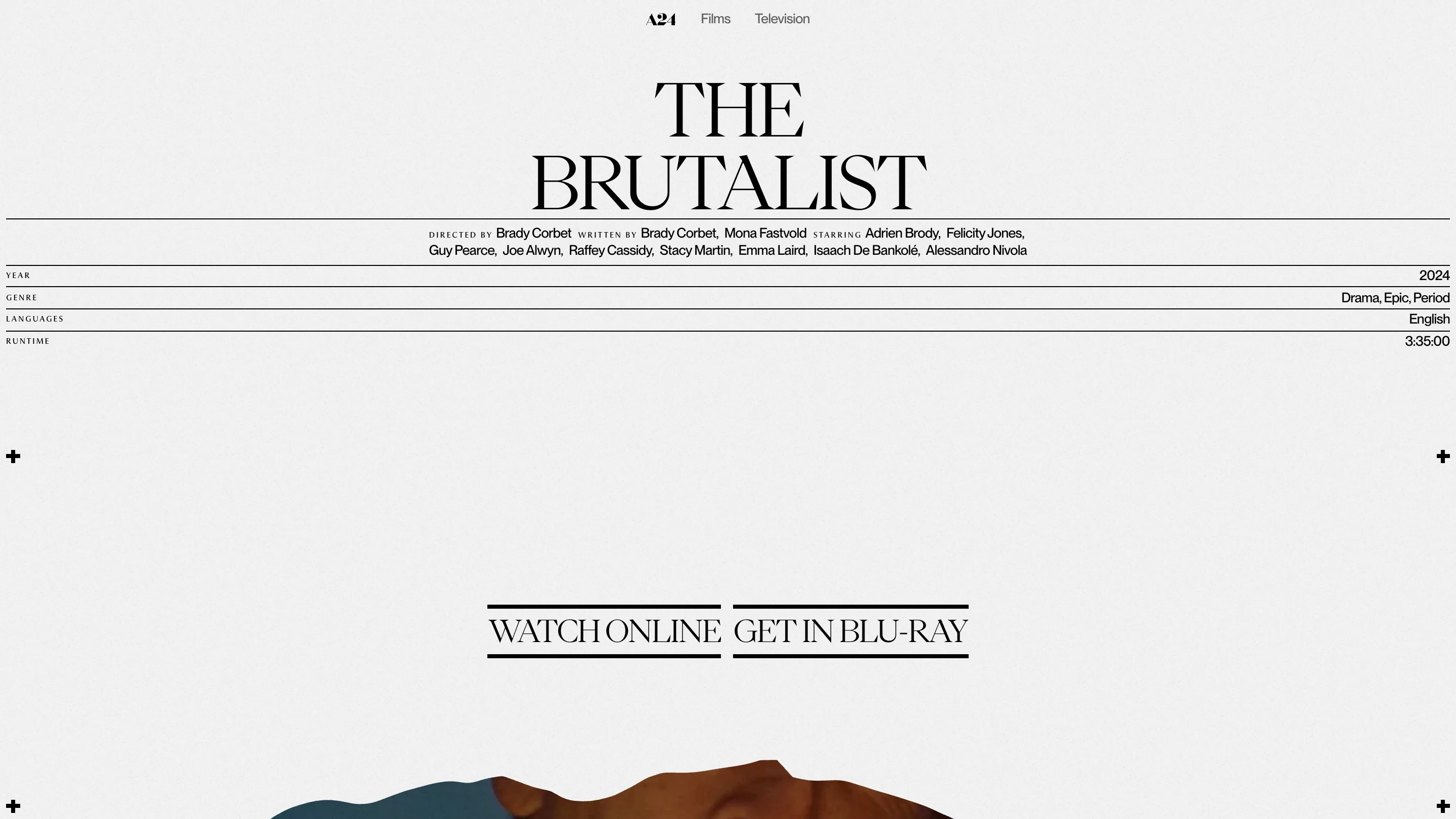
Click a disc and the 3D drops away. The Brutalist page opens on its name in two centred lines of PP Eiko, then a single paragraph of credits with the role labels shrunk to small caps between the names. Below that, four rows run the full width of the screen: year, genre, languages, runtime. The runtime reads 3:35:00, a timecode, which is a nice nod to how an editor would write it.
The two actions are the loudest thing on the page. "Watch online" and "Get in Blu-ray" are set in the display serif between two heavy black bars, closer to a cinema marquee than a button. Further down, a trailer sits behind a torn-paper edge, the film's tagline ("They do not want us here"), the synopsis, and an awards list that ends on "+51 more" instead of printing all of them.
Every title gets the same page, and the layout holds. Everything Everywhere All at Once fills two lines edge to edge without anyone resizing it by hand.
Television, same shelf
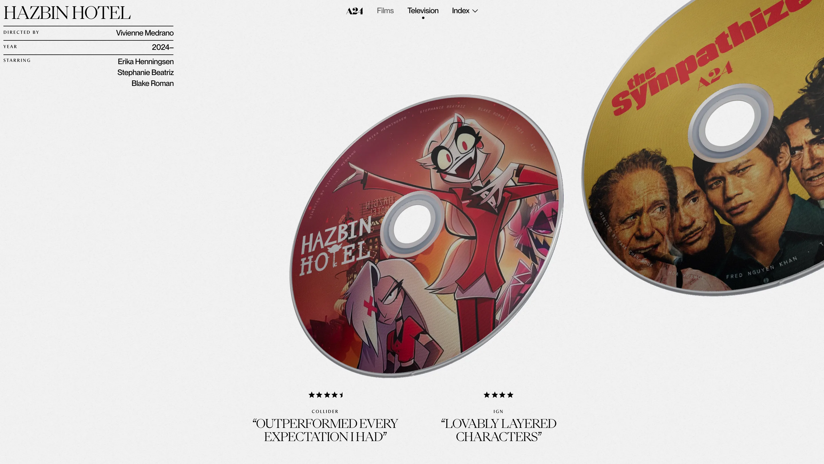
The Television tab runs the identical system over twelve shows, from Hazbin Hotel to Euphoria. Year ranges like 2019–2026 slot into the same table without breaking it. An Index menu lists every title with its year, so you can jump past the spinning when you know what you want. And the site respects reduced motion: with it switched on, the intro hold is skipped.
That's why it won. Klaassens picked one object A24's fans already collect, printed it with care twelve times over, and then let a quiet serif and a few hairlines do the cataloguing. The 3D is there to make you browse. The type is there so you can read what you found.