Beinc's ten-year rebrand retires the yellow dot and bets on human craft
The Brisbane studio Beinc dropped the yellow dot everyone knew it by for a darker, editorial identity, then put its position on AI right in the footer.
Beinc just turned ten, and it marked the milestone by killing the one thing everyone recognised it by. The Brisbane studio retired its yellow dot and lowercase wordmark for a darker, editorial identity, then shipped a redesigned site to carry it. What makes this design studio rebrand worth a look is the second move: a public position on where AI belongs in the work, and where it doesn't.
Founder and managing director Hayley Birtles-Eades didn't soften the call. "The yellow dot worked hard for the studio, and it served its purpose well," she said. "It was time for us to move onwards and upwards." That dot had been Beinc's shorthand for a decade. Dropping the mark people already know is the kind of decision most studios avoid.
What the design studio rebrand actually changed
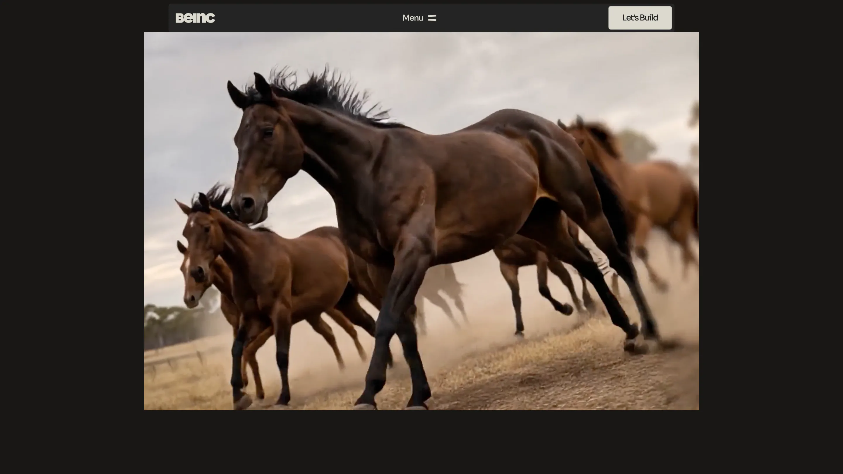
The old Beinc was lowercase and yellow. The new one is capitalised, set in a clean grotesk, and built on near-black with a warm off-white. The homepage opens full-bleed on a single image, with no headline fighting for the space. A dotted grid sits under everything, and the wordmark reveals itself block by block as the page loads, so the first thing you meet is the type doing work.
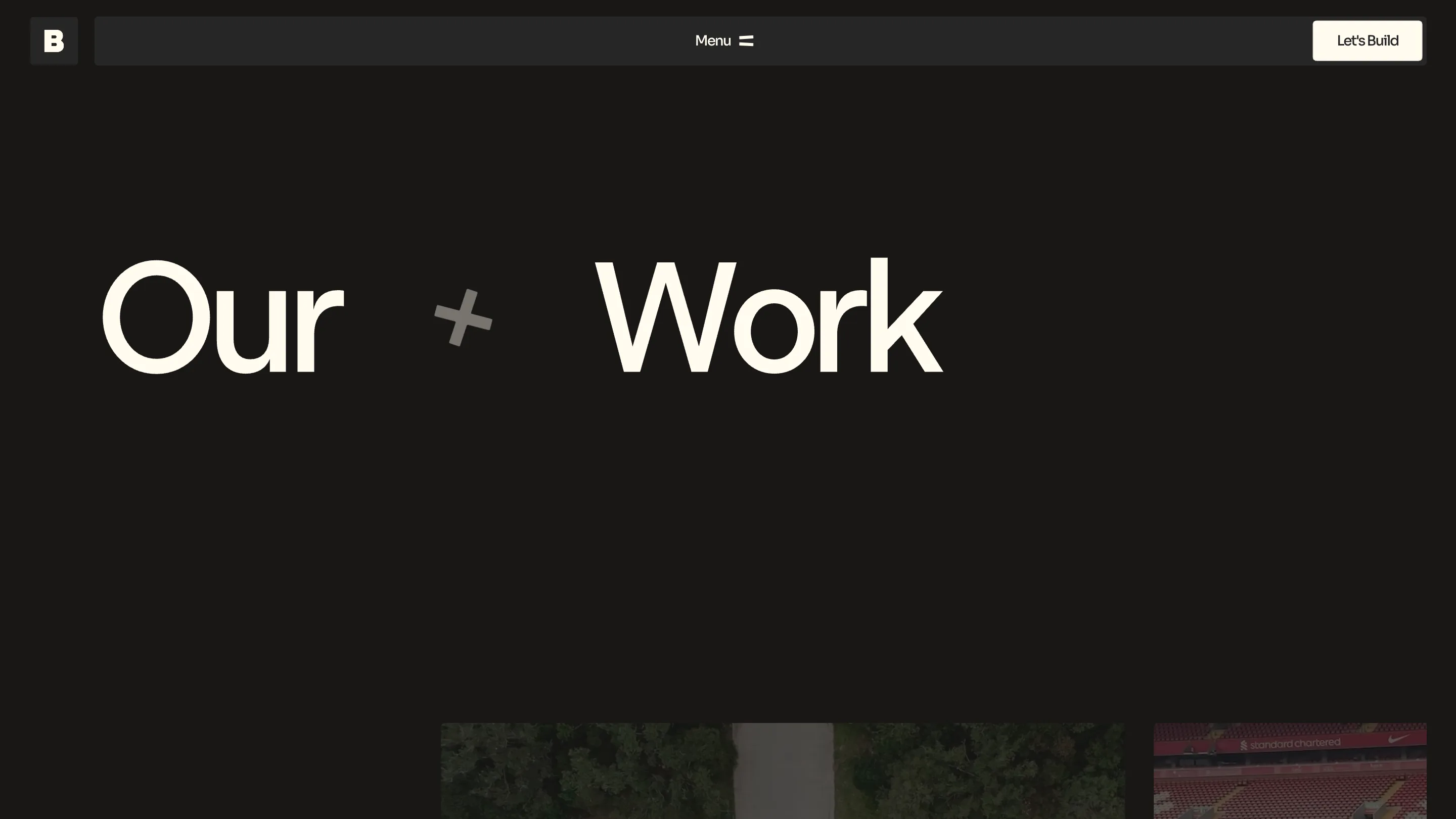
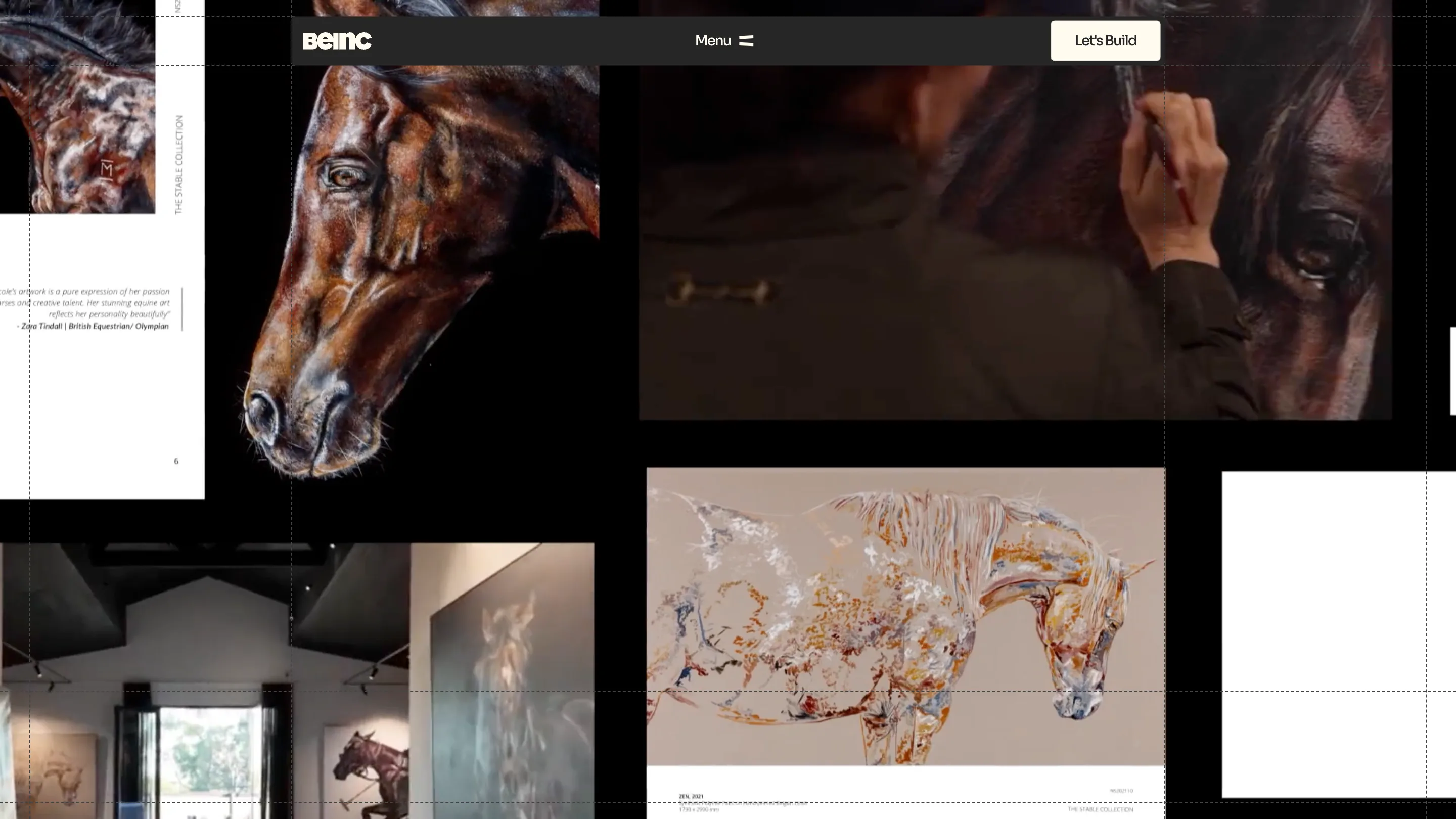
Type carries most of the page. "Our Work" runs across the screen at display size, split by a small cross mark, with a single B monogram top-left. It reads more like a magazine spread than an agency homepage, and it leans on the work instead of a pitch. The equestrian project across the top, oil paintings, a gallery install, a glass horse sculpture, shows the range without a line of copy.
A studio that puts its AI position in the footer
The part a working designer will notice sits at the bottom of the page. Under "Our Commitments," right next to Accessibility, Beinc links an "AI Statement." The studio calls its work human-centred, keeps quality control onshore, and says plainly that it ships no AI slop.
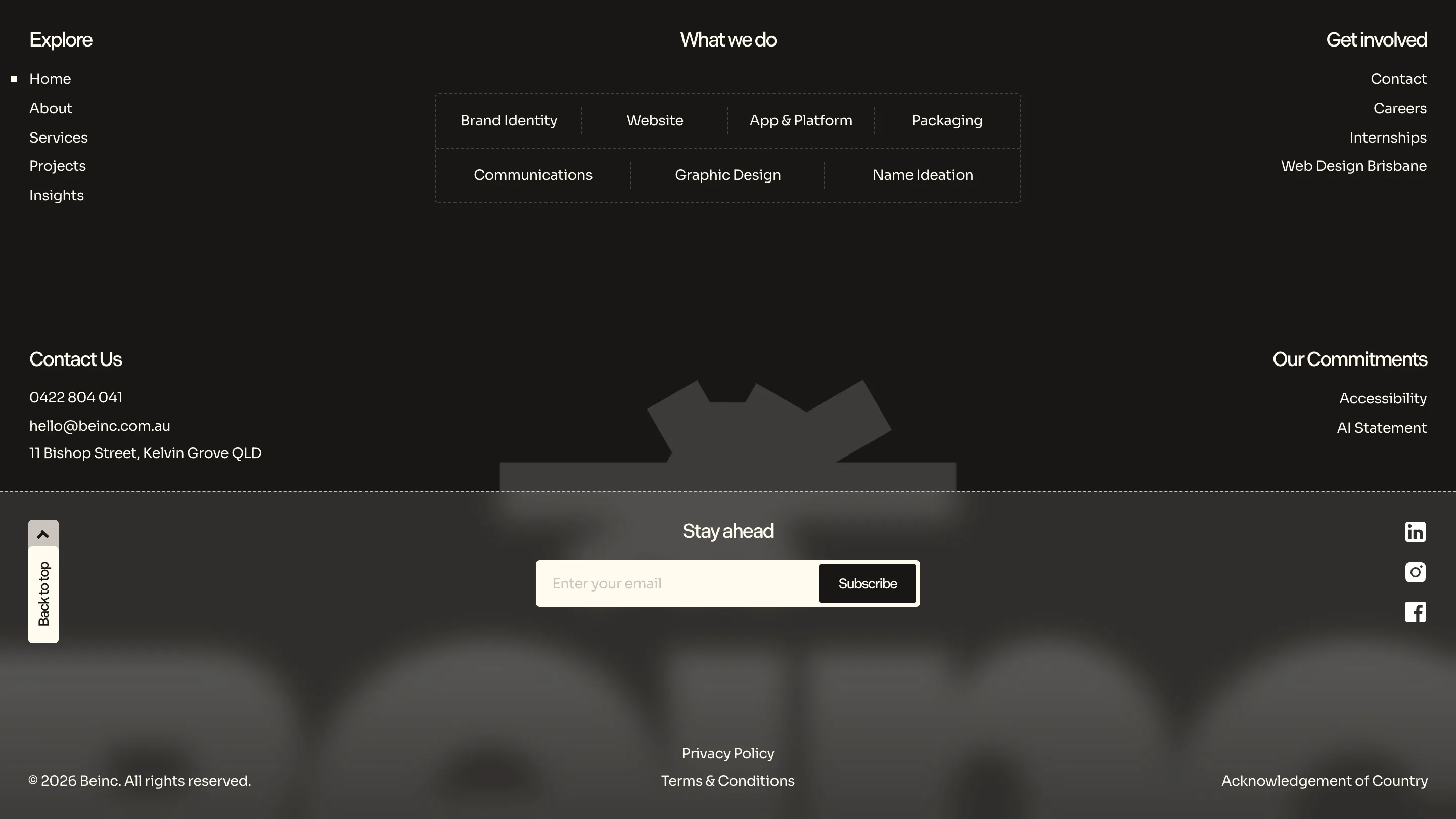
That's a positioning bet, and a specific one. In 2026 plenty of studios fold generative tools into every step and say so on the tin. Beinc is going the other way in public, treating "made by people, here" as the thing worth selling. Principle or marketing, it's a clear answer to a question clients keep asking, and it's rare to see a studio commit to it on the same line as its accessibility promise.
Why a rebrand like this matters
Ten years in, most studios refresh a logo and move on. Beinc used the milestone to reset what it wants to be known for: brand identity, websites, app and platform work, packaging, communications, all run out of Kelvin Grove. The new site sells that through craft you can see rather than adjectives.
The lesson for anyone shipping a product is old and still holds. An identity earns trust when the surface backs up the claim. Beinc says human craft, and the site is built with enough restraint, grid, and type discipline to make the claim land. You can read it yourself at Beinc.